
Wai Wai Phua
Blending technology, creativity, and thoughtful design
New to Contra
Wai Wai is ready for their next project!

Amplify AI — AI Content Tool Landing Page
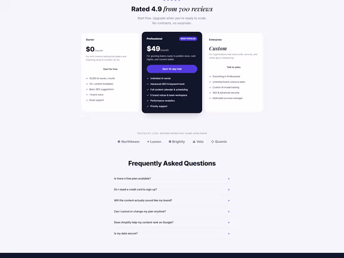
A conversion-focused landing page for an AI content platform aimed at growing marketing teams. The design balances a clean, trustworthy SaaS layout with enough energy to read as a modern AI product — indigo accents, an italic serif highlight on key phrases, and a dark "proven results" section built around dashboards and metric cards to make the value tangible. The page walks a visitor from hook to proof to action: hero with social proof, a results section with real-looking analytics, a feature grid, a testimonial, a three-tier pricing table with a highlighted "Most Popular" plan, an FAQ, and a closing email-capture CTA. Structured to support a clear free-to-paid path and reduce friction at every step.
0
40
Hearth & Honey — Neighborhood Café Landing Page
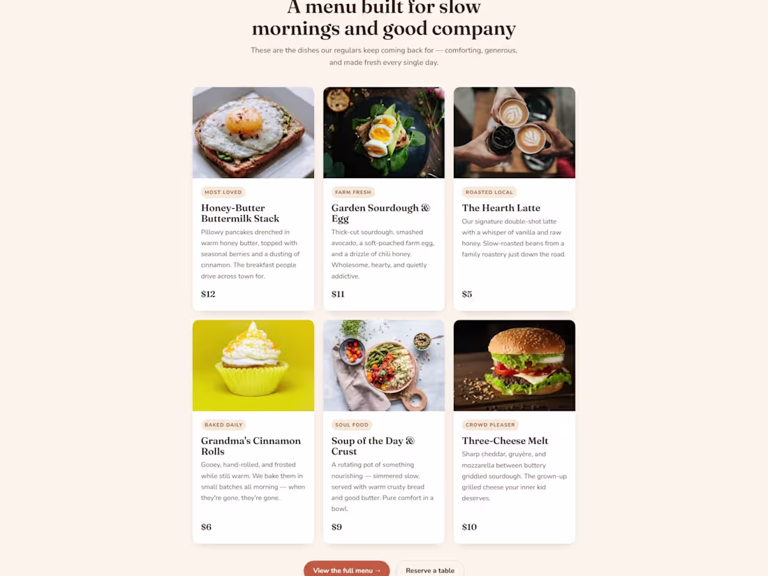
A warm, inviting landing page for a neighborhood café built around comfort and belonging. The design intentionally rejects the cold minimalism most restaurant sites use — soft cream backgrounds, a coral-and-brown palette, a friendly serif, and food photography given room to breathe. Copy is written in a homey, first-person voice ("We didn't set out to build a café. We set out to build a feeling."). Sections include the hero with a trust bar, an origin story, a menu built as appetizing cards with prices, a "why neighbors choose us" block, local testimonials, a functional table-reservation form, and a newsletter CTA offering a free pastry. The whole page is designed to make someone feel welcome before they've walked in.
0
50
Walles — Private Real Estate Buyer's Agency
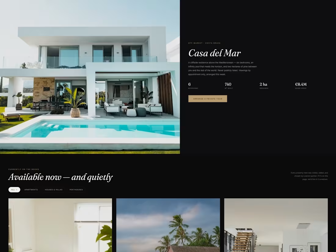
A landing page for a boutique buyer's agency that sources off-market homes across Europe. The brief was to feel less like a property portal and more like a private members' service — discreet, editorial, and unhurried. I leaned into a dark charcoal palette with warm gold accents, an italic serif headline ("The home you're looking for isn't listed yet"), and generous negative space so the architecture photography carries the page. Sections include a featured off-market listing, a quiet listings grid with filters, a private-viewing booking flow, a four-step "how we work" explainer, agent profiles, testimonials, and an FAQ. The goal throughout was trust over hype — every element written to sound like a senior partner, not a sales funnel.
0
62
Conversion landing page — coded + copywritten
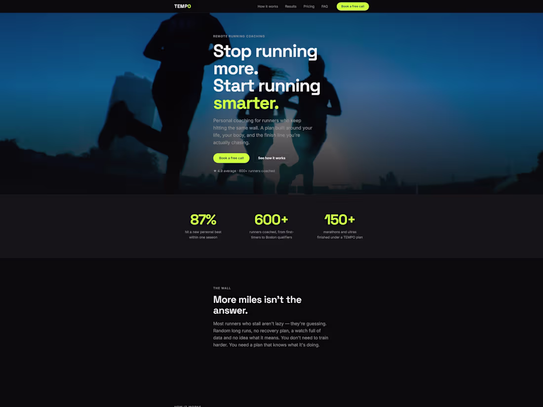
A dark, premium landing page for TEMPO, a remote running coach. The goal: turn plateaued runners into booked intro calls. I designed and hand-coded the page in semantic HTML, modern CSS, and vanilla JavaScript — no page builders — and wrote all the conversion copy, from the hero to the pricing tiers and FAQ. Fully responsive, fast-loading, and accessible. Mobile-first, built to convert, with clean source code the client owns.
0
86