
Venkatesh Vinod
Graphic Designer's
New to Contra
Venkatesh is building their profile!

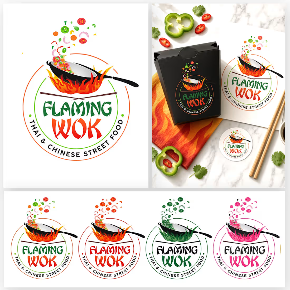
Flaming Wok — Thai & Chinese street-food logo
Flaming Wok is a compact identity for a Thai and Chinese street-food stall. The brief was a mark that reads in one glance on a hanging sign, a takeout box, a menu, and a phone thumbnail.
The logo is a single circular lockup. A tilted black wok sits over an open flame, with vegetables tossed above the pan and chopsticks crossed underneath. The name is split for hierarchy: FLAMING in a bold green display face, WOK in a heavier red script so the heat lives in the lettering, not only in the illustration. A thin dual ring in orange and green carries the arc line “THAI & CHINESE STREET FOOD,” so the cuisine is clear without a second mark.
Color does the category work. Green and red are the primary pair. Orange flame is the accent. Vegetables stay in real food colors so the mark still looks edible at small sizes. The black wok and white interior give a clean cutout edge on light packaging and dark menus.
The same lockup is shown in five palettes: original green and red, full red heat, forest green, hot pink, and gold. Structure does not change. Only the ink does, so a stall color, a festival version, or a limited print can be picked without redrawing the logo.
Applications covered in the presentation: hanging sign, takeout box, menu cover, round sticker, and food-truck panel. Best used centered, with clear space around the ring, and not smaller than the size where the arc line stays readable.
Deliverables: primary logo, color variations, and simple brand applications for signage, packaging, and social.
1
38
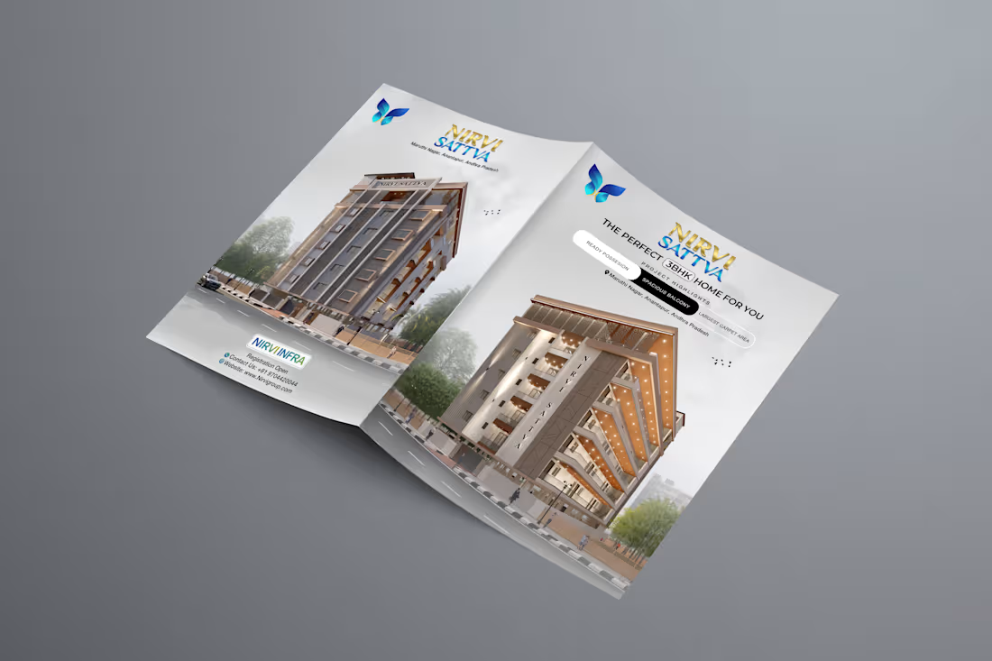
Brochure design for Nirvi Sattva, a residential project.
I designed the spread, logo lockup, and print layout, then presented it as an open-brochure mockup so the building, headline, and butterfly mark read together. The goal was a clean real-estate piece: strong first impression, easy to scan, ready for print.
Open to brochure, flyer, and brand work for builders and agencies.
1
3
114