
About the Project
Vaulta is an iOS utility that tracks app permissions and uses AI to explain data risks in simple terms through actionable security tasks.
Task
Create a high-impact onboarding flow that introduces key features and demonstrates immediate value.
Process
I used a familiar Stories-style layout to ensure intuitive navigation. Dynamic animations were added to make the experience more engaging and visually demonstrate progress.
Result
The design optimizes Time-to-Value. This gamified approach builds user trust, reduces early-stage churn, and increases conversion rates from onboarding to active daily use.
16
518
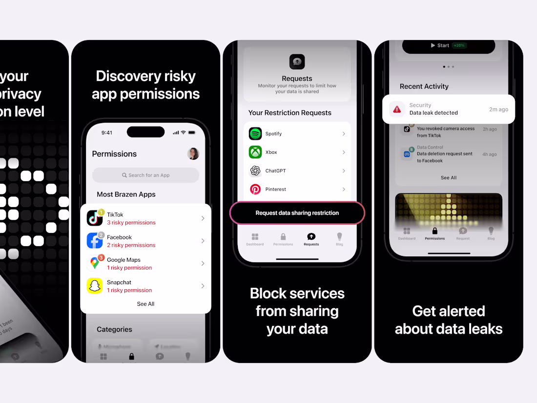
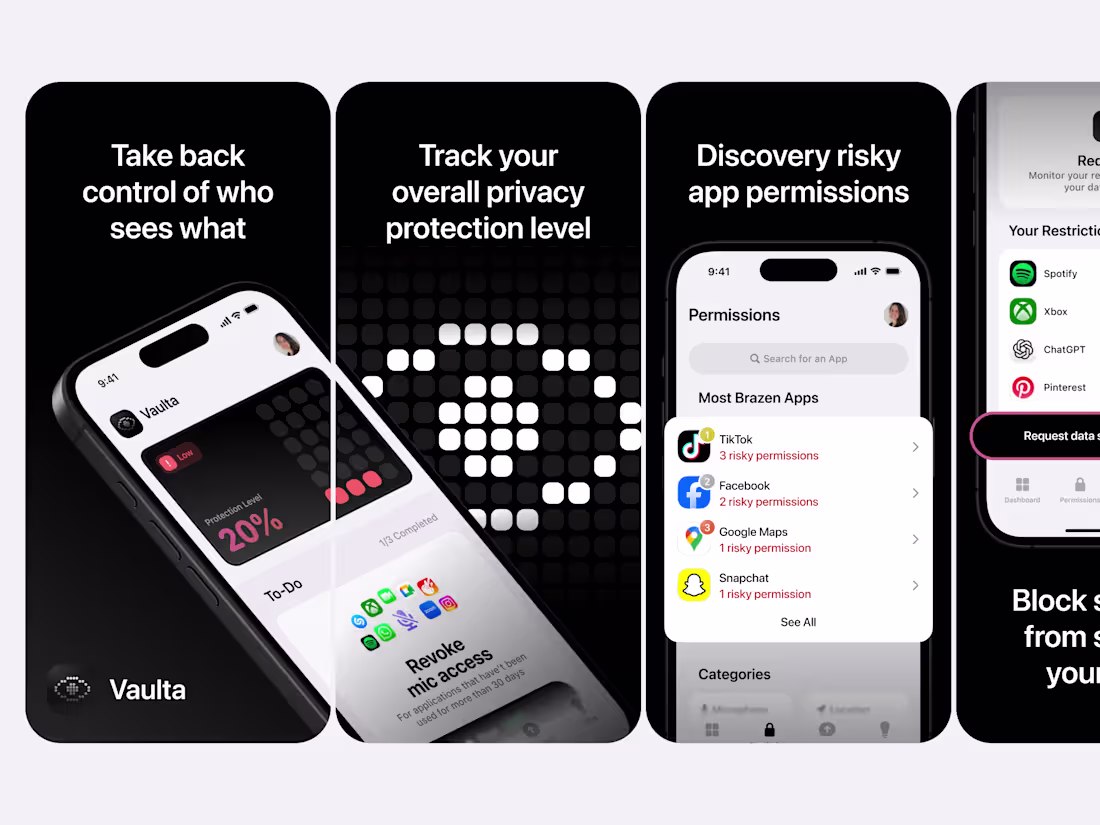
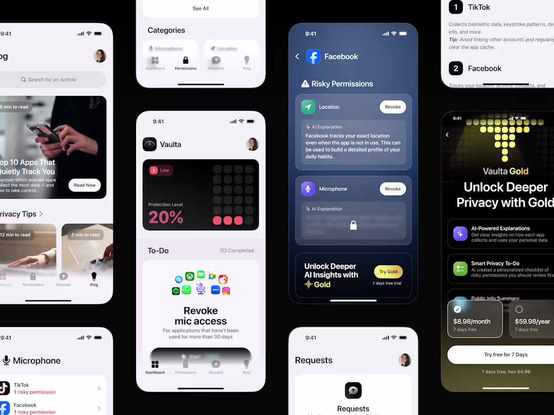
Just wrapped up this new batch of App Store screenshots for Vaulta, focused on making the user value clear at first glance.
This time I worked on:
• Creating a strong visual rhythm across screens. Сlean, high-contrast frames that guide the eye naturally
• Making each screen answer one clear question: Why should I care?
• Balancing bold UI previews with simple, benefit-focused headlines
• Adding subtle touches of urgency (like alert badges and dark backgrounds) to support the privacy theme
• Keeping everything readable and consistent in tone, even when showing technical features like permissions or AI explanations
Every screen is designed to work both on its own and as part of a clear, scrollable story.
The goal: help people instantly get what Vaulta does and why it matters before they even tap “Get”.
4
22
577
About the Project
Vaulta is an iOS utility for privacy. It tracks app permissions, provides security tasks, and offers AI-powered insights to explain data risks in simple terms.
Task
Create a set of App Store screenshots that increase install conversion by presenting Vaulta’s core features in a clear, compelling and immediately understandable way.
Process
I built a clear visual story where each screenshot delivers one focused message. Clean hierarchy, bold headlines and real UI frames highlight the core benefits, while the dark aesthetic reinforces privacy and clarity.
Result
The final screenshots clearly communicate how Vaulta protects user data and make the app easier to understand at a glance. Strong visuals and focused messaging help increase trust and improve download conversion.
2
463
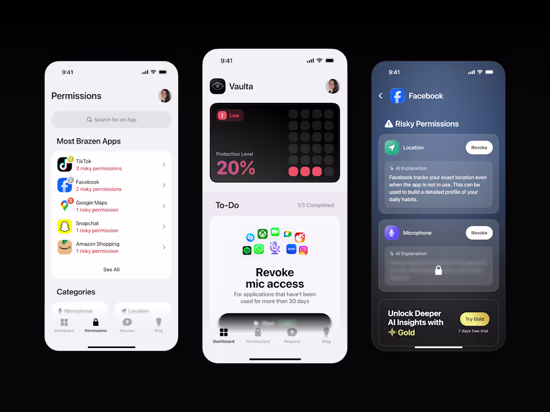
About the project
Vaulta is an iOS utility for privacy. It tracks app permissions, provides security tasks, and offers AI-powered insights to explain data risks in simple terms.
Task
Design an engaging, native app that simplifies privacy management. The goal was to help users identify risks and take protective action instantly, without the usual complexity.
Process
To reduce cognitive load, I prioritized actionable tasks as the main view, letting users improve security immediately. I also restructured the Permissions tab to rank apps by risk level exposing the most intrusive ones first and integrated AI to explain threats clearly.
Result
User-centric interface that transforms complex privacy data into a simple checklist. The design empowers users to effortlessly control their digital footprint and stay secure in gamified way.
6
29
727
I designed Vaulta as a clean iOS style privacy utility that helps people understand and control their digital footprint. The app shows a real time Protection Level, highlights risky permissions, displays what data apps collect, and reveals public information external services may already know about the user. Vaulta turns this into clear summaries and lets users send data deletion requests when needed.
The experience focuses on clarity and trust with organized permission groups, clear risk indicators, and a spotlight on the most data heavy apps. A Pro tier unlocks deeper insights and more advanced recommendations, while the built in privacy blog keeps users informed.
The result is a minimal and engaging tool that makes privacy easy to understand and act on, supported by a natural subscription driven model.
8
28
648
Vaulta is your digital security control center.
It shows what data apps collect, explains the risks, and helps you regain control over your personal information.
Ma task was to create a Welcome Screen that conveys the atmosphere of Vaulta and makes the topic of privacy visually understandable. I developed a series of pixel art symbols that are part of the brand's style. The illustrations transform smoothly, reflecting different aspects of protection. I set up smooth transitions so that the animation feels like data movement.
The result is a lively and high-tech screen that sets the tone for the product and quickly explains the idea of controlling your privacy.
6
30
762
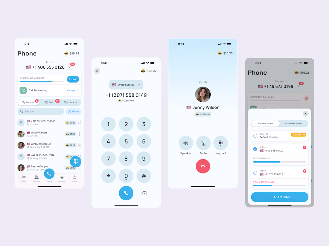
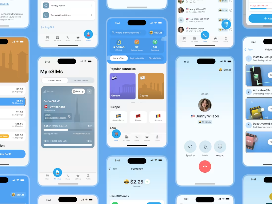
From eSIM to a complete VoIP experience
I have been with this product from the start. It began as an eSIM and data app, and adding VoIP meant fitting a full phone system into an app that was never designed for it.
Users can have unlimited numbers with their own calls, messages, contacts and rates. The structure was complex, so I focused on making the experience feel simple.
Since the app already had many sections, I designed everything to live inside one tab. After many wireframes, I arrived at a layout that keeps navigation clear and effortless.
Users can switch numbers, manage caller ID, check messages and buy new numbers all in one place. The interface feels light while the system behind it is very powerful.
14
601
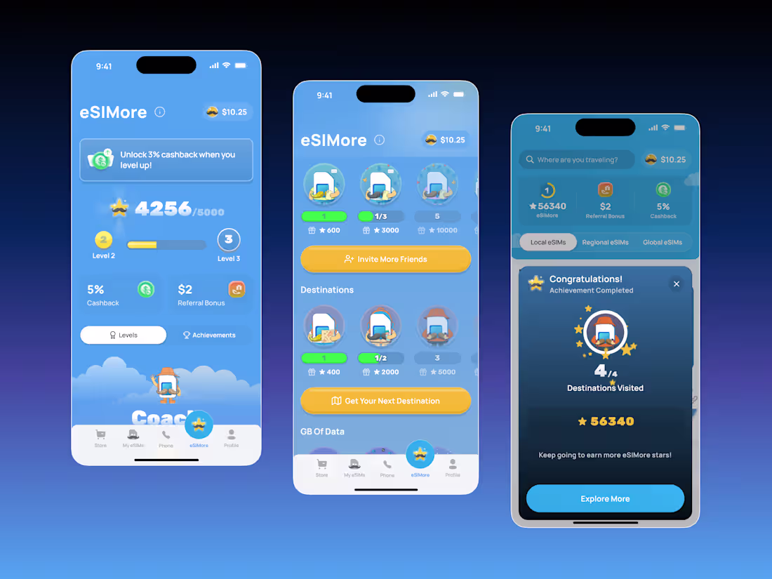
Sometimes, all you need to stand out from your competitors is to add gamification to your app!
That's exactly what we did at eSIMo! eSIMo is an eSIM provider focused on travelers. Before eSIMo, no other eSIM (electronic SIM card) provider had a user experience where users could access a rewards club with a level system where you earn points for purchases, inviting friends, and visiting new countries! Users are motivated to earn points and move to new levels to get higher cashback percentages or increase the reward for inviting friends. Users don't switch to another provider because they know they will be rewarded for every action they take in eSIMo, which increases sales and trust in the product!
What do you think about adding gamification to apps?
19
694
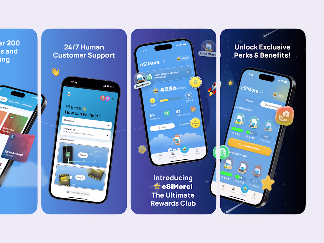
I’ve just finished another set of App Store screenshots for eSIMo and wanted to share them here. I love working on projects like this because good screenshots can genuinely change how people feel about an app.
When the visuals are clear and friendly people understand the value instantly. They see how support works what rewards they can get and why the product is actually helpful even before they hit “Install.”
For this batch I focused on
• keeping the screens easy to read
• guiding the user’s eye naturally
• adding a bit of personality and warmth
Every screen is designed to answer a real user question and to make their first impression feel smooth and positive.
Let me know what you think
2
4
440
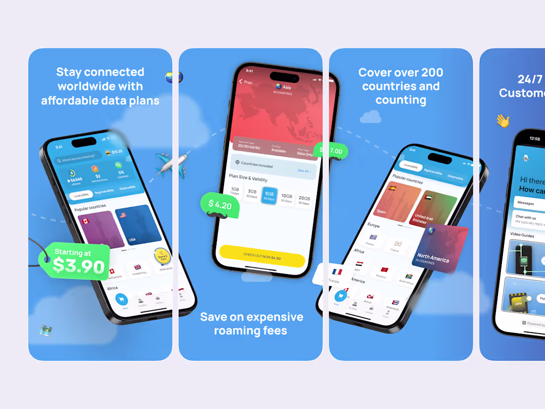
Designed a clean and modern App Store presentation crafted to highlight a seamless way to stay connected worldwide. Each screen showcases how users can access affordable data plans, avoid roaming fees, and choose coverage across more than 200 countries.
Minimalist layouts, bright visuals, and clear value messaging help build trust and turn visitors into active travelers who connect in seconds.
What do you think?
3
483
Engaging design isn't just about beautiful screens; it's about what keeps users staying, exploring, and coming back.
At eSIMo, I created an experience that turns the technical process of connecting into an easy and enjoyable journey. When people really enjoy using a product, they spend more time with it, trust the brand more, and take more action!
P.S Is bento grid design still relevant, haha?
2
5
571
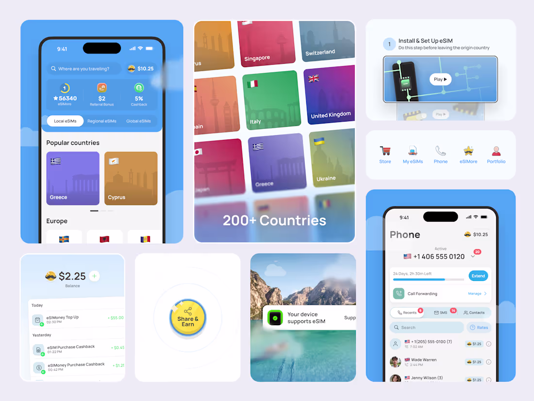
Been working on eSIMo for a while, and it’s grown a lot.
What started as a simple way to buy eSIMs for travelers has evolved into a full ecosystem:
💰 eSIMoney – an in-app currency for calls, messages, and purchases. It can be earned through cashback or topped up directly.
🎯 eSIMore – a loyalty program where users can increase their cashback and earn extra eSIMoney by inviting friends, exploring new destinations, and spending data to level up.
📱 VOIP functionality – built-in calls and messaging that keep users connected anywhere in the world.
I focused on UX flow, UI design, and crafting a gamified experience that makes staying connected feel fun and effortless.
Really proud of how far the product has come!
2
27
830
Took some time to get this one just right. 🚀
This is the final onboarding flow for eSIMo, the version that got approved after countless iterations.
I went through multiple concepts before landing on this one, built custom illustrations, then brought them to life through animations to make the experience fun, light, and truly engaging for users.
The goal was simple: make the first moments inside the app feel exciting and effortless. ✨
Thoughts?
2
20
677
This is my second post on Contra and I already feel lucky to be in a space filled with so many inspiring creators.
Today I want to share some work I did for the eSIMo app that helps people stay connected anywhere using eSIM technology and VOIP calls with SMS support. The goal was to bring a sense of joy and freedom to the experience so users can land in a new country and connect instantly, without hunting for plastic SIM cards or relying on unstable airport WiFi.
I focused on visual storytelling through clean UI, smooth animations, and playful country illustrations. Thay was really fun to work on! It was a big challenge but a very exciting one. Alongside this I also conducted UX research to make sure the experience feels intuitive and delightful.
Can't wait to show you more soon! What do you think?
17
682
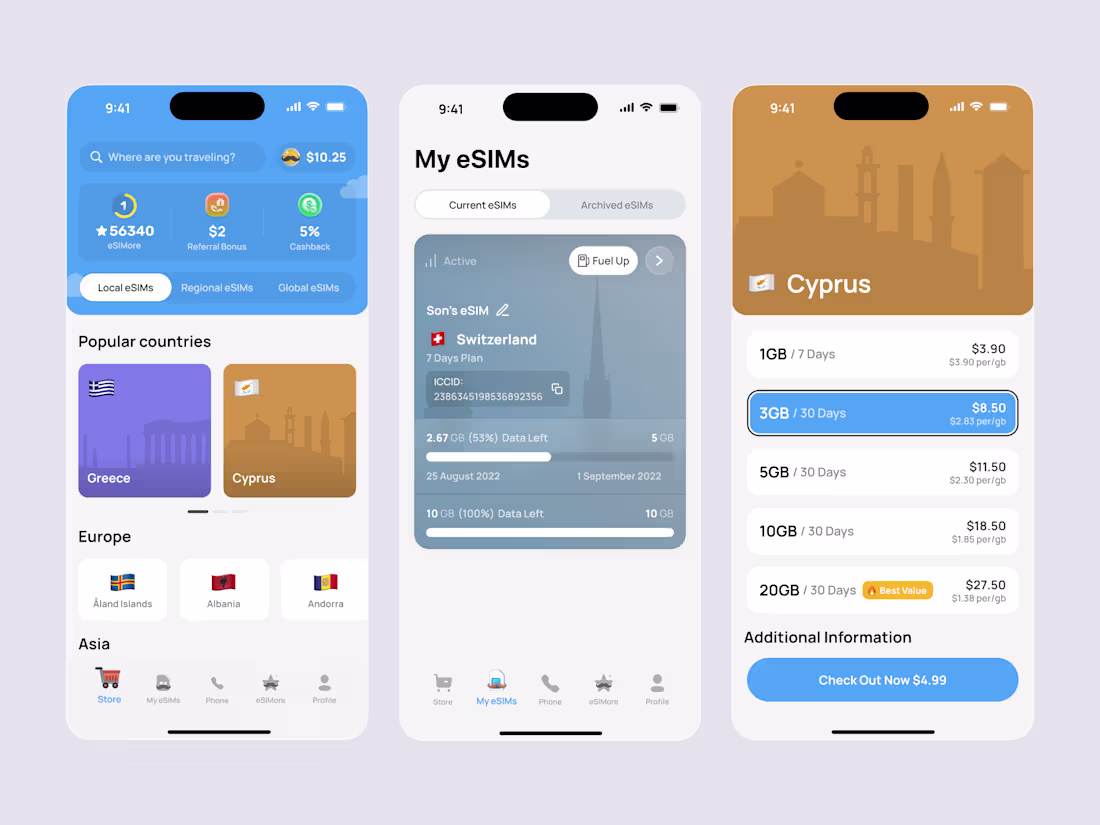
Smooth eSIM purchase flow, but make it fun 🎉
The UI was created for the existing eSIMo application with the aim of creating an attractive purchasing process that would be enjoyable and simple for users.
What do you think?
12
38
888