
Vladmir Oliveira
Web Designer, UI Design & Brand Identity Designer.
New to Contra
Vladmir is ready for their next project!
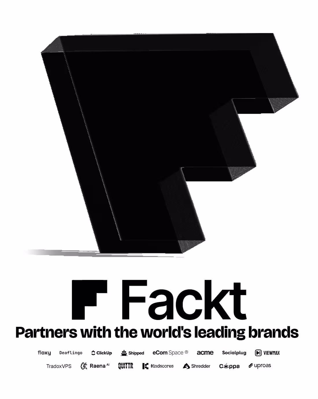
I created a series of social media posts for Fackt.io (http://Fackt.io), a company that provides high-performance UI/UX design for SaaS and tech products. They build dashboards, mobile apps, and landing pages that turn users into customers and customers into long-term revenue. The posts highlight their brand credibility, showcase a client example like Floxy, present their core mission with a growth chart, and end with a clear call to action to schedule a conversation. The design is clean and modern, made for LinkedIn, Instagram, and their website.
0
65

Hot Birds is a brand identity study developed for a contemporary fast casual restaurant focused on hot chicken and bold flavors. The project explores the creation of a strong and recognizable visual system that reflects intensity, quality and personality.
Inspired by the culture of Nashville hot chicken and the warmth of Southern hospitality, the brand combines a vibrant color palette, bold typography and a playful yet confident visual language. The intention was to build a brand that feels approachable while still standing out in a highly competitive food market.
From logo design to real world applications, the identity was designed to be flexible and impactful across multiple touchpoints including packaging, social media and physical environments, ensuring consistency and memorability.
3
7
113
BrewPort is a specialty coffee shop brand concept built around the culture of modern nomads, remote workers, and people who treat every seat like a headquarters. This project covers the full brand identity system, from logo design and color palette to typography, tone of voice, and merch copy. About this project This is a fictional project developed for portfolio purposes. The logo and visual identity were originally created for a real client - who, let's say, decided not to pay. Rather than letting the work disappear into a drawer, I reframed it as a full brand study case, built out the identity system, and turned it into something worth showing. If life gives you an unpaid invoice, make a case study.
1
1
64
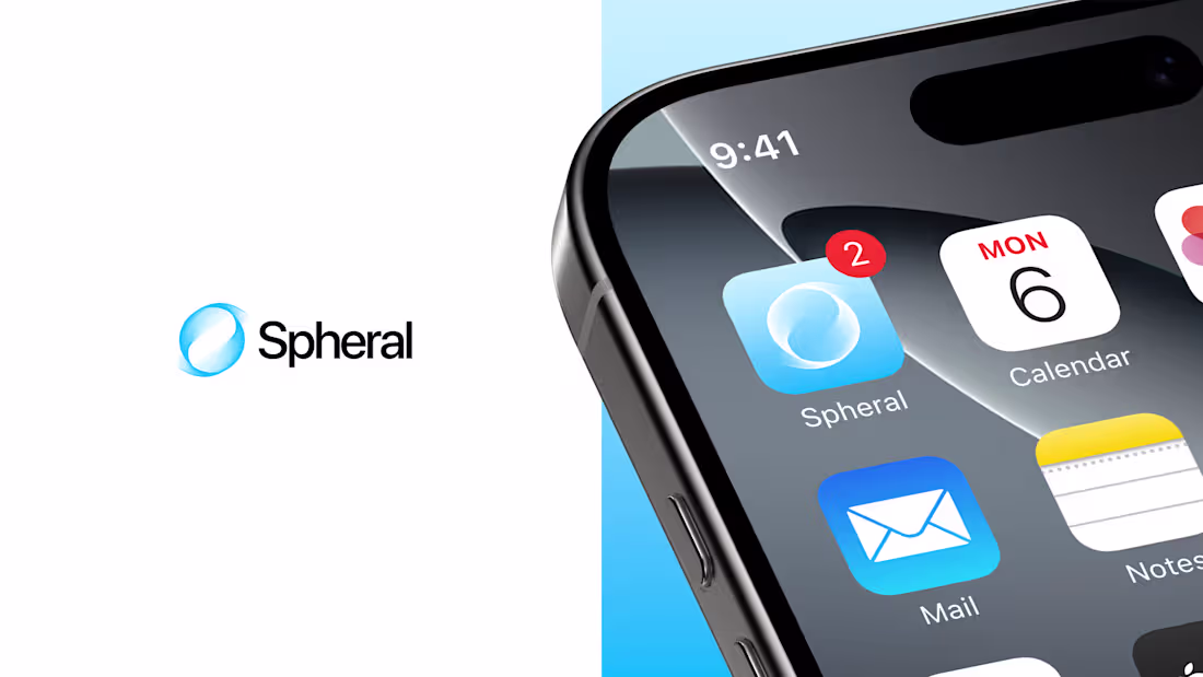
Conceptual identity and interface project for Spheral, an app focused on centralized organization and communication. The design explores organic shapes, depth, and motion to convey fluidity and continuity across interactions. The name Spheral derives from the concept of a sphere, representing a cohesive, immersive system that moves around the user.
5
4
151
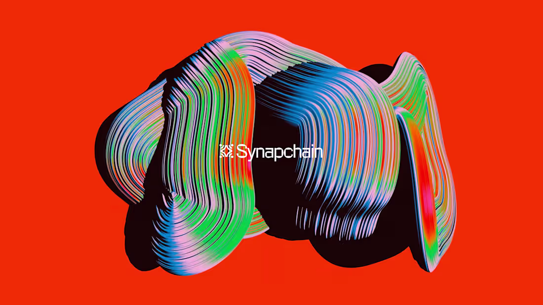
I designed the brand identity for Synapchain, a data intelligence platform bridging the gap between blockchain complexity and human clarity. The visual system needed to feel both technical and alive. The result: an identity built around fluid 3D forms , and a modular logo mark that reflects the interconnected nature of decentralized networks. Every touchpoint was crafted to make Web3 feel approachable without losing its edge. This is what I love about branding: turning abstract ideas into systems people actually want to engage with.
Background by: Rik Oostenbroek (store.rikoostenbroek.com (http://store.rikoostenbroek.com)) all credits.
Open to new projects and opportunities.
2
126
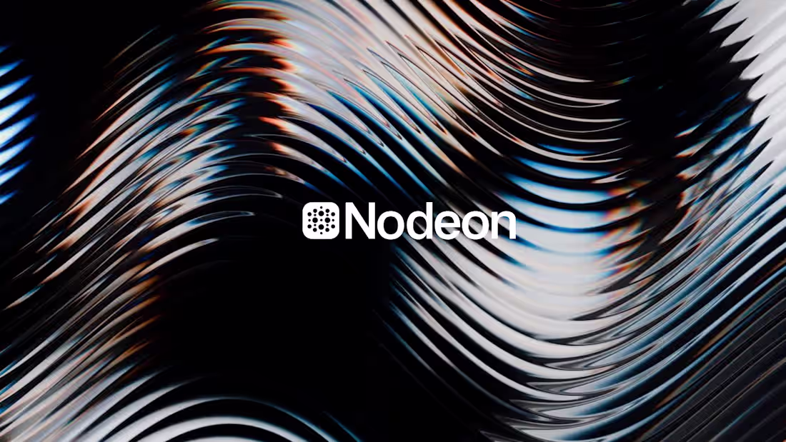
Nodeon was created to translate the complexity of blockchain data into clarity.
The visual identity is built around the idea of nodes, networks, and flow represented through modular forms, dynamic patterns, and high-contrast compositions. The dotted symbol reflects decentralized systems, while the minimal typography and restrained color palette reinforce precision, trust, and scalability.
Nodeon’s design balances technical depth with visual clarity, positioning the brand as a modern Web3 data infrastructure focused on insight, intelligence, and usability.
2
3
115

A concept for a Web3 product.
1
2
106
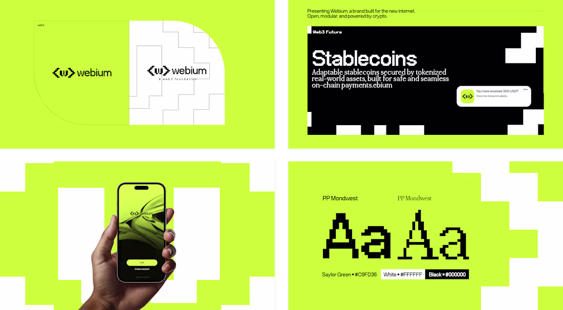
Webium was conceived as a bold visual statement for the Web3 era, merging a pixel-inspired typographic approach with a high-contrast color system. The custom display typography evokes early digital interfaces, reinforcing themes of decentralization, technology, and modularity, while the clean sans-serif pairing ensures clarity and usability across modern applications. The vibrant Saylor Green serves as the project’s core identity, symbolizing innovation, energy, and forward-thinking digital culture, balanced by black and white to create striking contrast, legibility, and a futuristic aesthetic. Together, these elements shape a brand language that feels both retro-digital and contemporary, capturing the essence of a new internet built on speed, security, and adaptability.
2
15
220
My first logo in my career (2019). looks good? 😅
0
132
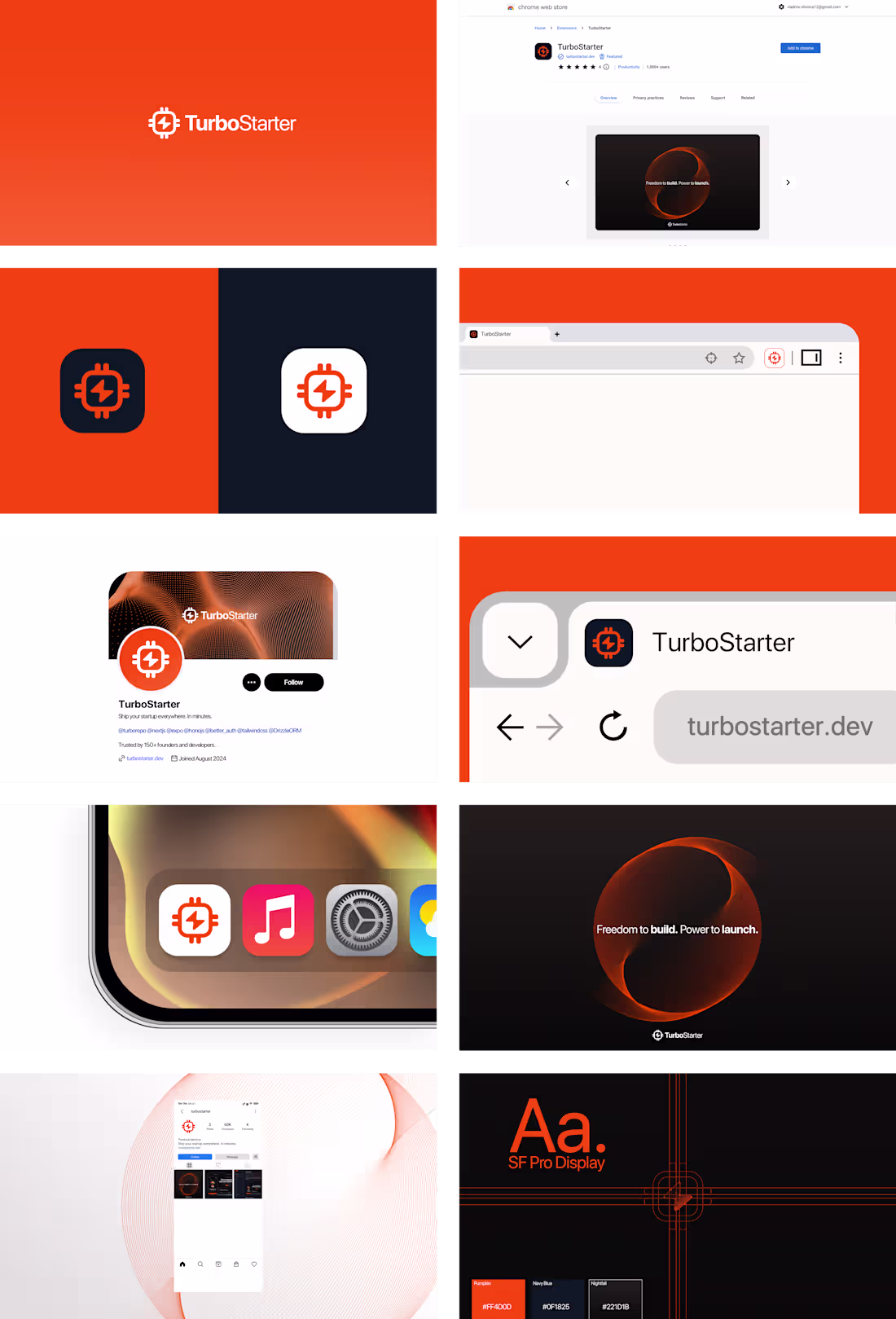
rejected rebrading for turbostarter (ps: logo for sale) =)
0
150
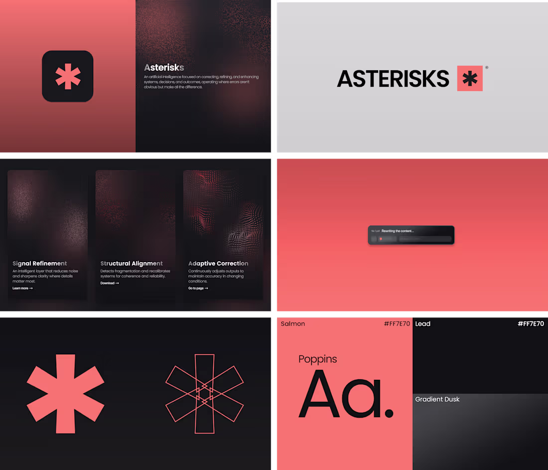
Asterisks was named after the asterisk symbol, a universal sign of correction, annotation, and added meaning. The brand was designed to represent an artificial intelligence that operates where details are often overlooked, refining systems with precision and subtlety. The logo transforms the asterisk into a bold, simplified mark, conveying clarity, focus, and intelligence. The visual system combines the Salmon palette, introducing warmth and human presence, with Lead tones that reinforce structure, depth, and technological reliability.
2
22
351
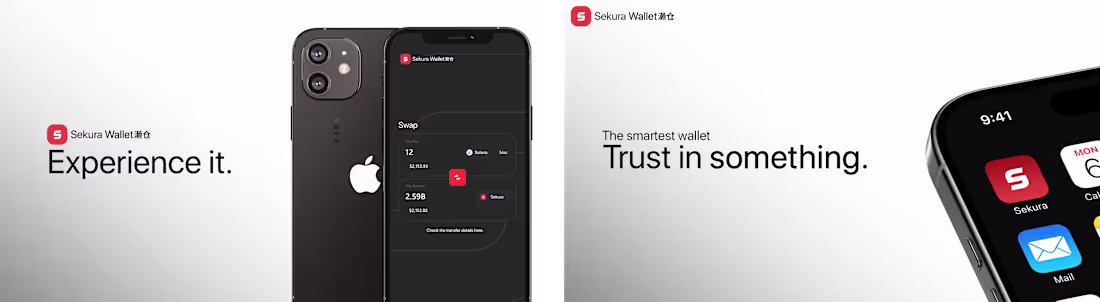
Presentation using an interface (UI) developed from concepts of security, clarity, and trust. The presentation was built with a clean visual system, exploring strong typography, generous spacing, and a restrained color palette, ensuring readability and focus. The result prioritizes the direct communication of the value proposition, conveying intelligence and reliability through a sober and functional digital aesthetic.
27
334
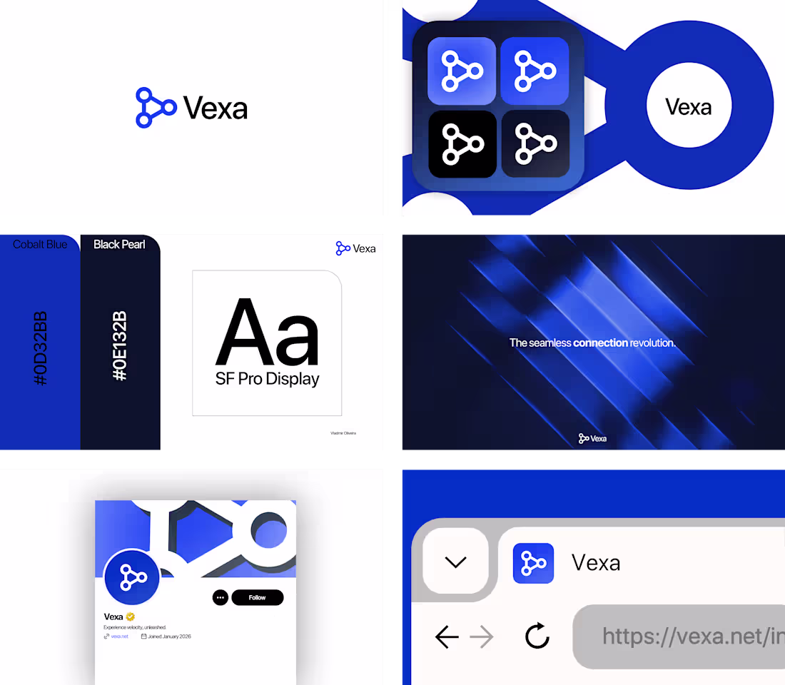
I developed the complete visual identity for Vexa, an internet connectivity brand, with a focus on performance and modernity. I created the name concept by merging velocity and nexus, and built a robust visual system from it. I strategically defined the color palette, choosing a vibrant cobalt blue as the primary color to convey trust and technology, and a deep pearl black for contrast and sophistication. I selected a Sans Serif typeface (a style I often use for visual identity projects) to ensure clarity and efficiency, aligning with the brand's proposal. I designed each element to build a cohesive visual experience, where innovation, speed, and trust are reflected in every detail of the brand.
1
17
253
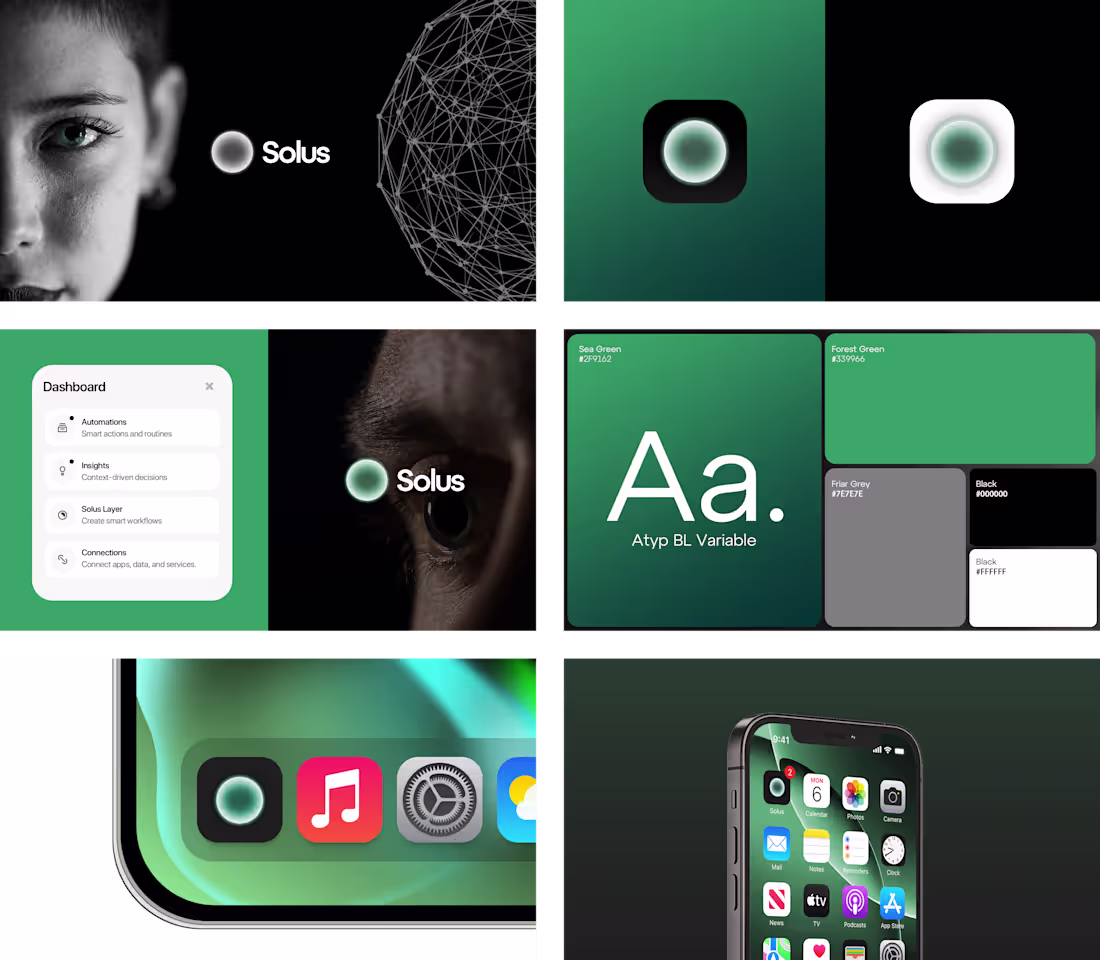
Conceptual interface project for Solus OS, an intelligent system focused on automations, insights, and connections. The design was crafted with an emphasis on visual clarity, fluid interactions, and centralized information, supported by a minimal and tech-driven identity. The name Solus reflects the idea of a core and singularity, positioning the system as the intelligent center of user decisions.
16
42
393
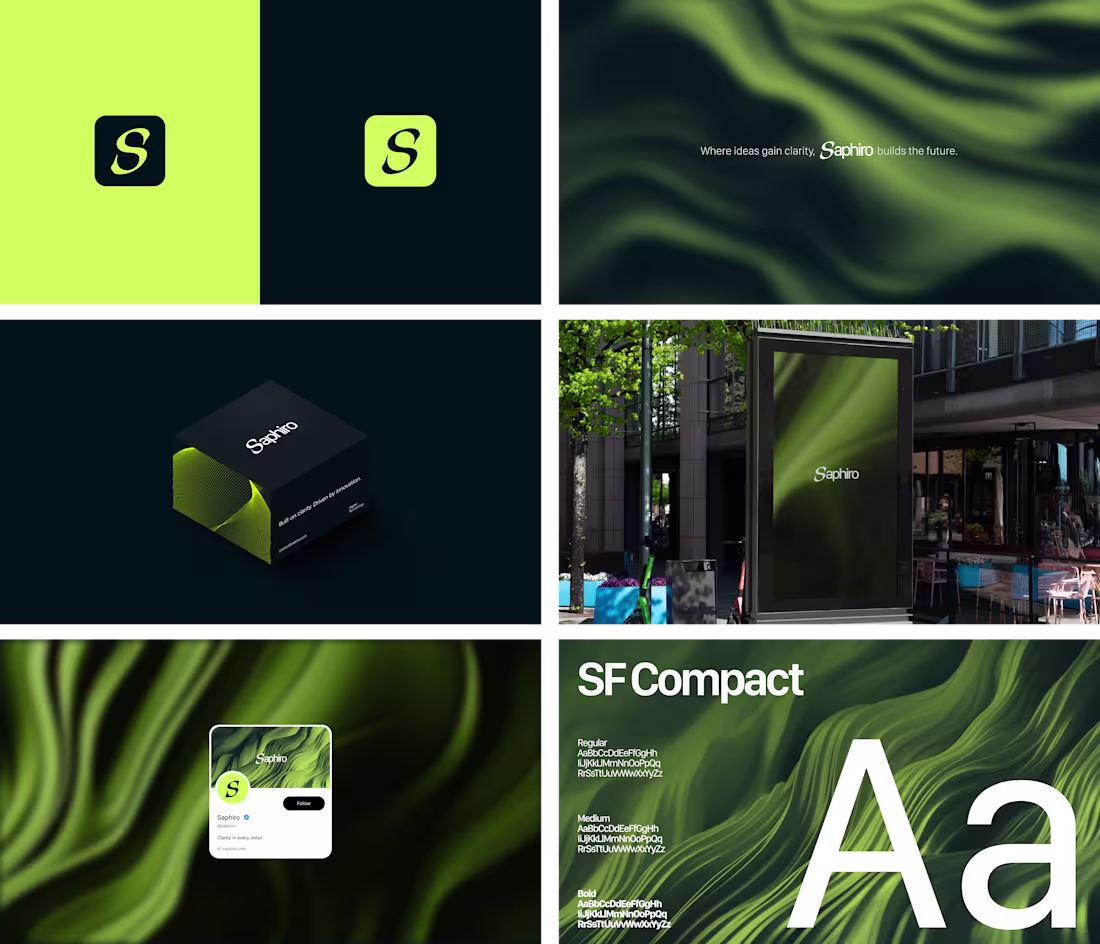
I developed Saphiro’s visual identity as a brand focused on clarity, sophistication, and technology. The name concept refers to purity and precision, reflecting the proposal of creating intelligent and well-defined solutions. The identity was built around a minimalist visual system, using a vibrant green palette combined with dark blue tones to convey confidence and modernity. The SF Compact typeface was chosen for its high functionality, ensuring strong legibility in user interfaces (UI) and reinforcing the brand’s technological aesthetic.
7
33
326