
Vy Vu
Expert Brand, UI, Packaging Design Specialist
Ready for work
Vy is ready for their next project!
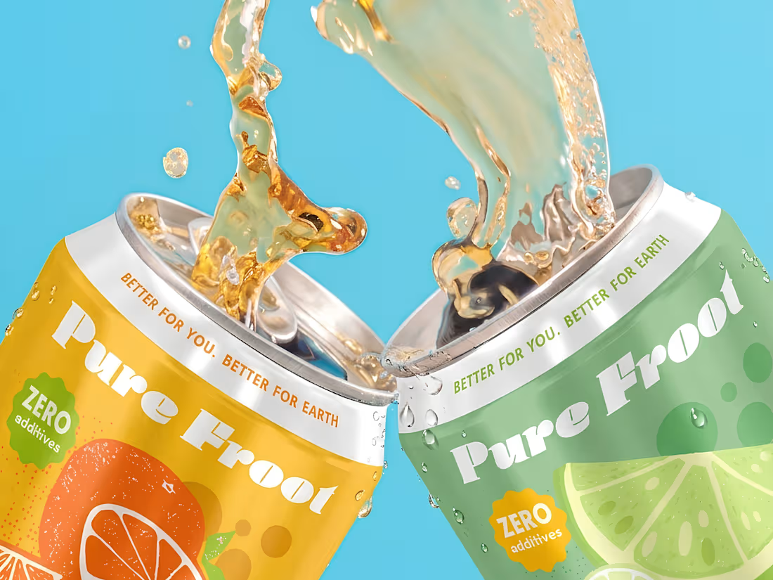
Took these can designs for Pure Froot from flat concept to real-life mockups, and it was a great exercise in translating flat visuals into something that feels tangible and production-ready.
This process pushed me to think more about hierarchy, material feel, and how design behaves in a real-world context, not just on screen. Seeing the transition from initial artwork to mockup helped refine both the details and the overall presentation.
1
74
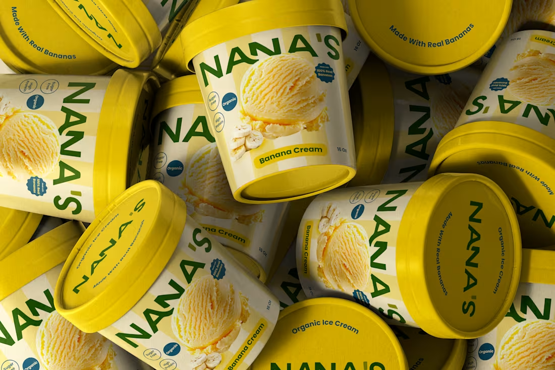
Branding exploration for NANA’S Organic Bananas 🍌
Focused on fresh, healthy, and approachable packaging.
3
3
103
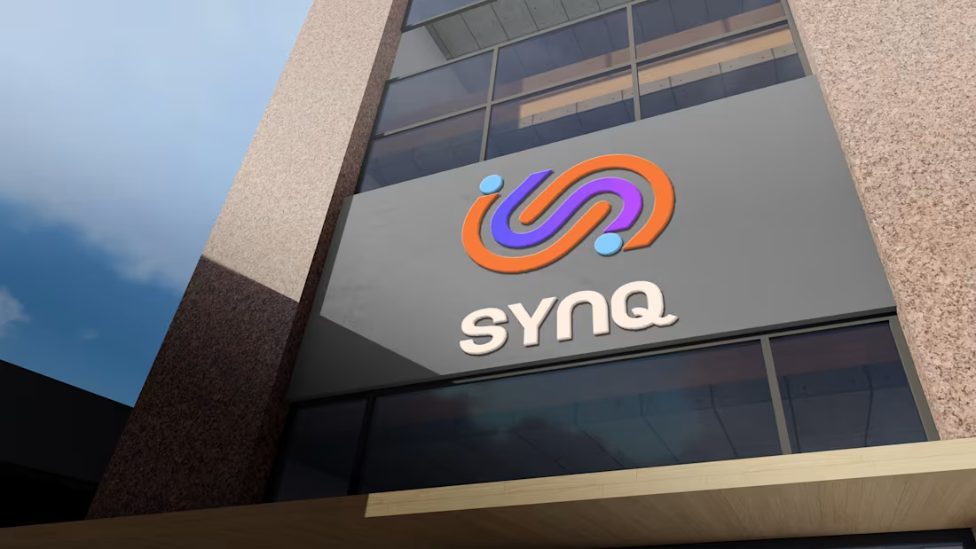
SYNQ | Vy Creative Studio
0
3
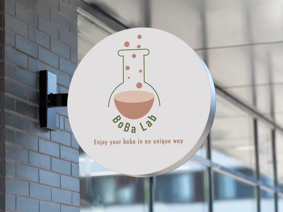
Boba Lab
0
60