
Vivek Jat
UI/UX and modern web design for fast-growing Businesses
New to Contra
Vivek is building their profile!
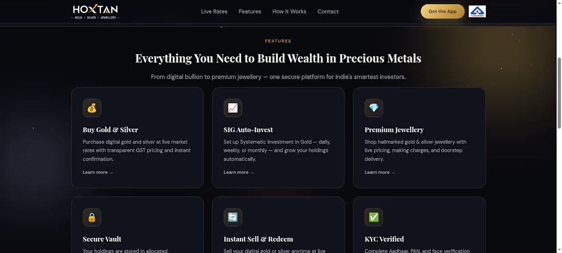
Hoxtan is a premium digital bullion platform allowing users to buy, sell, and auto-invest in live gold and silver. They needed a high-trust, conversion-focused landing page to drive app downloads and clearly communicate complex financial features to modern investors.
URL - https://hoxtandigigold.com/
The Design Approach
To establish immediate trust and a sense of luxury, I utilized a sleek, dark-mode aesthetic with high-contrast gold and white typography. The primary objective was to reduce friction for new investors, so I structured the information architecture around a seamless, scannable layout.
Key UI/UX Solutions:
Live Data Integration UI: Designed dynamic "Live Market Rates" cards right at the top of the hero section so users see immediate value without scrolling.
Trust Signals: Prominently integrated trust badges (99.9% Purity, 256-bit Encryption, 24/7 Support) directly below the main Call-to-Action.
Scannable Feature Grid: Organized complex offerings (Auto-Invest, Secure Vault, KYC) into clean, modern bento-style interactive cards.
Simplified User Journey: Created a visual "4 Easy Steps" timeline to demystify the investment process and encourage immediate onboarding.
The Result
A production-ready, pixel-perfect Figma design that seamlessly bridges modern financial aesthetics with CRO (Conversion Rate Optimization) principles, giving the development team a clear, accessible blueprint to build the frontend.
0
37
The Client & Goal
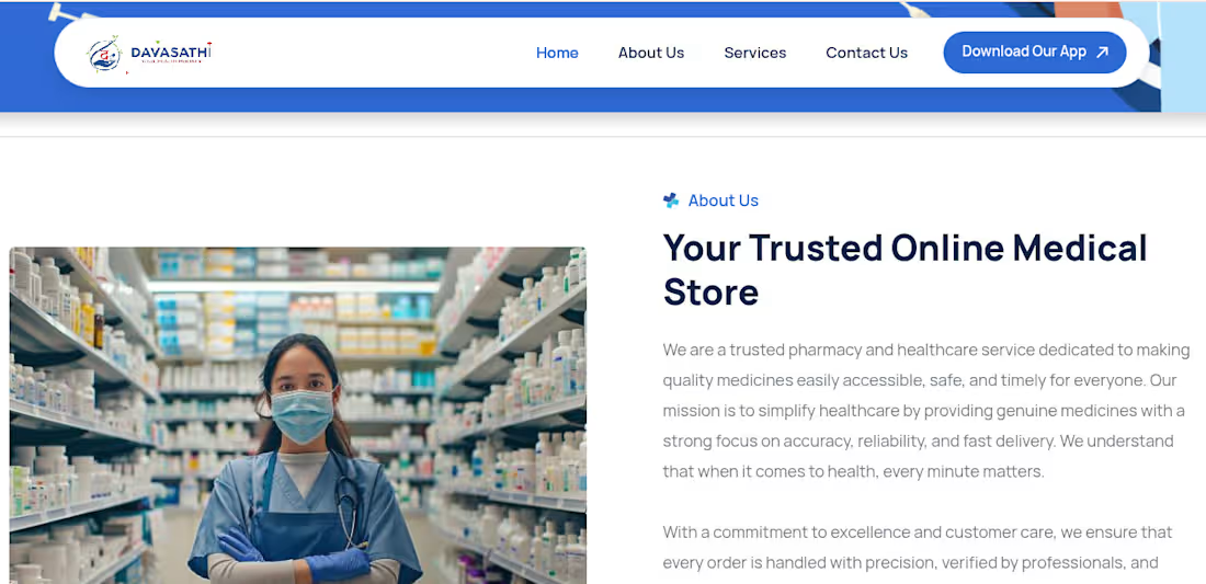
Davasathi is a comprehensive online medical store and healthcare platform. They required a robust, user-friendly e-commerce interface that allowed users to easily search for medicines, read trusted healthcare information, and seamlessly download their mobile application.
The Design Approach
Trust is the most critical conversion factor in the healthcare industry. I designed the platform using a clinical, clean blue-and-white visual identity to project reliability and hygiene. The layout was structured to balance a heavy product catalog with clear, educational, and trust-building sections.
Key UI/UX Solutions:
Frictionless Discovery: Designed a prominent "Find Your Medicines" search bar paired with a clean, high-contrast product grid featuring clear pricing and quick "Add" CTAs.
Conversion & Retention Prompts: Integrated an eye-catching promotional banner (Save 25%) and a dedicated mobile app download section with high-fidelity device mockups to drive multi-platform user retention.
Trust Architecture: Strategically placed trust signals throughout the page, including a statistics bar (e.g., 82+ partners), a "Trusted Online Medical Store" bio, and clear icons for reliable, 24/7 care.
User Education: Built a clean "How Our Platform Works" timeline and a dedicated FAQ section to resolve buyer hesitations instantly.
The Result
A modern, responsive e-commerce web design tailored specifically for the medical niche. The layout prioritizes accessibility and clear navigation, ensuring users of all demographics can confidently purchase healthcare products and transition to the mobile app.
0
29
The Client & Goal
Athiti Devo Bhava is a comprehensive travel and hospitality platform dedicated to authentic Indian experiences. The client needed a robust web interface capable of handling three distinct business verticals—Stays, Food, and Rides—within a single, unified booking experience.
The Design Approach
To capture the essence of "Discover the Real India," I opted for an earthy, premium color palette featuring deep forest greens and warm cream backgrounds. The design balances heavy photographic storytelling with clean, high-conversion UI elements, ensuring the interface feels both inspiring and highly functional.
Key UI/UX Solutions:
Unified Booking Engine: Designed a prominent, multi-tab hero search widget (Stays, Food, Rides) allowing users to input destinations and dates immediately upon landing.
Categorized Discovery Cards: Structured complex offerings into clean, scannable visual cards such as "Authentic Homestays," "Historic Food," and "Trusted Rides" to simplify user navigation.
Cultural Storytelling: Integrated bespoke illustrations, such as the vibrant Indian cityscape banner, to reinforce the brand's cultural identity while promoting their "One account for stays, food & rides" feature.
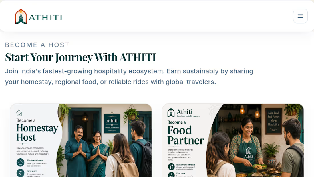
Two-Sided Marketplace Funnel: Created a dedicated onboarding section ("Start Your Journey With ATHITI") tailored for supply-side acquisition, featuring distinct CTAs for Homestay Hosts, Food Partners, and Ride Partners.
The Result
A sprawling, fully responsive marketplace design that effortlessly organizes a massive amount of travel data. The Figma files were delivered with modular components for the booking widgets and discovery cards, allowing the development team to scale the platform seamlessly.
1
18
The Client & Goal
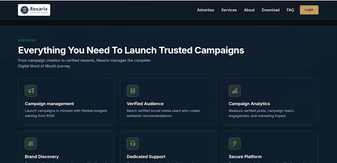
Rexarix is an innovative marketing platform designed to help brands grow through real people rather than just algorithms. They needed a high-impact, premium landing page to attract businesses, clearly explain their unique "pay only for verified posts" model, and drive mobile app downloads.
The Design Approach
To establish a sense of authority, trust, and modern technology, I utilized a deep dark-mode aesthetic paired with luxurious gold and vibrant teal accents. The visual hierarchy was structured to immediately communicate the platform's core value proposition while guiding the user through a logical conversion funnel.
Key UI/UX Solutions:
High-Impact Hero Section: Designed a striking hero area pairing the primary USP ("Pay Only For Verified Posts") with a high-fidelity mobile UI mockup that visually demonstrates the post-verification process.
Strategic Contrast: Introduced a stark white "Power Your Brand" card in the second section to intentionally break the dark mode flow, capturing user attention for key branding statements.
Process Visualization: Deconstructed complex AdTech workflows into a simple, scannable 4-step pipeline: Launch Campaign → Real People Share → Verification → Pay for Results.
Modular Feature Grids: Organized the platform's capabilities (Campaign Management, Verified Audience, Campaign Analytics) into clean, bento-style UI cards for effortless reading.
Seamless App Handoff: Integrated a dedicated "Take Your Business Wherever You Go" section featuring clean mobile screens and Google Play download CTAs to drive cross-platform adoption.
The Result
A sophisticated, conversion-optimized SaaS landing page that bridges complex advertising technology with an intuitive, user-centric visual experience. The dark UI combined with strategic color accents provides a highly polished, developer-ready asset.
1
16