
Vikram Mendiratta
Finance & Analytics Leader | Power BI | Automation | 18+ Yrs
New to Contra
Vikram is building their profile!
Receivables Overview Dashboard
A collections-focused executive dashboard built to give finance leaders same-day visibility into cash tied up in accounts receivable, without waiting on a manual aging report.
What it Does
Tracks Total Receivables, DSO, Overdue %, and Collection Efficiency (CEI) side-by-side with Total Sales, so leadership can see revenue growth and collections health in the same glance — growth that isn't being converted to cash is a warning sign, and this surfaces it immediately.
Breaks receivables into aging buckets (Current through 180+ days) with a live donut visualization, so the collections team knows exactly where risk is concentrated.
Surfaces the Top 5 highest-risk customers by both outstanding balance and average days delinquent, turning a static report into an actionable call list.
A forward-looking "Amount Due Next 7 Days" panel gives treasury a short-term cash inflow forecast — not just a historical rearview.
Fully dynamic: Year, Region, Customer Segment, and Business Unit slicers recalculate every visual instantly — no separate reports needed per filter combination.
Why this Matters for your Business
DSO and aging reports are usually static exports that go stale the moment they're generated. This dashboard stays live — filter to any region, segment, or time period and every number, chart, and risk list recalculates in seconds, so finance teams spend time acting on collections risk instead of rebuilding spreadsheets to find it.
1
17
Global Startup Funding & Unicorn Analytics
An interactive analytics dashboard tracking global startup funding activity, unicorn company distribution, and sector-level investment trends — built for investors, analysts, or founders who need a fast read on where capital is actually flowing.
What it Does
Summarizes total funding raised, number of startups tracked, and unicorn count in top-line KPI cards, giving an instant scale check before drilling into detail.
Maps funding activity geographically, making regional concentration and whitespace opportunities visible at a glance instead of buried in spreadsheets.
Breaks investment down by industry and sector, highlighting where capital is concentrating and helping identify emerging versus saturated markets.
Tracks funding trends over time to reveal whether the broader investment environment is expanding or cooling.
Ranks the highest-funded companies and unicorns in a detailed table for quick exploration and comparison.
Why this Matters for your Business
Startup and venture capital data is often scattered across Crunchbase exports, news articles, and manually maintained spreadsheets. This dashboard consolidates funding activity, geographic distribution, and sector trends into a single interactive experience. Users can filter by region, industry, or year and every visual updates instantly, transforming hours of manual research into minutes of interactive analysis.
0
17
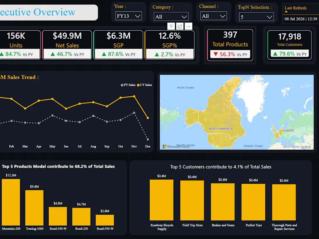
Sales Performance Analysis
An executive-level sales analytics dashboard built to give leadership a real-time read on revenue performance across regions, products, and sales channels — replacing static monthly sales decks with a live, filterable report.
What it Does
Surfaces headline KPIs (Total Sales, YoY Growth, Average Order Value, Invoice Volume) so performance is legible in seconds, not buried in a spreadsheet
Breaks sales down by region, product category, and channel, so leadership can see exactly where growth is coming from — and where it's stalling
Tracks sales trend over time with year-over-year comparison, distinguishing genuine growth from seasonal noise.
Ranks top-performing sales reps or products, turning a static report into an actionable list rather than a wall of numbers.
Fully interactive: slicers for year, region, and category recalculate every visual instantly, so one report replaces what used to be several static exports.
Why this Matters for your Business
Sales leaders shouldn't have to wait for a monthly deck to know how the quarter is trending. This dashboard stays live — filter to any region, product line, or time period and every number recalculates instantly, so conversations shift from "let me pull that" to actually deciding what to do about the numbers in front of you.
1
32
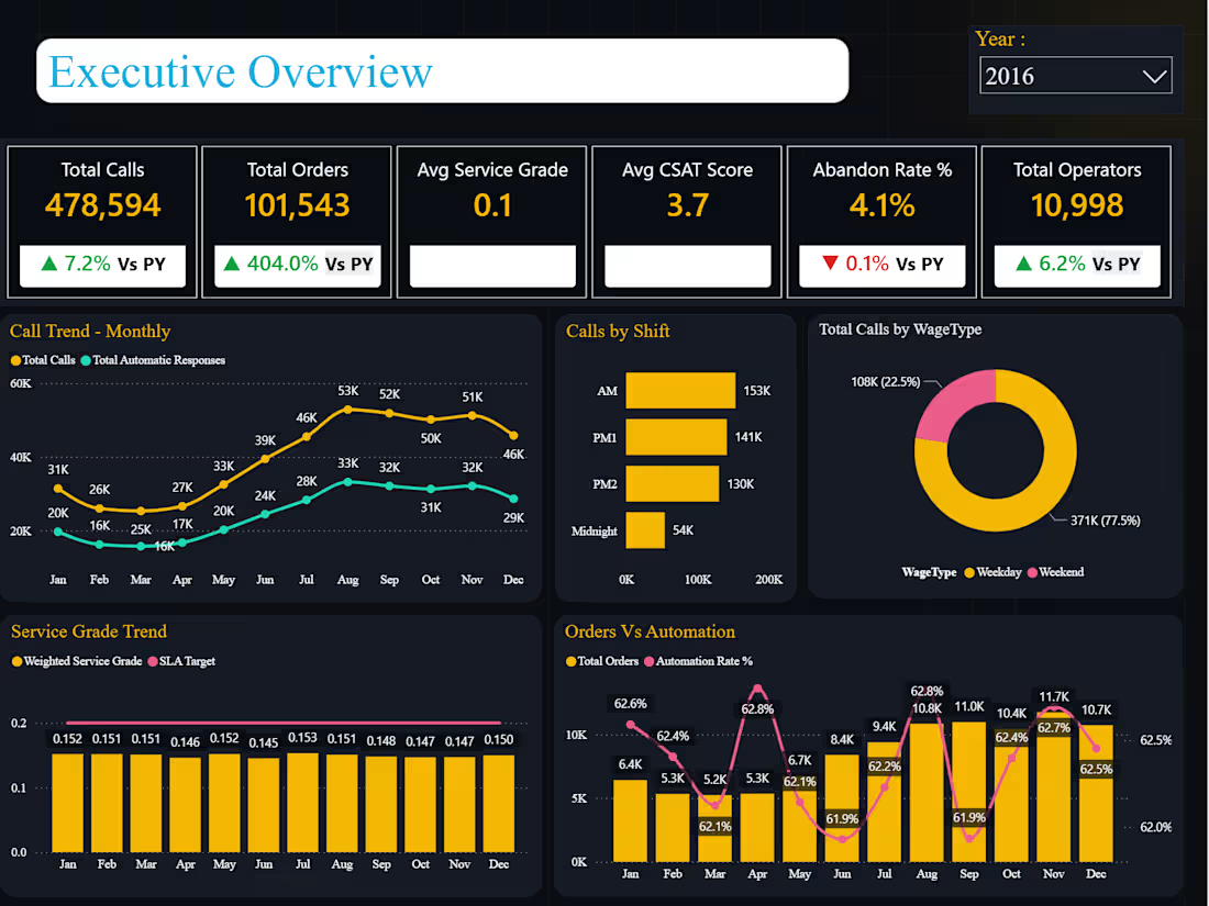
Call Center Executive Overview
A multi-page operational dashboard built for call center leadership to monitor volume, staffing efficiency, service quality, and customer experience in one connected view — with dedicated drill-down pages behind each KPI area rather than a single flat report.
What it Does
Tracks Total Calls, Total Orders, Service Grade, CSAT, Abandon Rate, and Operator headcount side-by-side, each benchmarked against prior-year performance so leadership sees momentum, not just a snapshot.
Breaks call volume down by shift (AM/PM1/PM2/Midnight) and by WageType (Weekday vs. Weekend), surfacing where staffing pressure actually concentrates rather than leaving it buried in a raw call log.
Overlays Service Grade against SLA Target month-by-month, turning a compliance requirement into a visual trend the ops team can act on before a miss happens, not after.
Tracks automation rate alongside order volume, showing whether growth is being absorbed by self-service systems or by live agents — a direct signal for capacity planning.
Left-hand navigation (Executive Summary, Staffing & Efficiency, Service Quality & SLA, Customer Experience & Drilldown) structures the report the way a call center director actually thinks about the business — not as one crowded page, but as a guided path through it.
Why this Matters for your Business
Call center leaders are usually stitching this picture together from separate ACD reports, WFM exports, and a CSAT spreadsheet. This dashboard puts volume, staffing, SLA compliance, and customer sentiment on one page that updates automatically — so the conversation in a leadership meeting shifts from "let me pull that number" to actually deciding what to do about it.
1
33