
pro
Vasily One
Creative web developer: Three.js React Framer Astro websites
- $1k+
- Earned
- 4x
- Hired
- 5.0
- Rating
- 59
- Followers




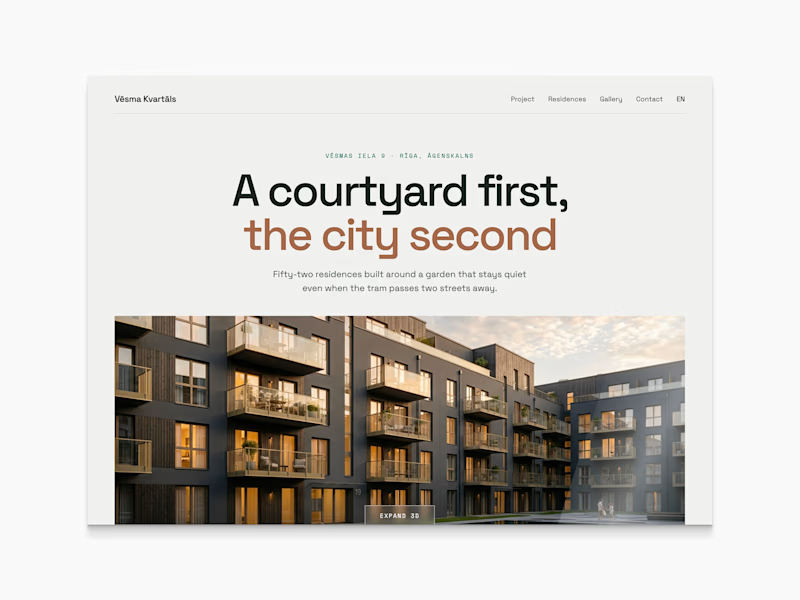
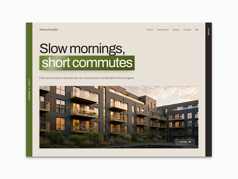
Working on real estate website now and deciding what can be the right direction for the whole website. What do you think?
63 voted
53%
55 voted
47%
118 votes
Closed
Today I proceed working on Real Estate website prototype. I use Claude Design for quick interaction prototyping and getting almost full website UX before I touch any tool like Blender or Figma.
Elevenlabs node based flows are truly amazing!
Just made a screencast of gray-blocked interactions and placed them to the canvas. Used previously generated images for interactions and got the perfect (ok, not really perfect, haha) reference of interaction.
My goal is automate most...

Portfolio update day 7/30 : Three.js website.
Today I drafted the interactions. Removed a few sections from the layout and combined different shading variations.
The idea is to make transitions seamless but for the preview it's already enough to have not so clean transitions.
...