
Jefferson Flores
Brand & Strategic Design Partner
Ready for work
Jefferson is ready for their next project!


LeonSol is an architecture firm specialized in managing highly complex projects, transforming them into efficient, high-impact solutions.
Its experience and strategic vision have positioned the firm as a regional reference, collaborating with visionary clients to create results where aesthetics, profitability, and sustainability come together.
Together with the EL FIN team, we worked on LeonSol’s complete rebranding, redefining its visual identity and developing a brand system that reflects the firm’s experience, strategic vision, and architectural approach.
3
55
Steady: The stablecoin for the future was a challenge to explore decentralized finance through a lens of clarity, focusing on how it communicates, the trust it builds, and where it stands as a reliable financial tool.
At EL FIN, we took on this challenge as a team, building a solid visual identity that reflects the core of the protocol.
→ I crafted the comprehensive Brandbook, defining the strategic guidelines, UI styling and real-world brand applications.
→ Fidel Huezo led the 3D explorations, bringing the core concepts to life with incredible depth.
A project that reminds us how thoughtful design can establish immediate trust, especially where Web3 technology and everyday finance meet.
9
10
185
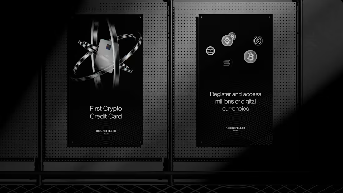
Rockefeller is more than just a credit card; it’s a bold statement in the world of digital finance. Designed for those who not only understand the value of cryptocurrency but also seek to master it, Rockefeller is the crypto credit card that embodies exclusivity and strength.
Accessible only to a select elite, this card isn’t for everyone—it’s for those ready to stand out, influence, and leave an indelible mark on the world. With Rockefeller, your credit isn’t just a tool; it’s a badge of prestige.
2
2
131
Mexica Beer – Visual Identity & Packaging
The label features a refined typography that is bold yet elegant, echoing the spirit of Mexica—strong in tradition but forward-thinking in approach. Iconography inspired by ancient glyphs and artisanal motifs pays homage to Jalisco’s cultural heritage, while the overall design remains uncluttered and sophisticated, appealing to modern beer enthusiasts. The packaging not only stands out visually but also conveys the essence of Mexico’s vibrant past and present through a refreshing, contemporary lens.
6
48
345