pro
Tyler Andersen
Product design, strategy, & brand.
Ready for work
Tyler is ready for their next project!
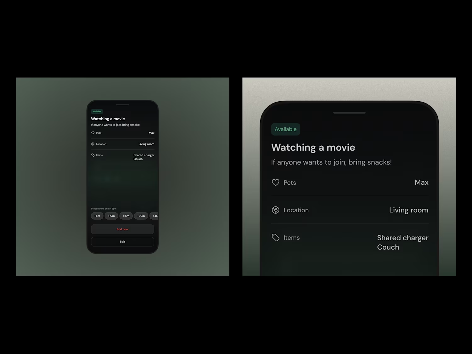
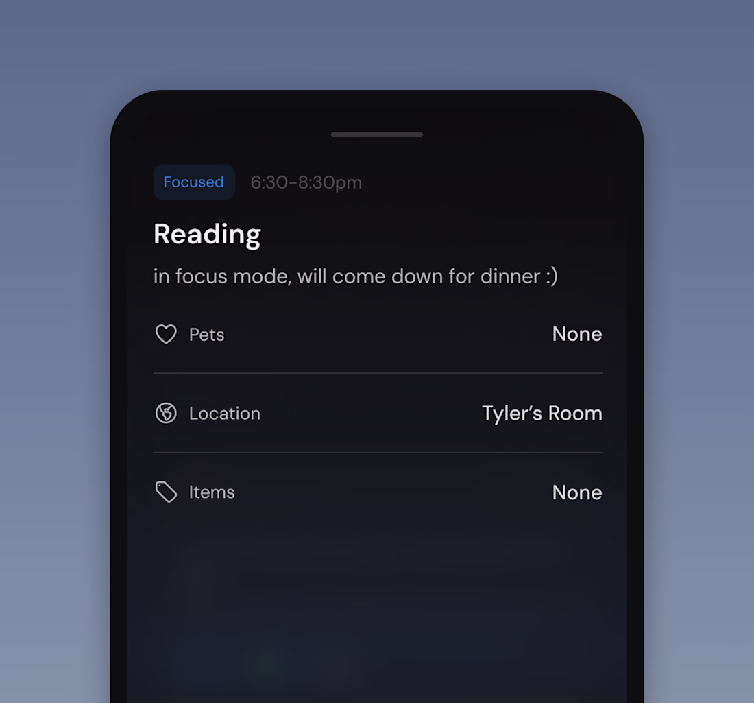
A recent screen I shipped for an app I’m designing.
The layout borrows from playlist-style mental models. Why? When you’re introducing something unfamiliar, grounding the UI in patterns people already know reduces cognitive load and creates quicker buy-in from both users and stakeholders.
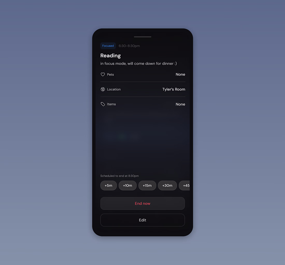
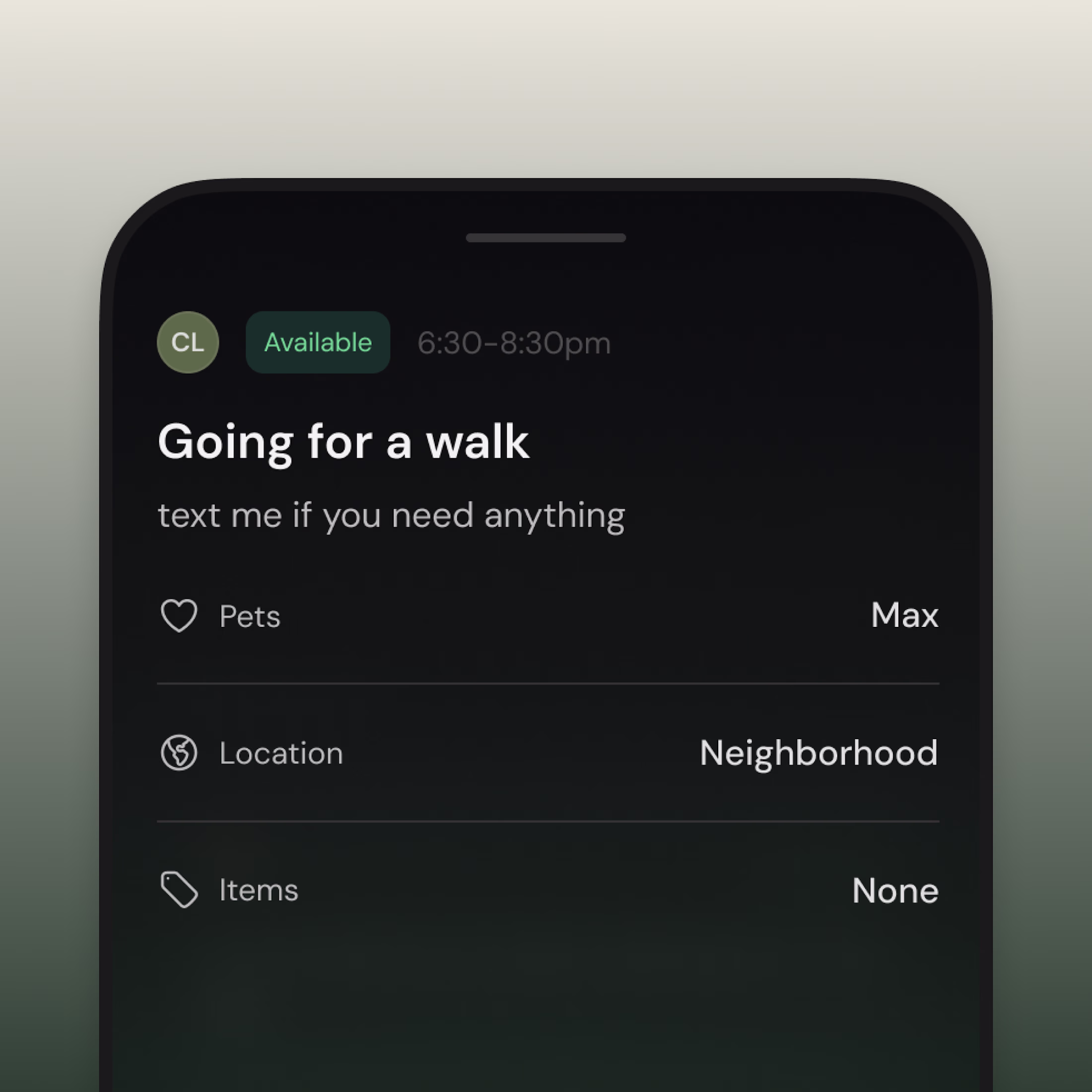
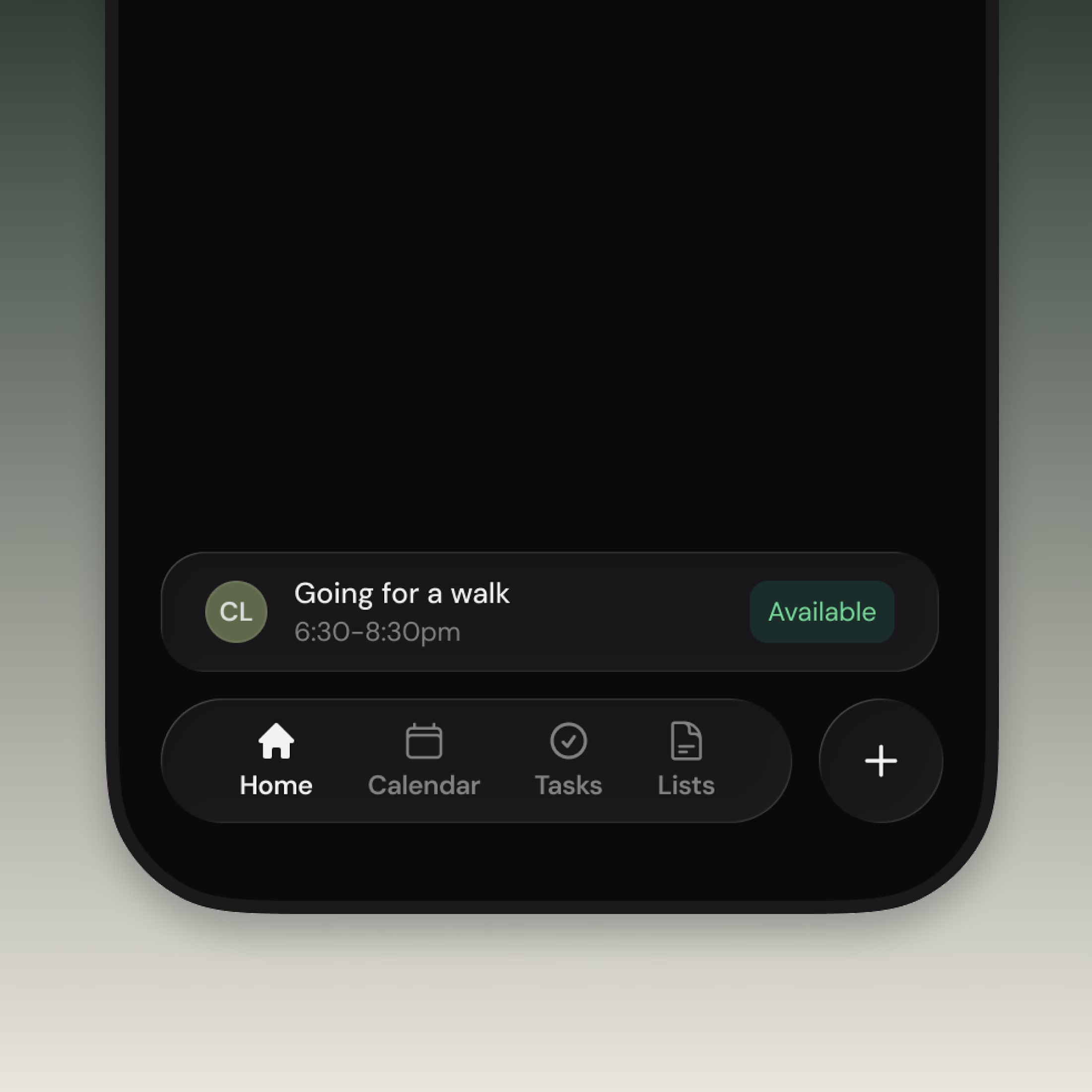
It's been fun exploring new iOS 26 design paradigms for my app. We adapted the floating bottom bar to show a user's current status.
This is an availability update you can share with your roommates to let them know what you're up to, without the noise of a group chat.
logo + color palette explorations for my app