Twist Tinsel
complex ideas into sleek, high-impact visual identities
New to Contra
Twist is building their profile!
"Design and produce engaging digital e-books for the school library, integrating dynamic animations, custom graphic elements, and strategic typography to enhance student readability and engagement."
0
10
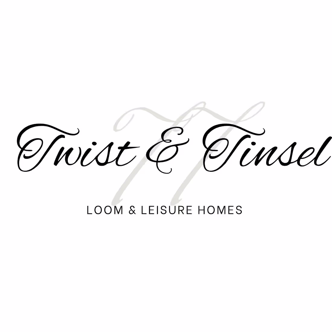
Creating this logo on Canva involves layering elegant typography to achieve a sophisticated, high-end brand identity. The design centers around a dual-letter monogram featuring large, interwoven "T" initials in a muted beige script font, which acts as a soft background element. Layered directly over this monogram is the main brand name, "Twist & Tinsel," written in a crisp, flowing black cursive typeface that provides a sharp visual contrast. To balance the ornate calligraphy, a clean, modern sans-serif font is used at the bottom for the tagline, "LOOM & LEISURE HOMES," adding a grounded structure to the layout. The entire composition utilizes Canva's layering system, alignment tools, and a generous use of negative space on a clean white canvas to deliver a timeless, upscale aesthetic suitable for home or lifestyle branding.
1
26
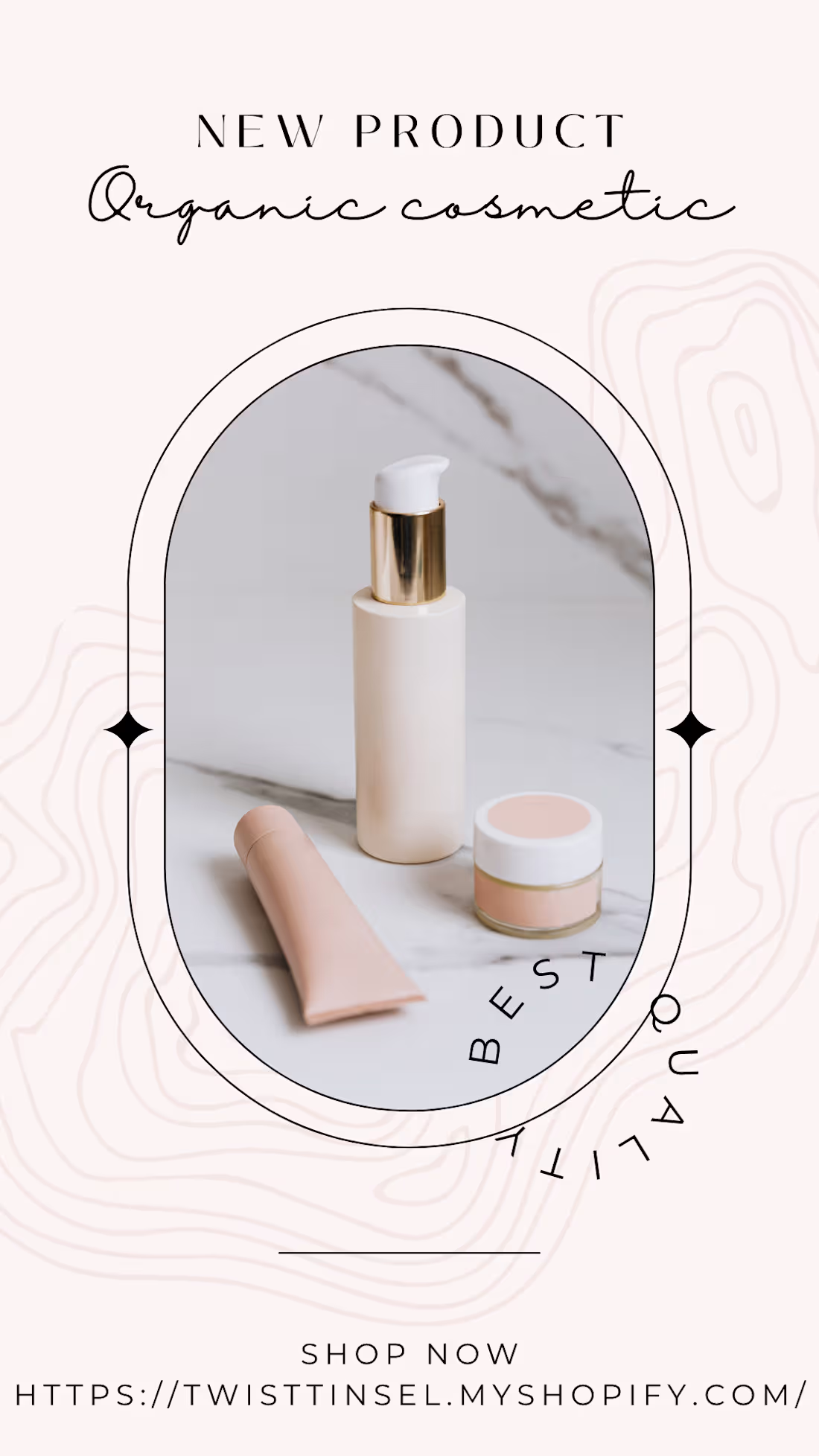
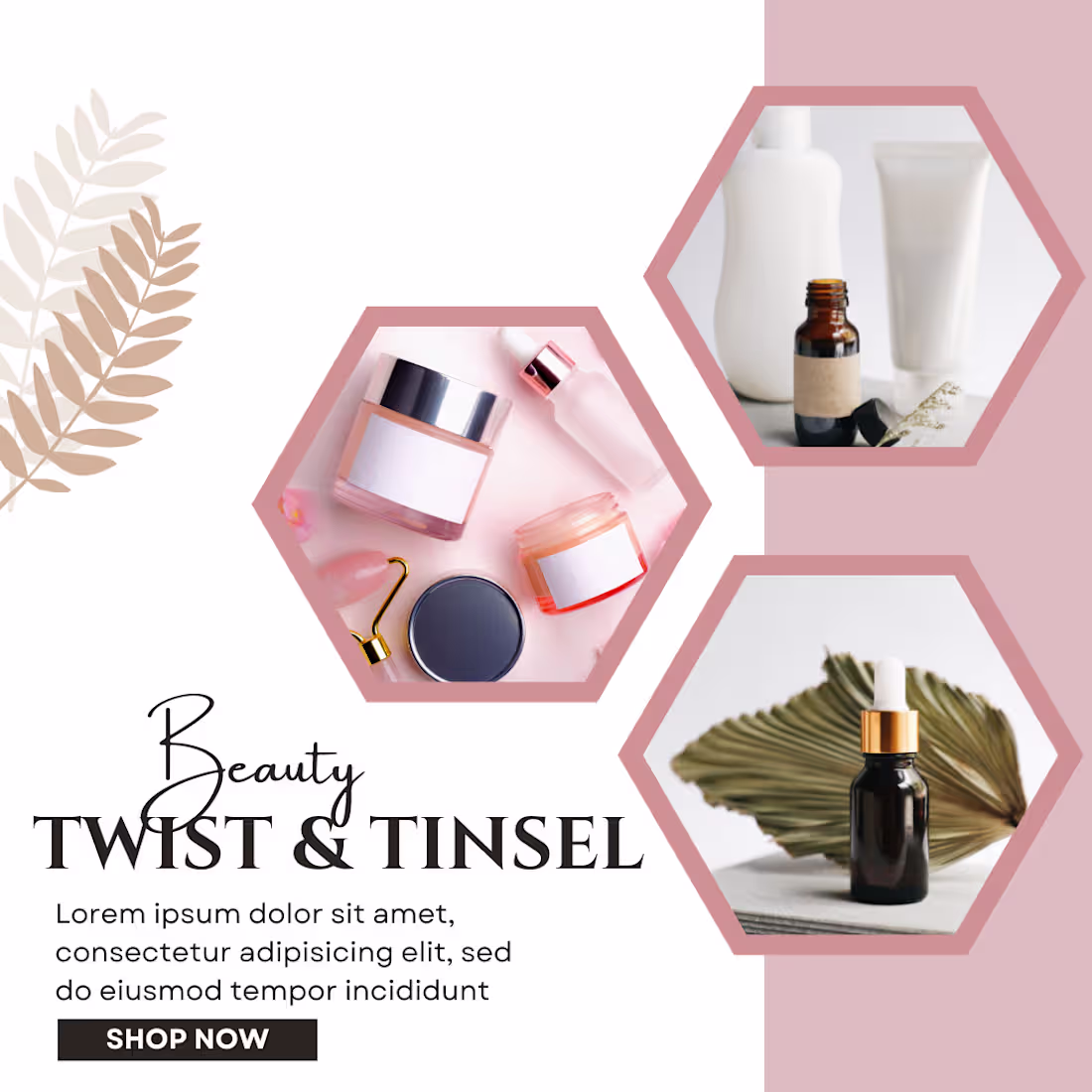
This minimalist Instagram Story template is designed to promote an organic cosmetic brand using a clean, modern aesthetic centered around a soft beige and blush color palette. It features an elegant arched frame highlighting a collection of sleek skincare products—including a pump bottle with gold accents, a squeeze tube, and a small cream jar—set against a marble backdrop. The typography tastefully blends a structured serif font for "NEW PRODUCT" with a flowing script for "Organic cosmetic," while the words "BEST QUALITY" curve dynamically along the frame. Subtle topographic lines add an earthy, natural texture to the background, and the layout concludes with a clear "SHOP NOW" call to action pointing to the brand's Shopify store link.
0
20
The video is built around a product-focused promotional layout—in this case, an advertisement for a shoe sale. To create the motion, the design is split into distinct visual layers: the main product image (the pair of white running shoes), the textual headers ("NEW SHOES SALE" transitioning to "BATA Sale"), promotional badges ("Up to 50% OFF"), call-to-action buttons ("SHOP NOW"), contact details, and abstract geometric background elements.
0
27
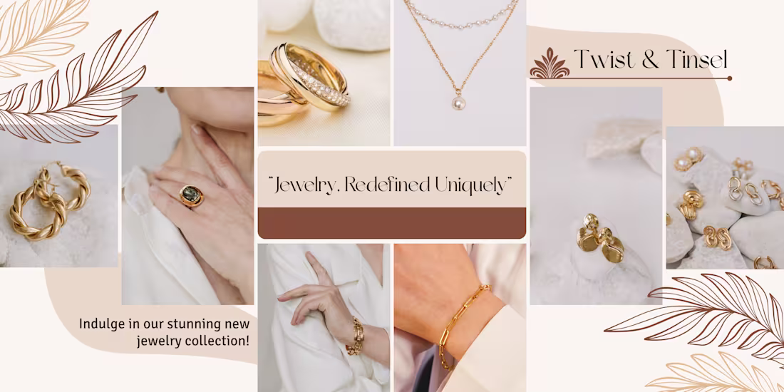
😊 The layout exhibits strong Color Curation, as the designer carefully selected stock photography that shares a unified palette of muted rose, soft terracottas, warm neutrals, and sage greens, ensuring the board feels like a singular brand universe rather than a random collection of clips. Furthermore, the central block demonstrates a keen understanding of Typographic Hierarchy, pairing an elegant, italicized serif font with varying text scales to draw the eye directly to the brand name before guiding it through the supporting product categories. Finally, the design excels in the strategic use of Negative Space and Asset Styling, using clean, rounded corner frames on every element to soften the aesthetics and leaving intentional breathing room around the central text block so the final graphic feels premium, balanced, and effortlessly sophisticated.
0
25
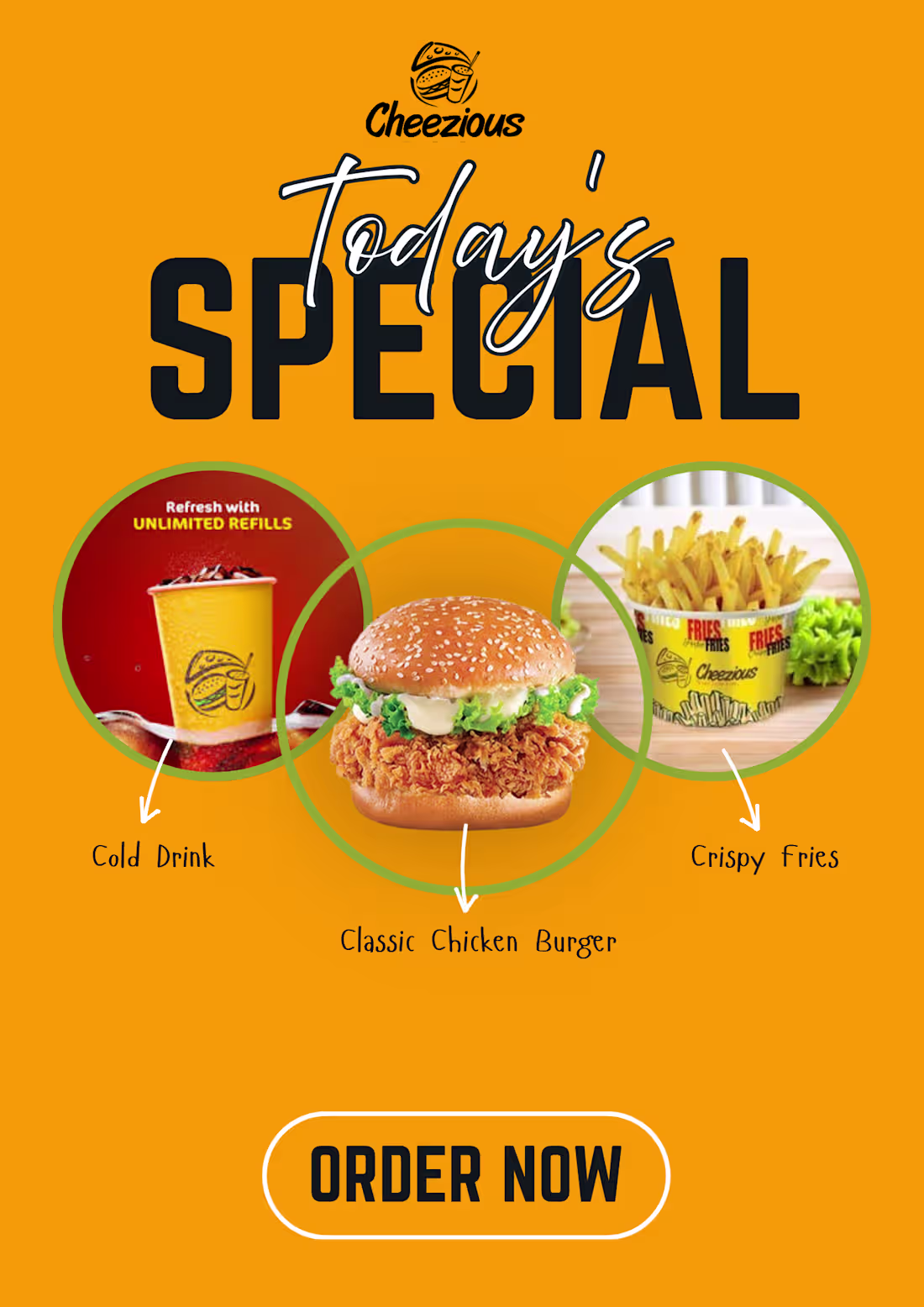
To bring a fast-food advertisement like this to life, a designer must execute several key steps:
Establishing High-Contrast Branding: The layout uses a bold, warm color scheme—relying on a bright mustard yellow background and rich red accents. In food design psychology, these colors are strategically used to stimulate appetite and create a sense of energy and excitement.
Layering Typography for Visual Punch: The header creates depth by layering two contrasting font styles. A giant, heavy, black sans-serif font grabs immediate attention with the word "SPECIAL," while a white script font is layered directly on top for "Today's" to give the heading a modern, dynamic, and customized feel.
Structuring Product Layouts with Frames: To showcase the combo meal items cleanly, the designer utilized three overlapping circular frames with thick green borders. Placing the "Classic Chicken Burger" in the central, foreground frame establishes it as the hero item of the deal, while the cold drink and crispy fries flank it as the supporting combo pieces.
Integrating Clear Call-to-Actions (CTA): At the bottom, a prominent, pill-shaped "ORDER NOW" button is created using a high-contrast white outline over a dark text box. This gives the viewer a clear, immediate next step, which is crucial for digital or print marketing materials.
0
25
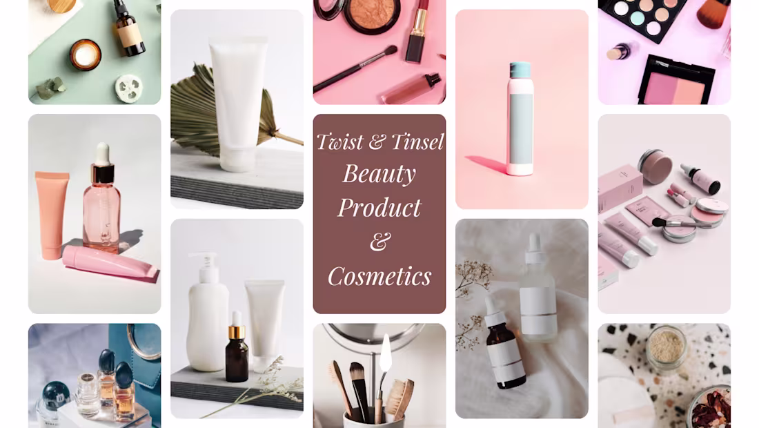
To create a professional mood board layout like this in Canva, a designer must master several core visual and technical skills. First, the design relies heavily on Precise Grid Alignment and Visual Balance, which is achieved by utilizing Canva’s built-in grid layouts and smart alignment guides to place images of varying heights into a seamlessly organized, cohesive masonry structure. The layout exhibits strong Color Curation, as the designer carefully selected stock photography that shares a unified palette of muted rose, soft terracottas, warm neutrals, and sage greens, ensuring the board feels like a singular brand universe rather than a random collection of clips. Furthermore, the central block demonstrates a keen understanding of Typographic Hierarchy, pairing an elegant, italicized serif font with varying text scales to draw the eye directly to the brand name before guiding it through the supporting product categories. Finally, the design excels in the strategic use of Negative Space and Asset Styling, using clean, rounded corner frames on every element to soften the aesthetics and leaving intentional breathing room around the central text block so the final graphic feels premium, balanced, and effortlessly sophisticated.
0
32
I am a passionate Graphic Designer dedicated to turning complex ideas into clean, impactful visual stories. With a strong eye for detail and a love for typography and branding, I specialize in creating cohesive digital and print experiences that connect with audiences. I thrive at the intersection of strategy and creativity, constantly pushing boundaries to deliver designs that don't just look great, but drive results. Let’s build something memorable together.
0
35