
Timothy Oderinde
Social Media Manager/Designer | Short-Form Video/AI Content
- 4
- Followers



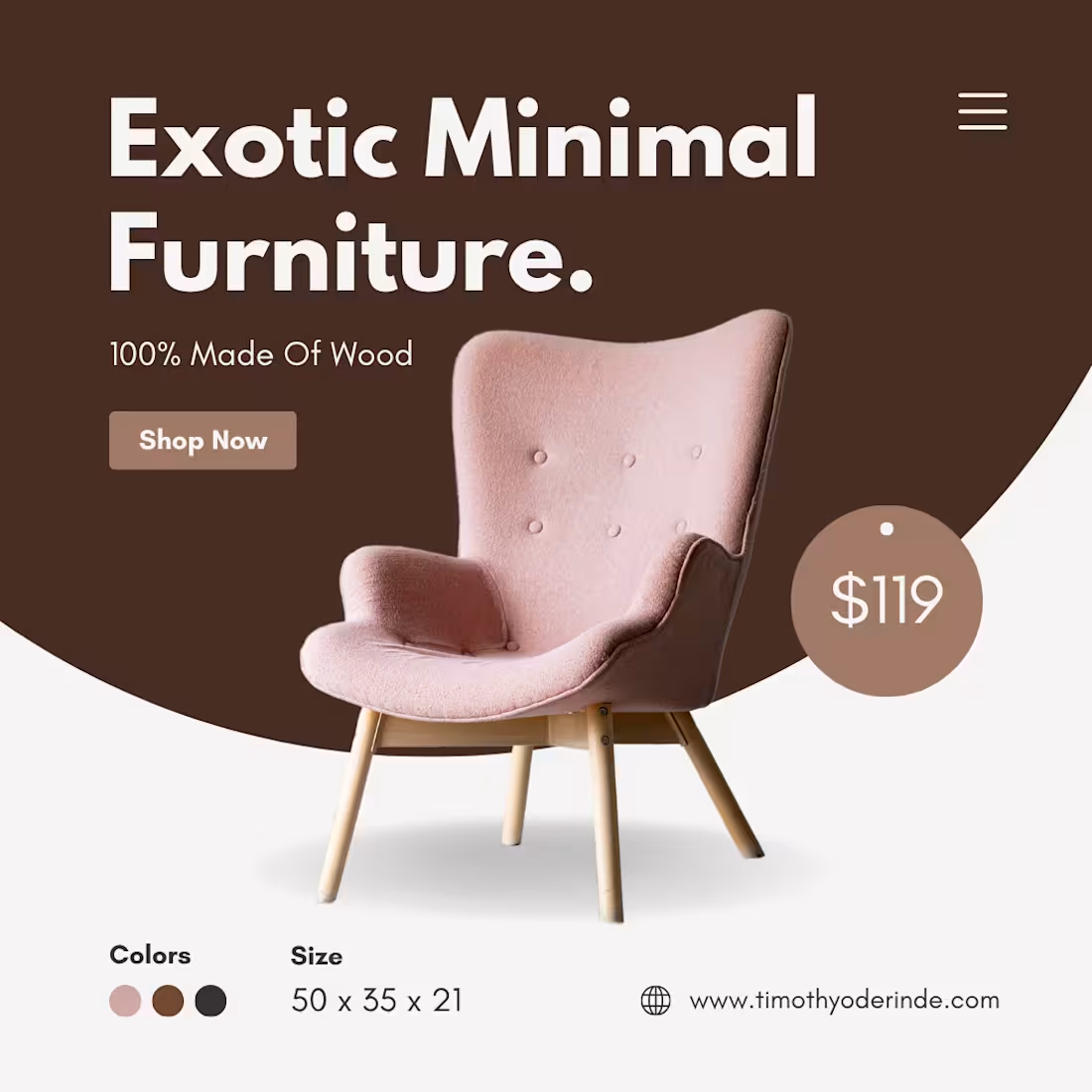
E-Commerce Social Assets: Editorial Furniture & Interior Design Graphics.
I partnered with three distinct furniture and home decor brands to elevate their digital storefronts through high-end, scroll-stopping social media assets. Ranging from mid-century modern curators to contemporary minimalist manufacturers, each brand required a tailored visual approach. I designed an extensive suite of social media graphics aimed at showcasing craftsmanship, highlighting product dimensions, and turning interior design inspiration into direct e-commerce sales.
The Creative Challenge:
Furniture marketing relies heavily on high-quality space and texture perception. On social media, the challenge is displaying big, structural items like sofas, tables, and lighting within a small mobile screen without losing their premium feel. Furthermore, working across three separate brands required creating three completely independent design systems that felt distinct from one another while keeping readability and product specifications crisp.
Strategy & Action Taken:
I engineered a multi-brand social design framework focused on editorial aesthetics and clear e-commerce information architecture:
Tailored Aesthetic Curation: Developed three unique design systems, utilizing sleek architectural layouts for a luxury brand, warm earthy tones for a vintage curator, and bold geometric structures for a modern consumer brand.
Whitespace & Editorial Framing: Prioritized clean, spacious layouts to let the furniture photography breathe, successfully mimicking the high-end feel of architectural and interior design magazines.
Interactive Product Feature Assets: Designed high-conversion carousels that broke down product details beautifully, combining full room mockups with close-up material textures, wood grains, and dimensions.
Seamless Commercial CTAs: Integrated elegant, minimalist text overlays and call-to-actions (e.g., "Tap to View Collection" and "Custom Finishes Available") that drove buying intent without crowding the visual canvas.
The Impact & Results:
The final deliverables provided all three brands with a highly polished, turn-key social media asset system.
Demonstrated Broad Creative Range: Showcased the ability to effortlessly pivot across multiple brand guidelines while maintaining elite quality and design cohesion.
Optimized for Shopper Trust: The clear presentation of dimensions and high-end styling made large-ticket items feel accessible and trustworthy to online shoppers.
Multi-Placement Ready Assets: Delivered pixel-perfect, high-resolution graphics optimized beautifully for Instagram grids, multi-slide carousels, and vertical formats for stories and social ads.
1
87
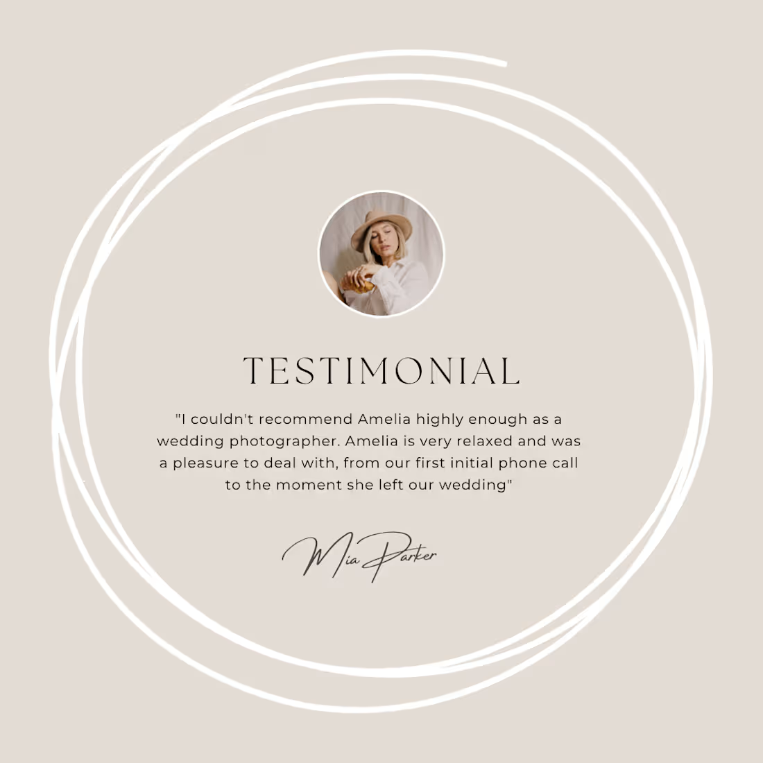
Visualizing Trust: Custom Testimonial & Client Review Graphics for Two Distinct Brands.
Social proof is the ultimate driver of online sales, but raw text screenshots often fail to capture attention. I partnered with two distinct brands to solve this by transforming their customer reviews, five-star ratings, and client testimonials into high-end, scroll-stopping social media graphics.
The goal was to elevate their customer praise into premium marketing assets that build instant trust and drive buying behavior across their social channels.
The Creative Challenge:
Testimonial posts can easily look repetitive, cluttered, or out of place on a curated social media feed. Because I was working with two entirely different brands, the challenge was twofold: creating a distinct visual identity for each brand’s social proof while ensuring the text remained highly readable, impactful, and authentic within a fraction of a second.
Strategy & Action Taken:
I engineered a dual design strategy tailored to the unique visual identities of both brands, optimizing for maximum credibility and conversion:
Tailored Brand Identity Integration: Crafted two completely distinct design systems, one utilizing a sleek, minimalist layout for a premium aesthetic, and the other using dynamic, high-energy framing for a modern consumer brand.
Flawless Typographic Hierarchy: Placed the most powerful phrase of each review in large, bold, editorial typography as the "hook," making sure the core message cuts through the noise instantly.
Authenticity Elements: Integrated clean five-star rating iconography, client avatars, and subtle framing elements to make the reviews feel highly official, trustworthy, and premium.
Seamless Grid Cohesion: Designed the templates to easily integrate into each brand's existing grid layout, ensuring that dropping in a review post enhances the overall aesthetic rather than disrupting it.
The Impact & Results:
The final deliverables provided both brands with a powerful arsenal of high-converting social proof assets.
Turned Text into Revenue Material: Elevated standard customer quotes into visually compelling marketing assets optimized to push hesitant buyers over the finish line.
Boosted Shareability & Credibility: Designed a layout that frames customer success stories proudly, increasing the professional perception and authority of both businesses.
Platform-Optimized Assets: Delivered pixel-perfect, turn-key graphics perfectly sized for square feed placements, carousel slides, and vertical formats for stories and ads.
1
98
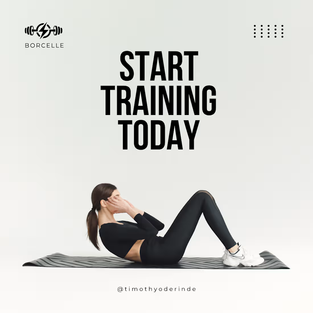
Visual Identity & Class Training Graphics for Yoga Coaching Platform
I partnered with a premium yoga coaching brand dedicated to helping individuals master mindfulness, flexibility, and holistic wellness through virtual and in-person class training. I was brought in to design a comprehensive suite of social media assets to streamline their weekly class announcements, beautifully format their expert yoga training tips, and build a cohesive visual presence that converts casual scrollers into dedicated students.
The Creative Challenge:
Educational and training content on social media can easily become visually cluttered, overwhelming, or difficult to read on a mobile screen. The challenge was to organize detailed training information, like pose breakdowns, weekly schedules, and coaching advice, into a clean, highly readable, and serene layout that maintains a professional, high-end studio aesthetic.
Strategy & Action Taken:
I engineered a balanced, conversion-focused design strategy that prioritized clarity, education, and brand calm:
Structured Information Hierarchy: Designed clean, easily digestible layout templates for weekly class schedules and training programs, making it effortless for students to know when and how to join.
Educational Carousel Blueprint: Created multi-slide carousel frameworks specifically for yoga training breakdowns (e.g., step-by-step pose alignments and breathing techniques), optimized for high saves and shares.
Mindful Color & Typography System: Implemented a soothing, cohesive palette paired with elegant, clear typography to ensure that even the most text-heavy coaching posts felt spacious and peaceful.
Action-Driven Coaching CTAs: Seamlessly integrated prominent, clear Call-to-Actions (e.g., "Link in Bio to Join Class," "Save for Your Next Practice") to drive traffic directly to the client's booking page.
The Impact & Results:
The final social media assets transformed the brand's coaching curriculum into a premium digital experience.
Enhanced Visual Clarity: Eliminated text clutter, ensuring that complex training tips and schedules are instantly understandable within a single glance.
Increased Community Engagement: The educational carousel layouts were built to maximize saves and shares, organically boosting the brand's reach and authority in the coaching space.
Turn-Key Content System: Delivered a fully responsive, pixel-perfect set of graphics optimized for static feeds, multi-slide carousels, and vertical social stories/reels.
1
108
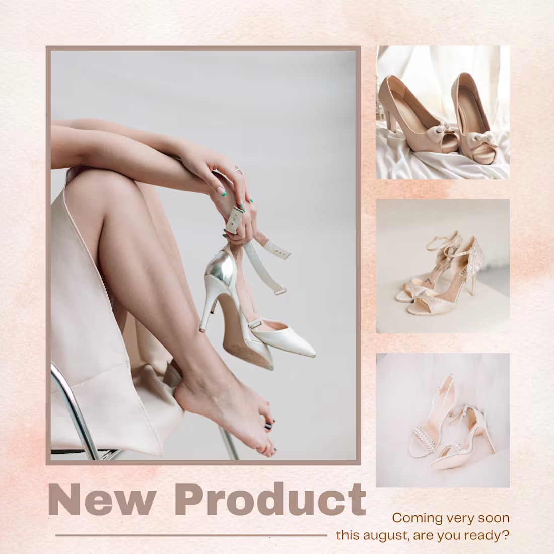
New Product Launch Design: Luxury Heels Collection for Footwear Brand.
An established, fast-growing e-commerce footwear brand known for its comfortable, casual flip-flops launched an exciting new product category: a premium line of stylish heels. I was brought in to design the official social media launch campaign assets, built to announce this major product expansion, introduce a more sophisticated aesthetic to their existing audience, and drive massive pre-orders and immediate launch-day sales.
The Creative Challenge
When a brand known strictly for casual comfort (flip-flops) expands into formal elegance (heels), the visual storytelling must pivot dramatically. The challenge was to elevate the brand's social media aesthetic to look upscale and high-fashion, while reassuring their loyal customer base that the new line still retained the core brand promise of incredible quality and comfort.
Strategy & Action Taken
I engineered an elegant, high-impact product launch design strategy:
Sophisticated Visual Pivot: Shifted the usual vibrant, beachy color palette into a sleek, editorial aesthetic using soft neutrals, rich deep tones, and minimalist typography to instantly signal a premium product line.
Hero Product Framing: Positioned the new heels collection with clean, sharp image isolation and dynamic angles, making the textures, craftsmanship, and heel design the undisputed focal points of the graphic.
"The New Arrival" Buzz: Designed high-contrast typographic layouts featuring bold "NEW ARRIVAL" and "NOW LIVE" callouts to generate maximum thumb-stopping excitement on the social feed.
Seamless Multi-Slide Storytelling: Created carousel layouts that beautifully highlighted product details (close-ups on material, stitching, and heel height) alongside a clear Call-to-Action to shop the collection.
The Impact & Results
The launch graphics successfully re-introduced the brand as a versatile footwear powerhouse.
Elevated Brand Positioning: Smoothly transitioned the brand’s image from "casual beachwear" to "day-to-night premium footwear," opening up a brand-new, higher-ticket customer demographic.
Optimized for Launch Conversions: The clean layout and premium aesthetic were built specifically to boost click-through rates (CTR) and convert high-intent traffic on launch day.
Platform-Optimized Deliverables: Created fully responsive, high-resolution assets tailored perfectly for static feeds, carousels, and vertical social stories.
1
132