
Thayná Leão
Designer Gráfica | Social Media & Identidade Visual
- 1
- Followers

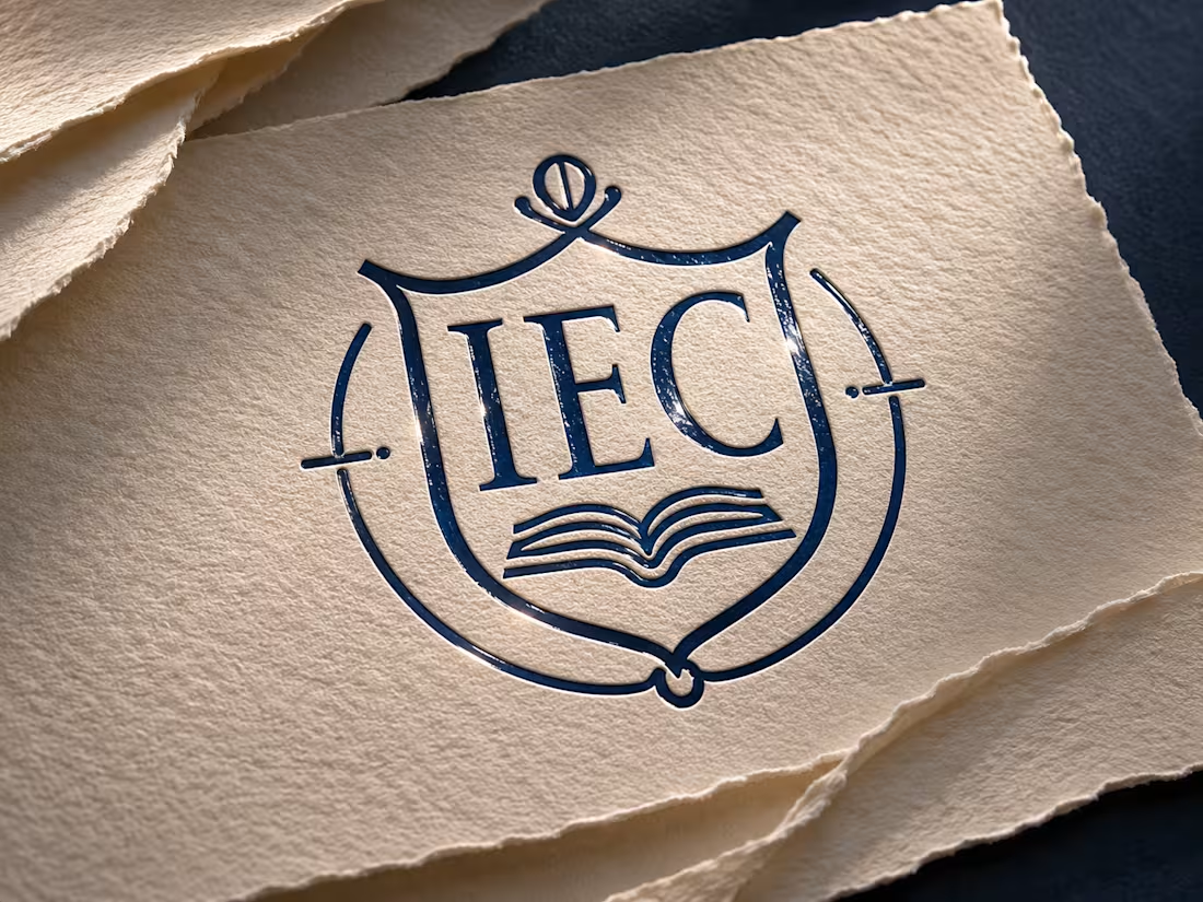
Schools sell trust before they sell courses. The Instituto Educacional Crescer (IEC) needed an identity that felt serious and credible, yet approachable for students looking for a fast, practical path into the job market.
IEC is a technical school that trains students through hands-on learning and partnerships with clinics and hospitals, where they complete their internships. The brand had to communicate preparation and opportunity, without promising what depends on each student’s effort.
What I created:
• A crest-style symbol with an open book, blending tradition and technical training
• A navy and gold palette, softened with sage, slate blue, off-white and terracotta
• A graphic pattern of connected lines, representing the path from course to internship to career
• An owl illustration as a symbol of wisdom
• Applications: uniforms (including a radiology lab coat), staff ID badge, mug and institutional folder
Guiding idea: “A escola prepara. Você conquista.” (“The school prepares. You achieve.”)
Need a brand identity for a school, training center or educational business? Let’s talk. Full project on Behance 👇
0
4
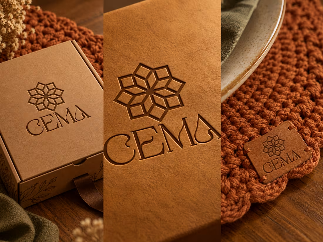
Handmade brands often look generic or childish. Cema Crochê needed neither.
Founded by Iracema, a craftswoman from the countryside of Bahia, Brazil, the brand was born from the pride of making beautiful things with her own hands. Her goal: to reach all of Brazil and, in time, sell abroad. The identity had to be ready for that.
What I created:
• A geometric symbol inspired by traditional crochet motifs
• A serif wordmark with curves that echo the movement of thread
• An earthy palette of caramel, terracotta, beige and brown
• Graphic pattern, sheep illustration and applications: leather labels, hang tags, business card, bags, gift box and storefront sign
The result is a welcoming, recognizable brand that makes handmade its main strength. Tagline: “O que é feito à mão, fica” (“What is made by hand, stays”).
Need a brand identity for a handmade, artisanal or small business? Let’s talk. Full project on Behance 👇
1
13
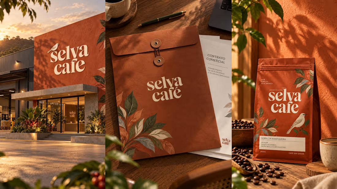
Selva Café | Brand Identity & Packaging for an Artisanal Coffee Roaster
Overview
Selva Café is a small artisanal coffee roaster with two years in the market, born from the idea of bringing people who drink coffee closer to the people who grow it.
The challenge
The client wanted to escape coffee clichés: no literal beans, no “mall café” look, no upscale gourmet tone that keeps people away. The brief was to be special without being intimidating, while communicating total traceability, since every bag can be traced to a specific producer and farm.
The solution
Concept: coffee as living landscape and territory, not just a product.
Mascot: the grey tanager (sanhaço-cinzento), a common bird on coffee farms in Bahia and Espírito Santo. Discreet, warm and knowledgeable, like the brand’s personality.
Logo: a sturdy serif wordmark that feels handcrafted without looking improvised.
Palette: terracotta, foliage green and tanager blue, avoiding the usual coffee green and brown.
Tagline: “Cada grão tem um nome” (“Every bean has a name”), taken directly from the business’s main differentiator.
Illustration system: botanical illustrations that tie the brand to the land.
Result
A visual identity that balances rustic and sophisticated, applied consistently across all touchpoints.
Deliverables: logo, brand seal, color palette, illustrations, mascot, coffee bag packaging, takeaway cup, mug, uniform, business card, presentation board.
Audience: conscious, curious coffee drinkers aged 25 to 45 who care about origin and process.
Values: Transparency • Sustainability • Authenticity
1
15
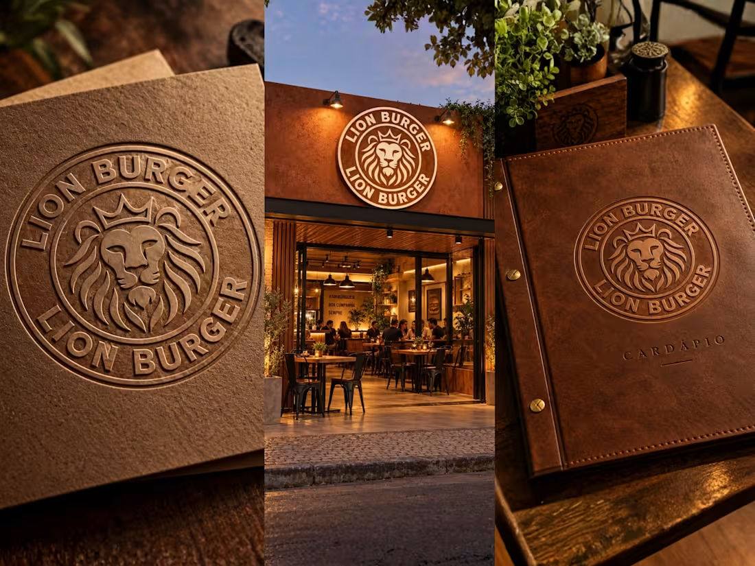
Brand identity for Lion Burger, an artisanal burger restaurant. Lion emblem, embossed packaging, storefront signage and leather menu, designed as one cohesive system. Open to brand identity and packaging projects worldwide.:
1
27