The network for creativity
Join 1.25M professional creatives like you
Connect with clients, get discovered, and run your business 100% commission-free
Creatives on Contra have earned over $150M and we are just getting started
Back to feedPost

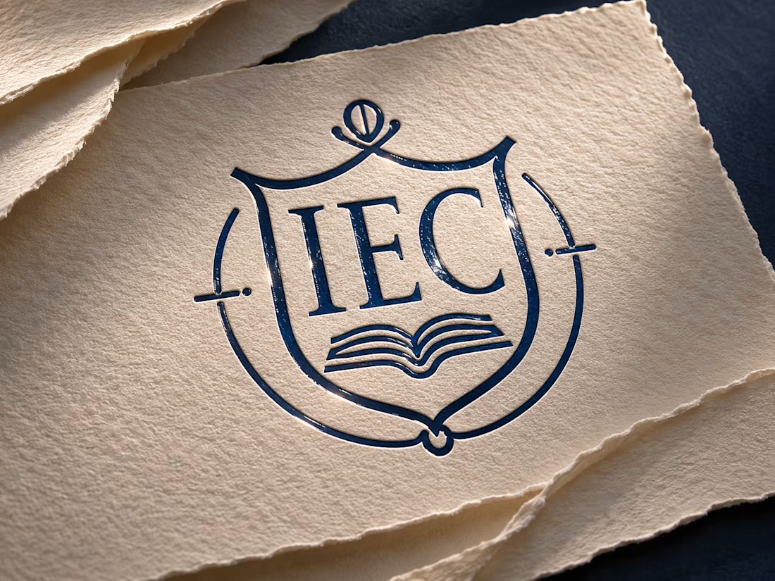
Schools sell trust before they sell courses. The Instituto Educacional Crescer (IEC) needed an identity that felt serious and credible, yet approachable for students looking for a fast, practical path into the job market.
IEC is a technical school that trains students through hands-on learning and partnerships with clinics and hospitals, where they complete their internships. The brand had to communicate preparation and opportunity, without promising what depends on each student’s effort.
What I created:
• A crest-style symbol with an open book, blending tradition and technical training
• A navy and gold palette, softened with sage, slate blue, off-white and terracotta
• A graphic pattern of connected lines, representing the path from course to internship to career
• An owl illustration as a symbol of wisdom
• Applications: uniforms (including a radiology lab coat), staff ID badge, mug and institutional folder
Guiding idea: “A escola prepara. Você conquista.” (“The school prepares. You achieve.”)
Need a brand identity for a school, training center or educational business? Let’s talk. Full project on Behance 👇


The network for creativity
Join 1.25M professional creatives like you
Connect with clients, get discovered, and run your business 100% commission-free
Creatives on Contra have earned over $150M and we are just getting started
Related posts

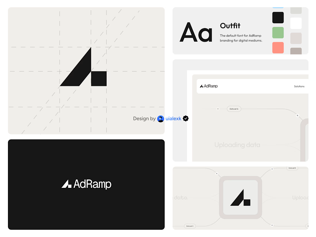

The A mark built on a diagonal grid, with the ramp stepping up on the right, is simple and holds up on the black AdRamp card. My challenge: the palette shows green and salmon swatches next to the black, but every application tile is black, white or grey. If the accent colours...

A little more about the inspiration behind Tindara.
I wanted the identity to have a connection to Tindari, Sicily. The Madonna di Tindari statue was the starting point for the symbol, while Sicilian decorative patterns inspired the graphics around it.
For the colors, I chose mustard yellow, deep green, and burgundy, balanced with cream. I wanted to bring some of that warmth and richness into the packaging, while keeping the different elements comfortable together.
For me, these references are what give the project its character and sense of place.



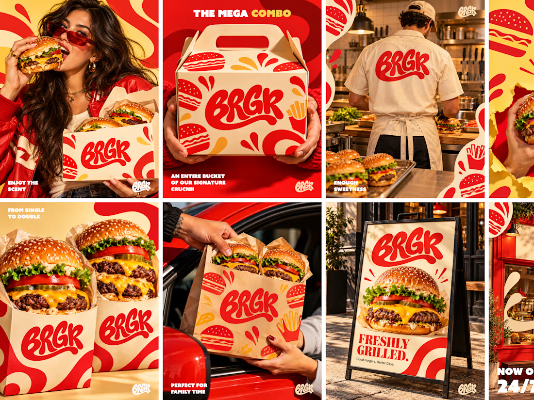
Good branding isn’t just about making things look pretty. It’s about making people crave your product before they even take a bite. 🔥
For BRGR, we focused on creating a bold, mouthwatering visual identity that brings the brand to life across every touchpoint — from Logo Branding and food photography to social media graphics and content.
Because when your visuals have direction and your social media has consistency, your brand doesn’t just show up — it stands out. ❤️=



Clean execution! Making people crave the product before the first bite is exactly what high-converting ad creative needs to do. Coupling this strong branding with direct response video hooks on Meta is a lethal combination for driving restaurant revenue!