
Thabo Mailula
Data Analyst: SQL, Python & Power BI for actionable insights
Ready for work
Thabo is ready for their next project!


Customer & Marketing Insights Dashboard | Power BI Project
This Power BI project analyzes customer behavior, sales performance, promotions, and product cross-sell opportunities using sample data. The dashboard provides interactive insights in four areas:
KPI Scorecards – New customers, repeat purchase rate, average basket size, and customer lifetime value (CLV). Promotion Effectiveness – Revenue trends and comparison charts showing how discounts impact sales and profit.
Product Affinity / Cross-Sell – Heatmaps reveal commonly purchased product combinations. Customer Retention & Cohorts – Tracks returning customers and retention patterns.
0
27
Maji Ndogo Water Project – Part 2 | Data Analysis & Insights
In Part 2 of the Maji Ndogo Water Project, I focused on cleaning and analyzing employee and water source data to understand access, detect patterns, and prioritize interventions.
Key Activities:
Employee Data Cleaning – Standardized emails, converted to lowercase, and updated phone numbers.
Employee Performance – Counted visits per employee and identified top surveyors.
Water Source Distribution – Analyzed records by town and province, calculated rural percentages, and total people served.
Water Source Usage – Calculated average and total users per source type.
Prioritizing Repairs – Ranked water sources by people served to guide repair priorities.
This workflow highlights water access, employee activity, and priority areas for intervention.
0
18

Workflow Explanation – Part 1
Here’s what I did in this first part of the Maji Ndogo Water Project:
1.Understand the Data
First, I looked at the types of water sources in the dataset: rivers, wells, shared taps, home taps, and broken taps. I noted which sources are generally safe versus which are high risk. This step helped me know what “normal” data should look like.
2.Identify Anomalies in Queue Times
I checked for visits where people waited more than 8 hours (500 minutes). This flagged water sources that may have access problems or data errors.
3.Check Water Quality Records for Invalid Revisits
I focused on records with perfect water quality scores (10) but multiple visits. According to the survey rules, only shared taps should have multiple visits. This step identified invalid or duplicated records in the database.
0
15
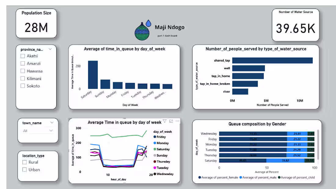
Maji_ndos_powerbi_dashboard_part1
This dashboard looks at how communities in the Maji Ndos project access water. The focus is on population size, water source availability, and how people actually use those sources during the week.
What’s in the report
Cards for total population and number of water sources
Slicers for province, town, and location type
Bar charts showing average queue time by weekday and people served by water source type
Line chart for queue-time trends across the week
Stacked chart showing women, men, and children in daily queues
How it was built
Cleaned and shaped the data in Power Query
Linked population, water source, and usage tables
Created measures for totals, counts, and average queue times
Designed visuals that highlight patterns without overwhelming the reader
0
27