
Tetiana Halushkina
A designer and illustrator who tells stories through art
New to Contra
Tetiana is building their profile!

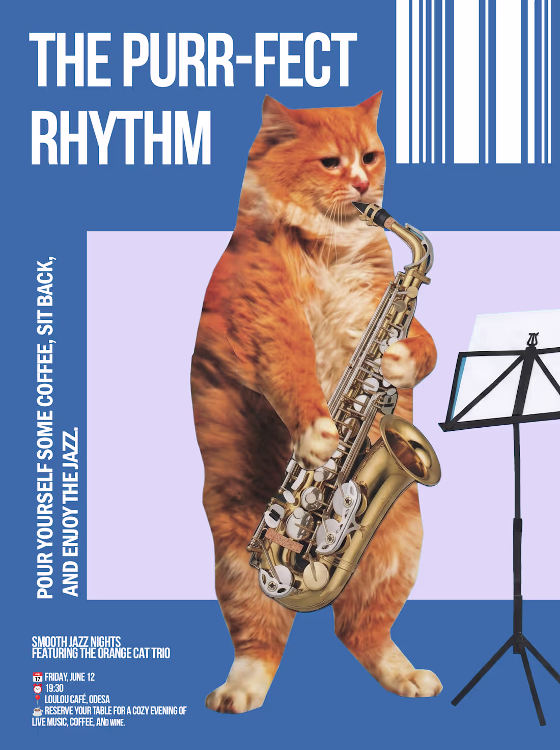
The human brain reacts to a cat faster than it can think. This isn’t a metaphor—it is literally how attention works. Before you even read what’s written on the packaging, before you even realize it’s an ad—you’ve already stopped scrolling.
Cats have sold more products than any marketer in history. The paradox is that the cat usually has absolutely nothing to do with the product it’s selling. But it doesn’t matter—because it’s not selling the product. It’s selling the state of mind in which a person wants to own that product.
And a state of mind doesn't need a logical connection to the item. It only needs one thing—to make the viewer feel something the exact moment they connect with the ad.
2
39
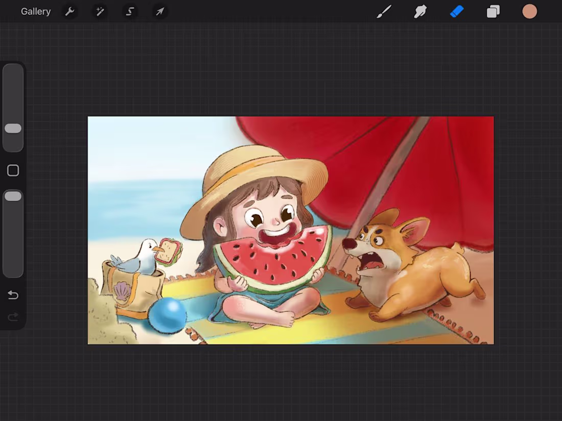
Summer is all about the little chaotic moments. 🍉☀️
I had so much fun playing with the warm, sunny colors and bringing out that soft, hand-drawn texture on the shading.
2
34
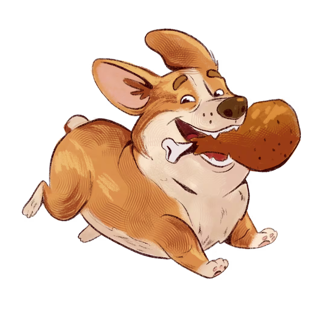
Today, I set myself the goal of creating a character based on a single, pure emotion. With this corgi, I set myself a simple task: ‘Pure, unadulterated joy’.
I wanted to capture that moment of pure bliss — the chaotic, unbridled energy of a very well-behaved boy who has just won the grand prize (in this case, a huge, juicy roast chicken leg).
Let me know in the comments if you like the result
2
55
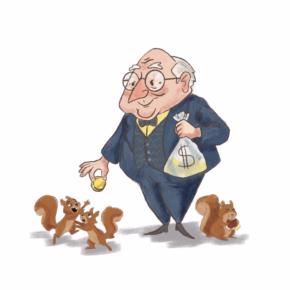
Is Corporate Design Killing Your Brand? 🧮💼
Let’s be honest — most financial and banking design is stiff, dry, and entirely forgettable. Brands spend thousands on cold geometric logos and corporate stock photos, completely missing the most powerful asset in marketing: emotional connection.
When I was designing this Character Case, I decided to break the rules.
The Concept: "The Money Magnet" Instead of creating another intimidating man in a sharp grey suit, I designed a banker you actually want to trust. A character that immediately builds an approachable vibe on a subconscious level.
Here is the strategy behind the
👉 The Vibe: A wealthy, wise grandfather figure. He’s prestigious, yet highly welcoming.
👉 The Twist: Squirrels. It adds a layer of whimsical storytelling — he’s not just holding wealth; he’s distributing resources.
👉 The Aesthetics: Soft watercolor-inspired textures combined with professional, calculated silhouettes to keep it high-end.
The takeaway for brands: Character design isn't just about "drawing a cute mascot." It's about developing your business DNA. A unique character humanizes your company, drives massive engagement, and makes you unforgettable in a sea of corporate sameness.
If your brand lacks a soul, it's time to build a character that actually communicates with your audience.
Let’s open the floor: What do you think works better for a modern brand — rigid, traditional corporate aesthetics or story-driven, expressive characters? Let me know below!
4
106