Syeda Maham Khaleeq
Designing bold, memorable, and strategic brand identities.
Ready for work
Syeda Maham is ready for their next project!


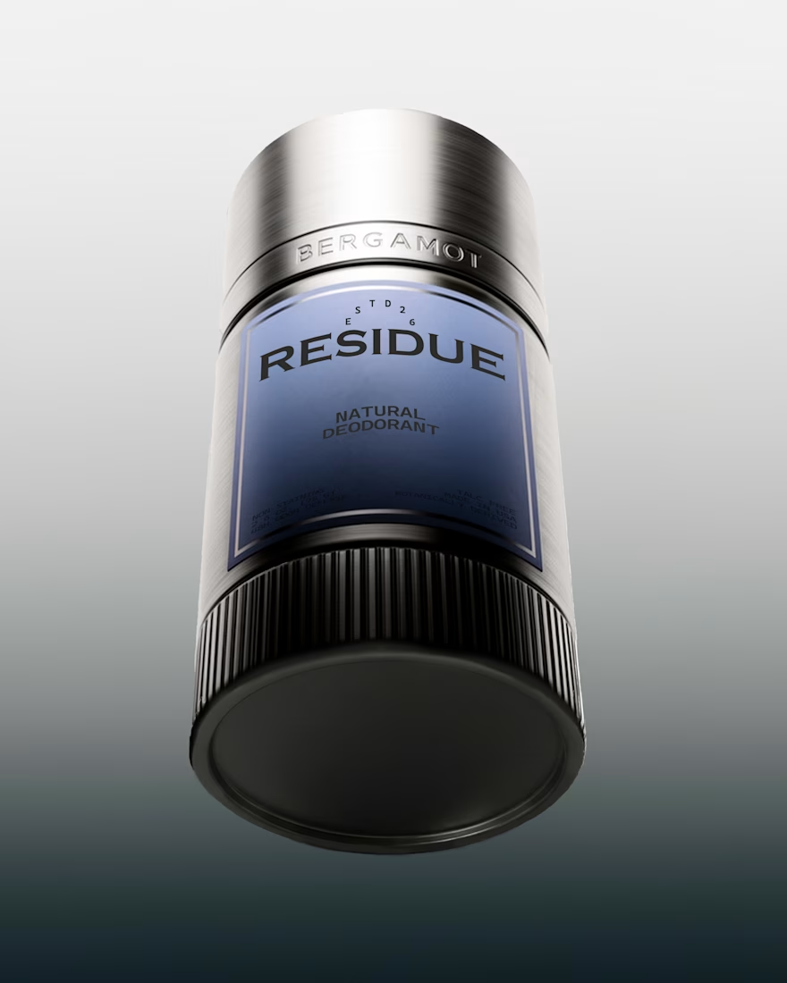
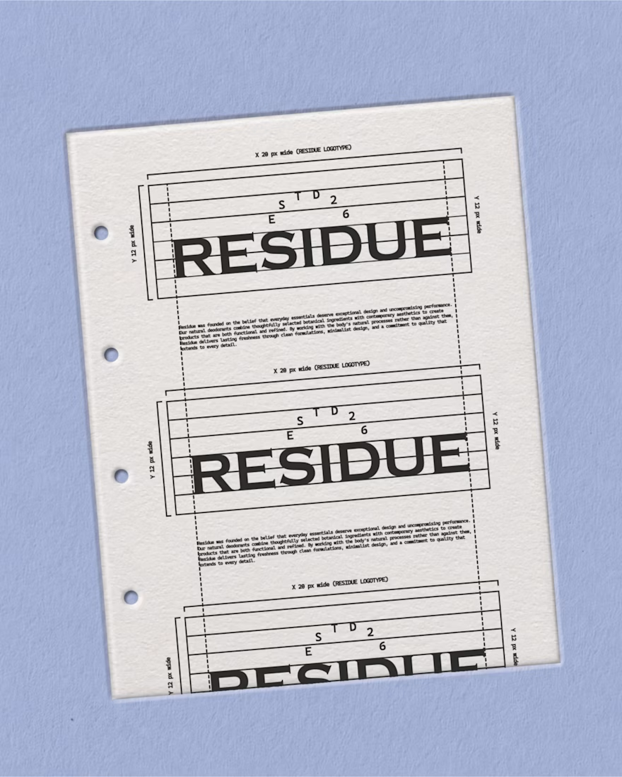
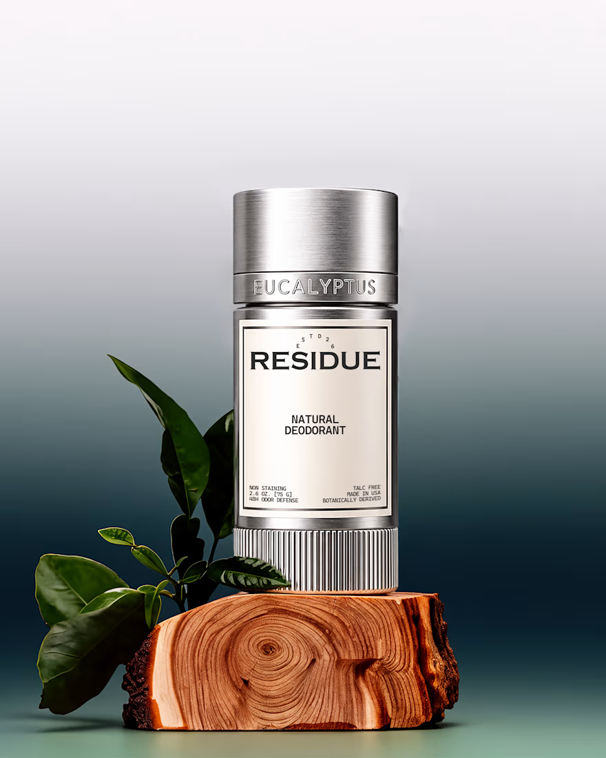
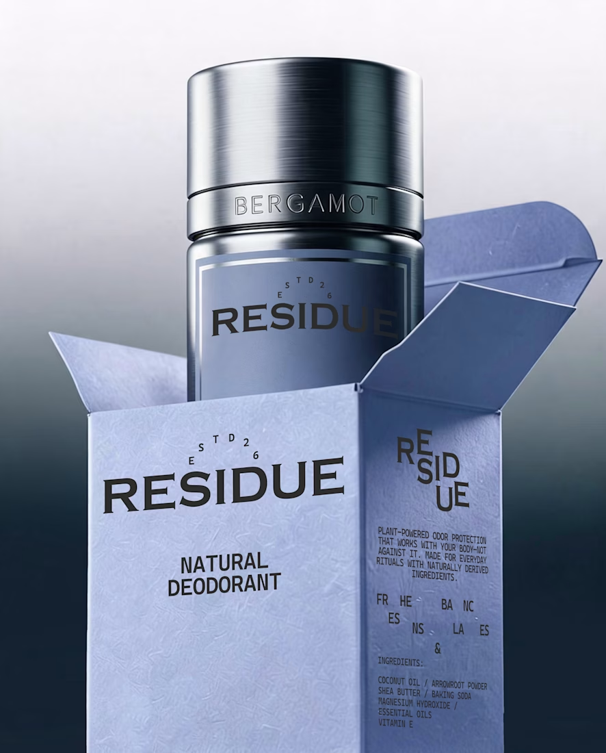
RESIDUE 2/3 The packaging system focuses on clean typography, thoughtful hierarchy, and restrained design choices. Every element was considered to create a cohesive identity that feels modern, confident, and distinctive on the shelf.
#packagingdesign #packaging #branding...

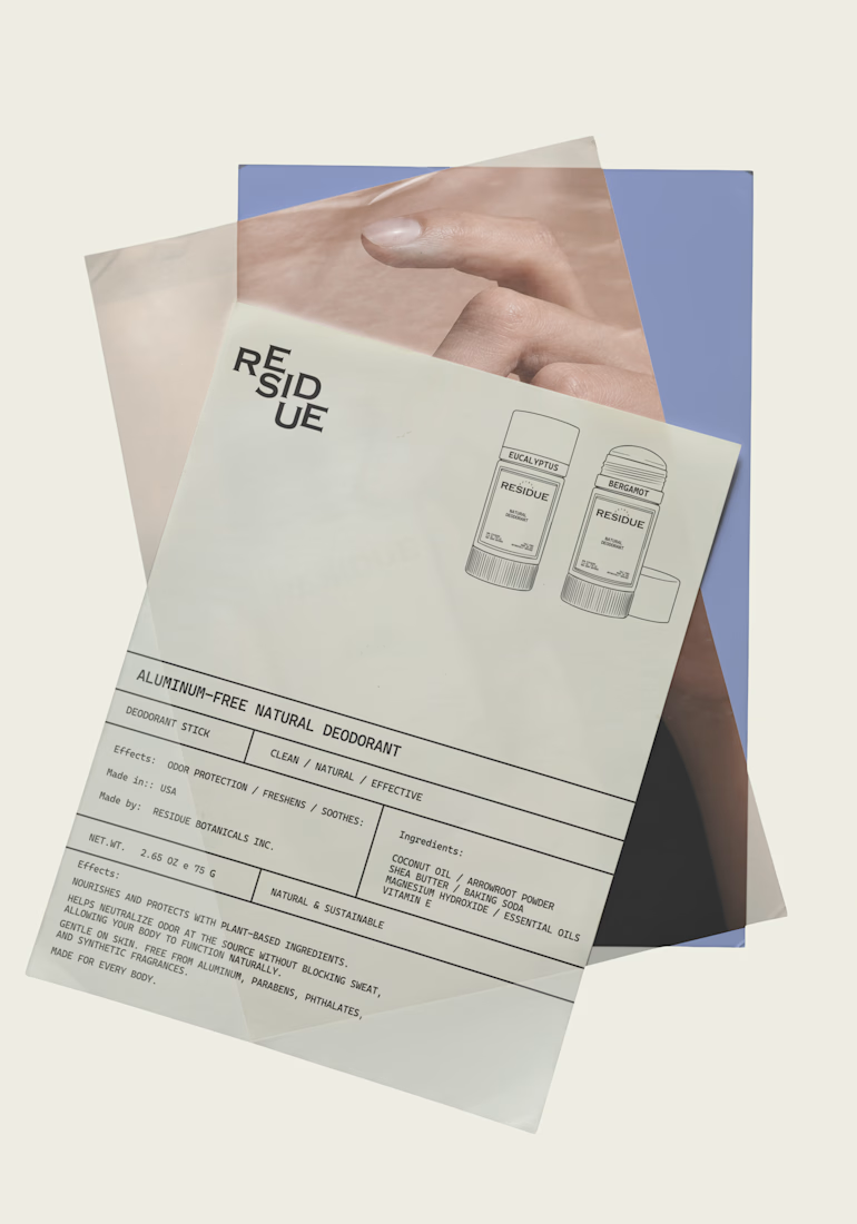
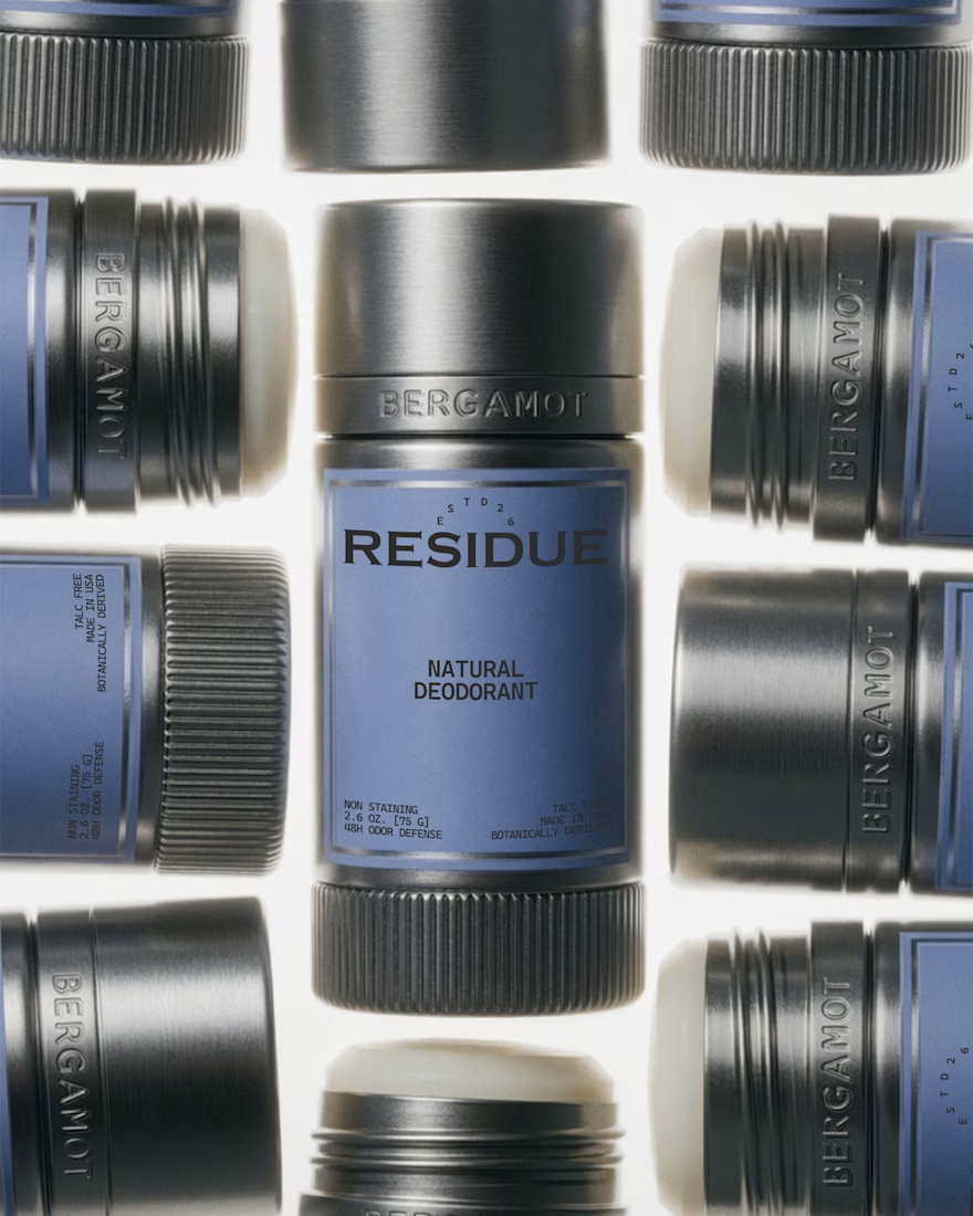
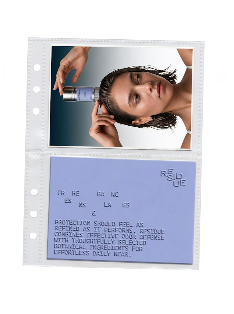
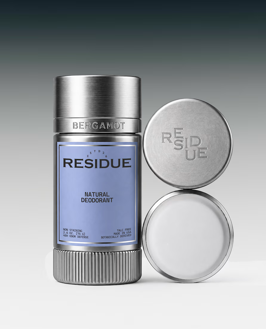
RESIDUE 3/3 One of my favorite parts of this project was pushing the details just a little further. refining the typography, layouts, and packaging until everything felt like it belonged together.
#brandidentity #branding #graphicdesign #visualidentity #designprocess...
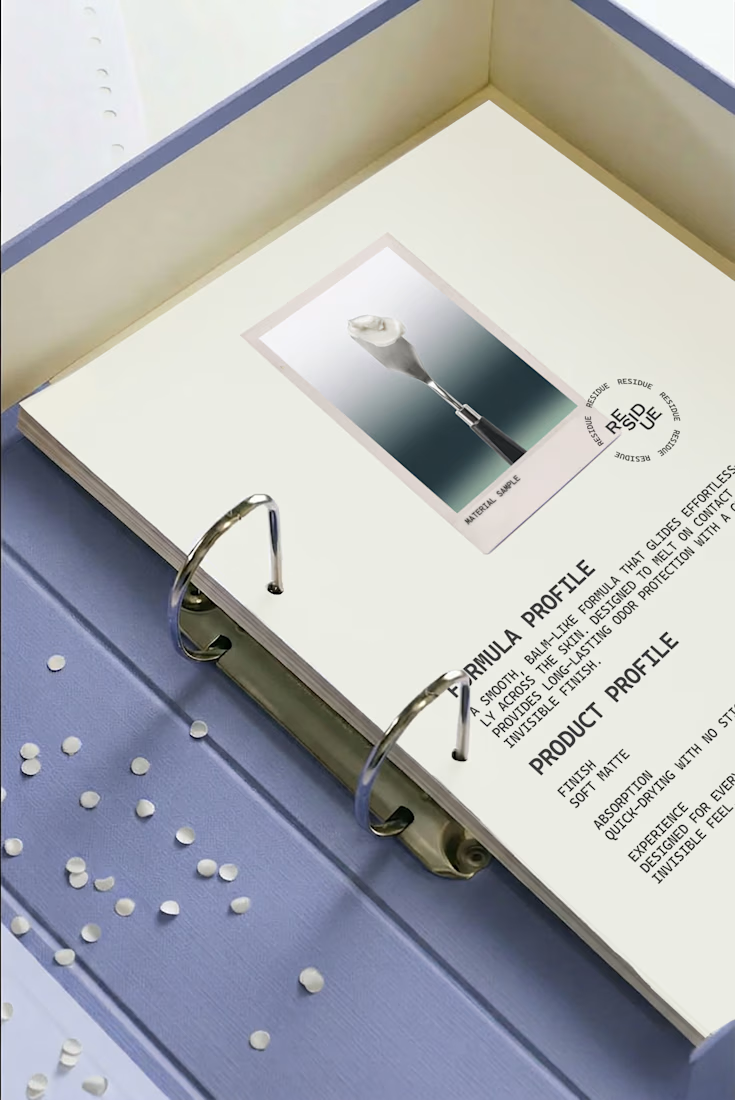
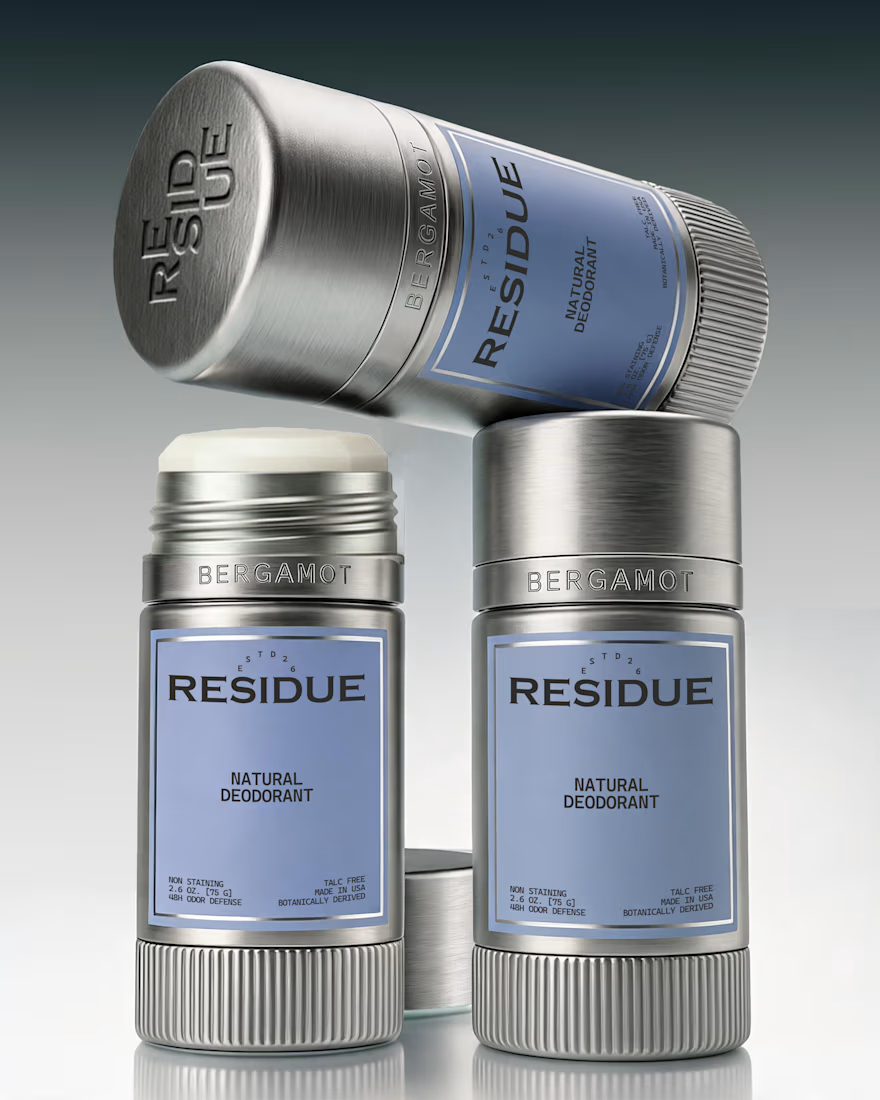
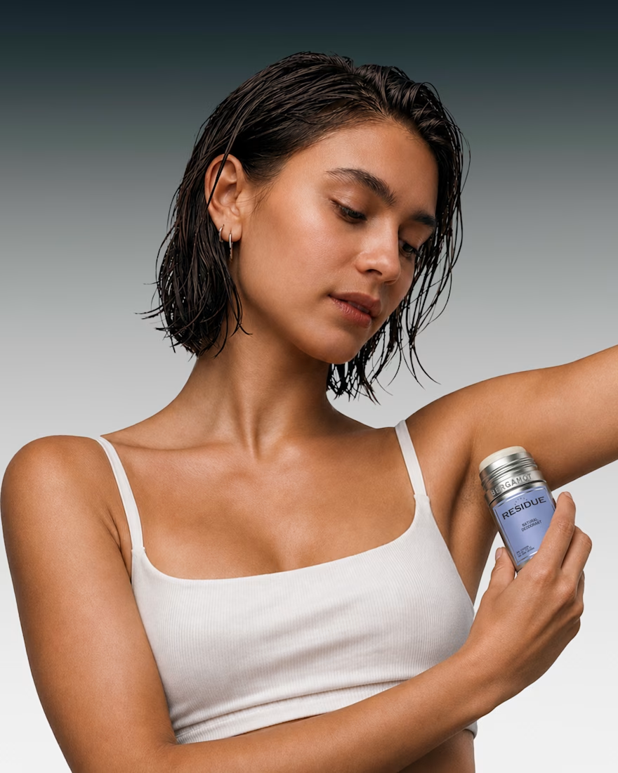
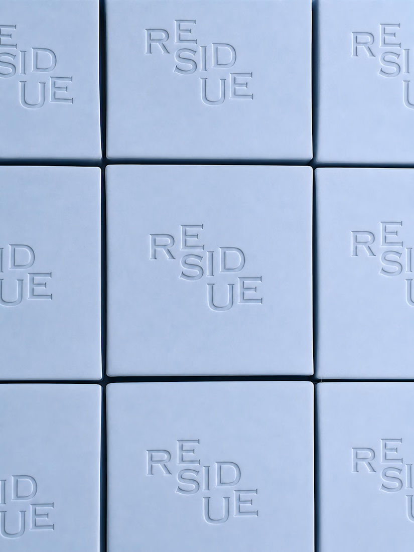
Residue 1/3 a branding and packaging concept for a natural deodorant brand designed to challenge the visual language of the category. Rather than relying on familiar organic cues, the identity draws inspiration from modern and editorial branding to create a refined, contemporary...
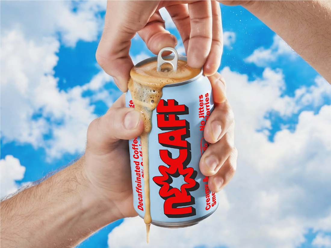
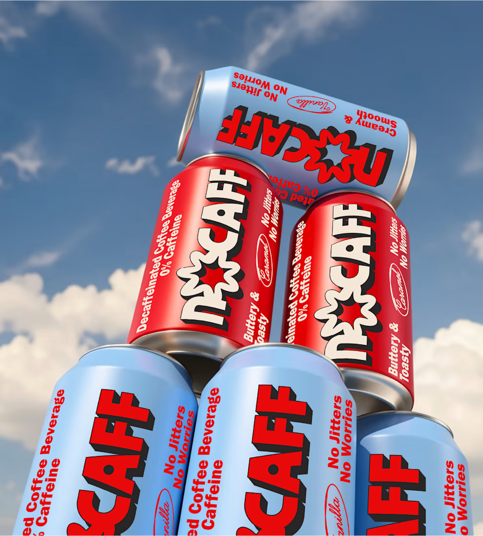
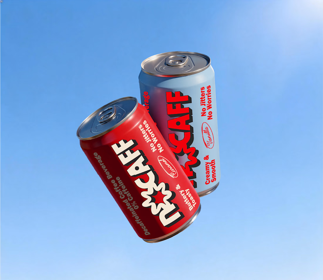
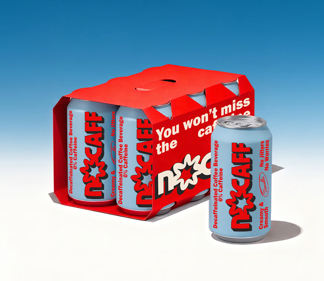
Did a passion project for @designerbriefs that later led to being featured on @thedieline. Built as an exploration of NOCAFF, a caffeine-free coffee identity blending nostalgia, bold typography, and expressive packaging design.
#brandidentity #packagingdesign #graphicdesign...
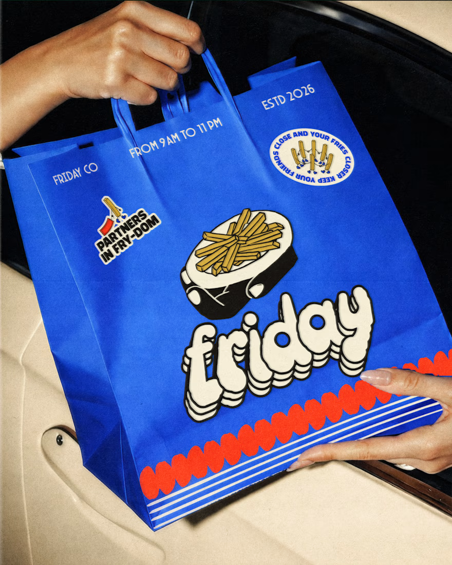
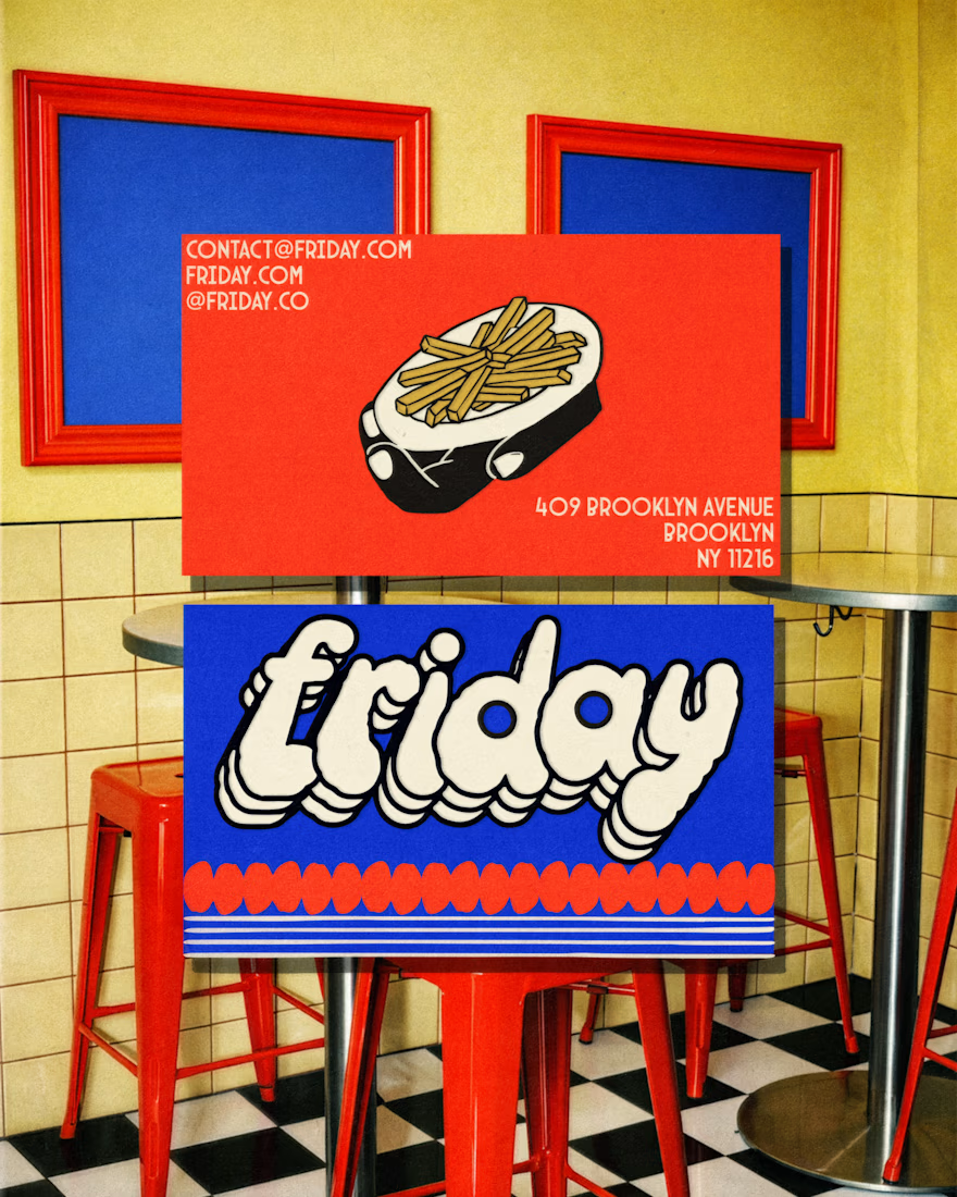
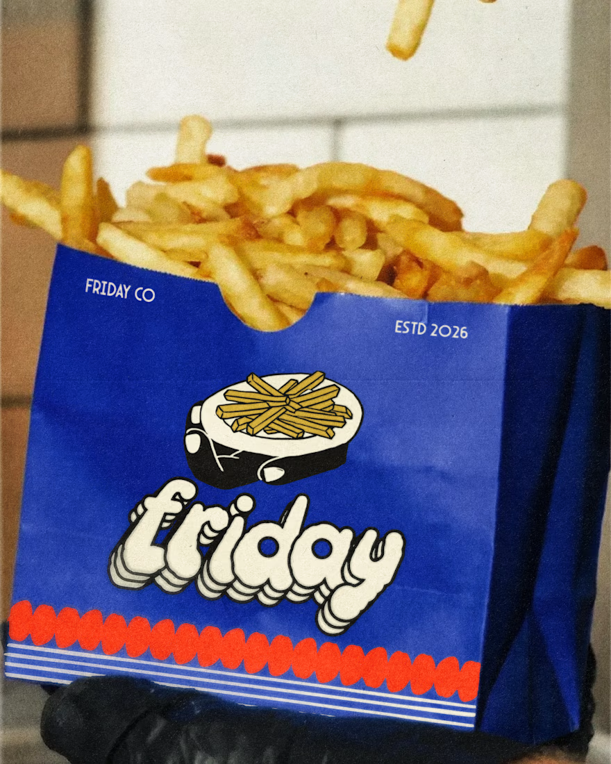
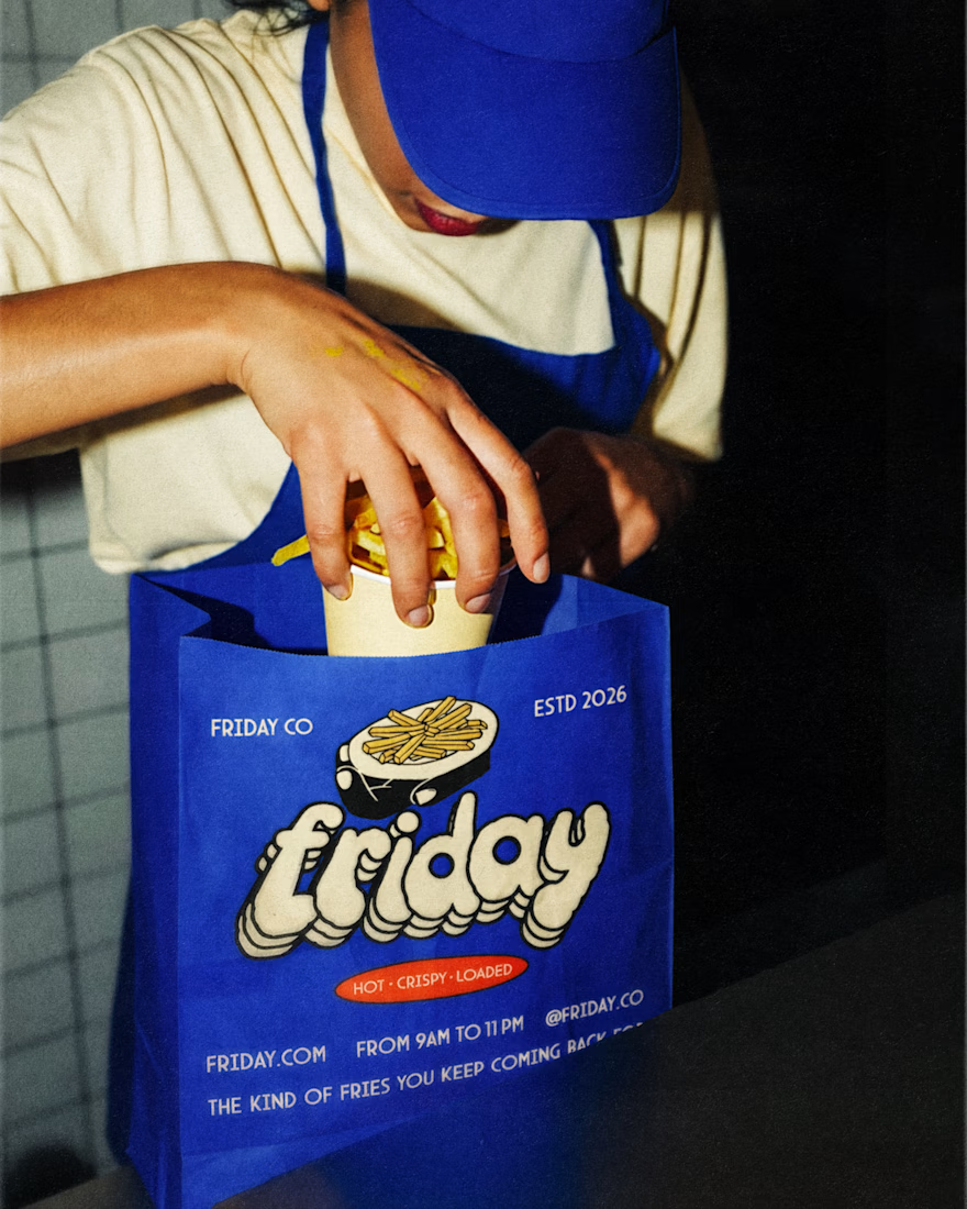
FRIDAY 1/2 — Bold fries, bolder branding. Did this branding for @briefcorp and got selected in the top 4! Voting is still on — go cast your vote!
#Branding #LogoDesign #FoodBranding #PackagingDesign #VisualIdentity #GraphicDesign #DesignInspiration #CreativeDesign #FoodBrand...