
Sydney Maresca
I design visuals people love and brands businesses trust
- $1k+
- Earned
- 1x
- Hired
- 5.00
- Rating
- 3
- Followers
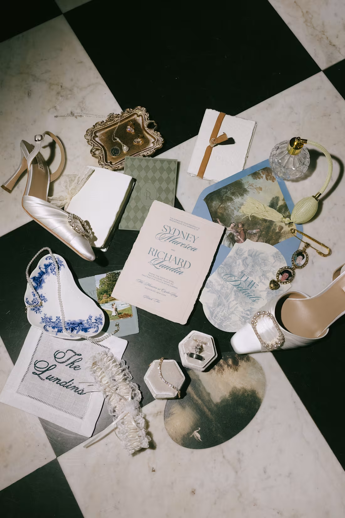
I created my wedding invitation suite in collaboration with Mango Paperie, leading the overall creative direction and design.
I defined the look and feel, aiming for a vintage, moody tone that felt timeless but still personal. I pulled together typography, color, and visual references to set that direction, then designed each piece in the suite, including the main invitation, rehearsal dinner card, details card, and RSVP, ensuring everything felt cohesive while still giving each element a clear role.
I focused on clarity and flow so the information is easy to follow, while still feeling elevated and considered. I used variation in scale, spacing, and layout to guide the eye, and introduced custom shapes and layered components to add depth and create a more tactile experience.
I worked closely with Mango Paperie throughout the process, collaborating on print production details to ensure the materials, sizing, and finishes aligned with the vision and translated well in the final pieces.
4
17
194
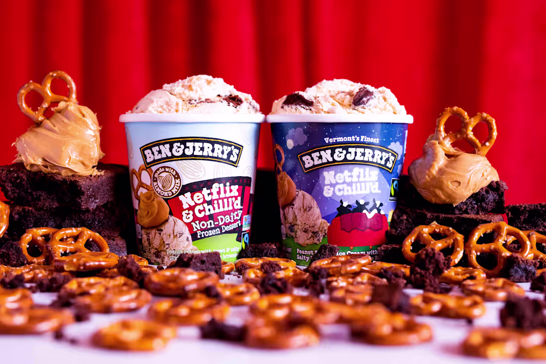
Fans and media alike enjoyed a global premiere event in New York City to announce the new partnership between Ben & Jerry’s and Netflix with their latest flavor “Netflix & Chilll’d”. Guests walked the green carpet for the paparazzi before heading into the theater for an exclusive screening announcement and a comedy performance by Michelle Buteau. A completely transformed after-party followed, including partnership-forward, interactive photo moments, a signature cocktail, flavor-inspired menu, and of course unlimited scoops of the new Netflix & Chilll’d.
Our goal was to create an immersive experience that media, storytellers, & fans will want to share. Celebrate & invite true fans of both brands to engage in an experience that they can’t get anywhere else. Provide fans with the opportunity to connect with each other over what they have in common – a shared love for both Ben & Jerry’s & Netflix. Create an experience that has global appeal and can translate across global markets.
1
92
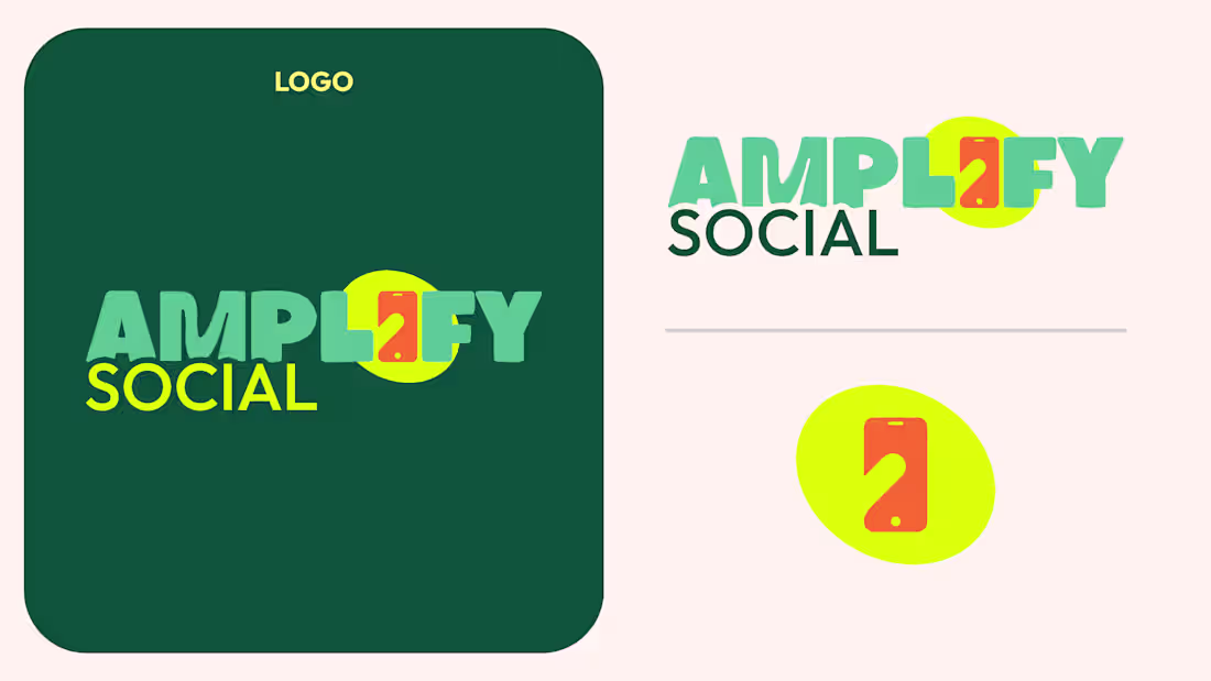
I created this brand kit to establish a bold, recognizable visual system for Amplify Social.
I defined the color palette to feel energetic and high-contrast, balancing deep greens with bright lime and playful secondary accents like purple and orange. This gives the brand flexibility while still feeling consistent across digital and social applications.
I selected typography that supports both personality and clarity. A strong, expressive display font is used for headlines to create impact, paired with a clean, highly legible typeface for everyday use. This balance allows the brand to feel distinct without sacrificing usability.
I designed a custom icon system to support content across social, marketing, and product touchpoints. Each icon uses simple shapes and layered color to feel cohesive with the overall brand while still being flexible enough for different use cases.
I also developed the logo and supporting variations to ensure it works across different formats and backgrounds. The mark is simple and memorable, with a visual element that ties back into the brand’s focus on communication and digital interaction.
This system was built to scale, giving the brand clear guidelines while allowing room for creative expression across campaigns and content.
0
46
I led art direction and creative strategy for The Predictive Index’s “AHA Moments” video series, a story-led campaign designed to capture the critical realizations HR leaders experience when using PI.
Partnering closely with our video agency, I shaped the foundational concepts to reflect the full scope of the PI ecosystem, from behavioral science to software. I defined the visual direction, narrative structure, and messaging hierarchy to ensure each story aligned with our brand positioning, product strategy, and business goals. My role focused on guiding the creative so it felt insight-driven rather than feature-led.
Each story was developed into four distinct versions to support Brand, SEO, Product Marketing, and Demand objectives. This modular approach allowed us to deploy tailored edits across landing pages, YouTube, review platforms, and paid campaigns while maintaining a consistent narrative system. The series established a scalable video framework that supported cross-channel growth without fragmenting the brand.
The first video, “Misreading the Signals,” launched across the About page, Diagnose product page, YouTube, and paid campaigns, setting the model for future releases.
1
66
The Predictive Index Product Graphics Gallery: Translating complex software into clear, scalable visuals
To support product marketing at scale, I developed a comprehensive library of custom product graphics that translate PI’s complex talent optimization software into clear, visually compelling assets. These graphics distill core platform functionality and concepts into modular, brand-aligned visuals that enhance understanding and engagement across all touchpoints.
Used extensively throughout the marketing website, sales collateral, enablement materials, and paid media, the graphics system was designed for consistency, clarity, and cross-functional usability. Each asset balances technical accuracy with visual simplicity, ensuring product value is communicated effectively to both prospects and clients.
The graphics are housed in an accessible library, enabling teams across marketing, sales, and partnerships to independently leverage high-quality visuals without sacrificing brand integrity or time.
0
52
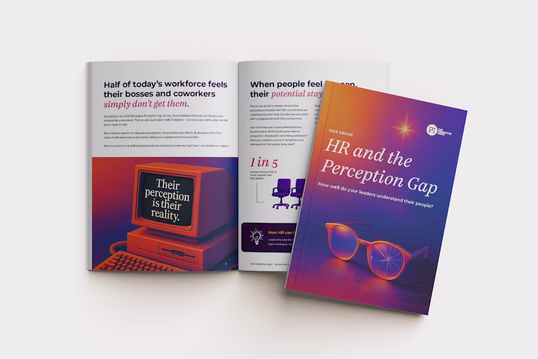
The HR and the Perception Gap is a research-driven eBook examining the disconnect between how HR leaders view their strategic role and how they are perceived by executive teams. Grounded in behavioral data and workplace insights, the piece highlights a critical tension: HR is often closest to talent challenges, yet its influence at the leadership level is frequently undervalued.
The objective was to turn complex research into a clear, persuasive resource that could help HR leaders strengthen executive alignment and increase their impact across the business.
I led the visual direction and full design of the eBook, translating dense data into a structured, executive-ready experience. I built a clean layout system, defined the typographic hierarchy, and developed supporting visual elements to clarify key insights and guide readers through the narrative. The design reinforced credibility while making the findings actionable and easy to navigate.
I also created the supporting social and promotional assets to drive distribution across paid and organic channels, ensuring message consistency from first impression through download.
The final asset positioned The Predictive Index as a trusted partner for HR leaders seeking greater influence and strengthened cross-functional alignment within organizations.
0
86
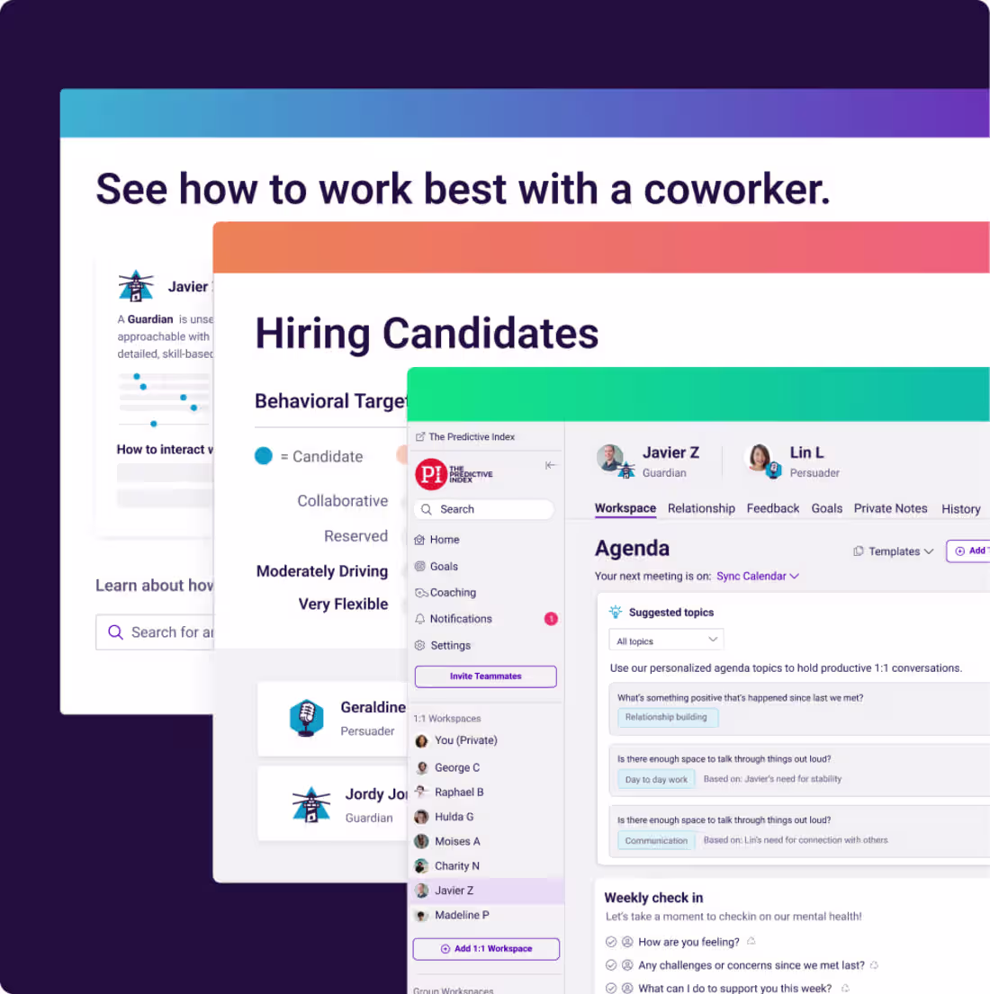
The Predictive Index website lacked consistency, scalability, and clear user journeys, limiting its ability to support growth initiatives across product marketing, demand generation, and renewals.
I led a full-site redesign across more than 50 pages to unify the brand experience and improve performance. Partnering with brand, web development, product marketing, and demand teams, I analyzed heatmaps, user behavior, and conversion drop-offs to identify structural gaps. Those insights informed a new page architecture, modular templates, and a scalable visual system built to support lead generation, product adoption, and future launches.
I defined the UX and UI direction, established standardized layout patterns, and created conversion-focused components that could be reused across campaigns and product pages. The redesign replaced fragmented page builds with a cohesive, performance-driven system.
The impact was measurable. Product page redesigns contributed to an 80% increase in demo requests and a 25% lift in clarity scores. The modular system also improved collaboration speed across brand, demand, and product marketing, reducing friction and enabling faster launches.
0
33
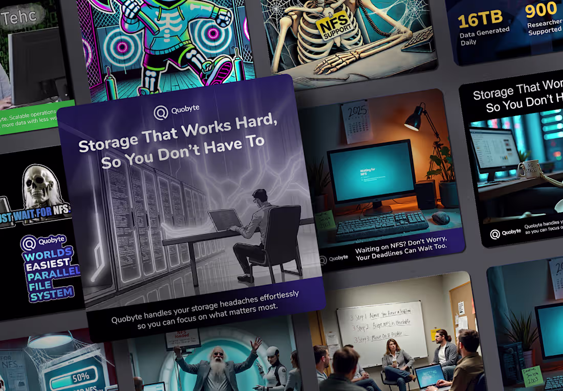
Quobyte operates in the enterprise storage space, a crowded and highly technical category where messaging often blends together. The brand needed a bold, differentiated campaign that clarified its value and increased awareness beyond a purely technical audience.
As Senior Visual Designer, I led the creative direction and execution of a full campaign suite across paid and organic channels. I translated complex storage challenges into clear, audience-focused narratives using AI-generated visuals, custom illustration, and a strong editorial tone. The concepts connected product pain points to business impact, making the solution accessible to both technical and non-technical buyers.
The campaign established a distinct, recognizable visual system that stood apart from competitors and set the creative benchmark for future marketing efforts. It positioned Quobyte as modern, credible, and confident in a category often defined by conservative design.
0
50
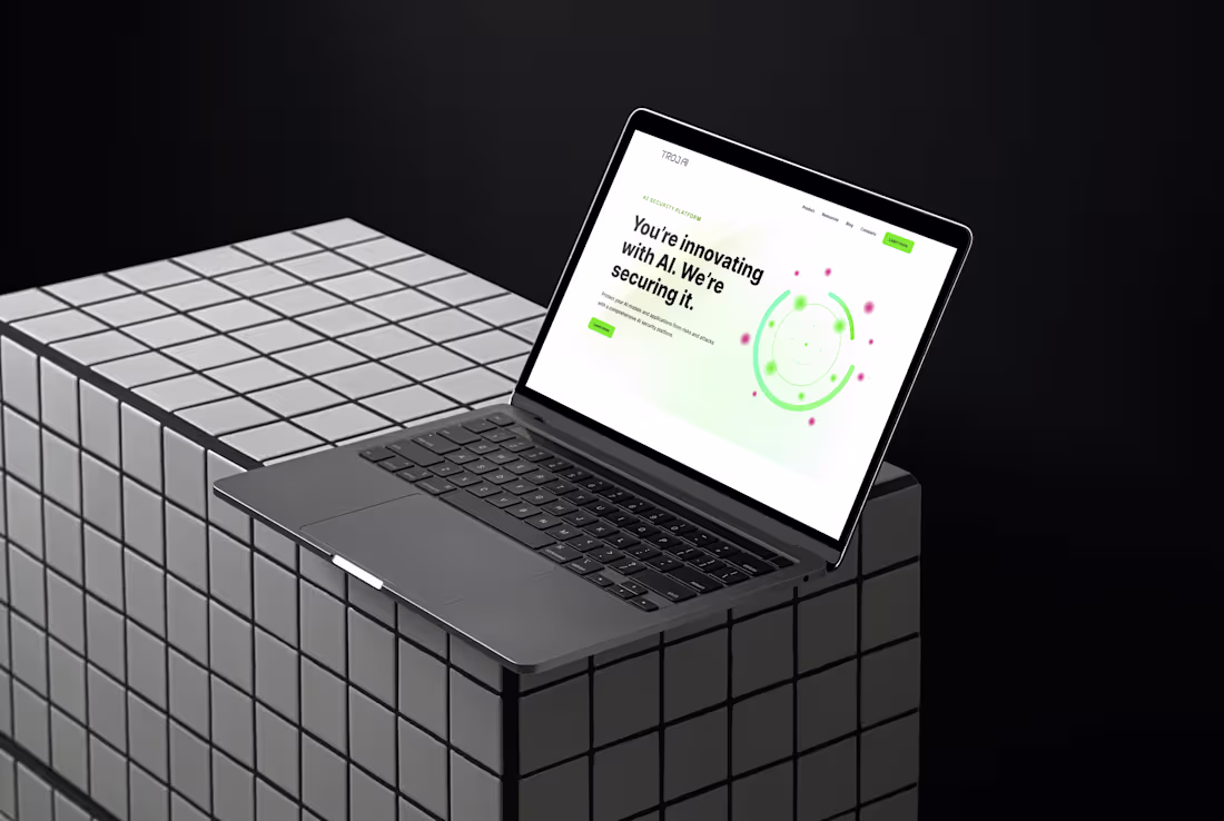
TrojAI needed a website that could clearly communicate complex AI security solutions to enterprise buyers while reinforcing a high-trust, high-stakes brand position. The existing structure did not fully support multiple product lines or evolving use cases, limiting clarity and scalability.
I led the UX and visual direction for a full website redesign, aligning messaging, structure, and design into a unified experience. Partnering with stakeholders, I mapped priority audiences and key user journeys, refined the content hierarchy, and developed flexible, modular templates designed to scale across product lines such as Detect and Defend. I ensured the visual system reinforced the brand’s positioning, “You’re innovating with AI. We’re securing it,” balancing technical authority with clarity and confidence.
The result was a scalable site architecture built to support product expansion, shifting market messaging, and enterprise-level credibility. The new system provided a stronger foundation for growth while improving navigational clarity for security-focused buyers.
0
24
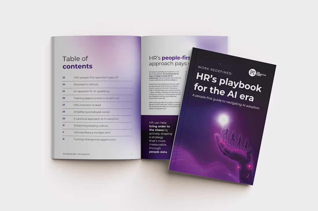
As AI reshaped how organizations operate, The Predictive Index developed a research-backed resource to help HR leaders guide their teams through change. The challenge was translating insights from 1,000 plus HR professionals and employees into a clear, executive-ready experience that could perform across channels.
I led the visual direction and design for both the eBook and its supporting landing page. For the eBook, I built a modular layout system that made dense research scannable and persuasive. I designed custom data visualizations, structured flexible content blocks, and established a clear typographic hierarchy to guide readers through key findings and recommendations. The system balanced credibility with accessibility, reinforcing PI’s authority while keeping the content practical.
For the landing page, I extended the same visual language to create a cohesive cross-channel experience and optimized the layout for conversion across paid ads, email, and organic traffic. The result was a unified campaign ecosystem rather than a standalone asset.
This project positioned PI at the intersection of AI and talent strategy, strengthened thought leadership in a competitive space, and supported multi-channel demand efforts with a high-performing gated resource.
0
40
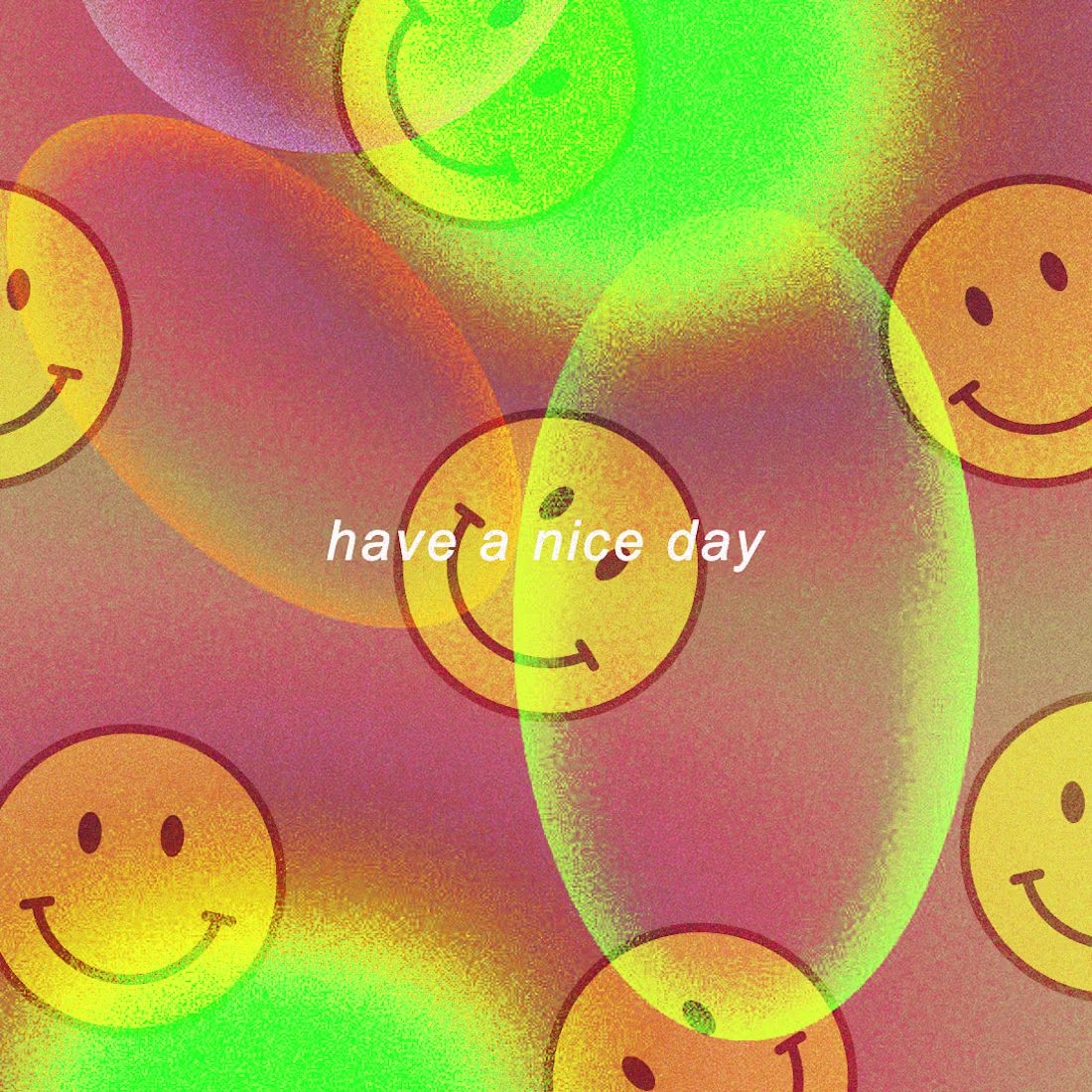
Digital media fun with illustrator & photoshop!
0
16
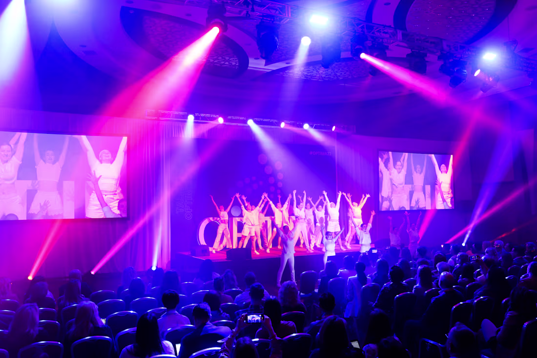
OPTIMA: The #1 Talent Optimization Conference
Meet at the intersection of leadership, people-first approaches, strategy…and an incredible speaker lineup. OPTIMA is the #1 annual talent optimization conference that brings together business leaders, HR strategists, and management consultants looking to learn strategies to hire the right talent, assemble high-performing teams, develop leaders, and boost employee engagement.
We hosted the #1 in-person and virtual talent optimization conference in April of 2022, located in Boston MA, for guests to learn from the best in business and iconic keynote speakers like James Clear—author of NYT Best Seller Atomic Habits, J.R. Martinez—Army vet, burn survivor, Dancing with the Stars winner and so many more.
0
20
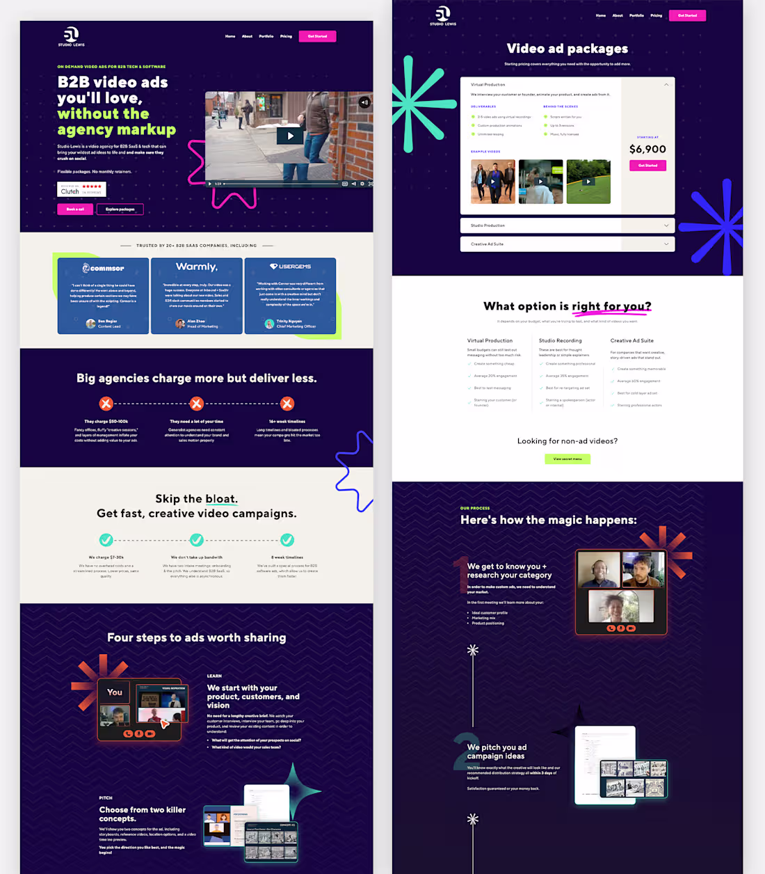
Studio Lewis Website Rebrand
0
7