
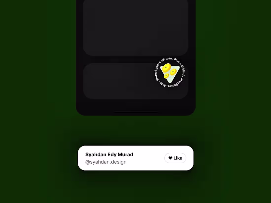
Syahdan Edy Murad
Crafting User-Centric Designs for Businesses
Ready for work
Syahdan is ready for their next project!
This time, I’m exploring animated icons on the homepage, gently appearing and “hanging” in place to highlight key insurance benefits as you scroll. The goal is to guide attention without shouting, making important features easier to notice and understand at a glance.
Made in @figma as a motion exploration. Feedback and thoughts are always welcome.
0
27
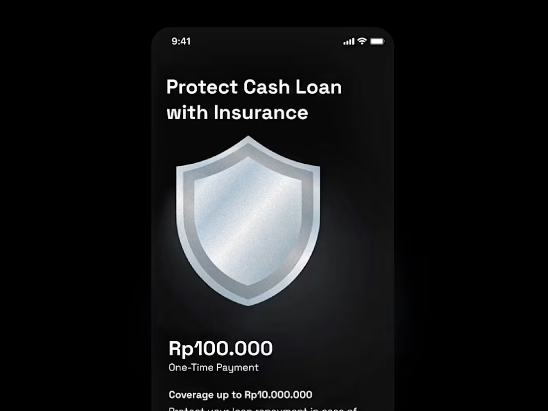
Protect what matters, without the complicated stuff.
This motion shows how insurance should feel: easy-to-see benefits, straightforward coverage, and clarity from the first glance.
Made in Figma as a motion exploration. Feedback and thoughts are always welcome.
0
30
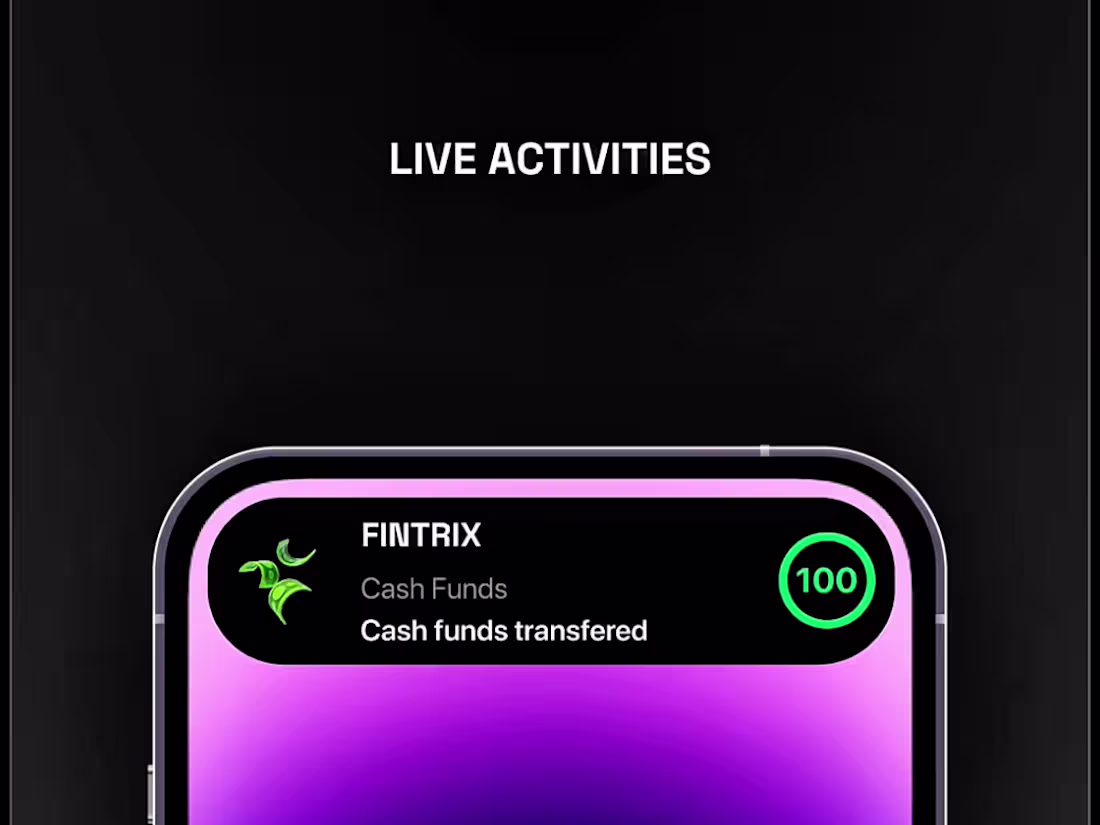
Loan Disbursement Micro-Interaction (Live Activities)
A small micro-interaction for cash loan disbursement after the financing gets approved. That quiet moment when you’re just waiting for the money to actually land. There’s a little glitch in the transition. Sorry about that haha 😅 Still figuring out the right feel between fast, clear, and reassuring.
0
42
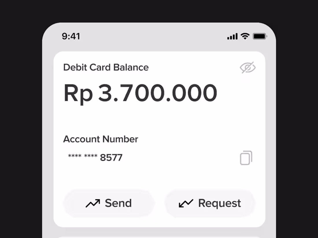
Financing Mobile App - Interactions
Digits rolling, balance growing 💸📈. It starts with an empty screen and a single number flickering into place. Slowly, the digits progress. It's not just an animation, it's the story of how your balance builds, little by little. As the numbers roll, they reveal more than transactions.
They show progress, possibility, and the quiet confidence of knowing you're moving ahead. This is more than a card. It's a reflection of your journey and the growth that happens with every choice you make.
0
47
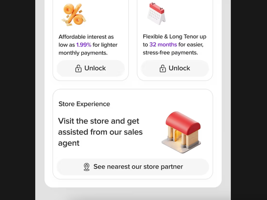
Financing Mobile App - Offers Section
Exploring a new interface design for the offer section. Instead of just laying out numbers and buttons, I wanted to shape a space that feels like a story. A place where people can easily understand low interest, longer tenors, and know from the first glance that there's direct help from sales agents at offline points of sale waiting for them. Designing it this way helps me bridge the gap between digital clarity and real-world support.
For me, this process isn't just about visuals or layouts, it's about empathy. I'm thinking about how someone feels when they open the app, what worries they might have about financing, and how a clear, human-centered interface can make their decision simpler and more confident.
0
51
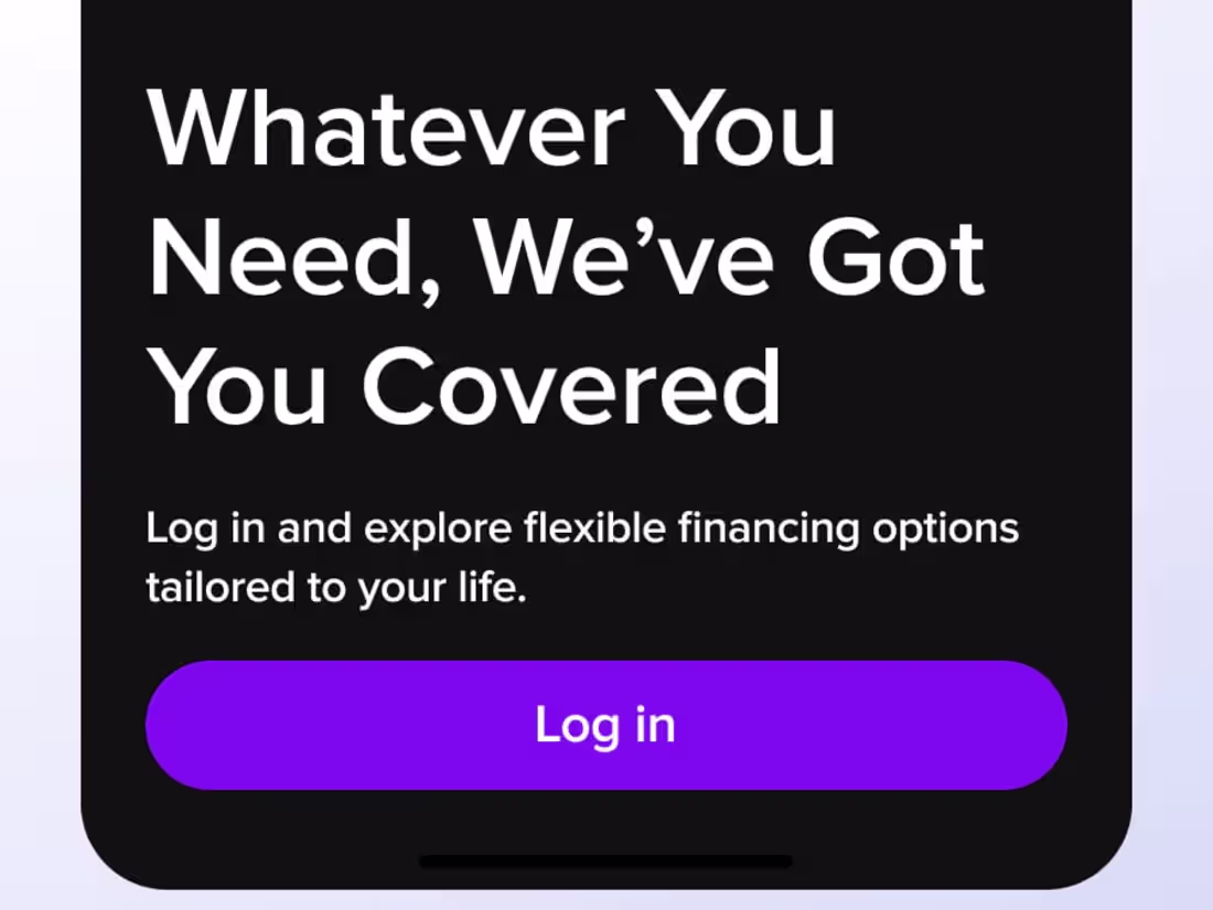
Financing Mobile App - Onboarding
Here's a little motion sneak peek from the FINTRIX onboarding flow aiming for that balance between clarity and delight, where every animation guides users through financing options, long tenors, and affordable rates with ease. Hope you enjoy this one! Follow @syahdan.design (https://www.instagram.com/syahdan.design/?__d=dist) for more design stories
0
56
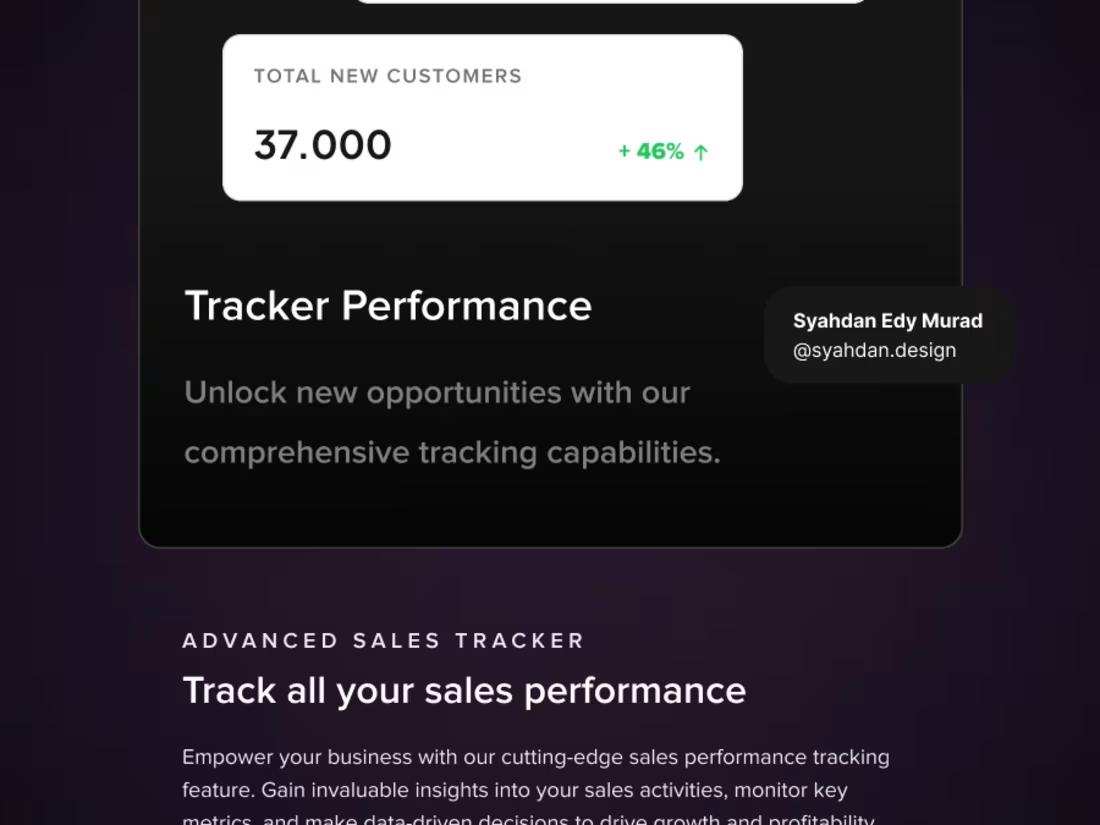
Tracker Performance Dashboard UI - B2B Web Design
Designed this interaction to help businesses show their impact more clearly. Instead of overwhelming users with numbers, the goal was to guide them through the story behind the data.
What it means, why it matters, and how the business creates value. Simple motion, clear structure, and focus on outcomes.
Design and animate with @figma
0
54