
Suvir Atrey
Building products that turn users into paying customers.
New to Contra
Suvir is building their profile!
The bank already knows exactly when to find you.
Every month, for a few hours after salary lands, users are at their most financially aware — and most financial products spend that window selling them something.
THE OBSERVATION
A moment the industry understands — and consistently misuses
Salary credit is one of the most well-studied behavioral triggers in consumer finance. Banks know it. Product teams know it. The notification that fires at 9:04 AM on the last Friday of the month is not accidental.
The industry just reaches a different conclusion about what to do with it.
"Your salary has been credited. Festival sale ends tonight — shop now with zero-cost EMI."
That message — or a close variant of it — appears across nearly every major retail banking app in India during payday windows. It is not a design failure. It is a deliberate product strategy: convert the liquidity moment into a consumption moment before the user has time to think.
The behavioral logic is sound. Users feel financially capable immediately after payday. Cognitive load is temporarily lower. Decision-making is optimistic. It is the ideal state to trigger a purchase, approve a loan, or lock in an EMI.
The problem is not that this works. The problem is that it works against the user.
THE REFRAME
What if the salary moment was an allocation trigger, not a consumption trigger?
That question became the foundation of Origin. Not a budgeting app. Not a trading platform. A behavioral operating system designed to intercept the salary-credit moment and redirect it — from spending stimulation to wealth-building action.
The insight sounds obvious in retrospect, which is how most good product insights sound. But the conventional fintech wisdom runs strongly in the other direction: engagement is revenue, and spending is engagement. A product that helps users invest quietly and then leaves them alone is, by that logic, a bad product.
THE CORE HYPOTHESIS
If investment decisions are embedded directly into the salary-credit moment — before consumption is triggered — activation rates improve, idle cash reduces, and recurring investment behavior becomes structurally easier to sustain.
The challenge was designing around a behavioral gap, not a feature gap. Users who fail to invest consistently are not failing because they lack access to investment products. They are failing because the decision to invest keeps getting deferred — and the systems around them are designed to encourage that deferral.
USER DEFINITION
The user who intends to invest — and doesn't
The target audience was deliberately narrow: salaried professionals with consistent income, genuine investment intent, and a pattern of financial procrastination. Not high-frequency traders. Not first-time earners needing basic financial literacy. Not users who lack the capital to invest.
This is a user who can tell you exactly why they should be investing more. They know about compounding. They have a trading account they opened two years ago. They have been meaning to set up a SIP since January.
The friction is not informational. It is behavioral.
Five recurring patterns emerged from research and defined the design problem:
1. Salary creates temporary financial optimismThe window between credit and the first discretionary spend is brief. Confidence is high; follow-through is not.
2. A large balance reads as spendable₹92,000 looks like ₹92,000 of available money. Users cannot intuitively subtract bills, rent, and investment allocations from raw balance figures.
3. Investment decisions get delayed to a "better moment"That moment rarely arrives. Cognitive load rises, financial awareness fades, and the window closes.
4. Financial anxiety comes from ambiguity, not shortageUsers with good salaries regularly feel financially uncertain — not because money is scarce, but because they have no clear picture of whether they are progressing.
5. Banking interfaces reinforce consumption by defaultThe products users spend the most time with are optimized to move money out, not to build it.
PRODUCT ARCHITECTURE
Five systems. One behavioral loop.
The product was not designed as a collection of features. It was designed as an interconnected behavioral system where each component reduces friction for the next. A fragmented financial workflow — strong onboarding, weak follow-through — produces investment activation without investment retention. The architecture was built to prevent that.
System —> What it solves:
Salary Intelligence —> Detects the payday window and surfaces an investment prompt before consumption behavior activates.
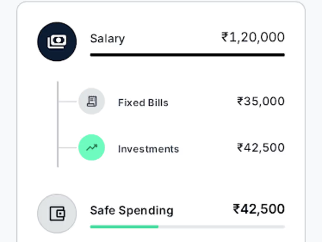
Safe-to-Spend —> Replaces total balance with a post-allocation number — bills, investments, and emergency reserves already subtracted.
Automated Allocation —> Pre-configured recommendations reduce the investment decision to a single confirmation, not a research session.
Behavioral Nudges —> Loss aversion framing and streak mechanics convert one-time activation into recurring habit.
Wealth Visibility —> Long-term compounding visualized over time — converts abstract future gains into present motivation.
ON THE SAFE-TO-SPEND REDESIGN
This was the highest-leverage design decision in the product. Most banking apps show total balance. That number, presented without context, consistently produces overspending. Users are not irrational — they are working with incomplete information.
Conventional approach::
Balance: ₹92,000
User subtracts mentally — rent, bills, groceries
Estimation error leads to overspend
Investment is whatever is left at month end
Origin::
Reserved: ₹34,000 (bills, EMIs)
Investing: ₹18,000 (allocated)
Emergency buffer: ₹12,000
Safe to spend: ₹28,000
The Safe-to-Spend figure does not tell users what to do. It simply eliminates the arithmetic that causes most spending mistakes. The behavioral effect is immediate: when users see ₹28,000 rather than ₹92,000, spending decisions are made against an accurate baseline.
ON BEHAVIORAL MECHANICS
The product incorporated behavioral finance principles — loss aversion, default bias, commitment devices, progress visualization — but drew a deliberate line between decision architecture and manipulation. Gamification that increases engagement without improving financial outcomes was excluded. Streak mechanics were tied to investment consistency, not app opens. The goal was not to maximize time in the product. It was to minimize the decisions users needed to make manually.
DESIGN PHILOSOPHY
Calm over stimulation
The visual language was a deliberate departure from standard fintech design — no trading charts, no real-time price tickers, no color-coded percentage movements. The product needed to communicate differently from the apps competing for the same moment of attention.
Fintech products that optimize for engagement tend to borrow interaction patterns from gaming and social media: rewards, streaks, leaderboards, push notifications engineered for dopamine response. These patterns work in contexts where high engagement is itself the product goal. In a wealth-building product, they introduce a conflict of interest: the user needs calm, long-term thinking; the app is rewarding short-term action.
The product was not trying to be used more. It was trying to be needed less — while quietly doing more.
Spatial layouts prioritized clarity over density. Information hierarchy was strict. Color conveyed state, not excitement. The experience was designed to feel closer to a wealth management dashboard than a consumer app — institutional enough to signal trust, accessible enough to not intimidate.
BUSINESS LOGIC
Why recurring investment behavior is a stronger business model than transaction volume
The conventional fintech monetization path runs through volume: more transactions, more lending, more spend. These are real revenue streams, but they are also structurally extractive — they perform best when users are financially undisciplined.
A product that helps users build recurring investment habits creates a different economic profile. AUM grows predictably. Churn is lower — users who are financially progressing do not leave. The platform becomes a structural part of a user's financial life rather than a service they switch away from when something cheaper appears.
NORTH STAR METRIC
Salary-to-investment conversion rate
Percentage of salary allocated to investments within 24 hours of credit. Every other product metric flows toward or against this one.
Metric —> Business rationale
SIP activation rate —> Early signal of behavioral habit formation, not just product trial.
Recurring investment retention —> Primary driver of AUM compounding and long-term LTV.
Idle cash reduction —> Proxy for how effectively the product intercepts the salary moment.
Investment consistency score —> Measures behavioral success, not just activation.
Goal completion rate —> Retention signal — users completing goals re-set new ones.
IMPLICATION
What this suggests about where fintech is heading
Origin is not a novel product category. Direct deposit accounts, investment platforms, and allocation tools all exist independently. The product's thesis is not about new features — it is about sequencing, timing, and the behavioral system connecting them.
The more significant argument is about the purpose of financial products. Most fintech infrastructure is built to process financial behavior, not to shape it. The margin of influence products have over user behavior is treated as a surface for monetization rather than a responsibility.
A product designed to benefit from its users' financial discipline — rather than their financial impulsiveness — operates on a fundamentally different alignment. The business does better when users do better. That is not idealism; it is a different incentive structure.
The salary-credit window will continue to be contested real estate. The question is whether the products competing for that moment will keep optimizing it for extraction, or begin building for the alternative — a user who is, after twelve months, measurably wealthier and considerably less anxious.
The strongest realization from this project was not about fintech. It was about the relationship between product design and financial behavior at scale. The systems users interact with daily are quietly shaping their financial lives — often in ways that serve the platform more than the person. Origin was an attempt to design that influence differently.
1
31