pro
Studio Blanche
Branding & Web Design Studio for wellness and beauty
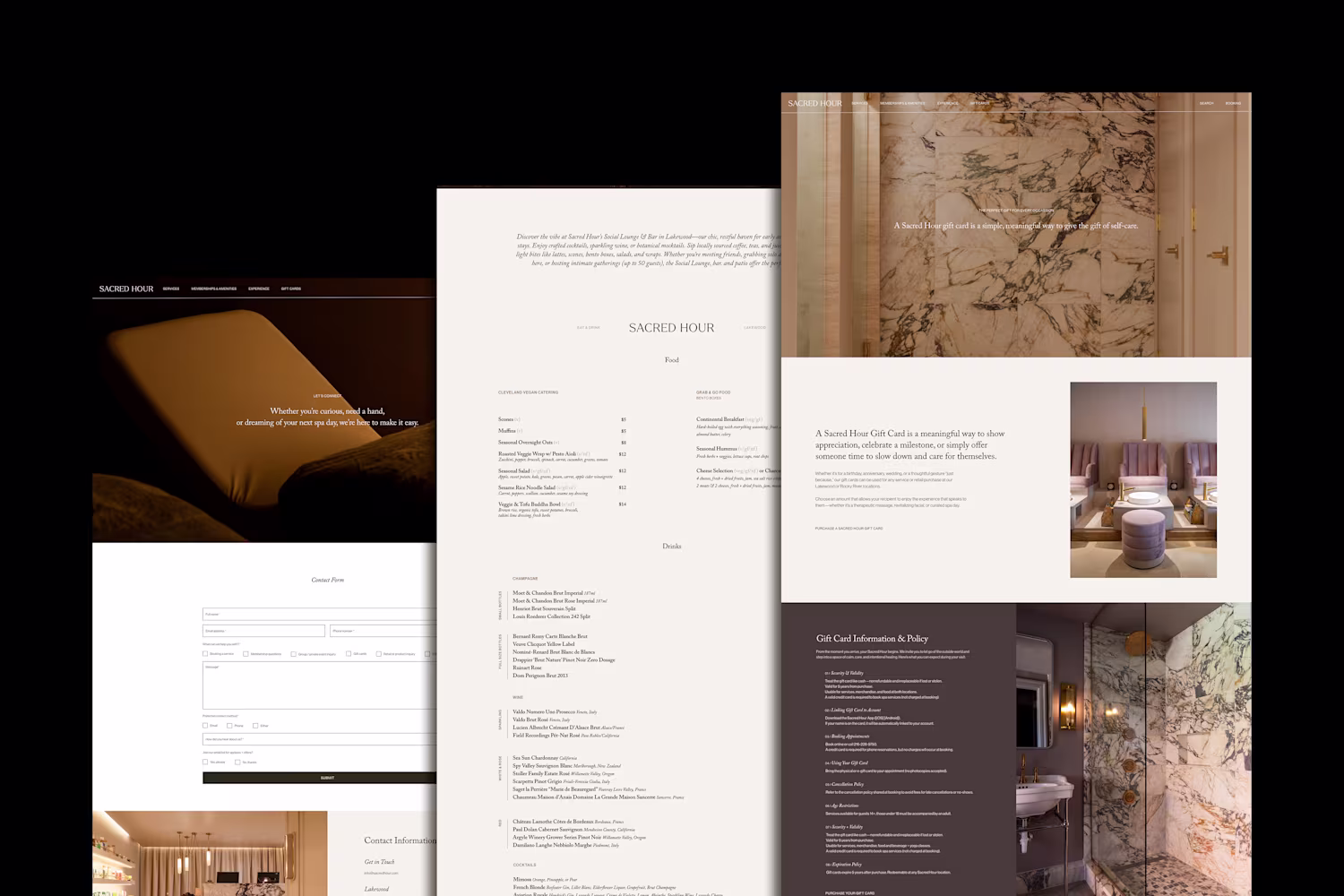
Ready for work
Studio is ready for their next project!
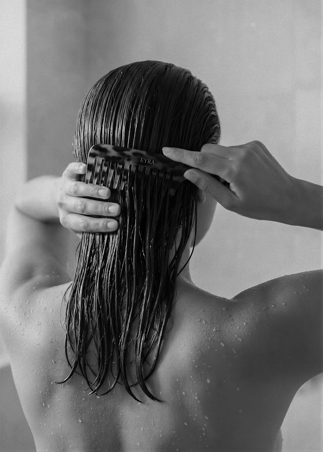
The brief was simple - create a brand that feels like a ritual, not a routine. We've been working behind the scenes to craft a brand identity that honours the beauty of hair and the rituals that care for it
1
4
37
When timeless meets elevated. ✨
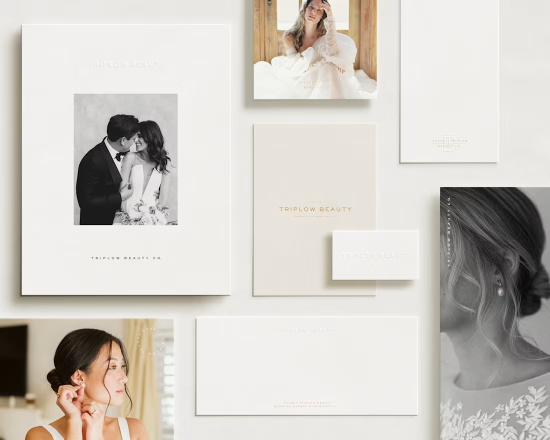
We created a brand identity for Stacey Triplow Beauty that speaks to the artistry of bridal beauty. Where every detail is considered, every moment feels intentional, and every bride is made to feel extraordinary.
The submark weaves together elegant geometry with a whisper of romance, a monogram that feels both modern and heirloom. Clean lines. Refined proportions. The kind of mark that looks as beautiful embossed on textured paper as it does illuminated on a screen.
This is branding for a business built on transformation and trust. One that deserves a visual language as sophisticated as the experience it creates. 🤍
2
27
164
Branding with purpose, authenticity, and transformation. ✨
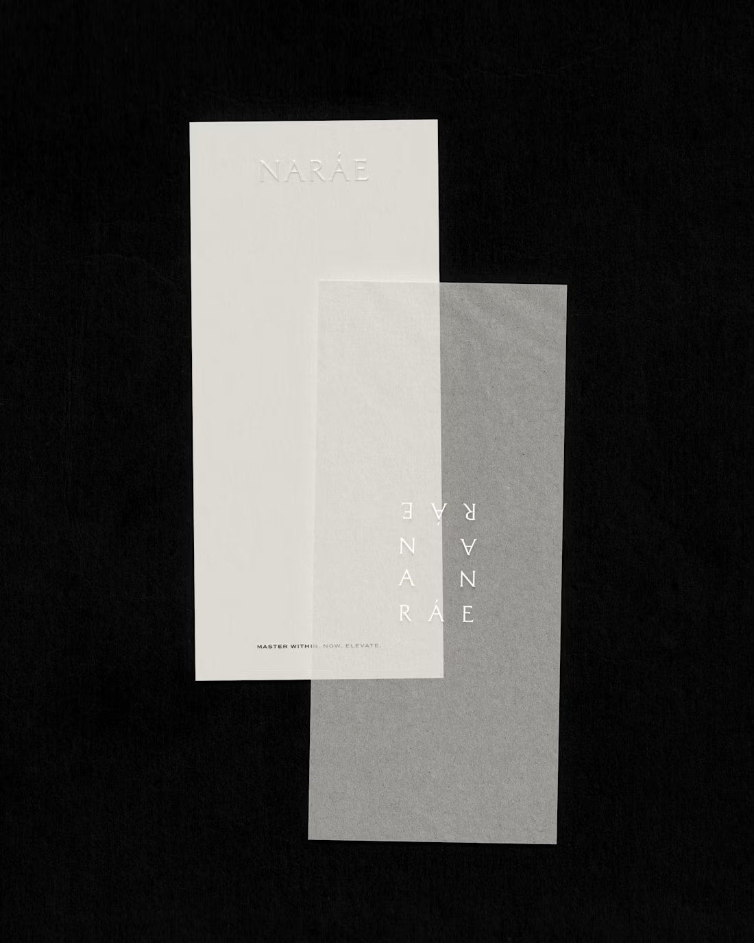
We’re so excited to share our latest project for Naráe Coaching; a brand dedicated to empowering individuals to live with intention and confidence. For this branding, we focused on capturing Naráe’s mission to inspire personal growth and fulfillment through thoughtful design elements:
The Submark: A refined focus on the “N” in Naráe, symbolising the starting point of transformation and the strength found within.
The Secondary Logo: A creative rectangle featuring the word “Naráe” repeated, representing the balance, structure, and intentionality that Naráe Coaching helps their clients achieve.
Every detail was crafted to reflect Naráe’s commitment to helping people create lives they truly value. 🤍
27
161
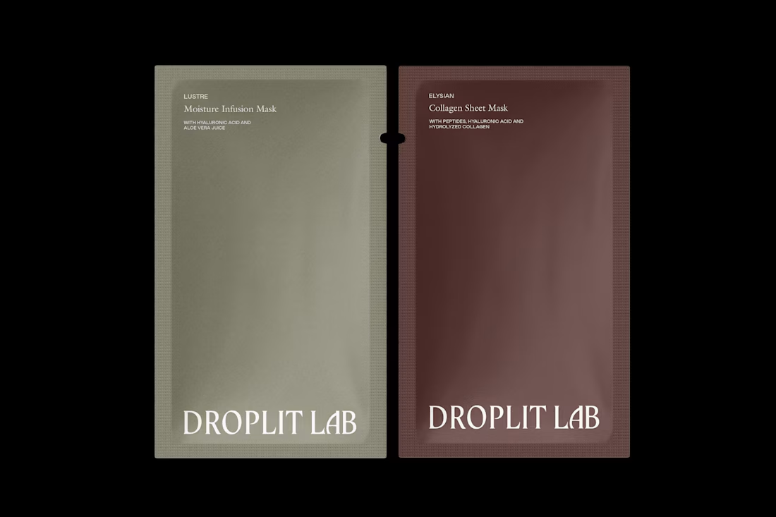
Sharing unused concepts for Droplit - a glimpse into our creative process behind the scenes. Not every concept makes it to launch, but each one plays a part in shaping the final brand.
Exploring different directions helps us push creative boundaries and discover what truly fits. We believe every concept, chosen or not, holds value and insight. Unused ideas are never wasted - they’re part of building bold, thoughtful brands.
13
128
When designing the brand identity for Mandy & The Med Spa, we focused on creating a visual and emotional experience that aligns with their mission: revolutionising skincare routines and empowering women to feel confident in their unique beauty.
From the colour palette, which exudes trust and sophistication, to the typography, carefully selected to balance modernity and approachability, every design decision was rooted in their vision for connection and empowerment.
A strong brand doesn’t just make a company look good, it creates a foundation for building trust, forming relationships, and communicating values. This is where design meets purpose.
Reach out to us today and let’s craft a brand that feels as beautiful and unique as the story it tells.🤍
13
113
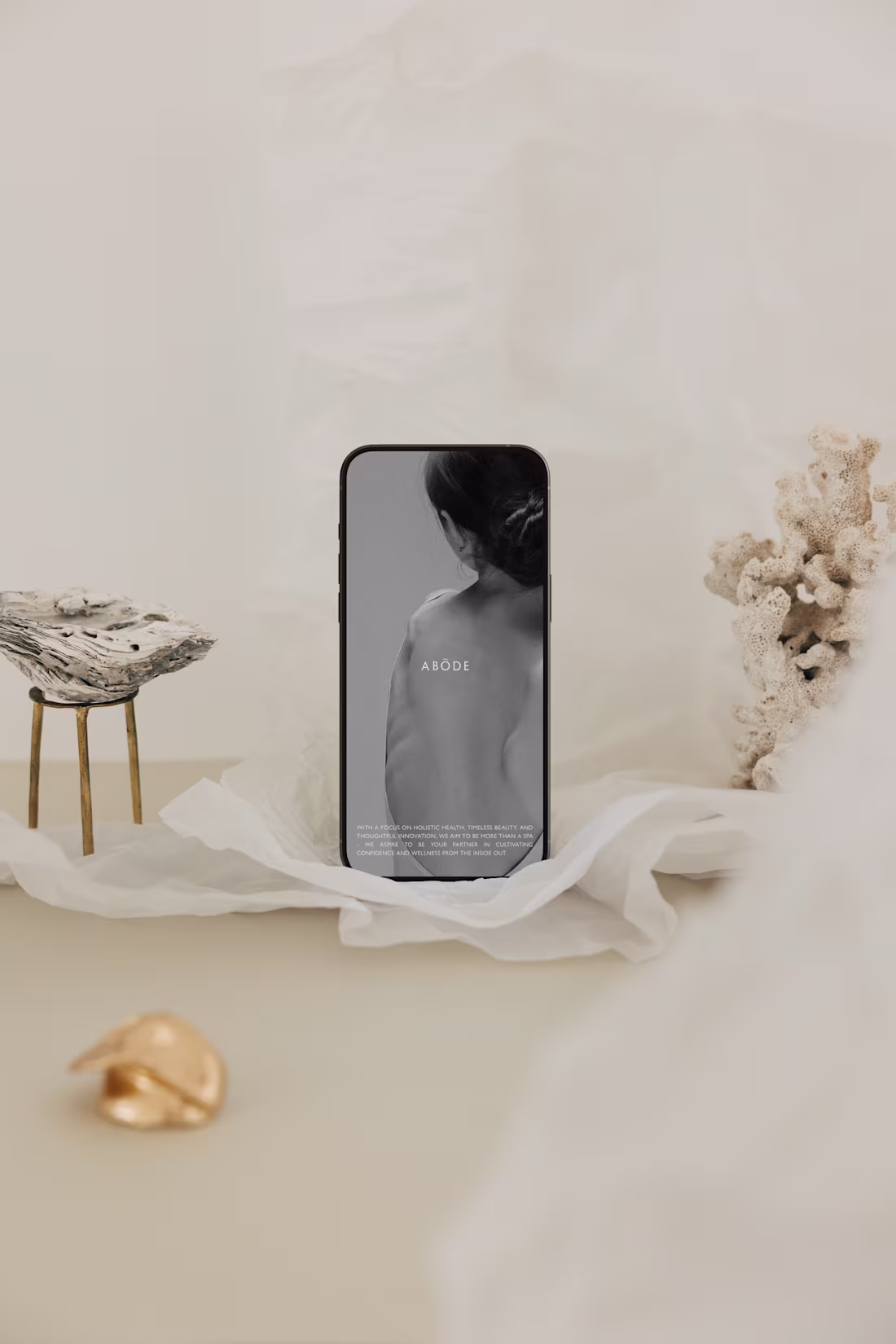
Not every concept is meant to be used but every concept plays a role.
When we began crafting the brand identity for Abōde Skin & Wellness, our goal was to bring their vision to life: a sanctuary where self-care feels as natural as coming home. We explored multiple directions, each designed to capture the essence of luxury, authenticity, and holistic wellness.
This unused concept was one of those explorations. While it didn’t make the final cut, it was a stepping stone that helped us refine the brand’s voice and visual story. It taught us what felt right for Abōde and, just as importantly, what didn’t.
Branding is a process of discovery. Every iteration, even the unused ones, brings clarity and brings us closer to creating something truly aligned with the heart of the brand.
22
173
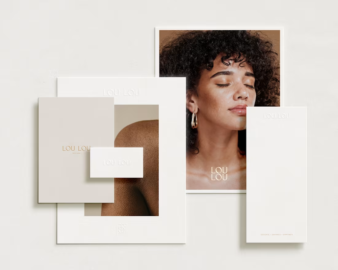
Brand Identity Development for Lou Lou Med Spa
0
0