Sofia Kozanidou
Brand strategy and identity for founders who prefer clarity.
New to Contra
Sofia is ready for their next project!


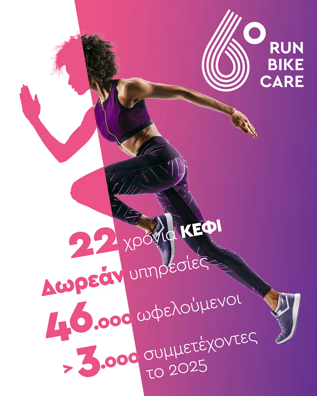
Brand Strategy for ΚΕΦΙ NGO
0
3
Brand Identity Creation for Astraean
0
14
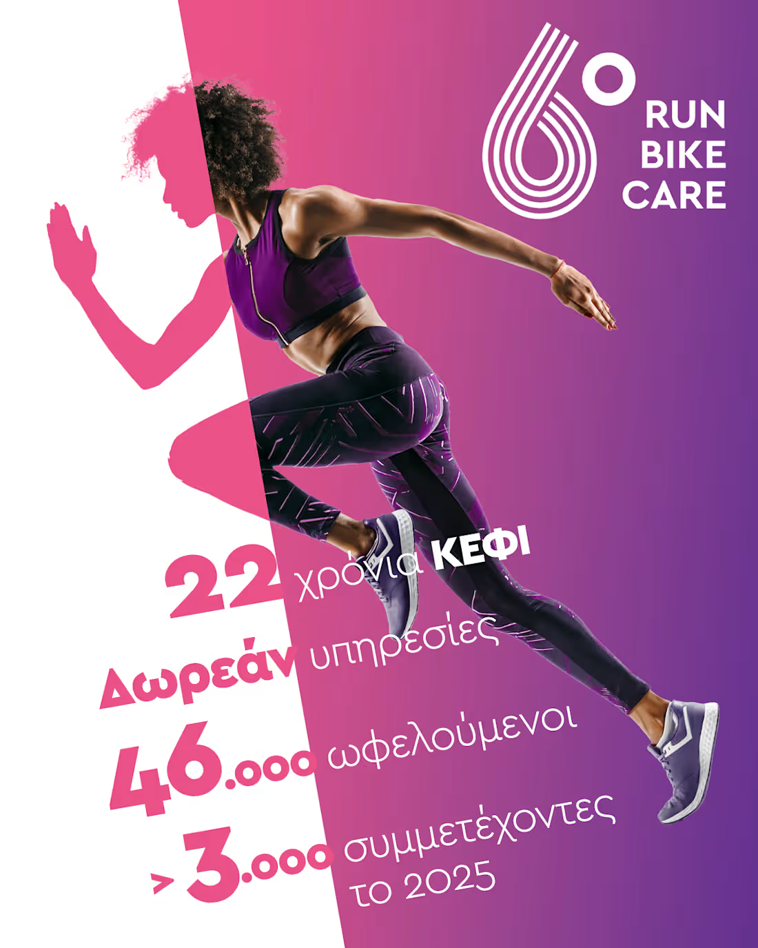
Brand Strategy · Communication Architecture · Social Media for ΚΕΦΙ | Greek Cancer Patients Association
The challenge
ΚΕΦΙ has been operating for decades. It runs 12 conferences a year, hosts 120 speakers, serves 3,000 attendees, and maintains 12 ongoing patient support groups. The work is real, consistent, and meaningful. The communication was none of those things.
An established NGO with deep roots and a long track record — but no coherent brand identity, no tone of voice, no content strategy to match the scale of what it actually does. And a subject matter that demands both sensitivity and authority: cancer, in all its dimensions: patients, caregivers, doctors, prevention. Getting the communication wrong here doesn't just underperform. It alienates the people it's supposed to reach.
The approach
Strategy first. Before any visual or any post, the work began with a thorough audit: existing communication materials, organizational history, audience mapping and personas and a competitive review of how peer organizations — in Greece and internationally — position themselves in this space.
The benchmark work covered leading cancer advocacy organizations across Europe and the US, identifying what works (credibility through expertise, community through storytelling, clarity in calls to action) and what doesn't (clinical distance, charity-speak, trauma-centered messaging that disempowers rather than supports). From this, a clear direction emerged: warm but credible, expert but human, never clinical, never pitying.
That direction became the foundation for everything that followed — a positioning document, defined content pillars, tone of voice guidelines, and a framework that could survive internal handover.
What was delivered
A complete brand strategy and communication direction document — the reference point every subsequent decision was checked against.
A content architecture: thematic pillars covering medical education, patient support, prevention, events, and advocacy, each with its own messaging logic and format guidelines.
A visual identity system applied consistently across channels — built to work across a fragmented archive of legacy materials and new content alike.
Editorial oversight: reviewing and shaping content before publication, coaching the internal team toward independence.
The information architecture and design direction for a new website (WordPress), structured to serve multiple, distinct audiences simultaneously: patients, caregivers, healthcare professionals, and the general public.
1
64
Astraean.
Brand, voice, and website for the other Mykonos.
Naming · Strategy · Identity · Copy EN/GR · Website · Print | Mykonos, 2026
OVERVIEW
Chrysoula came to us with a word she loved, Αστραία, and a practice: craniosacral therapy. Behind her, twenty-five years on Mykonos:
initiation in a house where nothing was charged for, a year as guardian of
Delos, twelve years running a Greek koutoûki, a deliberate return to healing.
In front of her, nothing.
No identity, no site, no clear service list. Not even a settled spelling of her own name in the language her clients speak.
CHALLENGE
Mykonos is the loudest brand in the Aegean, and it means the opposite of this work. Wellness is a saturated category, and energy healing claims nothing on its own.
So we refused to sell healing, and sold access instead. Twenty-five years on the island. A former guardian of Delos. A home on its last unbuilt shore. A method can be copied. A biography cannot.
PROCESS
The first deliverable was the name itself: its exact form and its English spelling, Astraean, the word that means of the stars. A brand for international travellers cannot change shape depending on who writes it.
Then the position, written before anything was drawn, and drawn out of her rather than invented for her:
The Unseen Mykonos
Everything else grew from that sentence. The target audiences, the brand colours, the brand tone of voice.
Two identity routes, argued from strategy rather than taste. A nine-page architecture, service by service, until the offering matched the truth of the practice. A full copy deck in English and Greek, reviewed with her line by line, with three Greek words set into the English like stones: Να είμαι, Δήλος, Μοροέργο.
The brief banned the words every wellness site leans on: journey, transform, unlock, magical, awaken.
The site was built on WordPress and customised until it stopped resembling a theme, with a dedicated hotels page opening a B2B channel from day one. Cards and tent cards went from our desk straight to the printer. She approved artwork. She chased no one.
OUTCOME
Astraean launched with a position no competitor can occupy, one voice in two languages across every touchpoint, and two channels: travellers, and the hotels that reach them first. Chrysoula runs it herself.
Astraean is not something you visit. It is something you return to.
1
67