
Shreyash Barot
Digital Product Designer


Atelier Studio: Beauty & Salon - Self-care, Designed Better. ✂️✨
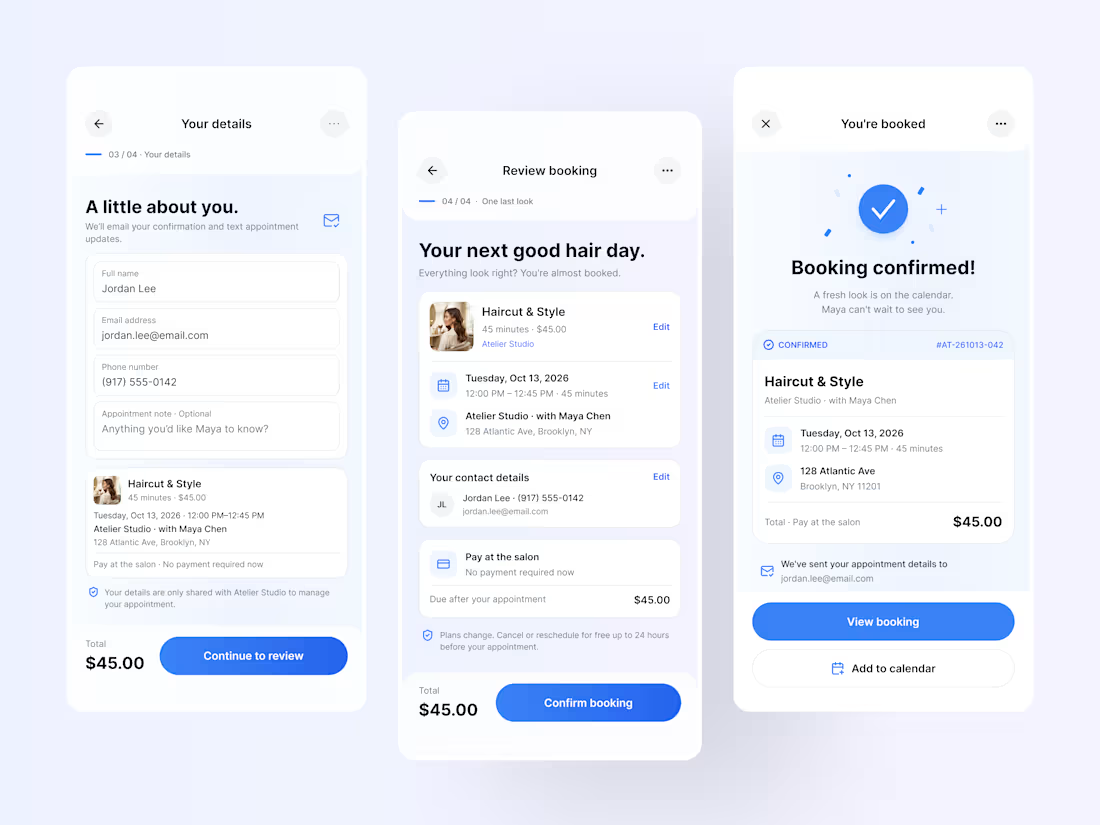
Atelier Studio: From Booking to Beautifully Confirmed ✓
Great experiences don't end when you choose a service. They continue right through the final confirmation.
This next part of the Atelier Studio concept explores the final steps of a salon booking journey, from entering customer details and reviewing appointment information to receiving a clear, reassuring confirmation.
The goal was to make the final stage feel effortless and trustworthy, with transparent pricing, editable booking details, clear appointment information, and a confirmation screen that leaves no room for uncertainty.
Designed with intention:
— Simple, user-friendly customer forms
— Clear appointment summaries
— Transparent pricing and payment details
— Easy-to-review booking information
— A reassuring confirmation and calendar experience
Every interaction has a purpose. Every detail builds confidence.
Because thoughtful UX isn't just about helping people complete a task. It's about making them feel confident every step of the way.
Project: Atelier Studio
Focus: UI/UX Design · Mobile App Design · Product Design
Tools: Figma
Part of a personal concept exploring a seamless, end-to-end salon booking experience.
What matters most to you in a great booking experience: speed, clarity, or flexibility?
2
3
44
Atelier Studio: Beauty & Salon - Self-care, Designed Better. ✂️✨
Service Discovery & Appointment Selection
A little refresh, a lot of you.
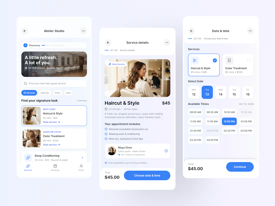
Introducing Atelier Studio, a modern salon booking app concept designed to make finding your next salon experience feel effortless.
From discovering services and exploring stylist details to selecting your preferred date and time, every screen is thoughtfully designed to bring clarity, simplicity, and a touch of elegance to the booking journey.
The visual direction combines a soft lavender palette, vibrant blue accents, clean typography, and carefully structured components to create an experience that feels as good as it looks.
The experience focuses on:
— Seamless service discovery
— Clear, informative service details
— Intuitive appointment scheduling
— Easy-to-scan layouts and visual hierarchy
— A consistent, premium mobile experience
The idea is simple: less friction in booking, more time for self-care.
Project: Atelier Studio
Focus: UI/UX Design · Mobile App Design · Product Design
Tools: Figma
What do you think of the direction? I'd love to hear your feedback.
1
44
Sharing a logo for Rootlogic - a brand that stands for clarity, momentum, and smart digital solutions.
The mark is built using clean geometric strokes that create a sense of flow + structure, while the bold red accent adds energy and instant recognition.
Why this identity works:
• Minimal form → Maximum recall
• Strong rhythm → Shows progress & movement
• Scalable design → Works from app icon to full brand system
Crafted to feel simple, modern, and unmistakably Rootlogic.
Thoughts? 👇
#BrandIdentity #LogoDesign #ModernLogo #IdentityDesign #VisualBranding #DesignShowcase #CaseStudy #ContraCreators #DigitalDesign
2
12
782
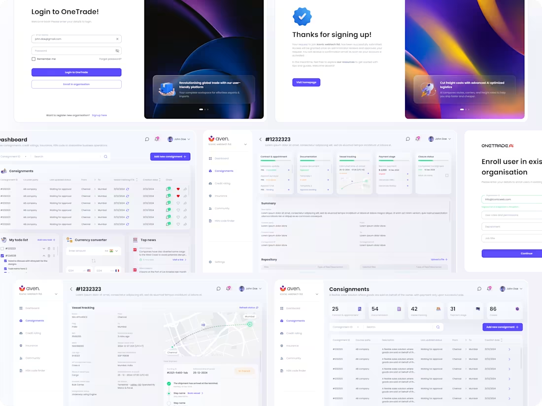
OneTrade - Trade & shipment management platform
11
38