
Shireen Zainab
Website & Mobile App Designer
New to Contra
Shireen is ready for their next project!
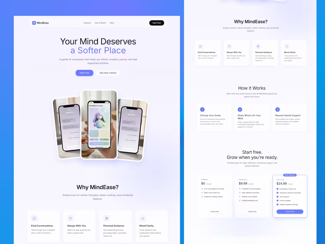
Designed a calming, conversion-focused landing page for MindEase — an AI-powered mental wellness platform built to support emotional clarity, journaling, mindful routines, and gentle self-reflection.
This project focused on creating a soft, trustworthy digital experience that blends modern SaaS structure with wellness-centered design. From the hero section to feature blocks, onboarding flow, and pricing strategy, every section was crafted to feel emotionally safe, visually clean, and easy to navigate.
The goal was simple: design a platform that feels supportive from the very first scroll.
Key focus:
• Calm, premium UI/UX
• Soft blue/lavender wellness palette
• Clear product storytelling
• Conversion-driven landing structure
• Emotional trust + simplicity
• Modern SaaS + wellness balance
A thoughtful design approach for mental wellness products that need both clarity and compassion.
1
8
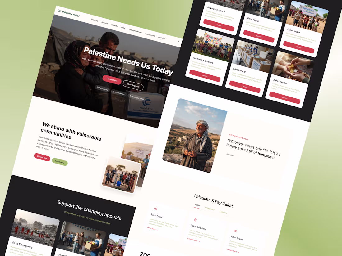
esigning for impact is different from designing for looks.
This charity donation website was created with one goal in mind —
make it easier for people to take action.
Most NGO websites struggle with clarity.
Too much information, weak hierarchy, and confusing donation flows.
This design focuses on solving that.
A clear hero section builds emotional connection instantly.
Strong call-to-actions guide users without hesitation.
Each appeal is structured in a simple, scannable way so users can quickly decide where to contribute.
The entire experience is designed to reduce friction —
less thinking, faster action.
Because when it comes to donations,
every second and every click matters.
2
1
20
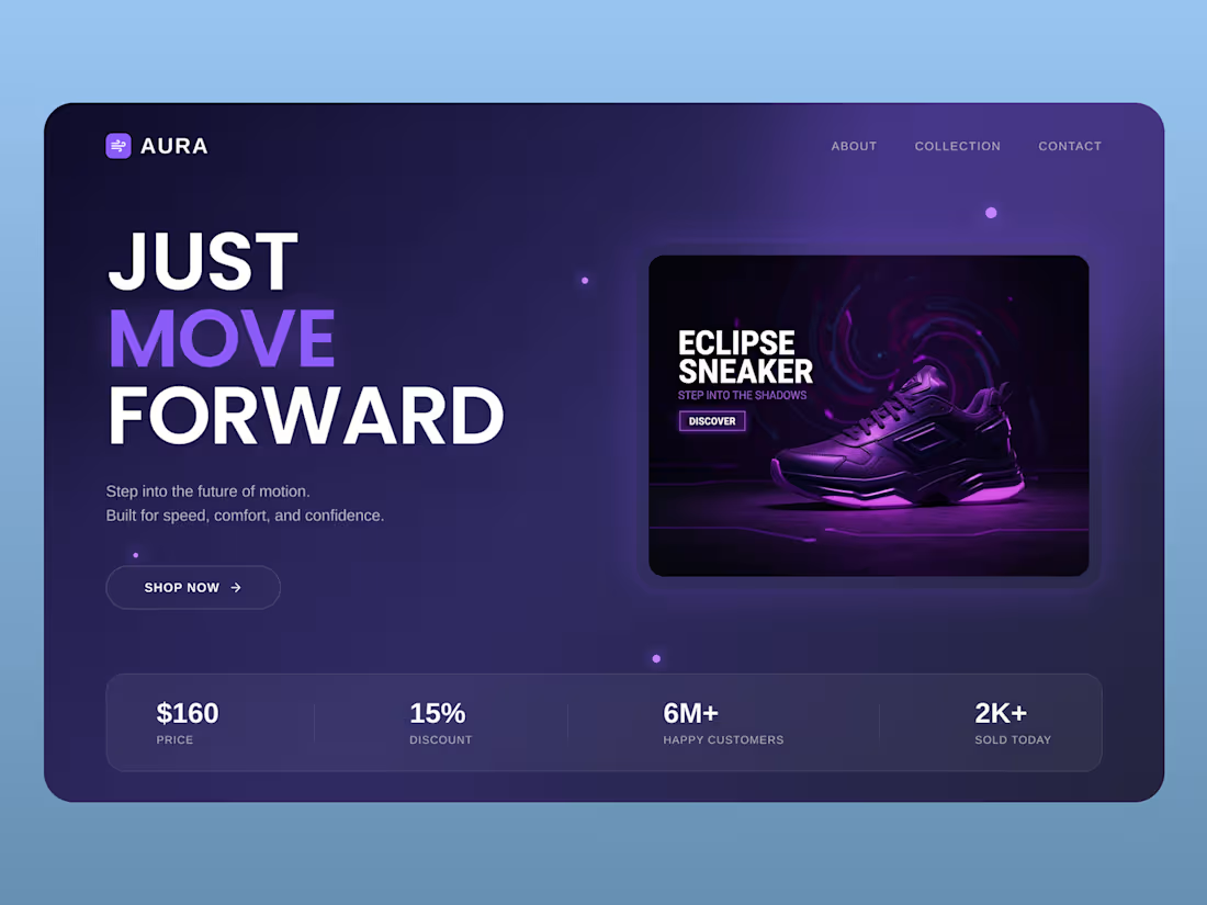
A modern sneaker landing page with a bold purple neon aesthetic.
Clean layout, strong typography, and a product-focused design create a premium and futuristic user experience.
1
16
This project is a complete UI/UX redesign of a dental clinic website focused on improving clarity, structure, and user experience.
The original design had all the right content — but lacked hierarchy, flow, and visual direction.
So instead of changing everything, I focused on what actually matters:
• Clear layout structure
• Strong visual hierarchy
• Better content spacing
• Conversion-focused CTA placement
• Clean, modern healthcare aesthetic
Same content.
Same brand colors.
Completely different experience.
The result?
A design that feels more premium, easier to navigate, and built to convert.
Good design is not just about visuals —
it’s about making decisions easier for the user.
1
5
49
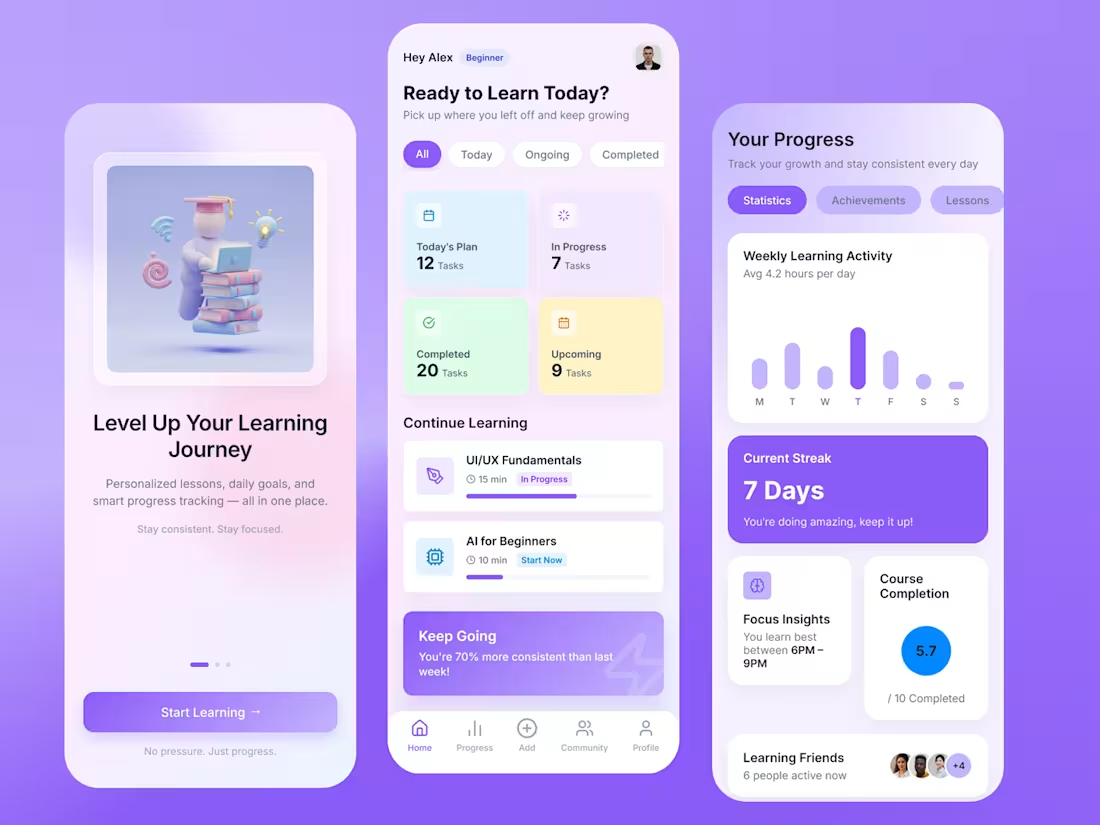
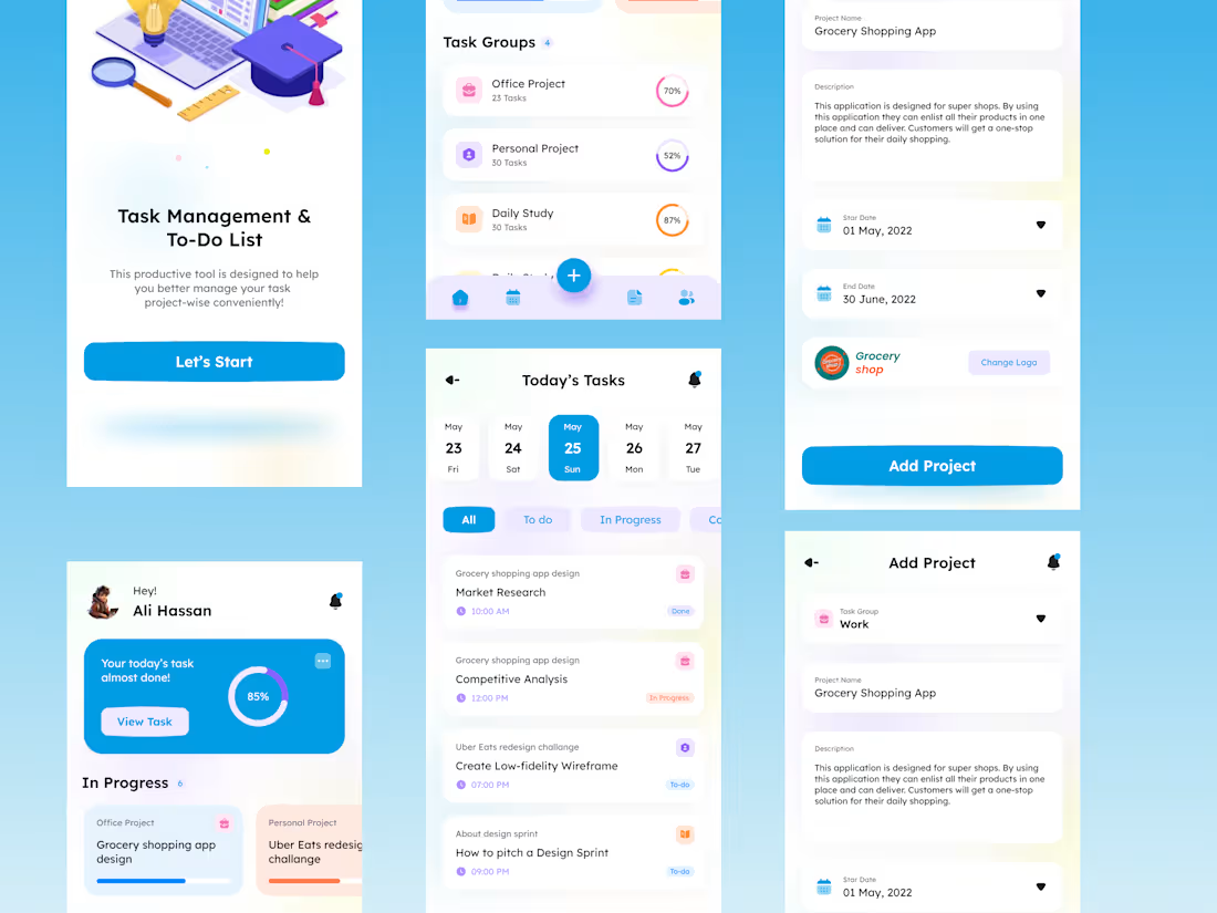
Designed a modern mobile learning application focused on improving user engagement and retention through intuitive UX and clean UI.
The goal was to simplify the learning journey by combining onboarding, task management, and progress analytics into a cohesive and user-friendly experience.
Key design decisions included:
• Clear visual hierarchy for faster user understanding
• Data-driven dashboard for tracking daily progress
• Motivational elements like streaks and insights to improve retention
• Soft UI and modern gradients for a premium look and feel
This design is ideal for SaaS, EdTech, or productivity-based platforms aiming to deliver a seamless and engaging mobile experience.
2
4
53
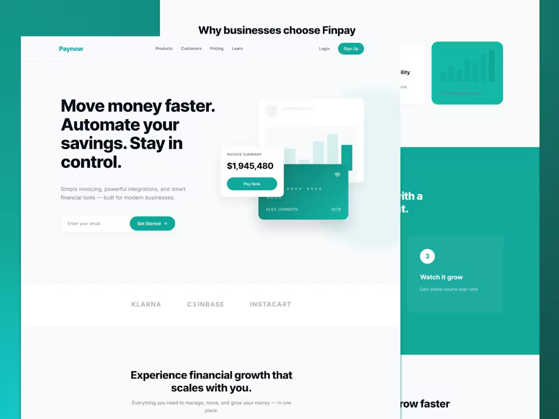
A modern fintech SaaS landing page
designed to simplify payments, automate
savings, and improve cash flow management.
This design focuses on creating a clean and
intuitive user experience while maintaining a strong
visual hierarchy and conversion-driven layout.
The goal was to make financial tools feel simple, fast, and accessible for modern businesses.
Key highlights include a bold hero section,
structured feature blocks, data visualization, and
a clear call-to-action strategy to guide users effortlessly
through the product.
Ideal for fintech startups, payment platforms,
and SaaS products looking to improve usability and
user trust through design.
3
4
82
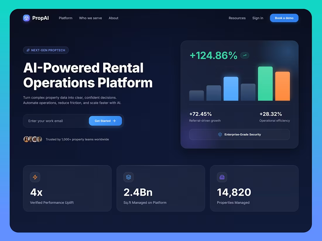
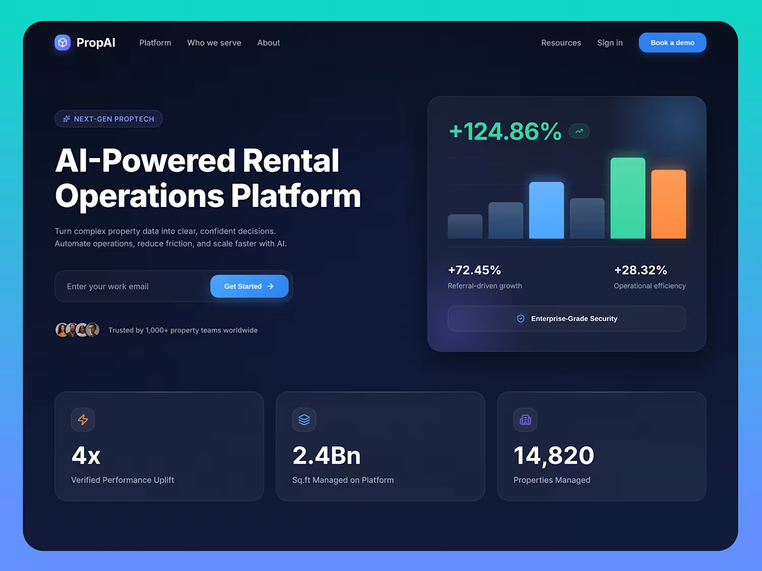
AI is changing real estate operations,
but most tools still feel complex and outdated.
This concept focuses on making rental operations
simple, clear, and easy to trust through a modern SaaS experience.
The idea was to turn complex property data into
something users can understand instantly and
act on with confidence.
Clean hierarchy, strong messaging, and a premium
dark UI help reduce friction and improve decision-making.
Every element is designed to show the right information at the right time nothing extra, nothing confusing.
The result is a scalable,
conversion-focused interface that feels powerful but effortless to use.
If you're building a SaaS, dashboard, or AI product, I can help design something that actually converts.
3
3
74
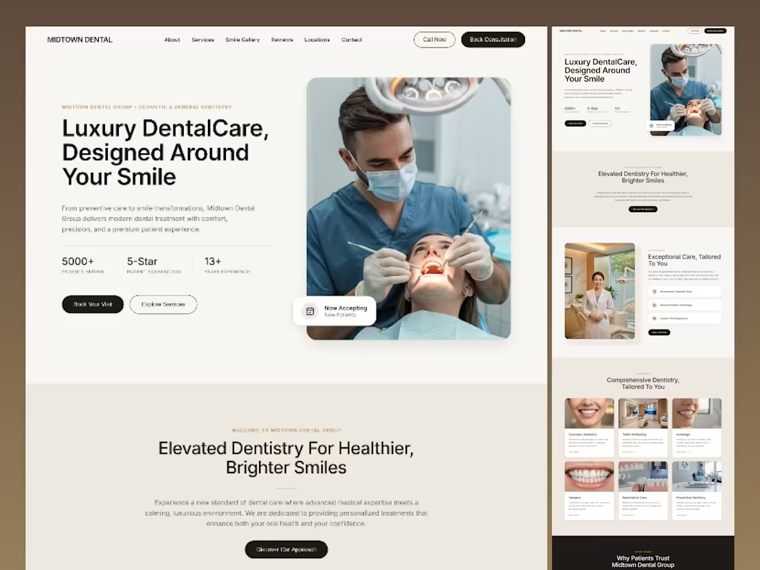
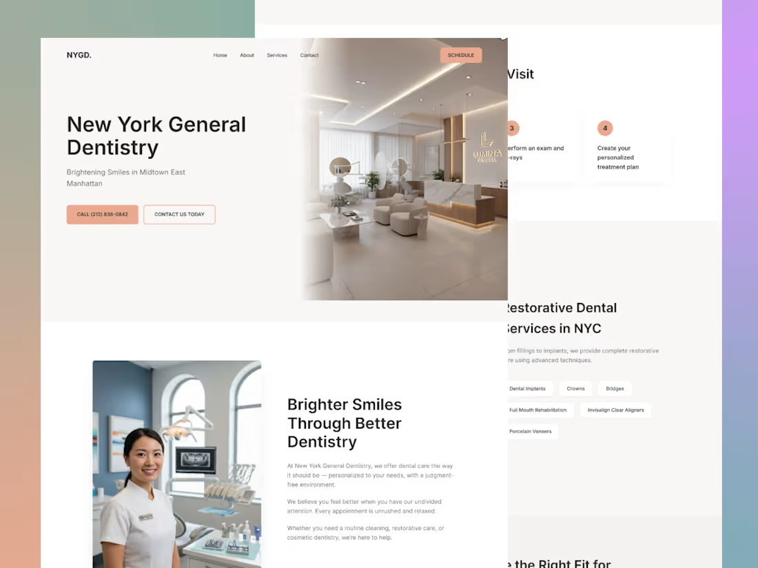
Most dental websites don’t have a
service problem hey have a trust problem.
This project focused on redesigning a dental
clinic website that felt outdated, visually heavy,
and difficult to navigate, despite offering high-quality care.
The goal was to transform the experience
into something that feels modern, premium,
and easy to trust from the first interaction.
The original design lacked clear hierarchy, relied
heavily on dark sections, and didn’t guide users effectively.
Important information felt scattered, services
were not easy to explore, and the overall experience
didn’t reflect the level of professionalism the clinic actually offered.
Instead of only improving visuals, the redesign focused
on how users perceive and make decisions.
The layout was restructured to create better flow,
spacing was refined to improve readability, and a
modern typography system (serif + sans) was introduced
to elevate the overall feel. A softer, more premium color
palette replaced the heavy contrast, helping the interface
feel calmer and more approachable.
Service sections were redesigned into clean, easy-to-scan cards,
making it simpler for users to understand their options.
Trust signals such as reviews, stats, and visual cues
were placed more strategically to support decision-making.
The hero section was completely reworked to create a strong first impression and clearly communicate value within seconds.
The final result is a website that feels more refined,
more intuitive, and more aligned with a high-end dental experienc.
It not only looks better but guides users more effectively, builds trust faster, and supports conversion in a natural way.
Because in healthcare, especially dentistry, people don’t just choose a service they choose a place they feel comfortable trusting.
If a website doesn’t create that feeling instantly, it loses the opportunity before the user even explores further.
4
4
65
A modern property management dashboard designed to simplify operations and improve decision-making.
This project focuses on creating a clean, intuitive SaaS experience where users can easily manage properties, track revenue, monitor lease expirations, and gain actionable insights — all in one place.
The design is built with a strong emphasis on usability, clarity, and performance:
✔ Clear data hierarchy for faster decisions
✔ Intuitive navigation and user flows
✔ Clean, modern UI with balanced colors
✔ Real-time insights and actionable components
✔ Scalable design system for future growth
From AI-assisted interactions to financial tracking and lease management, every element is crafted to enhance user experience and efficiency.
Tools: Figma
Focus: User-centered, conversion-driven UI/UX
If you're building a dashboard or SaaS product and need a design that actually works — let’s connect.
4
3
107
Breaking the rules of clean design to explore chaos.
This concept blends modern UI components with glitch typography, creating a bold and experimental visual direction. The idea was to push boundaries—mixing structured layouts with distorted, high-energy text styles.
Focus Areas:
• UI Layout Balance
• Experimental Typography
• Visual Noise vs Clarity
• Modern Dashboard Elements
Perfect for brands that want to stand out, disrupt, and grab attention instantly.
💬 Available for UI/UX & creative collaborations.
3
5
115
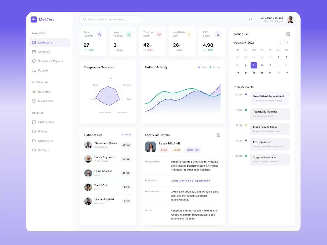
Designed a modern healthcare dashboard focused on clarity, usability, and data-driven decision making.
The goal was to create a clean and intuitive interface that allows healthcare professionals to easily monitor patient data, track activity, and manage schedules without cognitive overload.
The design emphasizes:
• Clear information hierarchy for faster insights
• Minimal and distraction-free layout
• Soft color palette with a premium SaaS feel
• Consistent spacing and component system
• Easy-to-read charts and patient analytics
From patient management to scheduling, every section is structured to improve workflow efficiency and user experience.
This project reflects my approach to UI/UX design:
Simple, functional, and focused on real-world usability.
Tools: Figma
Type: Dashboard UI / SaaS Product Design
1
2
61
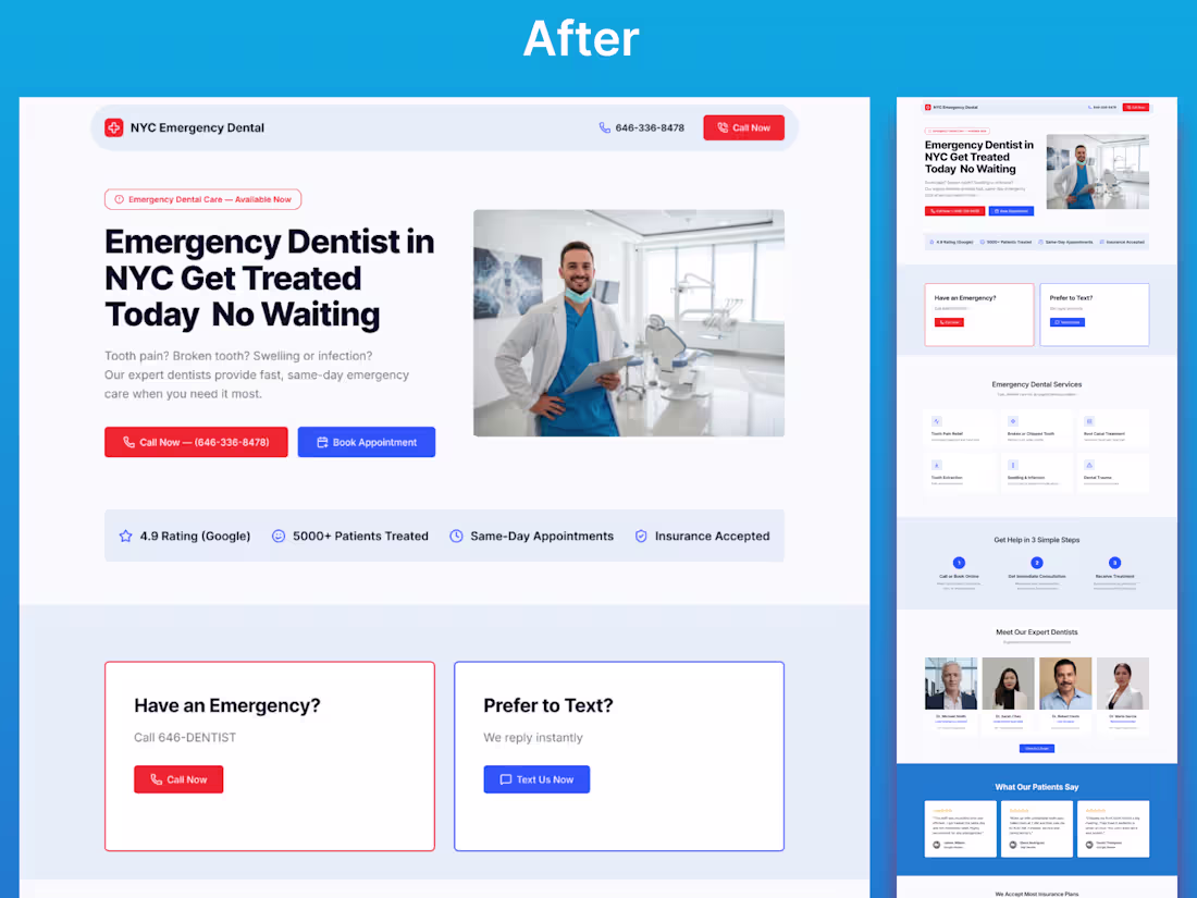
Most healthcare websites don’t fail because of bad design.
They fail because users don’t know what to do next.
This project focuses on redesigning an emergency dental website with one clear goal:
Turn confusion into immediate action.
Problem in the original design:
No clear primary CTA
Too many competing actions (Call, Text, Book)
Weak first impression
No urgency for emergency users
Poor visual hierarchy
Information overload
Users had to think… instead of act.
Solution in the redesign:
Strong, emergency-focused hero section
Clear “Call Now” primary action
Simplified user flow
Trust signals placed above the fold
Clean layout with better spacing and hierarchy
Reduced cognitive load for faster decisions
Outcome:
A modern, conversion-focused landing page designed to help users take action within seconds — especially in high-intent situations like dental emergencies.
This project highlights the importance of UX strategy over just visual design.
Because good design doesn’t just look better.
It performs better.
2
74
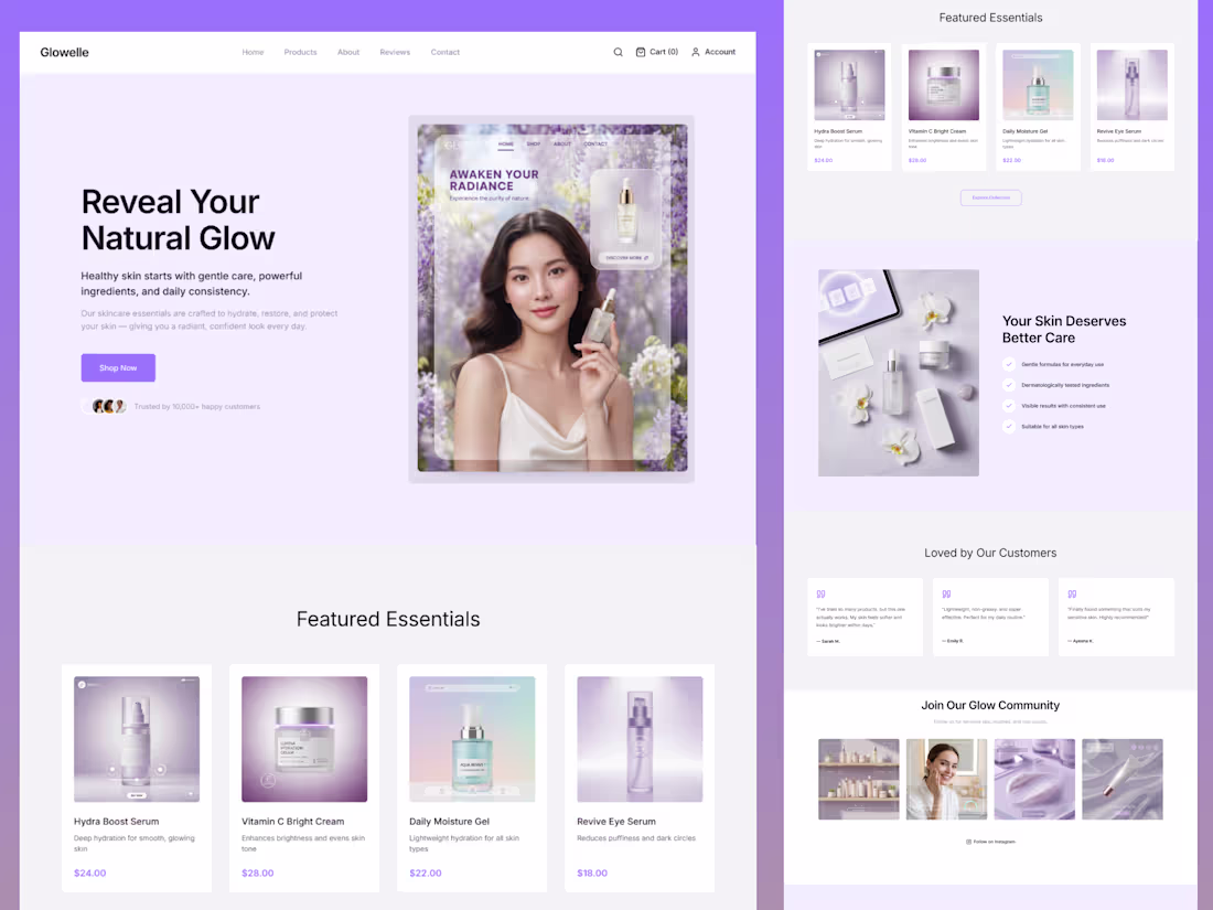
A modern skincare landing page designed with a soft, minimal, and premium aesthetic.
This concept focuses on creating a calming user experience using a pastel purple palette, clean typography, and well-structured sections. The layout highlights product visibility, brand trust, and smooth content flow to improve engagement and conversion.
The design includes:
– Hero section with strong visual focus
– Featured product showcase
– Benefits and trust indicators
– Customer testimonials
– Community/Instagram integration
The goal was to create a balance between beauty and usability — making the interface feel both elegant and functional.
Tools: Figma
Style: Clean • Minimal • Beauty • E-commerce
Available for freelance work.
1
2
142
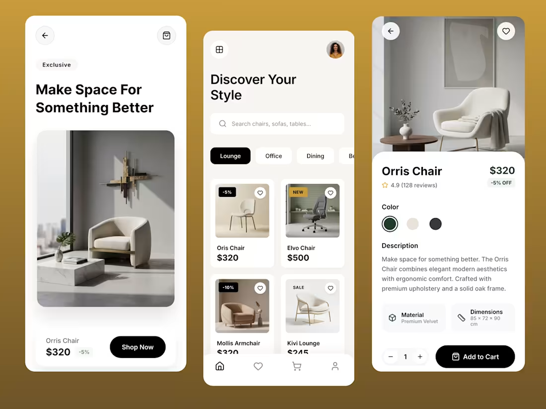
A modern furniture shopping app designed with a focus on simplicity, elegance, and user experience.
This concept explores a clean and premium mobile interface for browsing, discovering, and purchasing furniture. The design emphasizes soft layouts, minimal typography, and a calm neutral color palette to create a high-end feel.
The user journey flows through:
• A visually engaging landing screen
• A structured catalog with smart filtering
• A detailed product page optimized for conversion
The goal was to balance aesthetics with usability — making the experience both beautiful and intuitive.
Designed in Figma with a strong focus on spacing, hierarchy, and modern UI patterns.
4
121
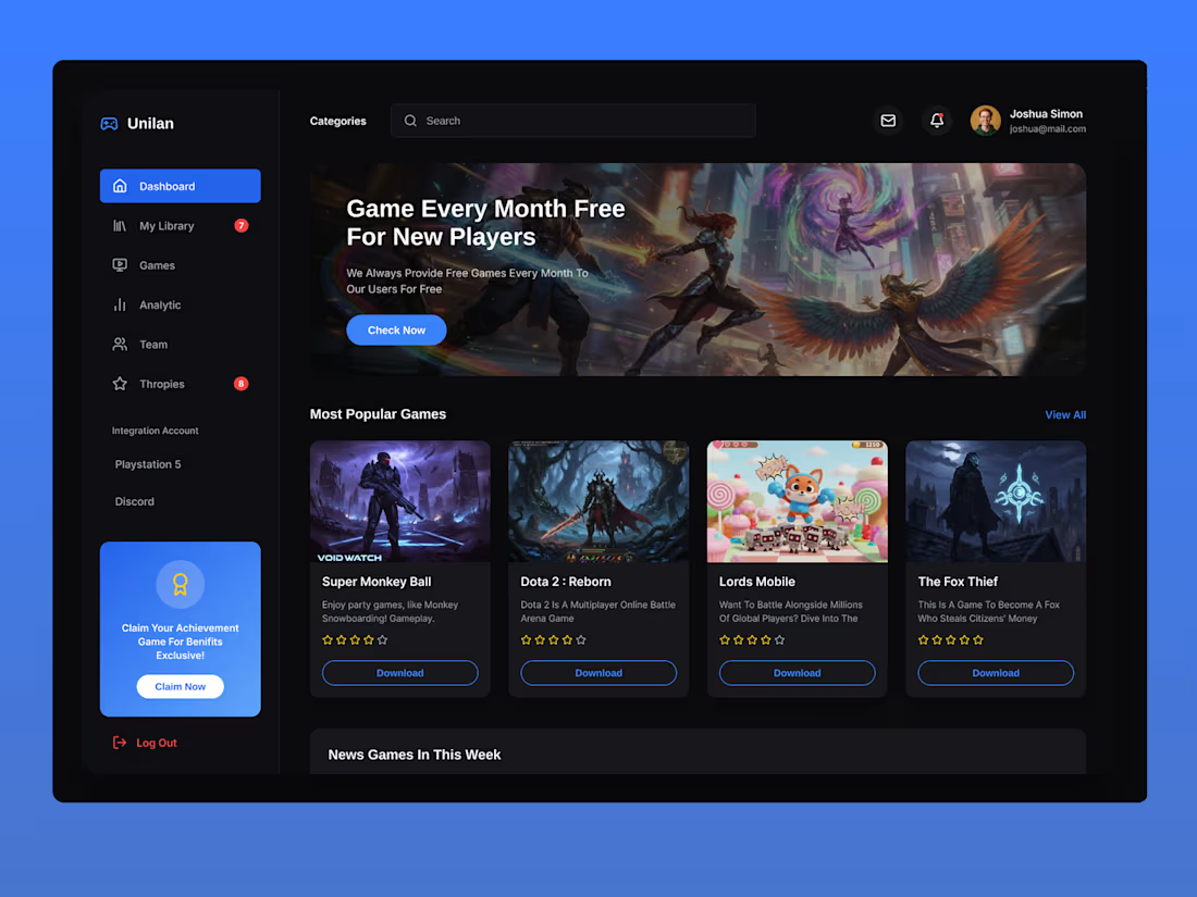
This project explores a modern gaming dashboard interface designed for a game launcher platform similar to Steam or Epic Games. The goal was to create a clean, immersive, and user-friendly interface that allows players to easily discover, download, and manage games.
The design uses a dark mode gaming aesthetic with neon blue accents, soft shadows, and card-based layouts to highlight game content. The interface includes a sidebar navigation, search functionality, game library sections, popular games showcase, and a promotional hero banner.
Key design elements include:
• Dark modern gaming UI
• Card-based game layout
• Sidebar navigation for quick access
The design focuses on clarity, visual hierarchy, and smooth browsing experience, making it ideal for game platforms, launchers, or digital game stores.
Tools used: Figma
1
2
105
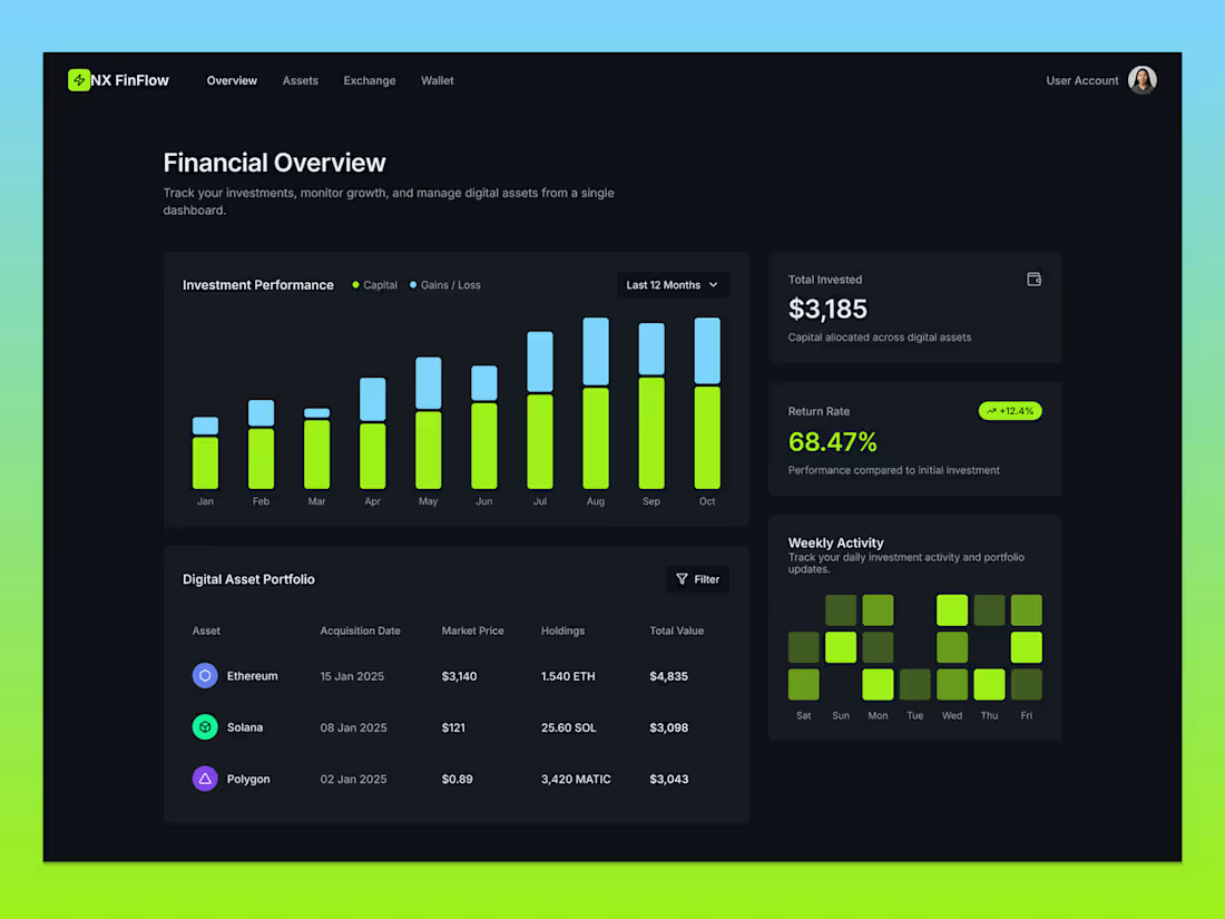
Exploring a modern financial dashboard interface designed for tracking digital investments and portfolio performance.
This concept focuses on clarity, data visualization, and usability. The interface allows users to monitor investment growth, analyze performance trends, and manage their digital assets from a single workspace.
Key design highlights:
• Clean dark fintech interface
• Investment performance analytics chart
• Portfolio management table
• ROI and total investment overview cards
• Weekly activity visualization
• Structured data hierarchy for better readability
The goal of this design was to create a simple yet powerful dashboard experience that helps users understand their financial data quickly.
Designed with a focus on minimalism, modern UI patterns, and data clarity.
1
95
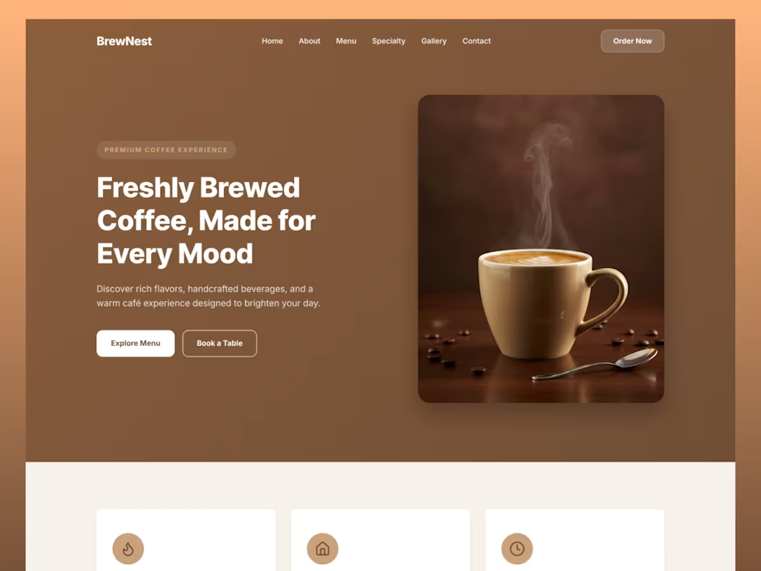
I designed a modern and elegant coffee shop landing page UI for a fictional café brand called BrewNest. The goal was to create a warm and inviting digital experience that reflects the comfort and richness of a real café atmosphere.
The layout focuses on clear hierarchy, warm brown color tones, and minimal UI elements to guide users smoothly from discovering the café to exploring the menu and booking a table.
Key sections include:
• Hero section with strong visual storytelling
• Feature highlights (fresh beans, cozy atmosphere, fast service)
• Crafted coffee selection categories
• Coffee menu cards with pricing
• Image gallery for brand atmosphere
The design emphasizes usability, readability, and emotional connection, making it ideal for café, restaurant, or coffee brand websites.
Tools Used:
Figma / UI Design System
2
3
122
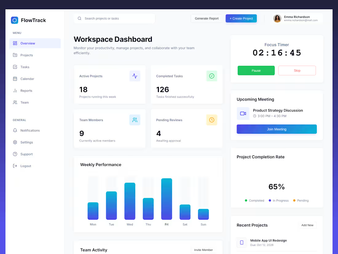
I designed a modern SaaS project management dashboard focused on clarity, productivity, and team collaboration.
The goal was to create a clean interface where users can quickly monitor projects, track performance, and manage tasks without unnecessary complexity.
The dashboard includes key productivity components such as:
• Project statistics overview
• Weekly performance analytics
• Focus timer for deep work sessions
• Upcoming meeting reminders
• Project completion tracking
• Recent projects list
The UI uses a minimal layout, soft shadows, and a gradient color system to keep the interface visually engaging while maintaining usability.
The design prioritizes clear hierarchy, readable data visualization, and efficient workspace management making it suitable for modern SaaS platforms and productivity tools.
Tools used: Figma
1
2
109
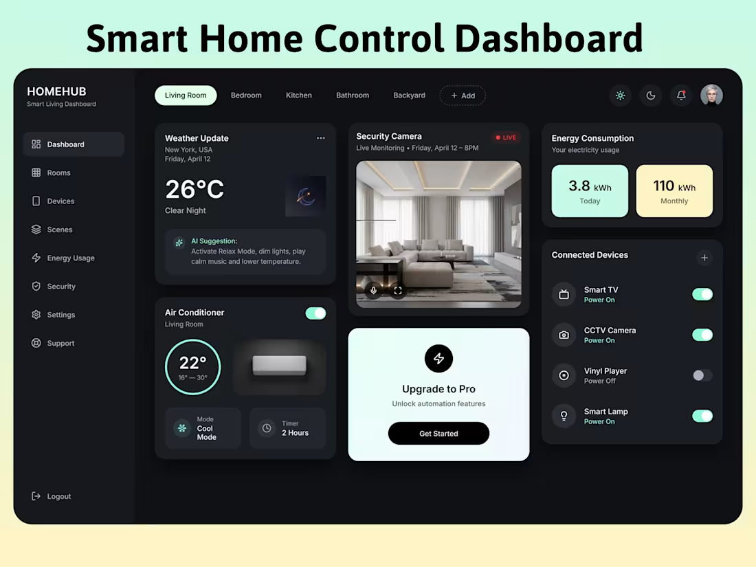
Modern Smart Home Dashboard UI Design created for a home automation system that allows users to control devices, monitor energy consumption, and manage security cameras in a single interface.
The design focuses on clean layout, dark UI aesthetics, and intuitive interaction, making it easy for users to monitor their smart home environment. The dashboard includes weather updates, CCTV monitoring, energy usage statistics, connected device controls, and air conditioner temperature management.
The interface follows modern SaaS dashboard design principles with soft shadows, rounded cards, and minimal UI elements to create a premium smart living experience.
This concept demonstrates how IoT home automation platforms can deliver a seamless and visually engaging user experience while keeping complex controls simple and accessible.
1
84
SaaS Product UI/UX & App Experience Design
0
0
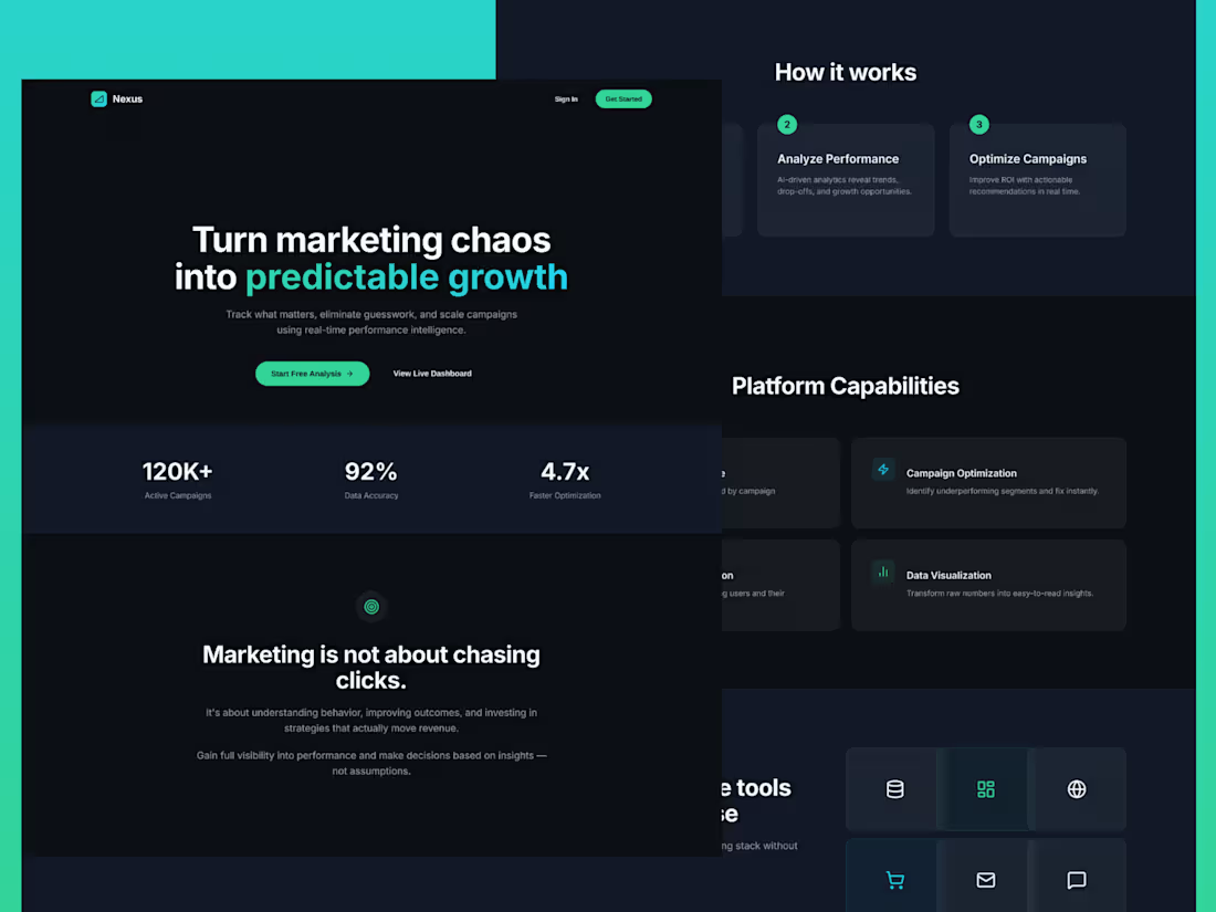
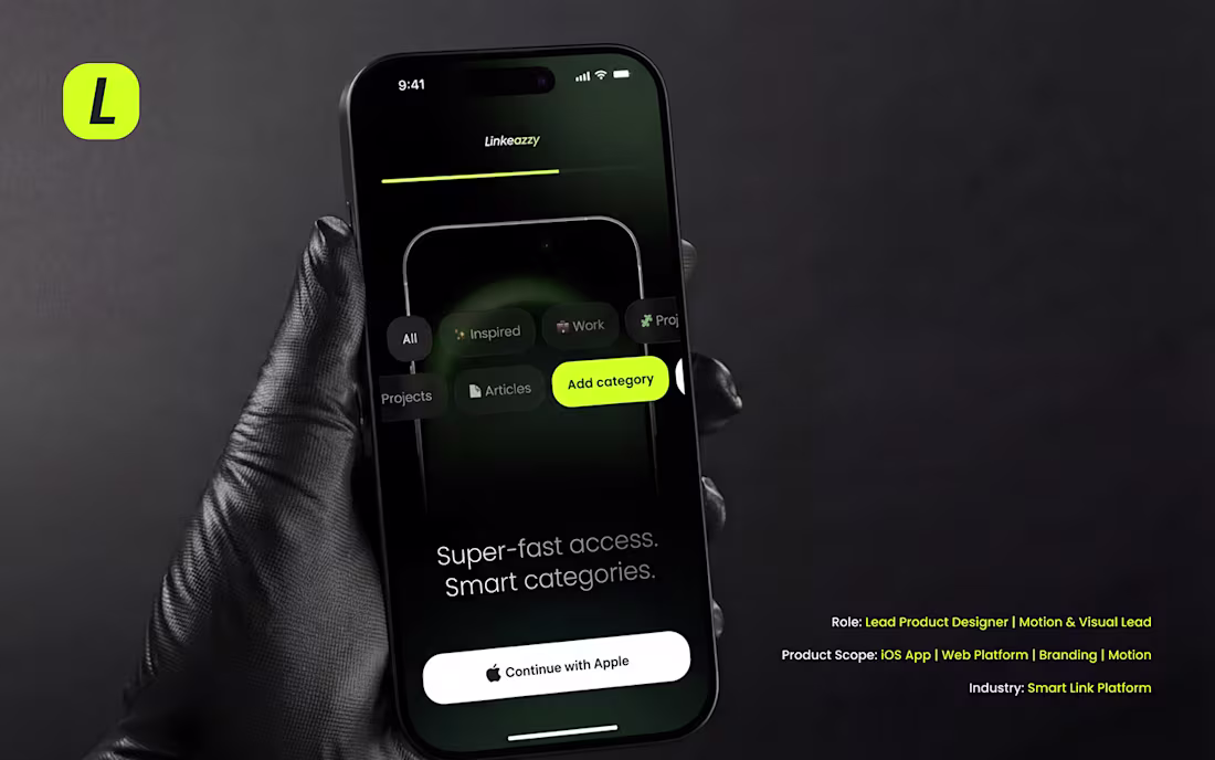
AI Marketing Analytics SaaS Landing Page UI Design | Dark Glassmorphism Dashboard
0
76
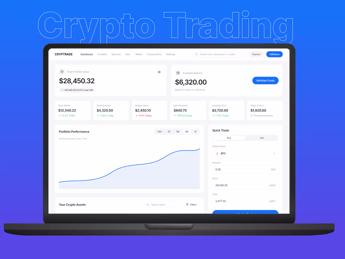
Crypto Trading Dashboard UI UX Design | Fintech Web App Interface
0
80
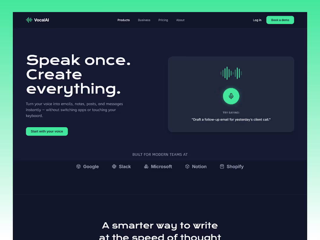
Voice AI SaaS Landing Page Design | Dark Futuristic UI/UX for Productivity Tools
0
99
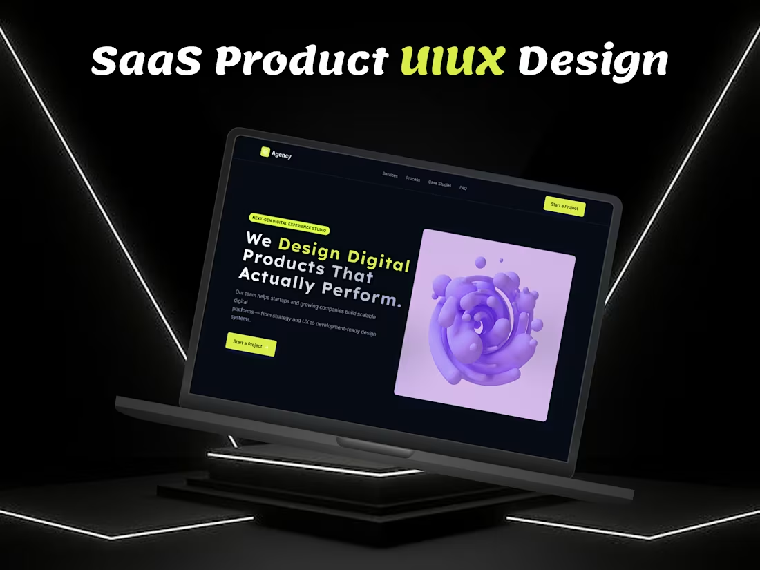
SaaS UI UX Design Agency | Conversion-Focused Product & Dashboard Design
0
102
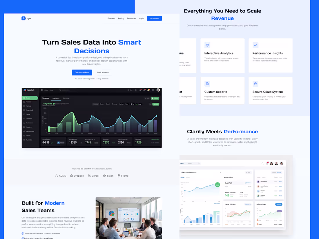
Sales Analytics Dashboard SaaS | Real-Time Revenue Insights
1
107
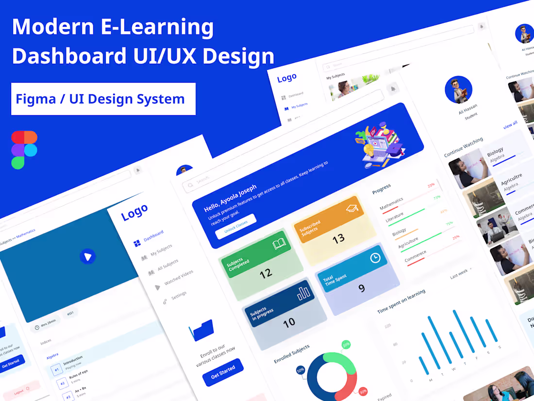
Modern E-Learning Dashboard UI/UX Design | Student LMS Web App Interface
0
100
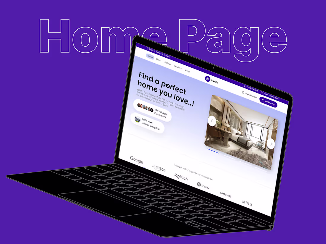
Premium Property Booking Website Design
0
113
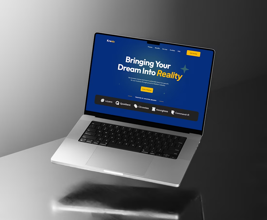
Modern SaaS Website Experience Design
0
148
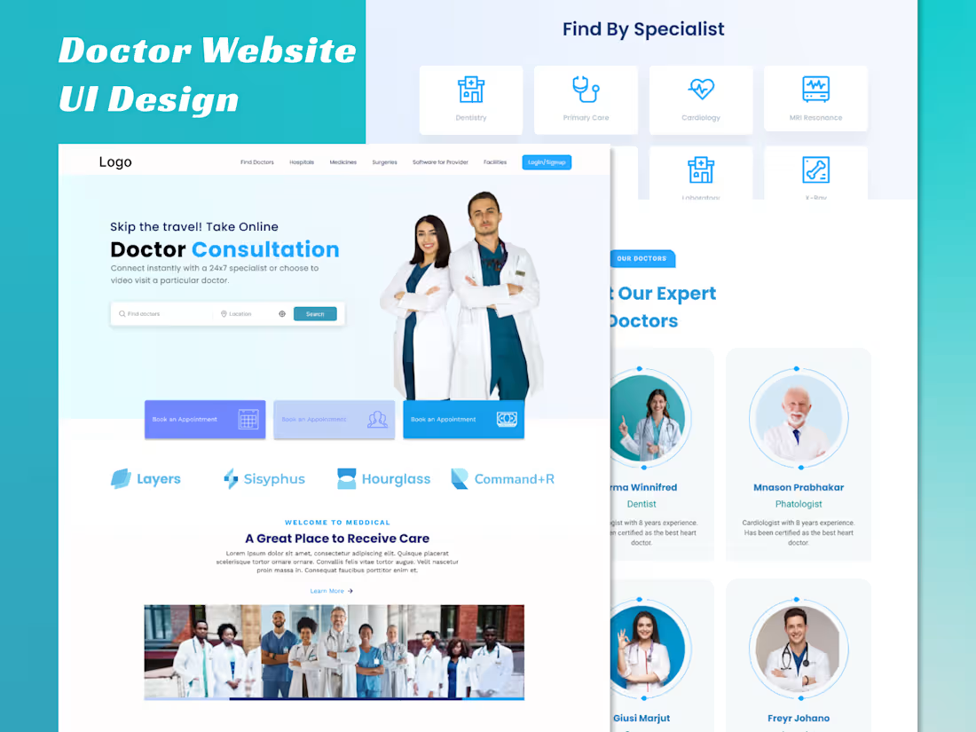
Online Doctor Consultation Platform UI
0
125