
SHIHAB SIKDER
Visualizing Ideas. Elevating Brands With Impact.
New to Contra
SHIHAB is ready for their next project!

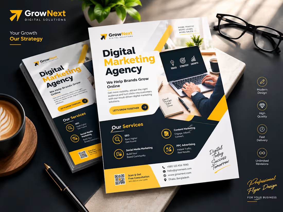
I Will Design a Premium Business Flyer That Attracts Clients & Converts
Looking for a flyer that doesn't just look good — but actually gets results?
You're in the right place. I design professional, print-ready business flyers that capture attention, communicate your brand clearly, and drive real action — whether it's calls, website visits, or walk-ins.
What You'll Get:
✅ Custom, modern flyer design tailored to your brand
✅ Strategic layout that guides the reader's eye
✅ High-resolution files (print + digital ready)
✅ Bold typography & professional color palette
✅ Icons, graphics & visual hierarchy — all included
Perfect For:
• Digital Marketing Agencies
• Local Businesses & Startups
• Events & Promotions
• Real Estate, Salons, Restaurants & more
Why Work With Me?
🎯 Result-Driven Design — Every element has a purpose
⚡ Fast Turnaround — Delivered within 24–48 hours
♾️ Unlimited Revisions — Until you're 100% satisfied
💎 High Quality — Pixel-perfect, print-ready files
📩 Message me before ordering — I'll make sure we're a perfect fit!
1
40
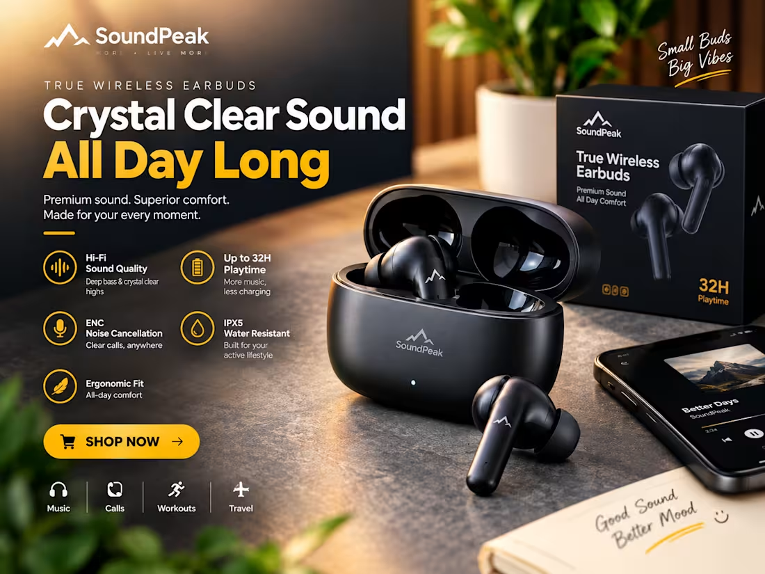
Premium Product Advertisement Design for SoundPeak Wireless Earbuds
I designed this premium product advertisement for SoundPeak True Wireless Earbuds, focusing on clear communication, modern branding, and strong visual impact.
The design highlights the product’s key features, including:
• Crystal-clear sound quality
• Up to 32 hours of playtime
• ENC noise cancellation for clearer calls
• IPX5 water resistance
• Comfortable ergonomic fit
• Use cases for music, calls, workouts, and travel
I used a bold black-and-yellow color palette, lifestyle product composition, clean typography, and feature-focused visual hierarchy to create an advertisement that feels premium, trustworthy, and conversion-focused.
This design is suitable for e-commerce stores, social media campaigns, product launches, paid ads, and marketplace promotions.
Looking for a high-converting product advertisement for your brand? Let’s work together.
1
54
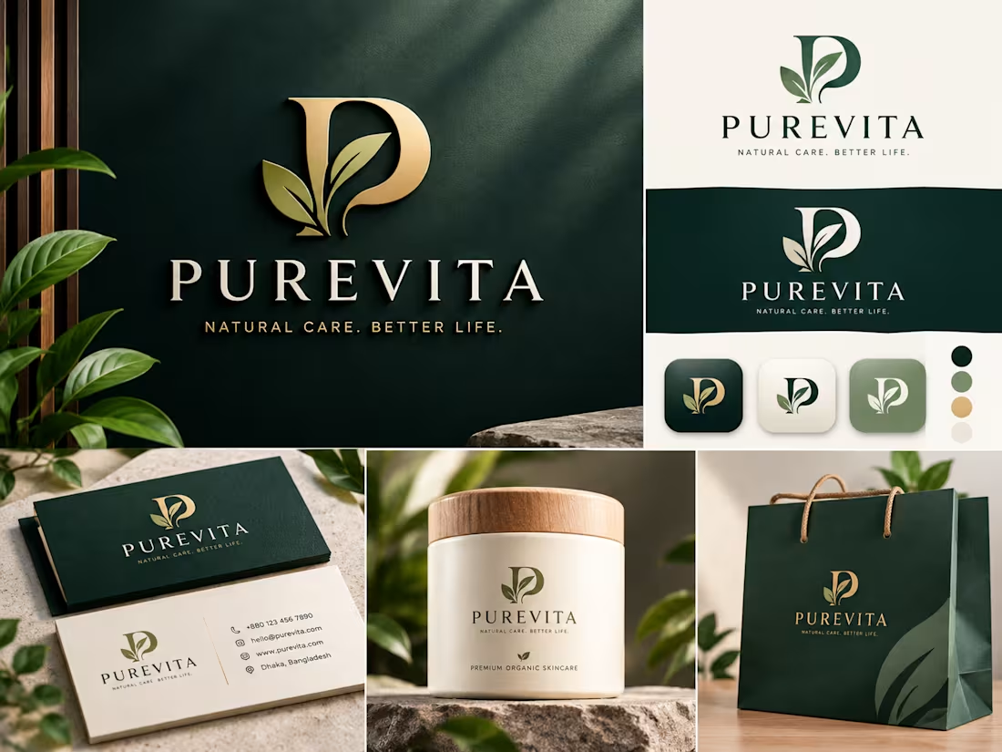
I'll Design a Premium Brand Identity That Makes Your Business Unforgettable
Transform Your Brand. Elevate Your Business.
You only get one chance to make a first impression — make it count.
I create high-end, nature-inspired brand identities that communicate trust, quality, and purpose from the very first glance. Whether you're launching a skincare line, wellness brand, or organic product, I'll build a visual identity that speaks directly to your audience and stands out in a crowded market.
What You'll Get:
✦ Custom logo design (primary + variations)
✦ Brand color palette & typography system
✦ Brand guidelines document
✦ Business card design
✦ Social media icon / app icon versions
✦ Packaging & mockup presentation
✦ All source files (AI, SVG, PNG, PDF)
My Approach:
I don't just design logos — I craft brand stories. Every line, color, and curve is intentional. I combine clean, modern aesthetics with meaningful symbolism to give your brand a soul that resonates.
Perfect For:
→ Skincare & beauty brands
→ Wellness & lifestyle businesses
→ Organic & eco-friendly products
→ Health & personal care startups
Why Work With Me:
★ 100% custom — no templates, ever
★ Unlimited revisions until you love it
★ Fast delivery with clear communication
★ Premium quality at an accessible price
Let's build something beautiful together. Drop me a message and let's talk about your vision.
1
2
61
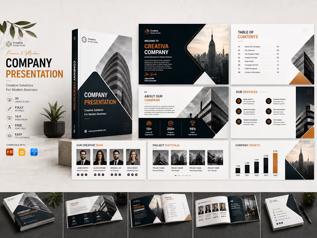
Premium Company Presentation Design Template | Modern Corporate Pitch Deck
Make a powerful first impression with this premium company presentation design template, created for modern businesses, creative agencies, startups, consultants, and corporate brands.
This professionally designed presentation features a clean, modern layout with a sophisticated dark navy, white, and warm orange color palette. It is ideal for company profiles, business proposals, pitch decks, portfolio presentations, annual reports, marketing presentations, and client meetings.
Key Features
• Modern and professional corporate design
• Clean, well-organized slide layouts
• Company introduction and services sections
• Creative team and project portfolio pages
• Company growth chart and business statistics layout
• Table of contents and case study sections
• Fully editable and easy to customize
• High-quality presentation mockup included
• Suitable for PowerPoint, Google Slides, Keynote, and Canva workflows
• 16:9 widescreen presentation format
Whether you are presenting your company, showcasing your services, pitching to investors, or preparing a client presentation, this template will help you communicate your ideas clearly and professionally.
2
2
133