
Shahbaz Afzal
Brand strategist & identity designer for founders


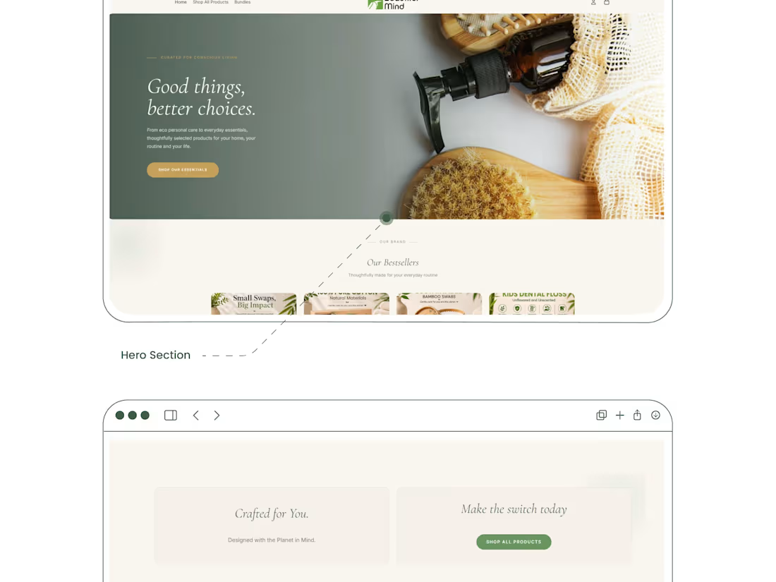
Beautiful Mind — Eco Personal Care Website Design
A full Shopify website design for Beautiful Mind, a sustainable personal care brand offering plastic-free, biodegradable everyday essentials (bamboo cotton swabs, reusable pads, dental floss, and more).
What's included:
Brand moodboard, color palette, typography (Cormorant Garamond, Georgia, Inter), and product photography direction
Hero section, bundle/kit builder, and product detail pages
Blog slider and "Our Bestsellers" merchandising sections
Full design process from research and UX strategy through wireframing, UI design, and final prototype (5-week timeline)
Approach: Warm, earthy palette (sage green, cream, gold) paired with elegant serif headlines to reflect the brand's "conscious living" positioning and built to feel premium without losing the eco-friendly, approachable tone.
1
1
16
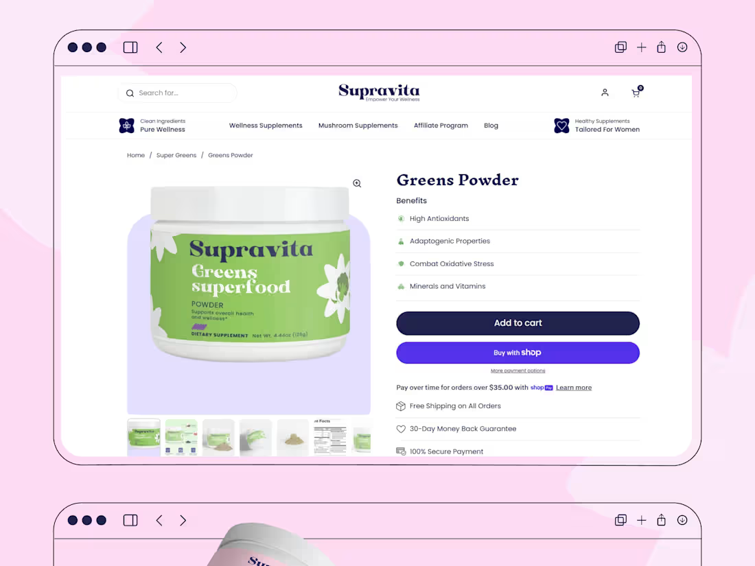
Landing page UI & packaging design for Supravita, a plant-powered wellness brand built for clarity, trust, and conversion.
1
1
45
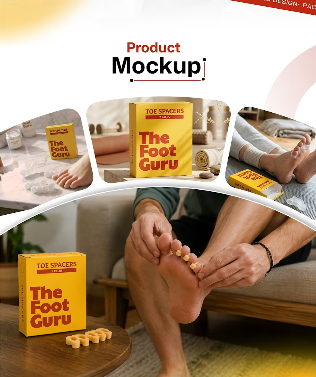
The Foot Guru — Packaging Design
The Foot Guru is a wellness brand specializing in premium toe spacers designed to improve foot alignment, enhance comfort, and support natural movement. The goal of this project was to create a modern, trustworthy, and health-conscious packaging identity that reflects the brand's mission of helping people achieve healthier feet and better mobility.
The design process included developing a cohesive color palette, custom typography, and a clean visual layout that balances a bold, energetic feel with a sense of care and reliability. I built the product dieline from scratch to ensure accurate proportions and print-ready structure, then finalized the design across the full packaging spread — front, back, and side panels — before producing realistic product mockups to showcase how the packaging performs in real-world settings.
This project reflects my process from concept to final production-ready design: overview & brand direction → dieline development → final packaging design → product mockups.
0
41
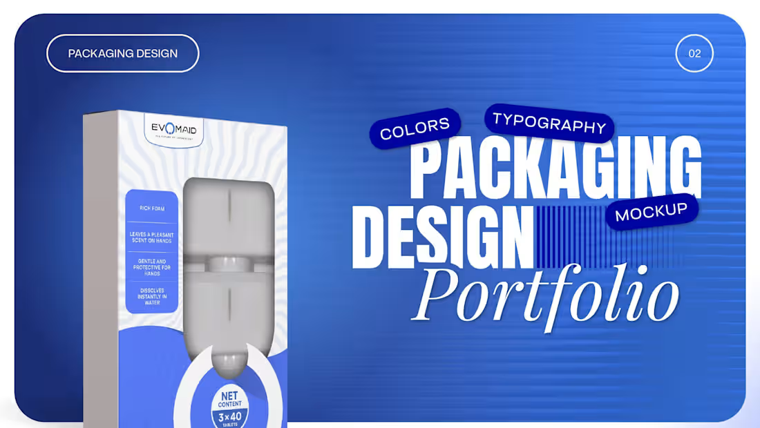
EVOMAID — Hand Wash Packaging Design
Developed the complete packaging design and brand presentation for EVOMAID, a hand-wash foam product positioned around clean, modern technology-driven branding. The project covered brand color exploration, moodboard direction, typography, and final print-ready packaging artwork for both front and back panels.
Key deliverables:
Brand color palette definition (deep blue, black, and neutral grey tones) for consistent visual identity
Moodboard development to establish tone, texture, and product photography direction
Front and back packaging layout, including ingredient information, usage instructions, and manufacturer details (localized in German)
Photorealistic product mockups showing the packaging in real-world bathroom/lifestyle settings
The final design balances a clean, trustworthy aesthetic with strong shelf presence, using a bold blue-and-white system to reflect the brand's modern, tech-forward identity.
1
65