
Sean Cope
Principle Product Designer Principle Product DesignerPrincip
Profile in progress
Sean is building their profile!
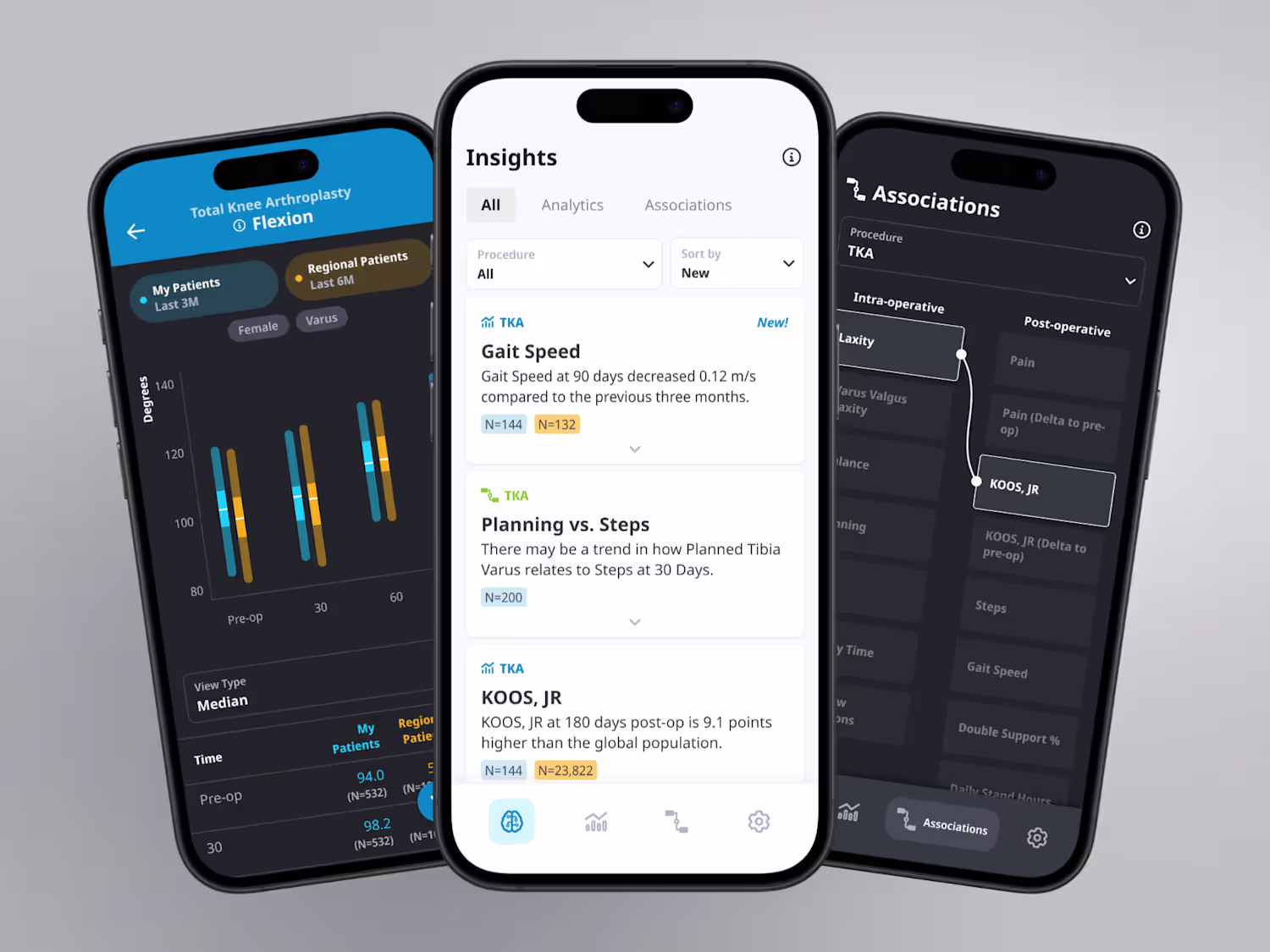
mymobility App Development with Apple
0
0
Mobile App Design for Orthopedic Surgeons
0
1
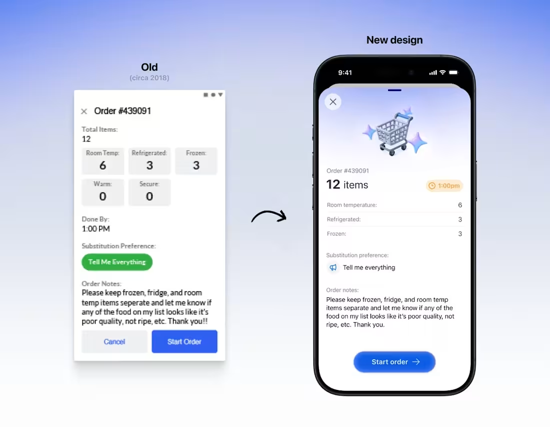
Hi Contra!! I redesigned one of the first products I shipped about 7 years ago. I'm grateful to have the experience and wisdom to be able to identify old mistakes and improve them. Will walk through my thought process for the design.
Some context: This was a grocery store shopping app for in-store employees. A customer would order online, the in-store employee would do the shopping and prep it for curbside pickup. Some lessons and tips 👇
1. Just because the “title” of the page is the order number, doesn’t mean it needs to be the biggest emphasis
2. Total items and time is most important for planning their shopping strategy, so that needs emphasized through visual hierarchy
3. In the original design, item types and "tell me everything" was too prominent and distracting. Also, everything is cramped.
2
35
274