
Satyam Pandey
Ideas begin somewhere. I turn them into experiences.
New to Contra
Satyam is ready for their next project!
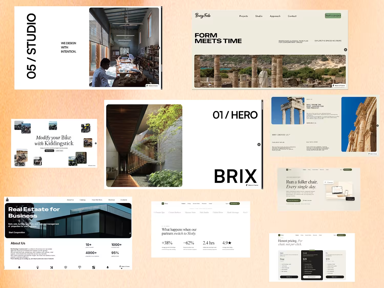
Hotel Vuren — Luxury Retreat in Bali
Hotel Vuren is a self-initiated concept for a luxury retreat in Bali, surrounded by dense tropical vegetation and designed around a slower, more intimate sense of hospitality.
The goal was to create a digital experience that feels as calm and considered as the retreat itself. I took an editorial, almost magazine-like approach to the layout, using oversized typography, generous whitespace, and carefully controlled asymmetry to create rhythm without making the experience feel busy.
The visual system is intentionally restrained — a soft eucalyptus-inspired #E6EBE6 paired with black typography and occasional white text. Rather than relying on decorative elements, the design uses scale, composition, negative space, and imagery to create the sense of luxury.
The layouts move between symmetry and asymmetry throughout the experience, giving each section its own visual character while keeping the overall system cohesive.
Designed and built entirely in Framer, with a focus on responsive composition, subtle interactions, and creating a premium editorial experience that feels closer to a luxury travel publication than a conventional hotel website.
One of my favourite projects to date — built from concept to final interaction.
#Framer #WebDesign #UIUX #LuxuryHospitality #EditorialDesign #FramerDesigner
1
2
31
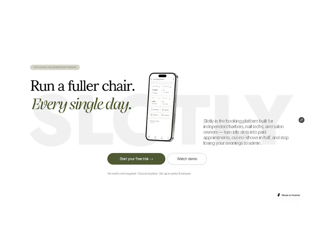
Slotly — Booking & Scheduling Platform
Slotly is a self-initiated SaaS concept exploring a modern booking and scheduling experience built for the Indian market.
The goal was to create a product that feels simple, approachable, and modern while handling the complexity of discovering services, choosing a time slot, and managing bookings. I focused heavily on the UI/UX, building a clear visual hierarchy, a flexible color system, and an interface that feels easy to navigate without looking overly generic or corporate.
The landing page and product experience were designed and built in Framer, with interactive elements and subtle motion used to make the SaaS feel more like a real product rather than a static concept.
A big part of the project was experimenting with color, typography, spacing, and component consistency to create a visual system that could scale across the entire product.
Rather than designing just a marketing page, I wanted Slotly to feel like a complete SaaS product — from the first landing-page interaction to actually discovering a service and making a booking.
A self-initiated project, designed and built from concept to final interaction.
#Framer #WebDesign #UIUX #SaaS #FramerDesigner
1
3
38
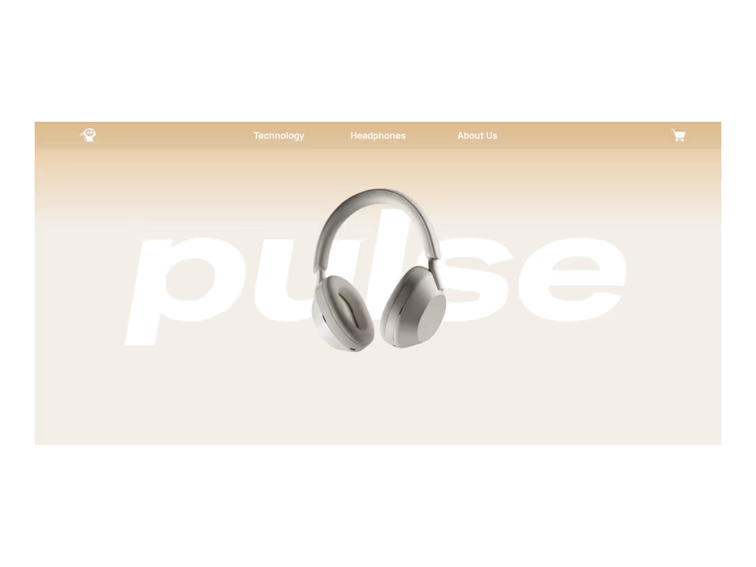
PULSE - Headphone Product Landing Page
PULSE is a self-initiated concept project exploring the digital identity of a premium headphone brand.
The goal was to create a product-first experience where the headphone itself remains the protagonist. I focused on oversized typography, soft neutral tones, immersive product imagery, and a restrained visual language to create a sense of luxury without overloading the interface.
The landing page was designed and built in Framer, with interactive 3D elements created using Spline. The experience includes an interactive 3D hero, a visual color selector showcasing five headphone finishes, and product-focused sections that explore the listening experience and design of the headphones.
Rather than treating the product as just another element on the page, I wanted every section to build around it from the way it is introduced, to how users explore its colors, details, and personality.
A self-initiated project, built from concept to final interaction.
#Framer #Spline #WebDesign #UIUX #ProductDesign #WebDevelopment
0
38
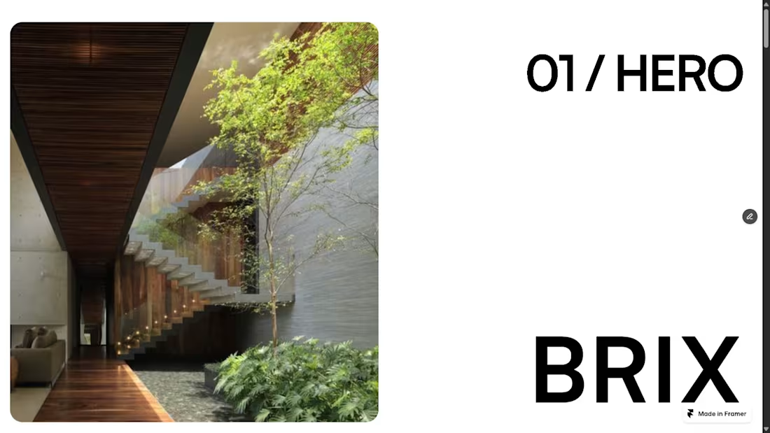
BRIX - Architecture & Interior Design Studio
BRIX is a self-initiated concept project exploring the digital identity of a contemporary architecture and interior design studio.
The goal was to create a minimal, editorial experience that feels as considered as the spaces the studio designs. I focused on strong typography, generous whitespace, architectural imagery, and a restrained monochromatic visual language to create a sense of clarity and sophistication.
The landing page was designed and built in Framer, with subtle motion and interactive elements throughout including animated project cards and an interactive before/after experience.
Rather than filling the page with information, I wanted the design to communicate through space, rhythm, typography, and imagery, allowing the work itself to take center stage.
A self-initiated project, built from concept to final interaction.
#Framer #webdesign #uiux #WebDevlopment
0
68