
Leah R
Expert Editorial Graphic Designer
- 1x
- Hired
- 5.00
- Rating
- 23
- Followers


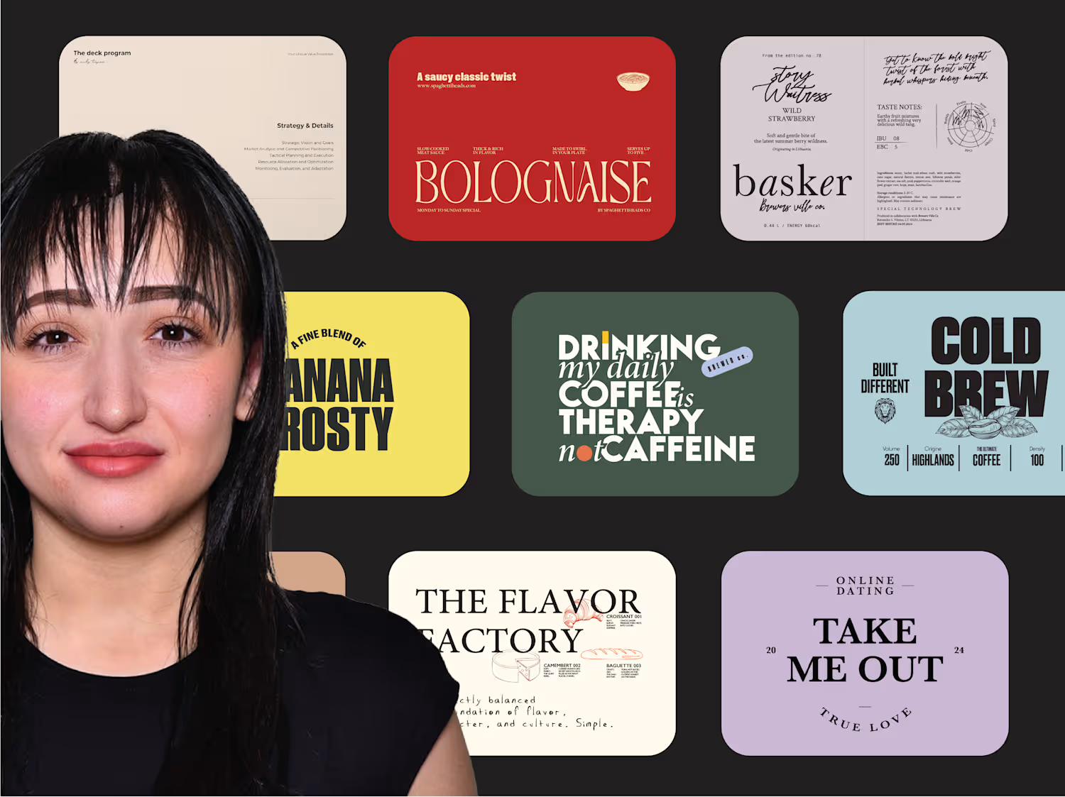
Am I Missing Something, Contra? (Part 2)
Plot twist:
I re-subscribed to Contra Pro.
Because if I’m going to question my entire existence on this platform, I might as well do it in HD with all the premium buttons unlocked 😂
So here we are:
New profile.
New projects.
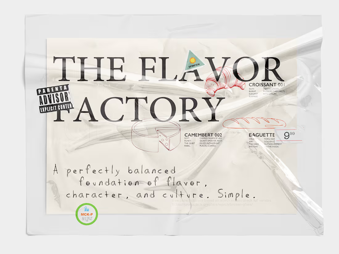
New branding case studies freshly uploaded like warm baguettes.
I even went full “teacher’s pet” mode and actually engaged with the community, liked posts, commented, cheered people on, became social. (Yes, introverts, I fought for my life.)
And after all that grinding, tweaking, polishing… my portfolio is officially fully updated, fully curated, and fully ready.
At this point, I’ve done everything short of sending Contra a croissant bouquet 😂
So naturally, the question returns:
Am I missing something, Contra?
Or is this just the character-building arc?
1
2
269
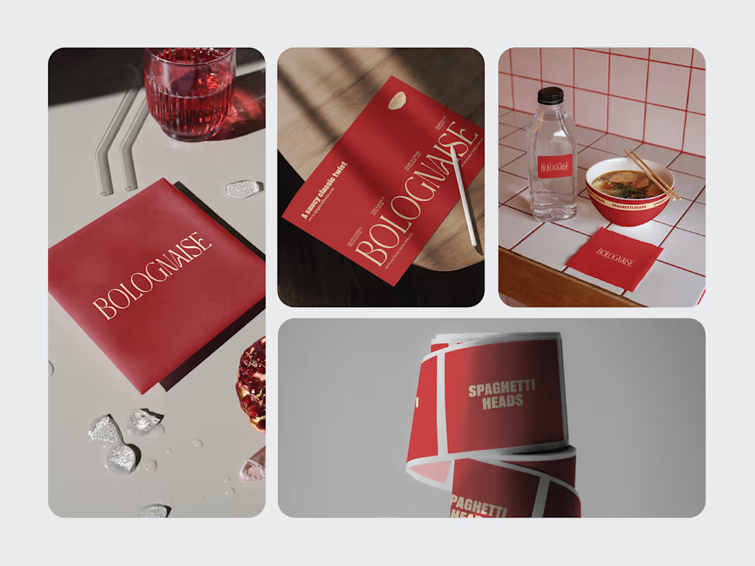
Am I Missing Something, Contra?
So here’s a fun little mystery.
I’ve had my Contra profile for 8 months.
Fully complete. Verified. Polished like a showroom car.
Contra Pro for 4 straight months.
Got “Featured On” three times.
Top 10% of creatives.
Availability updated so consistently you’d think I was clocking in for a shift.
And yet… my inbox looks like a ghost town.
No DMs.
No inquiries.
Just silence.. the kind that makes you wonder if you accidentally blocked the entire platform.
And I thought..
Maybe the algorithm hates me?
Maybe the planets are misaligned..
Maybe Contra’s matchmaking is drunk!
Or.. am I actually missing something?
So I did the dramatic thing: I wiped everything.
Now I’m rebuilding from scratch!
But honestly, I can’t help but wonder:
Am I missing something, Contra?
1
254
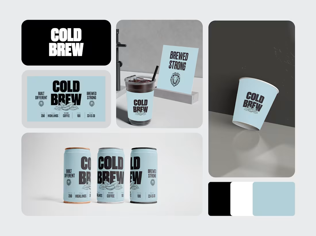
A client came to me saying..
“Our cold brew tastes amazing… but the packaging looks like it’s apologizing for existing.”
Fair enough.
So we gave it a glow-up.
I redesigned everything with unapologetically bold typography, the kind that practically taps you on the shoulder in the grocery aisle and says, “Hey. You need me.”
Then we paired it with that soft blue so it didn’t scare anyone before 9 AM.
And the lion? That was for the customers who want to feel like they wake up early… even if they absolutely don’t.
The funniest part?
After launching the new look, the client messaged me saying:
“People keep buying it because it finally looks like it has caffeine in it.”
Mission accomplished.
So I’m curious, have you ever bought something JUST because the branding slapped you in the face? I know I am guilty!
2
3
271
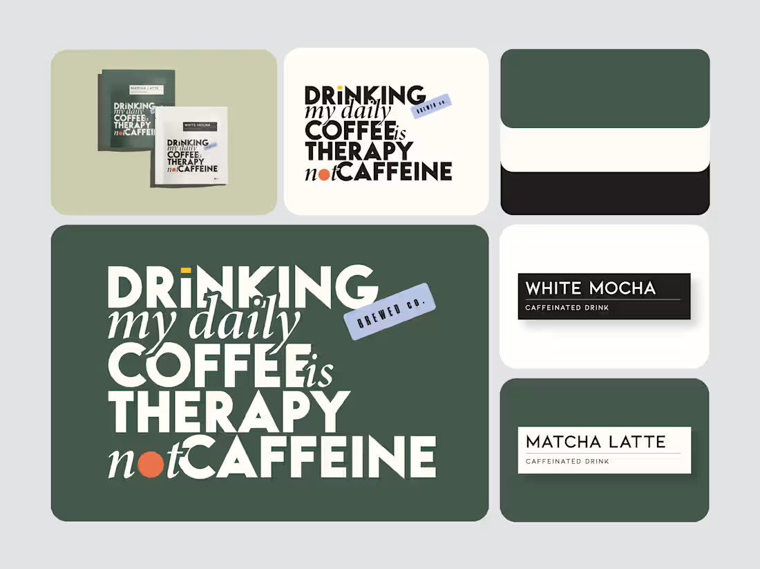
It started with a sentence I couldn’t shake:
“Drinking my daily coffee is therapy, not caffeine.”
I didn’t sketch a logo. I didn’t build a palette.
I just let the words pull me in, one letter at a time.
Soon the sentence wasn’t a sentence anymore.
It became a personality. A brand.
A little chaotic, a little honest… and somehow exactly right.
Typography first. Everything else followed.
Now I’m curious, what’s your go-to coffee order?
3
236