
sanni .sahil
Independent Design Director for SaaS & modern ecommerce bran
Ready for work
sanni is ready for their next project!
Portfolio Design
0
2
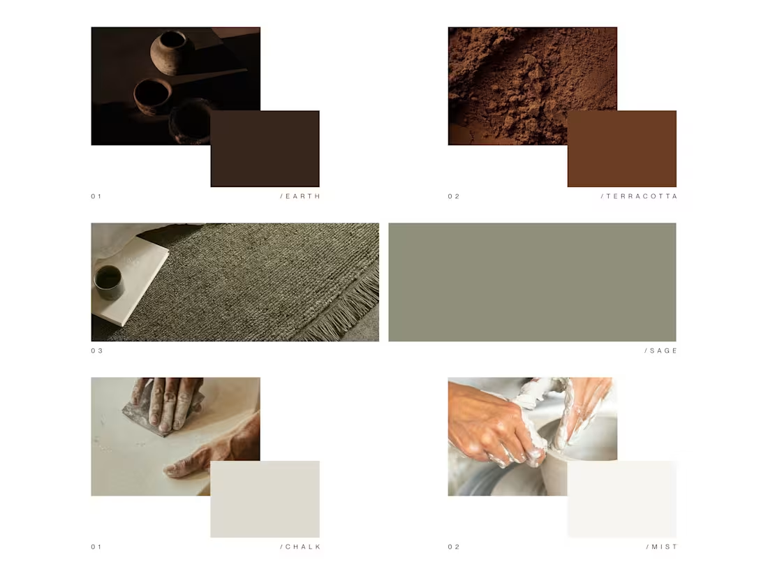
Gharko case study · Colour story
Before I touched layout for Gharko, I spent time on the colours that would hold the whole brand together.
I ended up with five anchors: Earth, Terracotta, Sage, Chalk, Mist.
They’re all pulled from real materials, soil, clay, woven textiles, plaster, soft light on ceramics. Together they do a few jobs:
• keep the brand grounded and warm, not glossy or shouty
• let product textures (ceramic, glass, fabric) stand out without fighting the UI
• work across website, print, packaging and photography without feeling dated
For me, a good palette is less about “trend colours” and more about:
Can this quietly support the brand for years while products and campaigns change on top of it?
0
32
Gharko case study · Part 1
Before I talk about grids, layouts and UX, I wanted to show what Gharko is meant to feel like.
This opening animation is a small brand film: the logotype broken into frames, warm light, soft textures. The idea is simple: you enter the world of Gharko slowly, the way you’d enter a calm home in the evening.
For me, good ecommerce design starts here, with mood and rhythm, not components. The next parts of the case study will go into the website, product pages and flows built on top of this feeling.
2
2
50
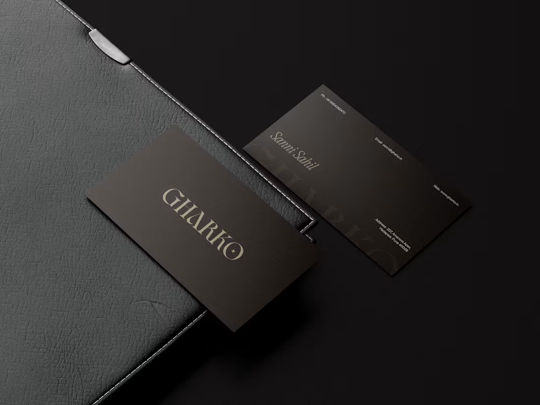
Business cards for Gharko, my premium home décor brand.
The goal was quiet confidence, not loud luxury.
Deep charcoal base with a soft sheen for a calm, tactile feel
Refined logotype in a warm metallic tone for subtle contrast
Minimal back layout with generous spacing and delicate typography
Designed to feel like an extension of the brand’s warm, slow-living aesthetic
Brand, product, website and print design all come together here to keep Gharko consistent at every touchpoint.
1
48