
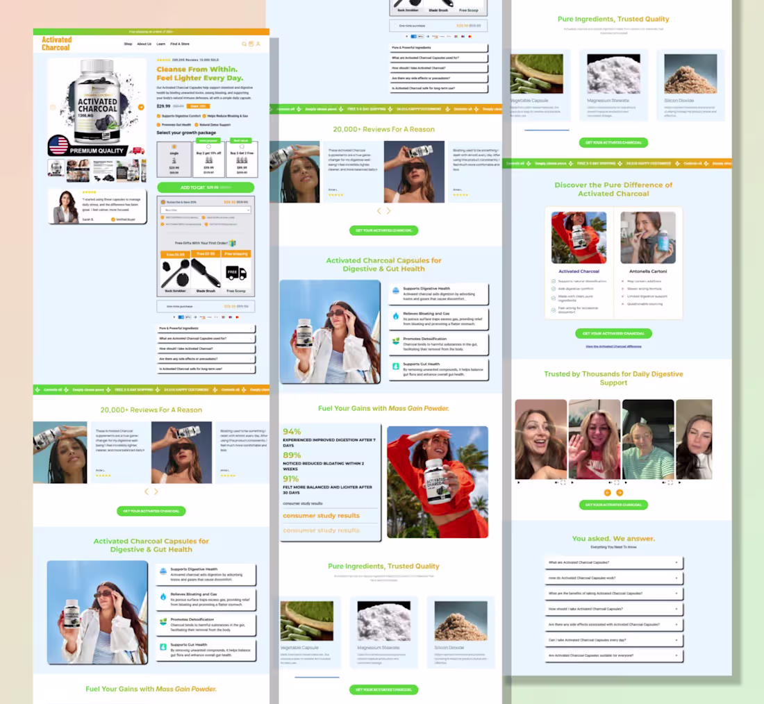
john Tech
I design high-converting landing page
New to Contra
john is building their profile!
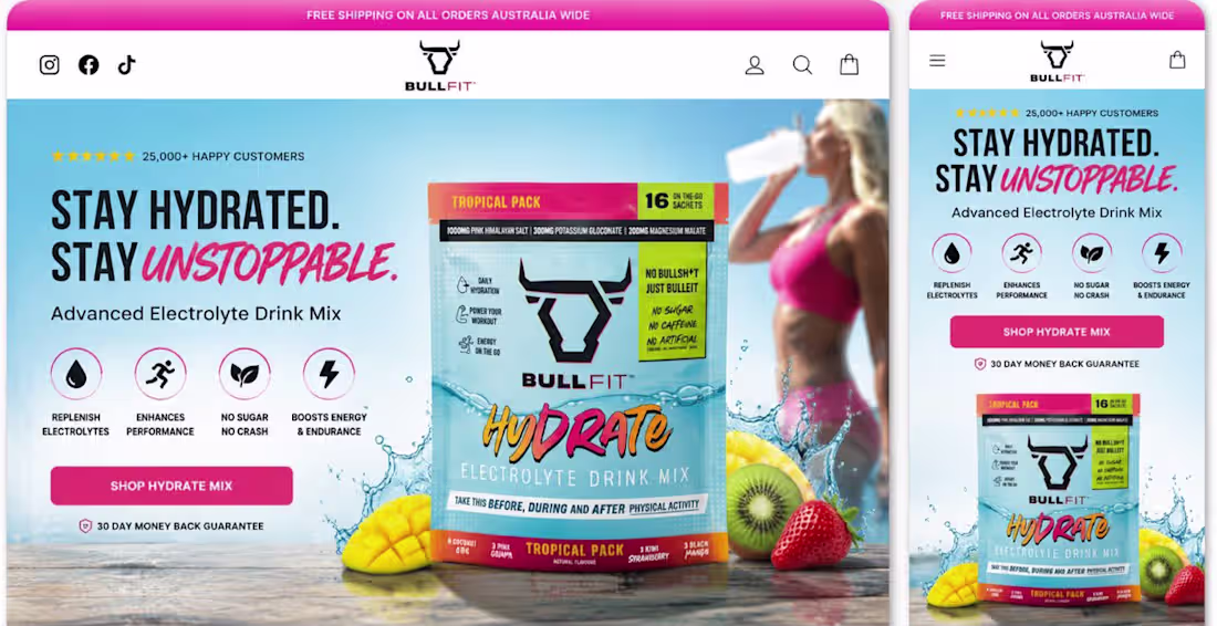
A homepage isn’t just the first page visitors see it’s the first opportunity to earn their trust.
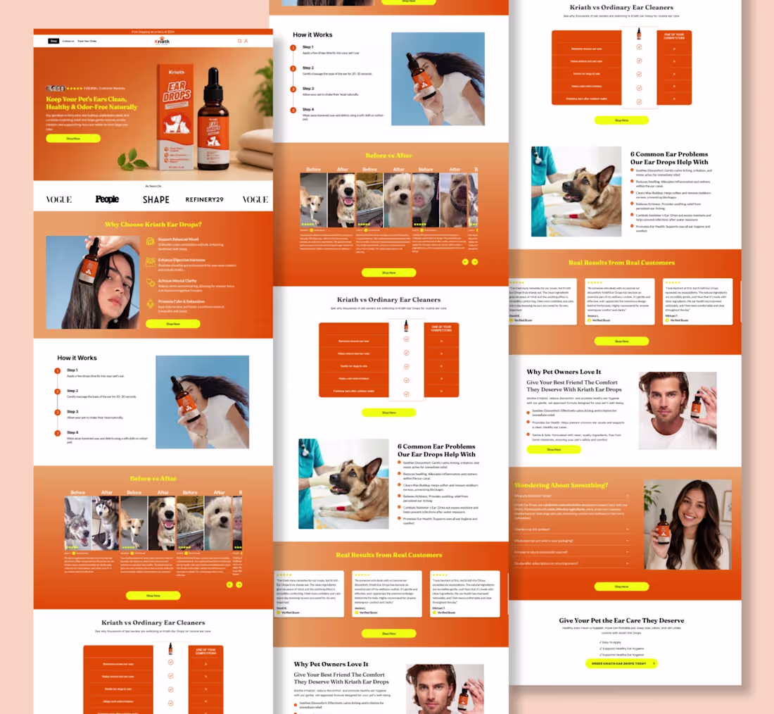
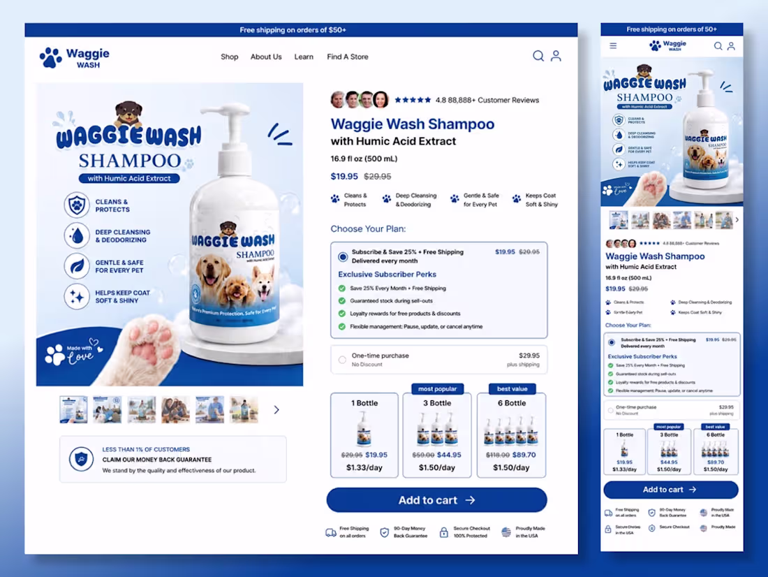
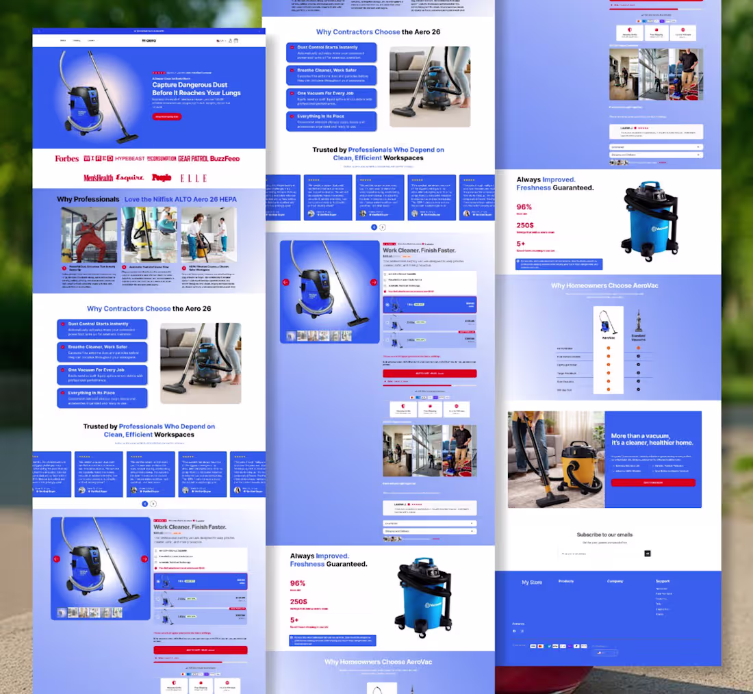
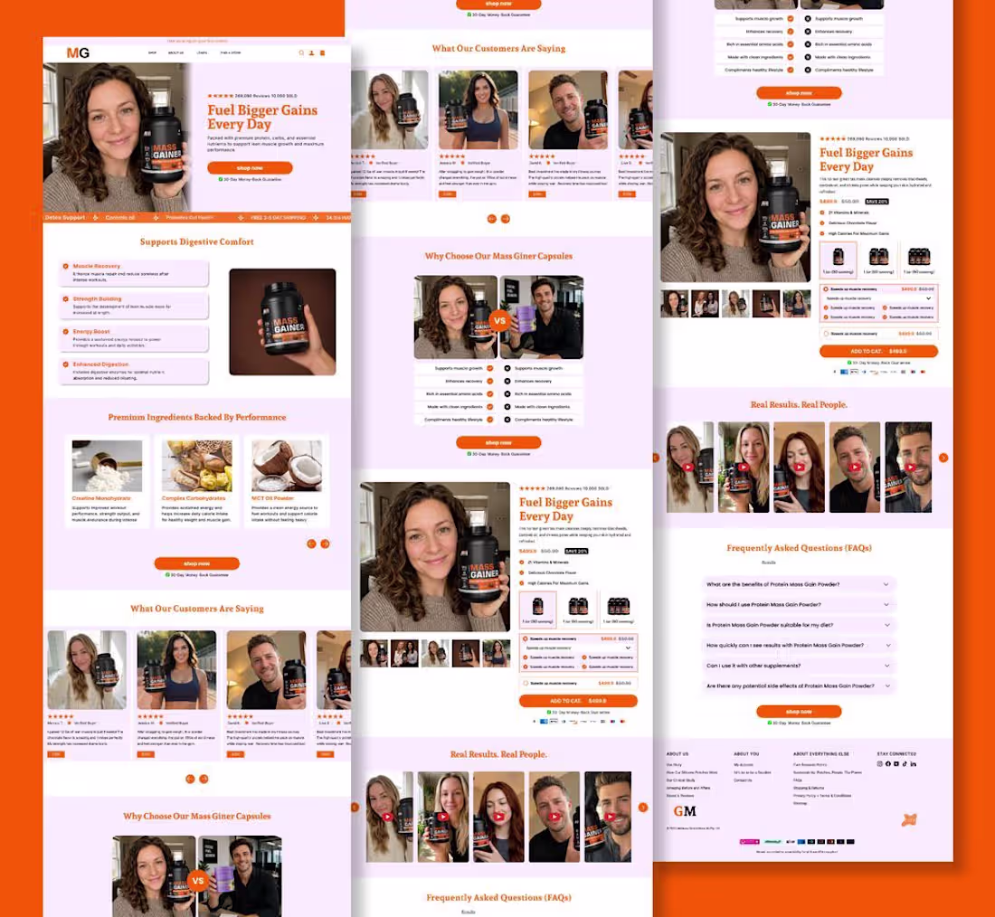
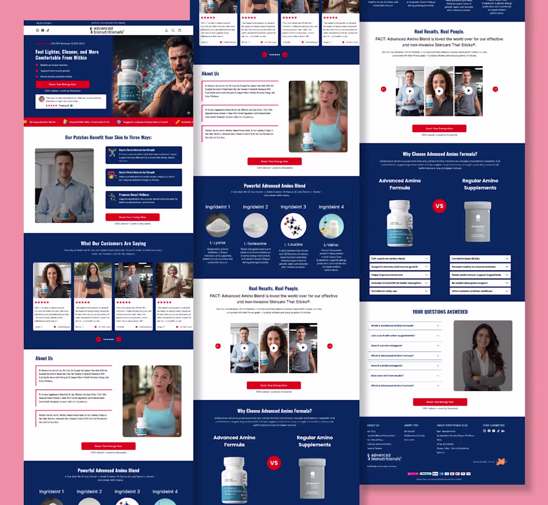
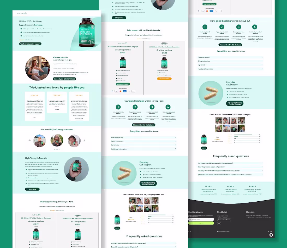
I recently designed and developed this high-converting Shopify homepage in Replo for Kriath Pet Care, with a clear objective: transform first-time visitors into confident buyers.
Every section was carefully planned to guide users through the customer journey from capturing attention to educating, building trust, and driving action.
Here’s what I focused on:
✨ A bold hero section with a clear value proposition
📱 Fully responsive across desktop, tablet, and mobile
🎯 Benefit-driven storytelling that keeps visitors engaged
⭐ Social proof, customer testimonials, and before & after results
📊 Comparison tables that reduce buying hesitation
🐶 Educational sections that answer common customer questions
💚 Strong visual hierarchy for a seamless browsing experience
🛒 Strategic CTA placement to maximize conversions
⚡ Pixel-perfect development in Replo with Shopify integration
Every scroll has a purpose. Every section answers a question. Every CTA moves the customer one step closer to purchasing.
That’s what great eCommerce design is about not just creating beautiful pages, but creating experiences that convert.
Proud to bring this vision to life for Kriath Pet Care, and excited to keep helping brands build Shopify experiences that drive measurable results.
If you’re looking for a Replo developer to create high-converting homepages, landing pages, or product pages, let’s build something exceptional.
1
10
Your homepage isn’t just a design. It’s your first sales pitch.
If visitors land on your homepage and leave within seconds, it usually isn’t because your product is bad.
It’s because your homepage failed to answer three simple questions:
❌ Why should I trust you?
❌ Why is your product different?
❌ Why should I buy from you today?
That’s exactly what I solve when designing Shopify homepages.
For this project, every section was built with a purpose:
✔️ Capture attention instantly with a compelling hero section
✔️ Build credibility through social proof and trust signals
✔️ Educate customers with benefit-driven content
✔️ Eliminate objections using comparisons, FAQs, and real customer results
✔️ Guide visitors naturally from curiosity to conversion with strategic CTAs
A homepage shouldn’t just look beautiful it should work as your best salesperson, building trust 24/7 and turning traffic into revenue.
That’s the approach I take with every homepage I build in Replo: combining strategy, user experience, and conversion-focused design to help brands grow.
If your Shopify homepage is getting traffic but not generating enough sales, it may be time to redesign the experience not just the visuals. Build on @replohq
0
12

Your homepage isn’t just a design. It’s your first sales pitch.
If visitors land on your homepage and leave within seconds, it usually isn’t because your product is bad.
It’s because your homepage failed to answer three simple questions:
❌ Why should I trust you?
❌ Why is your product different?
❌ Why should I buy from you today?
That’s exactly what I solve when designing Shopify homepages.
For this project, every section was built with a purpose:
✔️ Capture attention instantly with a compelling hero section
✔️ Build credibility through social proof and trust signals
✔️ Educate customers with benefit-driven content
✔️ Eliminate objections using comparisons, FAQs, and real customer results
✔️ Guide visitors naturally from curiosity to conversion with strategic CTAs
A homepage shouldn’t just look beautiful it should work as your best salesperson, building trust 24/7 and turning traffic into revenue.
That’s the approach I take with every homepage I build in Replo: combining strategy, user experience, and conversion-focused design to help brands grow.
If your Shopify homepage is getting traffic but not generating enough sales, it may be time to redesign the experience not just the visuals. Build on @replohq
0
8
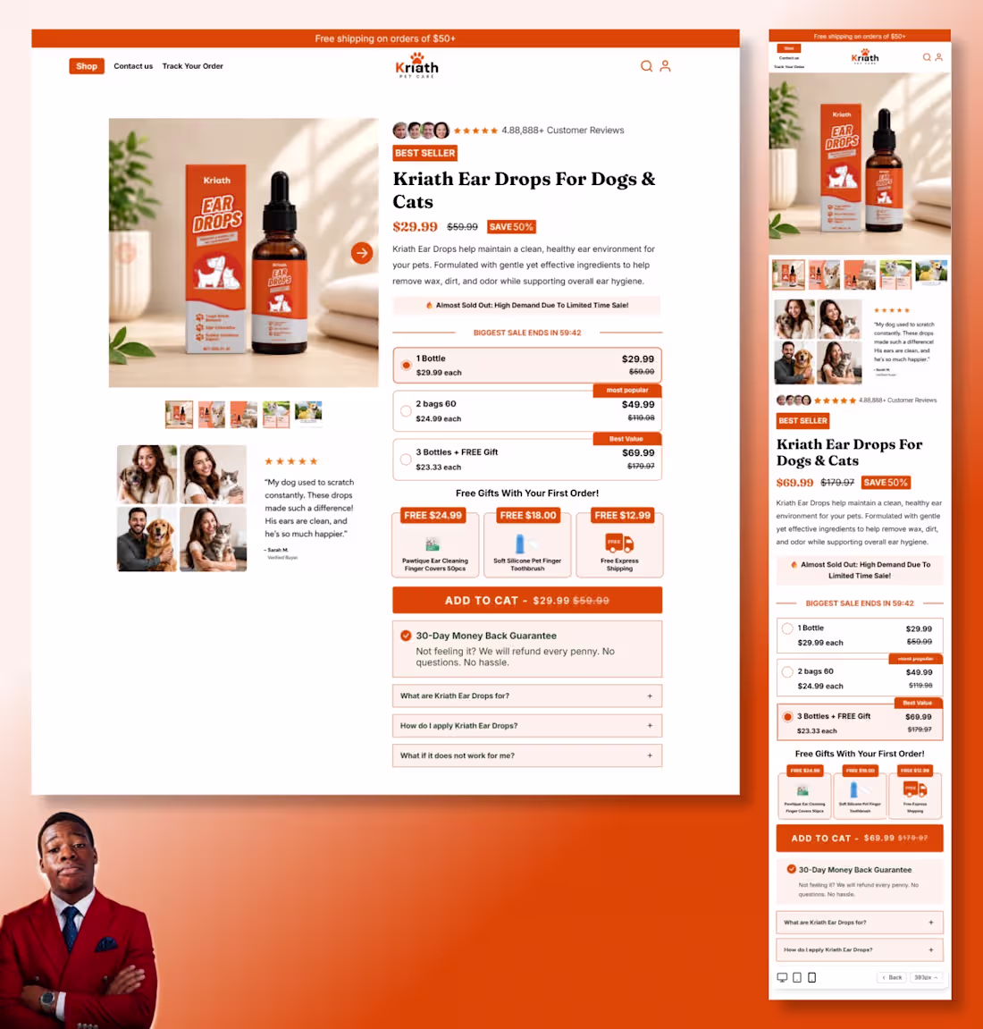
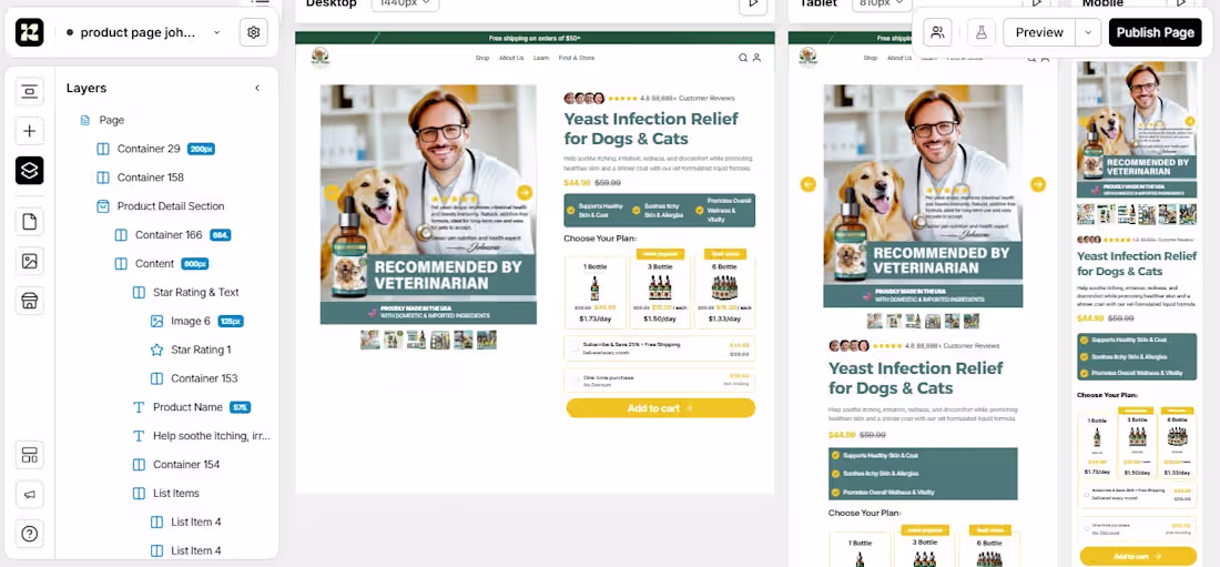
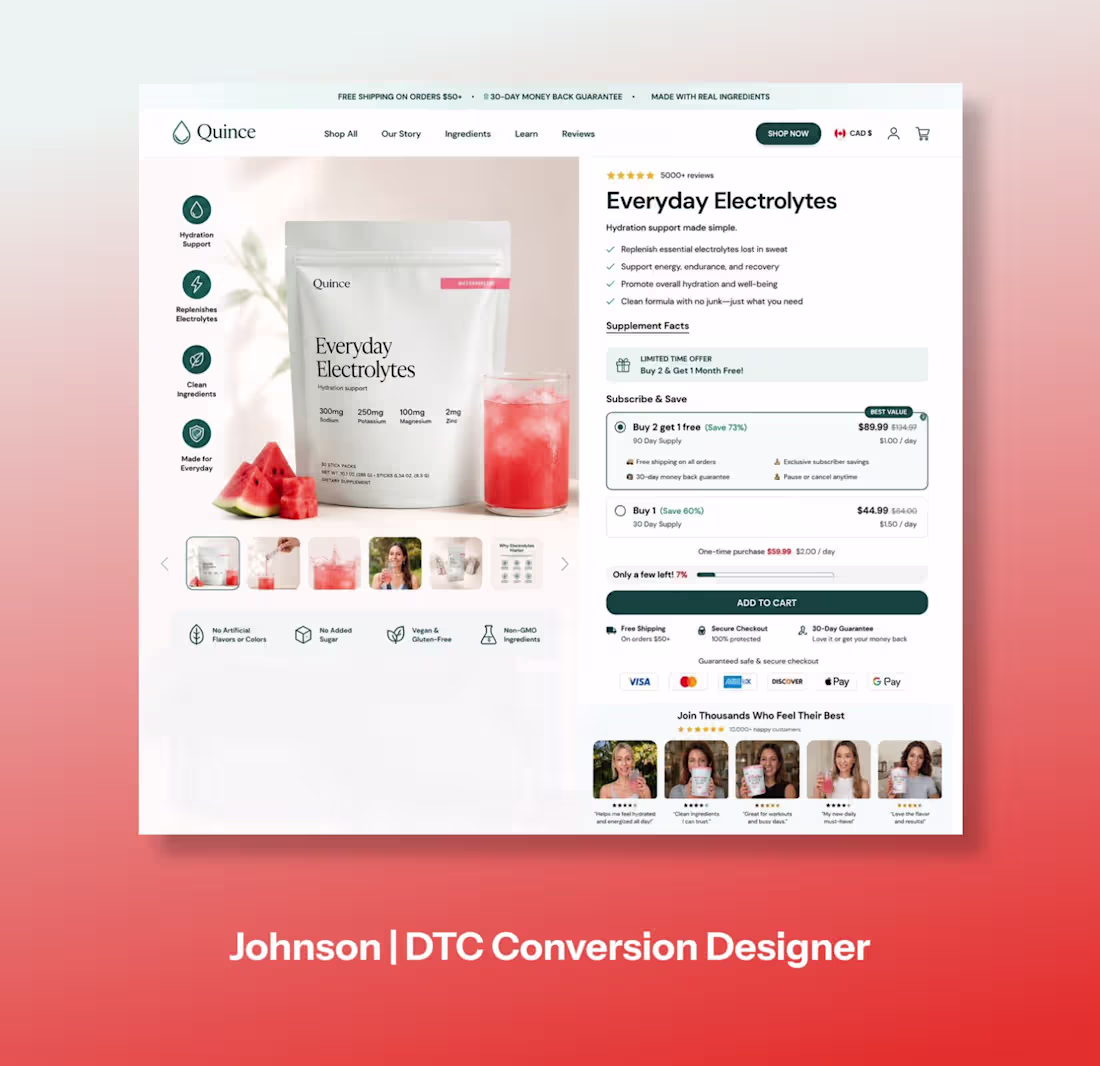
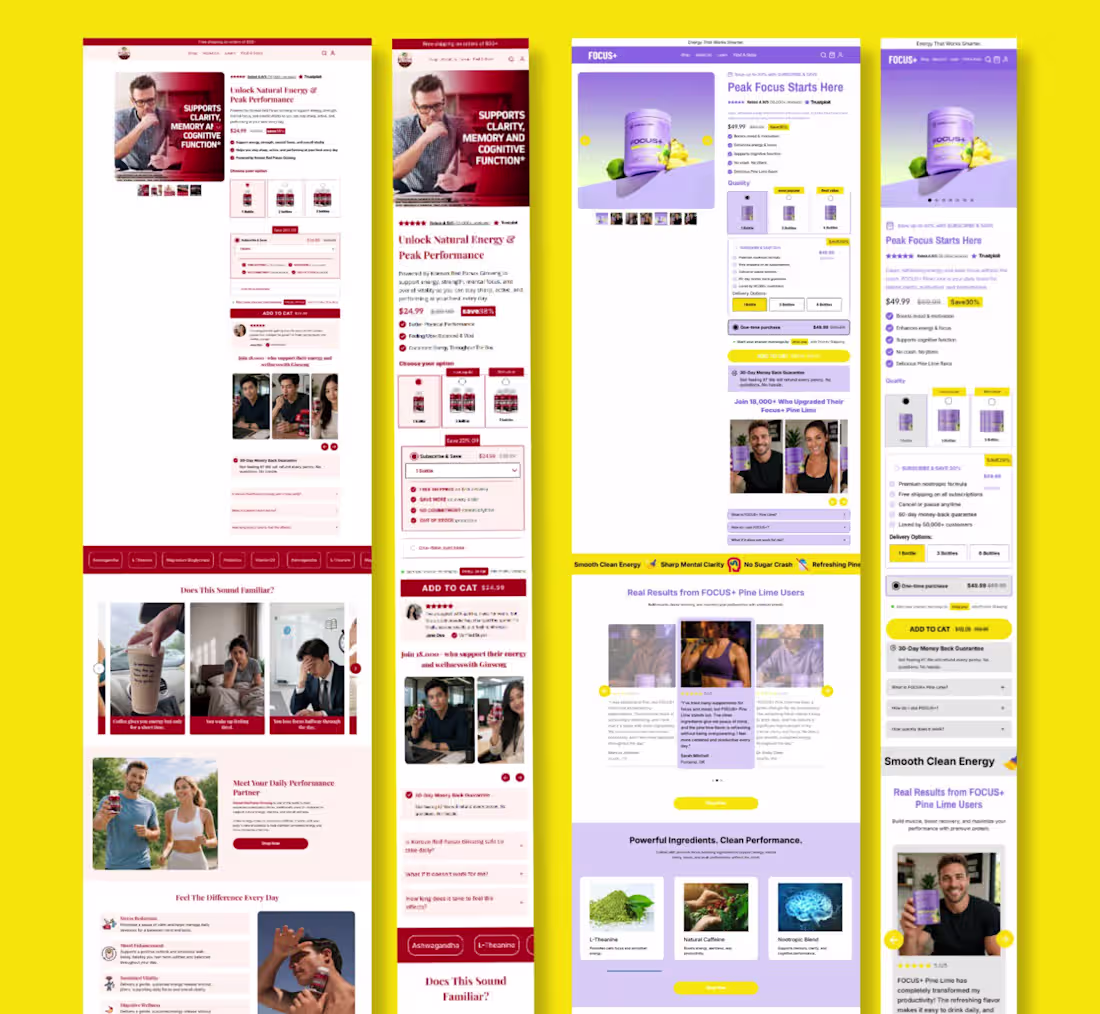
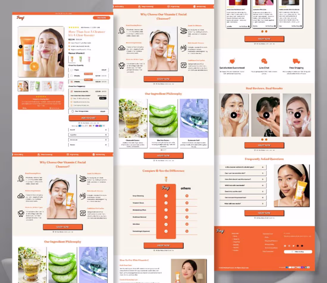
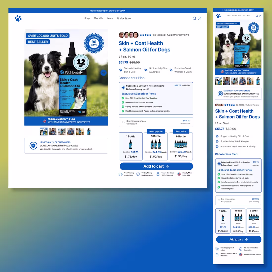
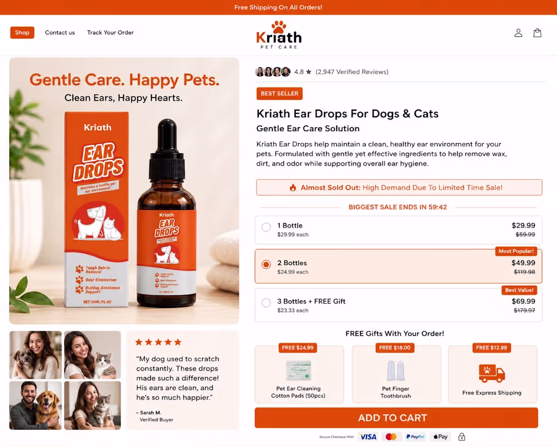
Every pixel on this page has a purpose.
I recently designed and developed this high-converting Shopify product page in Replo for Kriath Pet Care, with a focus on creating a seamless shopping experience across desktop and mobile.
This wasn’t just about making the page look good it was about building a product page that helps customers make confident buying decisions.
Here’s what went into the build:
✅ Fully responsive across desktop and mobile
✅ Clean, conversion-focused layout
✅ Benefit-driven product presentation
✅ Strategic pricing and bundle offers to increase AOV
✅ Trust signals, reviews, and money-back guarantee
✅ Urgency elements that encourage action without overwhelming the user
✅ Mobile-optimized purchase flow for a frictionless checkout experience
✅ Pixel-perfect development in Replo with Shopify integration
The best product pages don’t sell with flashy designs they sell by building trust, reducing hesitation, and making it easy for customers to say “Yes.”
That’s the mindset I bring to every Replo project.
If you’re an eCommerce brand looking to transform your product pages into high-performing sales assets, I’d be happy to help.
📩 Feel free to reach out if you need a Replo developer for Shopify.
0
20
Your homepage has one job: make a powerful first impression.
Every section should build trust, answer questions before they’re asked, and guide visitors toward one action—buying.
This homepage was designed with exactly that in mind:
✅ Clean, premium layout
✅ High-converting hero section
✅ Mobile-first responsive design
✅ Strong visual hierarchy
✅ Trust badges & social proof
✅ Clear, conversion-focused CTAs
✅ Brand consistency across desktop, tablet & mobile
✅ Optimized user experience for higher engagement
A great homepage doesn’t just look beautiful—it tells a story, builds credibility, and moves visitors through the buying journey with confidence.
Proud to have designed and developed this homepage to help the brand create a stronger first impression and maximize conversions.
Design. Strategy. Conversion.
0
21
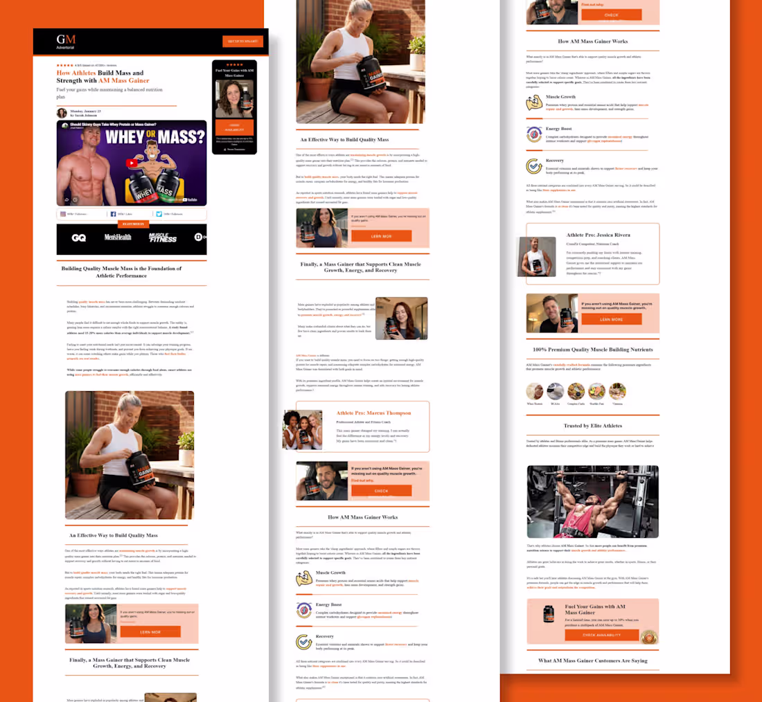
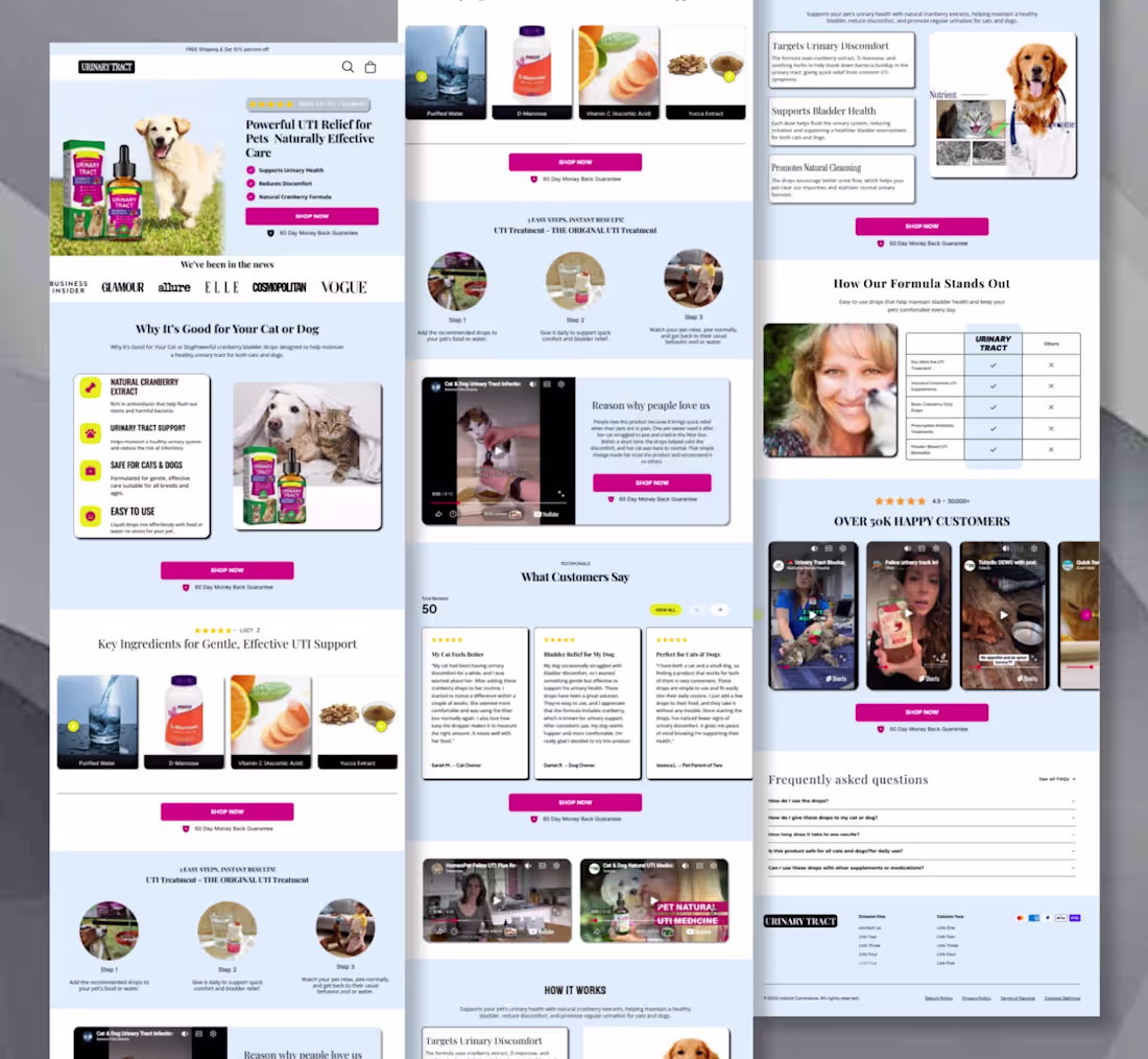
high-converting Shopify product page delivered in
@replohq (https://x.com/replohq) for Kriath Pet Care.
Every successful eCommerce brand needs more than a beautiful product page it needs an experience that converts on desktop, tablet, and mobile.
For this project, I developed a fully responsive product page that delivers a consistent shopping experience across every device, without compromising performance or usability.
What I focused on:
Pixel-perfect development in Replo
Responsive design optimized for desktop, tablet, and mobile
Clean product hierarchy for effortless browsing
Conversion-focused pricing and bundle selection
Trust-building reviews, guarantees, and social proof
Strategic CTA placement to increase conversions
Fast-loading, Shopify-ready implementation
Smooth, intuitive shopping experience from first click to checkout
Every breakpoint was carefully refined to ensure customers enjoy the same premium experience whether they’re shopping from a phone, tablet, or desktop.
Great product pages don’t happen by chance they’re built with strategy, attention to detail, and a deep understanding of how people shop online.
Proud to have brought this vision to life for Kriath Pet Care. Looking forward to helping more brands build product pages that not only look premium but also drive real results.
If your Shopify store needs a product page that’s designed to convert across every screen, let’s connect.
0
23
Built for thumbs. Optimized for conversions.
Most eCommerce traffic comes from mobile, yet many brands still treat the mobile experience as an afterthought.
For this project, I developed a mobile-first Shopify product page in Replo, designed to keep shoppers engaged and make purchasing as effortless as possible.
The focus wasn’t just on making it look good it was about creating a frictionless buying experience.
Here’s what went into the build:
✅ Pixel-perfect mobile development in Replo
✅ Fast, responsive layout optimized for every screen size
✅ Clear product hierarchy for easy scanning
✅ Conversion-focused bundle selection and pricing
✅ Strategic placement of trust badges, reviews, and social proof
✅ High-impact CTAs that stay visible and encourage action
✅ Smooth user flow from product discovery to checkout
A great mobile product page doesn’t just display a product it builds confidence, removes hesitation, and turns visitors into customers.
That’s the standard I aim for with every Replo project.
If you’re looking for a Replo developer to build high-converting Shopify product pages that perform flawlessly on mobile, let’s connect.
0
25
Good design doesn’t just look premium—it drives decisions.
Here’s a product page I designed with a clear objective: create a shopping experience that builds trust, highlights value, and makes purchasing feel effortless.
Every section was intentionally crafted to answer customer questions before they’re asked.
✨ Clean, modern UI that reflects the brand
📱 Responsive design for desktop, tablet, and mobile
🎯 Clear visual hierarchy for effortless navigation
⭐ Trust signals, reviews, and credibility elements
💰 Strategic pricing and bundle presentation
🛒 Strong, conversion-focused CTA placement
💡 A user experience designed to reduce friction and increase conversions
A great product page isn’t about adding more sections it’s about presenting the right information at the right moment.
Design with purpose. Build for conversions.
If you’re looking for a designer who creates high-converting Shopify product pages and landing pages, I’d love to help bring your vision to life.
#productpage #ShopifyDesign #Replo #Ecommerce #LandingPage #ProductPage #UIDesign #UXDesign #WebDesign #CRO
0
29
Another high-converting Shopify product page developed in Replo.
This project was built with one goal: turn more visitors into customers.
Instead of creating just another product page, I focused on a conversion-driven experience across desktop, tablet, and mobile.
Here’s what I implemented:
✅ Fully responsive design across all devices
✅ Clean, modern layout with strong visual hierarchy
✅ Optimized product information for easy scanning
✅ Trust-building elements, ratings, and social proof
✅ Bundle offers to increase average order value (AOV)
✅ Subscription options for recurring revenue
✅ Strategic CTA placement to reduce drop-offs
✅ Pixel-perfect development in Replo with Shopify integration
A great product page isn’t just about aesthetics it’s about creating a buying experience that builds trust, answers questions, and makes checkout feel effortless.
I love helping eCommerce brands bring their designs to life with fast, responsive, and conversion-focused Replo development.
If you’re looking for a Replo developer to build or optimize your Shopify landing pages and product pages, let’s connect.
#Replo #ReploDeveloper #Shopify #ShopifyDeveloper #Ecommerce #ProductPage
0
30
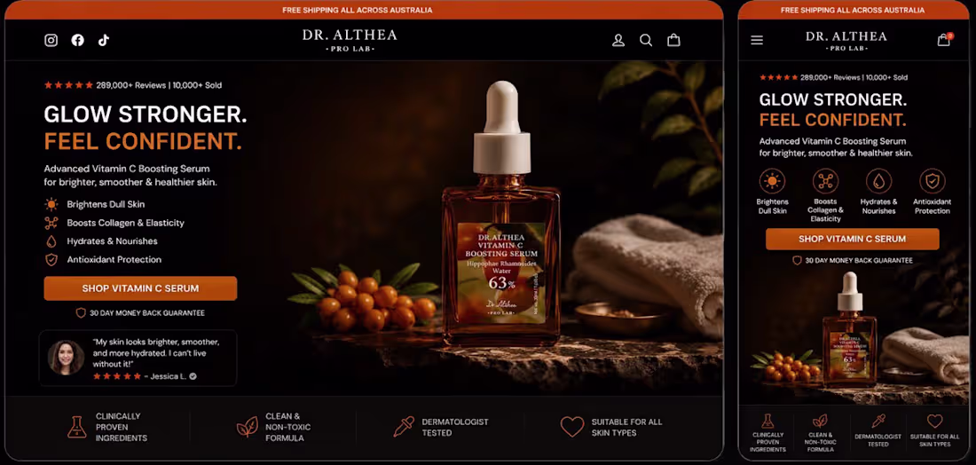
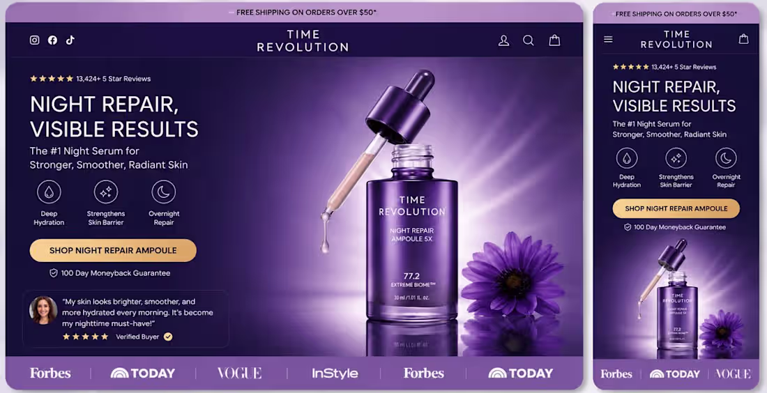
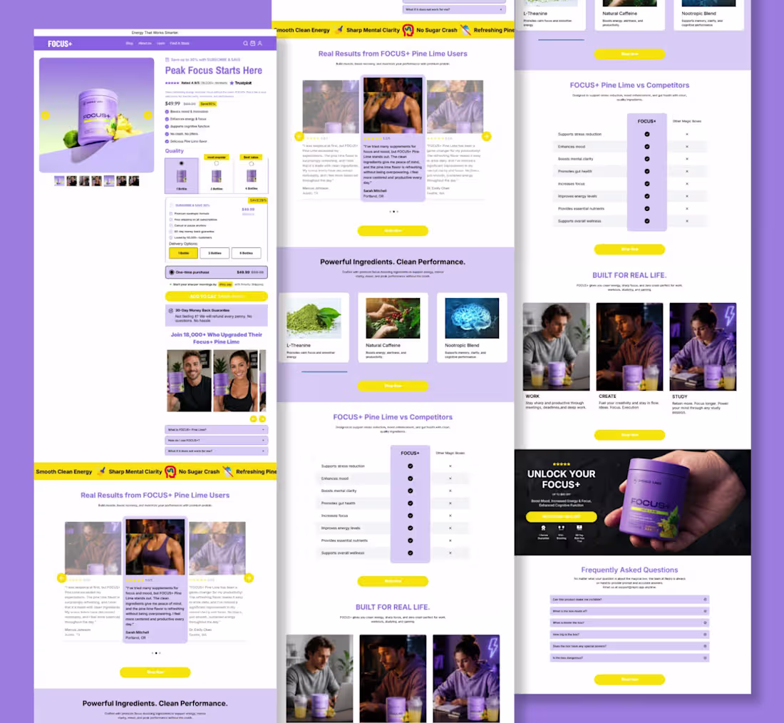
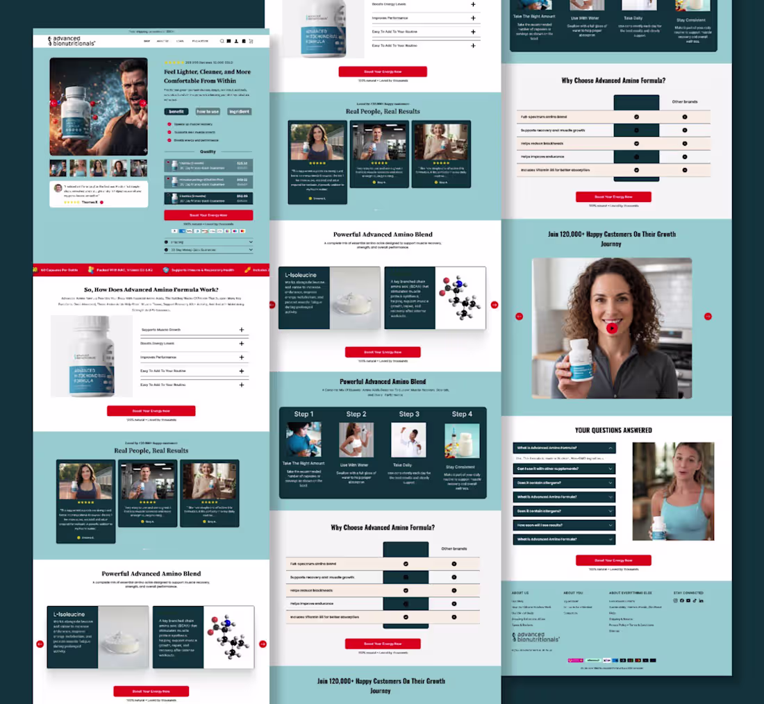
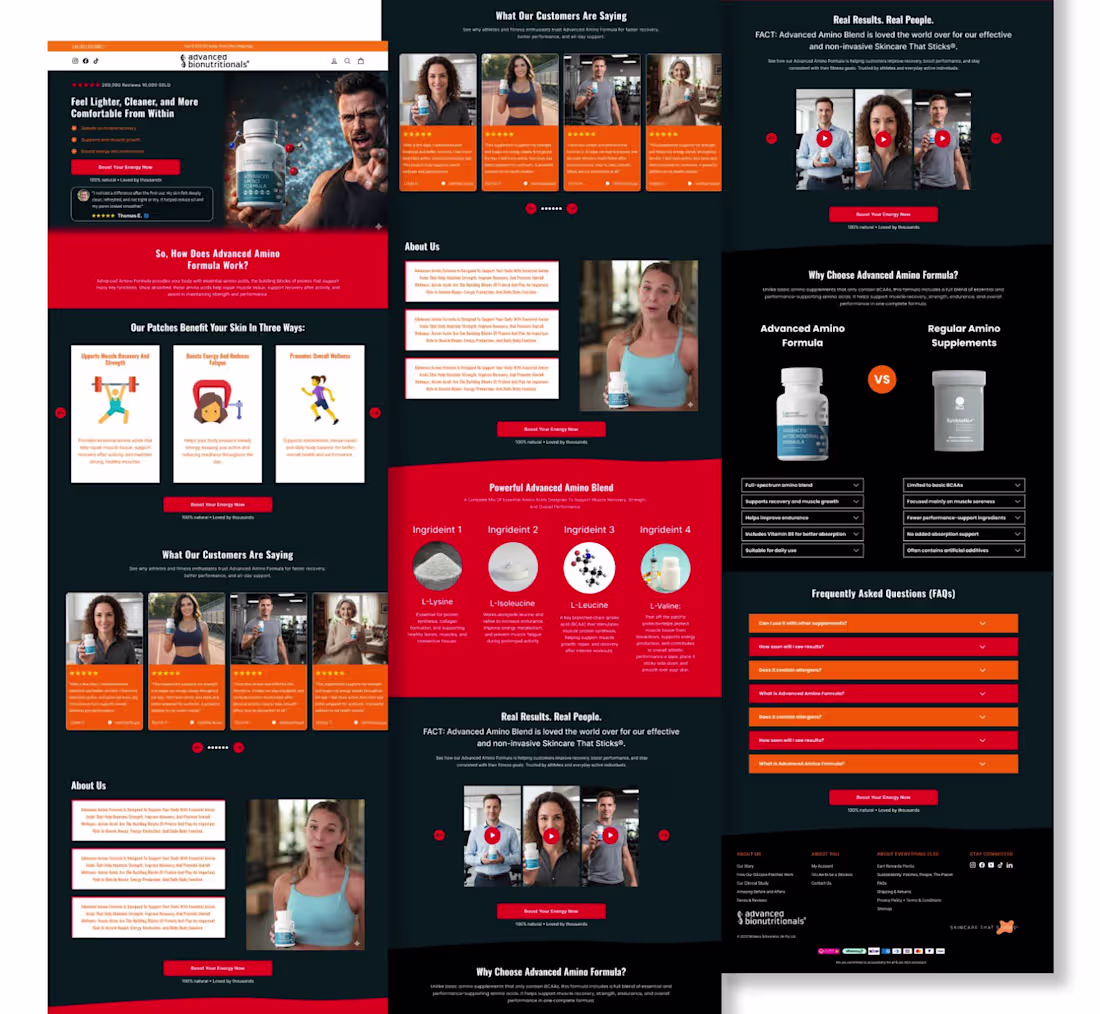
A homepage built to sell confidence, not just skincare.
From the first second, this page makes its promise clear: Glow Stronger. Feel Confident.
The dark luxury aesthetic, bold product focus, and benefit-driven messaging instantly position the brand as premium and trustworthy. Every section is designed to capture attention, build authority, and push action.
Why this homepage converts:
Powerful headline that connects emotionally
Strong social proof with 289,000+ reviews
Clean benefit-focused layout for quick decision-making
Premium product visuals that create desire
Trust badges like clinically proven and dermatologist tested
Risk-reversal with a 30-day money-back guarantee
Mobile-optimized experience for faster conversions
This is more than a skincare homepage it’s a premium sales funnel built to turn visitors into loyal customers through trust, emotion, and clarity.
Luxury design. Clear value. High conversion.
0
39
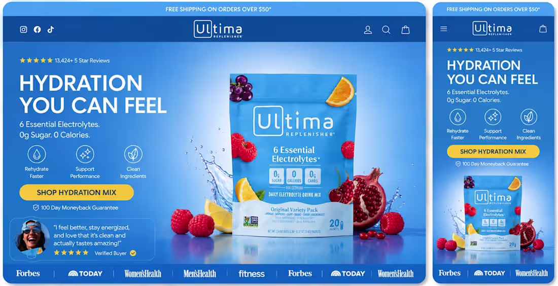
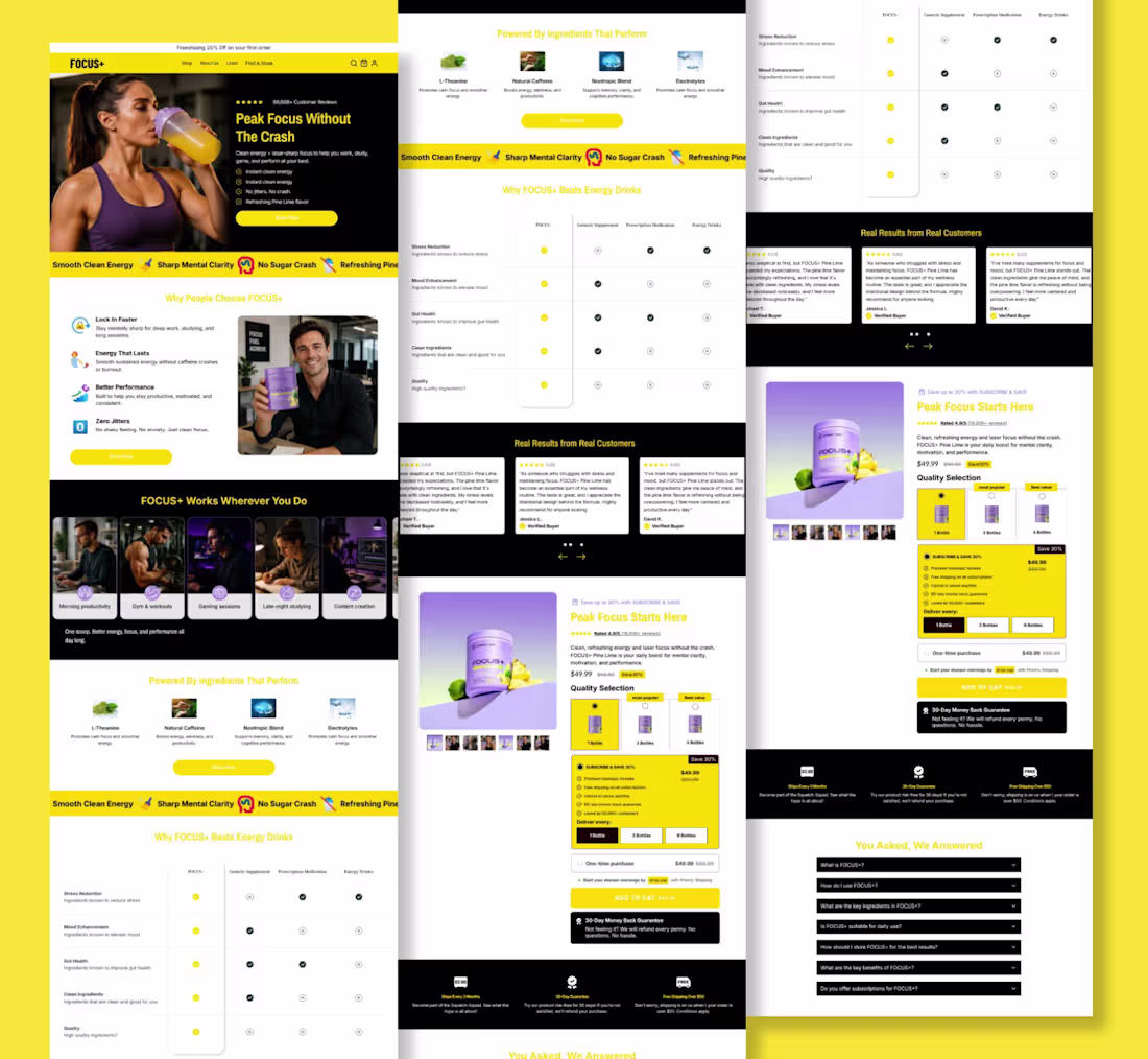
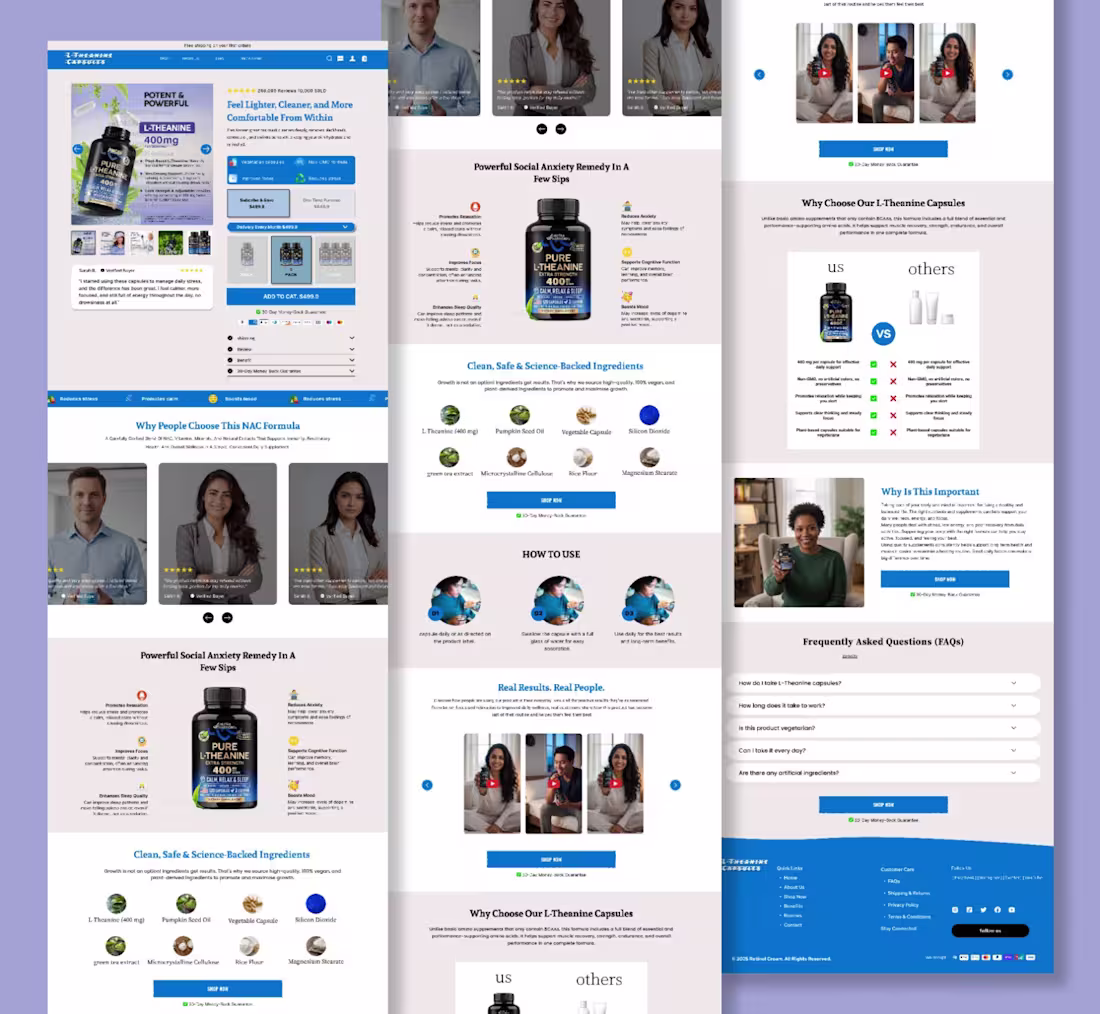
A high-converting wellness homepage isn’t about adding more sections.
It’s about reducing friction.
This design focuses on:
Immediate value proposition
13,000+ customer reviews
Lifestyle-driven visuals
Clear product benefits
Money-back guarantee
Seamless mobile experience
Every element moves the customer closer to one decision:
“This product is for me.”
0
34
A fitness homepage should do three things:
Grab attention instantly
Communicate product benefits clearly
Drive customers to take action
This design combines bold typography, vibrant colors, trust signals, and product-focused visuals to create a high-converting shopping experience.
Because great design doesn’t just look good.
It motivates people to act.
0
36
A homepage isn’t just about design it’s about creating trust in seconds.
13,000+ five-star reviews
Deep hydration
Stronger skin barrier
Overnight repair
Every element is designed to guide the customer from curiosity to confidence.
Clean visuals. Strong messaging. Premium experience.
Because great skincare deserves a homepage that sells.
0
38
Most product pages don’t lose sales because of the product.
They lose sales because they fail to create confidence.
A high-converting product page isn’t about adding more animations or flashy effects.
It’s about making every buying decision feel effortless.
This page gets the fundamentals right:
A benefit-driven headline that grabs attention.
Social proof that instantly builds credibility.
Premium product imagery that increases perceived value.
A clear discount that makes the offer feel irresistible.
Bundle options that increase average order value.
Customer reviews placed where they reinforce the buying decision.
A bold CTA that’s impossible to miss.
Every section answers a customer’s next question before they ask it.
That’s the secret.
The best product pages don’t pressure people into buying.
They remove uncertainty until buying feels like the obvious choice.
When design, messaging, and psychology work together, you don’t just create a beautiful page.
You create a page that turns visitors into customers and customers into repeat buyers.
That’s what conversion-focused design is all about.
0
37
Every section on your product page should have a purpose.
Build trust. Highlight benefits. Answer objections. Show proof. Make buying feel easy.
Great product pages don’t rely on luck. They’re built with strategy, clear messaging, and conversion-focused design.
The result? More confidence, higher conversions, and more revenue.
0
36
The difference between a 1% and 5% conversion rate isn’t luck.
It’s messaging.
Most brands talk about features.
Winning brands communicate outcomes.
People don’t buy ingredients.
They buy better sleep.
They don’t buy a vacuum.
They buy a cleaner workspace.
They don’t buy a supplement.
They buy how they want to feel.
Your landing page should sell the result, not the product.
0
35
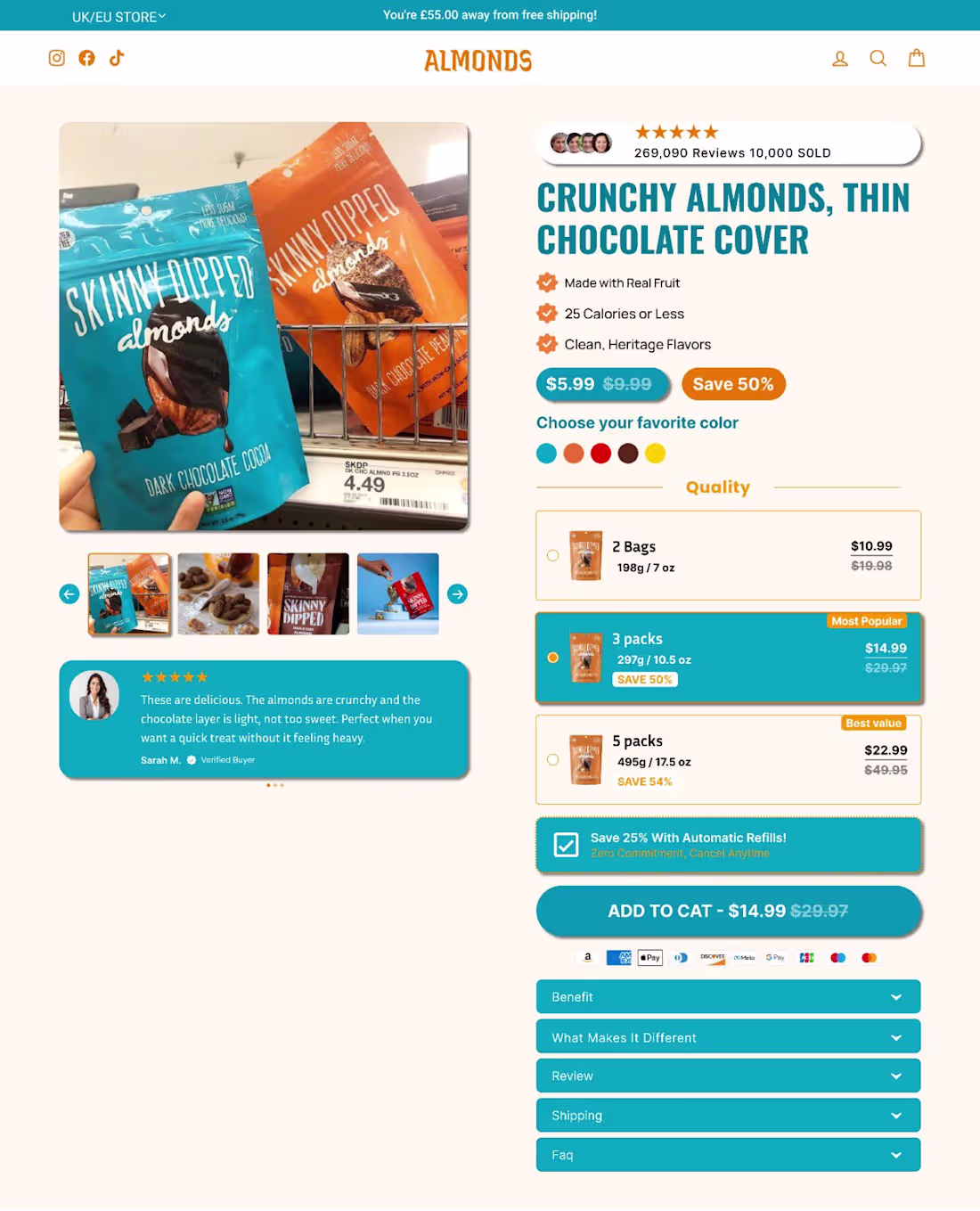
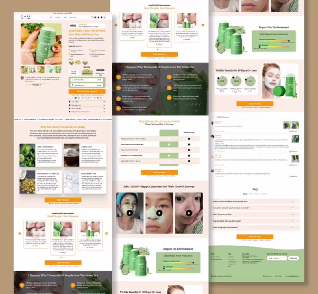
Great Products Deserve Product Pages That Convert.
A high-converting Product Detail Page isn’t just about showcasing a product it’s about building trust, creating urgency, and making the buying decision effortless.
This skincare PDP is designed to maximize conversions with:
Premium product-focused visuals
Benefit-driven messaging that answers customer concerns instantly
Social proof with ratings and customer trust signals
Smart bundle offers that increase average order value (AOV)
Free gifts and exclusive offers to boost perceived value
Scarcity and urgency elements that encourage immediate action
Secure checkout, money-back guarantee, and trusted payment options
Every section is strategically designed to reduce hesitation, increase confidence, and turn visitors into loyal customers.
A beautiful product page gets attention. A strategic product page gets sales.
Ready to transform your store into a conversion machine? Let’s build product pages that sell day and night.
0
35
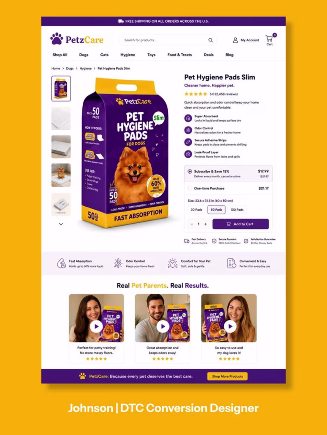
Your product page isn’t just selling dog pee pads… it’s selling a cleaner home, less stress, and happier pet parenting.
A high-converting Product Detail Page (PDP) is built on trust, emotion, and irresistible offers.
This design combines everything needed to increase conversions:
Lifestyle-focused product imagery
Authentic customer reviews & social proof
Value-packed bundle offers
Free gifts that boost average order value
Security badges & money-back guarantee
Clean, distraction-free buying experience
Strong, action-driven CTA
When your product page answers every question before it’s asked, buying becomes the easiest decision.
Great design doesn’t just look good.
It turns visitors into customers.
Ready to build a product page that sells 24/7? Let’s create one that drives more clicks, higher conversions, and bigger revenue.
#ProductPage (https://x.com/hashtag/ProductPage?src=hashtag_click) #PDPDesign (https://x.com/hashtag/PDPDesign?src=hashtag_click) #Ecommerce (https://x.com/hashtag/Ecommerce?src=hashtag_click) #ShopifyDesign (https://x.com/hashtag/ShopifyDesign?src=hashtag_click) #ConversionRateOptimization (https://x.com/hashtag/ConversionRateOptimization?src=hashtag_click) #cro (https://x.com/hashtag/cro?src=hashtag_click) #WebDesign (https://x.com/hashtag/WebDesign?src=hashtag_click) #UXDesign (https://x.com/hashtag/UXDesign?src=hashtag_click) #UIDesign (https://x.com/hashtag/UIDesign?src=hashtag_click) #LandingPageDesign (https://x.com/hashtag/LandingPageDesign?src=hashtag_click) #EcommerceDesign (https://x.com/hashtag/EcommerceDesign?src=hashtag_click) #ProductDesign (https://x.com/hashtag/ProductDesign?src=hashtag_click) #OnlineStore (https://x.com/hashtag/OnlineStore?src=hashtag_click) #DTCBrand (https://x.com/hashtag/DTCBrand?src=hashtag_click) #Branding (https://x.com/hashtag/Branding?src=hashtag_click) #DigitalMarketing (https://x.com/hashtag/DigitalMarketing?src=hashtag_click) #MarketingDesign (https://x.com/hashtag/MarketingDesign?src=hashtag_click) #SalesFunnels (https://x.com/hashtag/SalesFunnels?src=hashtag_click) #CustomerExperience (https://x.com/hashtag/CustomerExperience?src=hashtag_click) #PetProducts (https://x.com/hashtag/PetProducts?src=hashtag_click)
0
33
Why This Product Page Converts So Well
A high-converting product page isn’t just about beautiful design it’s about removing doubt and making buying feel easy. This page does exactly that.
From the moment you land on it, every section is built to answer one question: “Why should I buy this?”
✅ Powerful product images that instantly show the product in action.
✅ Clear benefits that explain exactly how it improves your daily routine.
✅ Before vs. after comparisons that make the difference easy to understand.
✅ Authentic customer reviews that build trust through real experiences.
✅ Data and proof points that reinforce credibility.
✅ FAQs that eliminate objections before customers even ask.
✅ A clean, distraction-free layout that keeps the focus on one goal: converting visitors into buyers.
This isn’t just a product page it’s a complete sales system designed to educate, build trust, and increase conversions.
Every section has a purpose.
Every element builds confidence.
Every click moves customers closer to purchasing.
The best product pages don’t sell products they sell confidence. That’s exactly what this page delivers.
0
33
Your Product Page Has One Job: Turn Interest Into Action.
Traffic gets people to your store.
Your PDP decides whether they buy or bounce.
The highest-converting product pages don’t rely on beautiful design alone.
They remove every reason not to purchase.
This page is built around conversion:
A clear value proposition above the fold
Premium product imagery that builds confidence
Benefit-driven copy that answers “Why this product?”
Bundle offers that increase AOV
Social proof that creates instant trust
Urgency and scarcity that encourage action
Trust badges that eliminate purchase anxiety
A bold, impossible-to-miss CTA
Every section moves the customer closer to one decision:
Add to Cart.
Because winning PDPs don’t just display products.
They build trust, reduce friction, and convert visitors into loyal customers.
0
35
Great Pet Brand? Great Product? That’s Not Enough.
A high-converting PDP turns curiosity into confidence and confidence into purchases.
Every element should answer one question:
“Why should I buy this right now?”
This product page does it well:
Clean, benefit-first layout
Premium product imagery that builds trust
Clear pricing and subscription savings
Customer reviews that reduce hesitation
Strong trust badges and guarantees
Simple buying experience with zero friction
The best-performing PDPs don’t overwhelm visitors.
They guide them.
Because every click should move customers one step closer to checkout not one step closer to leaving.
Less confusion. More trust. More conversions.
0
36
A Beautiful PDP Doesn’t Sell. A Strategic PDP Does.
Anyone can design a product page that looks premium.
Very few design one that actually converts.
The highest-converting PDPs remove friction at every step of the buying journey.
This page is built to do exactly that:
Strong product imagery that builds confidence instantly
Clear value proposition above the fold
Benefits customers care about not feature overload
Social proof that reinforces trust
Simple product options with zero confusion
Trust badges that reduce purchase anxiety
Bold CTA that makes buying effortless
A high-converting PDP doesn’t leave visitors wondering what to do next.
It answers every question before they ask.
Because every second of confusion costs conversions.
Design for clarity. Build trust. Increase conversions.
0
33
Most PDPs Don’t Lose Sales Because of the Product.
They lose because they fail to create belief.
Every section on your product page should answer one question:
“Why should I buy this right now?”
A high-converting PDP isn’t just beautiful it’s strategic.
Premium product imagery
Benefit-first copy
Clear visual hierarchy
Trust signals that reduce hesitation
Frictionless buying experience
CTA that’s impossible to miss
Every pixel should move the customer one step closer to checkout.
Because traffic gets visitors.
A great PDP turns them into customers.
Design for trust. Build for conversions. Optimize for revenue.
#ProductPageDesign
#PDPDesign
#ConversionRateOptimization
#EcommerceDesign
#ShopifyDesign
#DTCBrand
0
28
A Product Page Shouldn’t Just Display a Product.
It should remove every reason not to buy.
This PDP was designed with one goal:
Turn visitors into customers.
Why it works:
Clear product-first hero section
Benefits visible at a glance
Trust signals near the CTA
Subscription offer highlighted strategically
UGC placed where buying decisions happen
Clean layout that keeps attention on the product
The biggest conversion killer?
Making customers work too hard to understand the value.
The highest-converting PDPs make the decision feel effortless.
Because people don’t buy when they have more information.
They buy when they have more confidence.
Great PDPs don’t push products.
They build trust, reduce friction, and make the next step obvious.
#PDPOptimization
#ProductPageDesign
#ConversionRateOptimization
#CRo
#eCommerceMarketing
#ShopifyDesign
#ShopifyMarketing
#LandingPageDesign
#UXDesign
#UIUXDesign
#PerformanceMarketing
#EcommerceGrowth
0
23
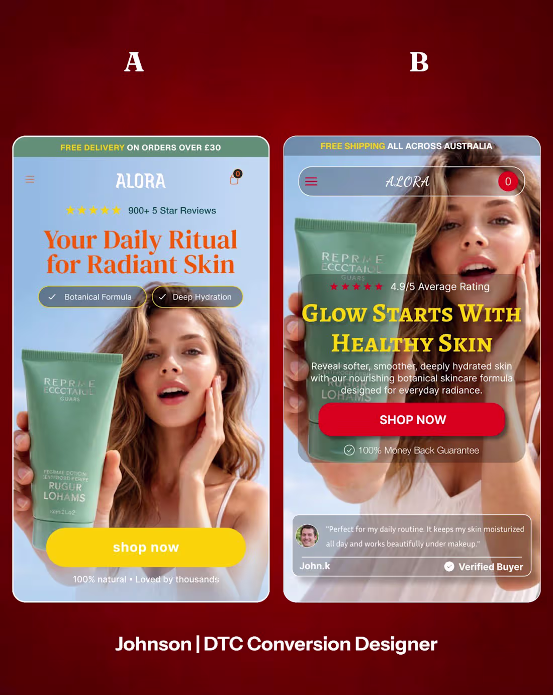
A/B Testing Doesn’t Tell You What Looks Better.
It Tells You What Sells Better.
Too many brands make decisions based on opinions:
❌ “I like this design more.”
❌ “This version looks cleaner.”
❌ “I think customers will prefer this.”
The problem?
Customers don’t buy based on what you like.
They buy based on what makes their decision easier.
That’s where A/B testing wins.
Test:
• Headlines
• Hero sections
• CTAs
• Product images
• Offers
• Social proof
• Layout structure
Sometimes a single change can increase conversions more than a complete redesign.
The goal isn’t to find the prettiest version.
The goal is to find the version that:
Gets more clicks
Builds more trust
Generates more sales
In ecommerce, assumptions are expensive.
Data is profitable.
Stop guessing.
Start testing
0
20
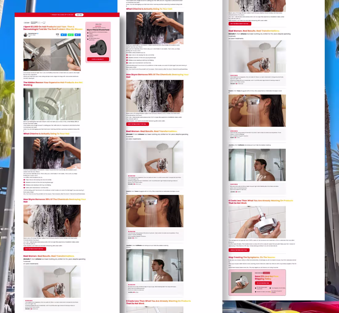
Most Advertorial Pages Don’t Fail Because of Traffic.
They fail because they feel like ads.
The highest-converting advertorials don’t sell immediately.
They educate.
They build curiosity.
They create belief.
A great advertorial page does this:
Hooks attention with a compelling story
Agitates a real problem
Introduces the solution naturally
Uses proof to build trust
Makes the next step feel obvious
The biggest mistake?
Leading with the product instead of the problem.
People don’t buy because they see a product.
They buy because they finally understand why they need it.
That’s why the best advertorials feel like content not marketing.
The goal isn’t to push a sale.
It’s to guide a prospect from:
“I don’t know if I need this.”
to
“I need this now.”
When done right, an advertorial page doesn’t feel like a sales page.
It feels like a discovery.
0
20
Your Homepage Has One Job:
Make visitors want to keep scrolling.
Most homepages try to say everything at once.
The best ones focus on one thing:
Clarity.
A high-converting homepage should:
• Explain what you sell in seconds
• Show why you’re different
• Build trust immediately
• Guide visitors to the next step
• Make buying feel effortless
The biggest mistake?
Filling the page with information instead of direction.
If visitors have to think too much, they leave.
Clear headline
Strong visuals
Obvious value proposition
Strategic social proof
Clear call-to-action
A homepage isn’t just a welcome page.
It’s the first sales conversation with your customer.
Make it count.
#HomepageDesign
#WebDesign
#UXDesign
#UIUXDesign
#eCommerceMarketing
#ShopifyDesign
#ConversionRateOptimization
#CRo
#LandingPageDesign
#EcommerceGrowth
#PerformanceMarketing
#MarketingStrategy
#DigitalMarketing
0
24
- Your PDP isn’t converting?
It’s probably not your product.
It’s the experience.
Weak visuals
Confusing layout
Unclear offer
Too much clutter
No trust signals
What converts instead?
Clear visual hierarchy
Strong value proposition
Benefit-driven messaging
Social proof at key moments
Clean, friction-free design
- The easier it is to understand, the easier it is to buy.
Comment “HELP” and I’ll share a quick PDP fix.
#PDPOptimization (https://x.com/hashtag/PDPOptimization?src=hashtag_click)
#ProductPageDesign (https://x.com/hashtag/ProductPageDesign?src=hashtag_click)
#ConversionRateOptimization (https://x.com/hashtag/ConversionRateOptimization?src=hashtag_click)
#CRo (https://x.com/hashtag/CRo?src=hashtag_click)
#eCommerceMarketing (https://x.com/hashtag/eCommerceMarketing?src=hashtag_click)
#eCommerceGrowth (https://x.com/hashtag/eCommerceGrowth?src=hashtag_click)
#ShopifyDesign (https://x.com/hashtag/ShopifyDesign?src=hashtag_click)
#ShopifyMarketing (https://x.com/hashtag/ShopifyMarketing?src=hashtag_click)
#LandingPageDesign (https://x.com/hashtag/LandingPageDesign?src=hashtag_click)
#WebDesign (https://x.com/hashtag/WebDesign?src=hashtag_click)
#UXDesign (https://x.com/hashtag/UXDesign?src=hashtag_click)
#UIUXDesign (https://x.com/hashtag/UIUXDesign?src=hashtag_click)
#PerformanceMarketing (https://x.com/hashtag/PerformanceMarketing?src=hashtag_click)
0
28
Just Design a Static Ads
I don’t just design ads I design attention.
Every static ad I create is built with intention:
• Clean layout = instant clarity
• Strong product focus = no distractions
• Clear messaging = fast understanding
• Premium visual direction = higher perceived value
• Benefit-driven structure = better decision-making
- Because in ecommerce, you don’t get long attention you get seconds.
So the goal is simple:
Stop the scroll.
Communicate fast.
Make the product feel like the obvious choice.
- Simple design. Strong intent. Better results.
0
30
Just designed a static ad for an ecommerce product.
Clean layout. Strong focus. Premium feel. Clear message.
Built to stop the scroll and make the product stand out instantly.
0
33
New static ad design for an ecommerce product.
Clean. Focused. Premium.
Built to grab attention in a crowded feed and drive clicks.
0
32
Designed a static ad for an ecommerce brand.
The goal was simple: clean layout, strong product focus, and a premium look that stops the scroll and communicates fast.
If your ads aren’t getting attention, it’s probably the creative.
#CROMarketing (https://x.com/hashtag/CROMarketing?src=hashtag_click)
#EcommerceStrategy (https://x.com/hashtag/EcommerceStrategy?src=hashtag_click)
#ProductDesign (https://x.com/hashtag/ProductDesign?src=hashtag_click)
#ConversionOptimization (https://x.com/hashtag/ConversionOptimization?src=hashtag_click)
#LandingPageOptimization (https://x.com/hashtag/LandingPageOptimization?src=hashtag_click)
#ShopifyDesign
(https://x.com/hashtag/ShopifyDesign?src=hashtag_click)#EcommerceDesign (https://x.com/hashtag/EcommerceDesign?src=hashtag_click)
#UXStrategy (https://x.com/hashtag/UXStrategy?src=hashtag_click)
#UIUXDesign (https://x.com/hashtag/UIUXDesign?src=hashtag_click)
#DigitalStrategy (https://x.com/hashtag/DigitalStrategy?src=hashtag_click)
#MarketingGrowth (https://x.com/hashtag/MarketingGrowth?src=hashtag_click)
#CopywritingTips (https://x.com/hashtag/CopywritingTips?src=hashtag_click)
#PerformanceAds (https://x.com/hashtag/PerformanceAds?src=hashtag_click)
#AdDesign (https://x.com/hashtag/AdDesign?src=hashtag_click)
#BrandGrowth (https://x.com/hashtag/BrandGrowth?src=hashtag_click)
0
31
What Makes a Static Ad Actually Convert
A static ad isn’t just a design it’s a decision trigger.
If it doesn’t stop the scroll in 2 seconds, it’s already failing.
Here’s what high-performing static ads get right:
• Strong visual hierarchy = eye lands exactly where it should
• Clear product focus = no confusion, instant recognition
• Benefit-led messaging = “what’s in it for me” is obvious
• Clean layout = no distractions, only intent
• Premium feel = builds instant trust and perceived value
• One clear message = faster understanding, faster action
Simple truth:
People don’t analyze ads.
They react to them.
If it’s unclear, it’s ignored.
If it’s clear, it converts.
Key takeaway:
Great static ads don’t explain too much.
They communicate fast, look premium, and make the product feel like the obvious choice.
#StaticAds
#AdCreative
#MarketingStrategy
#PerformanceMarketing
#Copywriting
0
32
Your PDP isn’t converting? Read this.
It’s not your product it’s your page clarity.
What’s breaking your sales:
• Weak or unclear visuals
• No clear structure or flow
• Offer doesn’t stand out
• Too much noise on the page
• No real trust signals
Fix this:
Clean, simple layout
Clear visual hierarchy
Strong, obvious offer
Less clutter, more focus
Benefit-driven messaging
Ecommerce truth:
If it’s confusing, it won’t convert.
Clarity = sales.
@replohq
#CROMarketing
#EcommerceStrategy
#ProductDesign
#ConversionOptimization
#LandingPageOptimization
#ShopifyDesign
#EcommerceDesign
#UXStrategy
#UIUXDesign
#DigitalStrategy
#MarketingGrowth
#CopywritingTips
#PerformanceAds
#AdDesign
#BrandGrowth
0
31
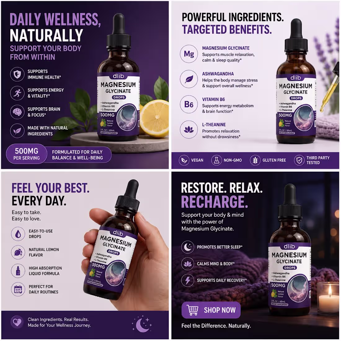
How to Make a Product Page Feel TRUSTWORTHY Instantly
Trust is not claimed on a PDP it’s engineered through design.
Here’s what actually builds instant credibility:
• Clean clinical-style layout = premium + authoritative first impression
• Strong hierarchy (product → benefits → offer → CTA) = effortless scanning
• Subscription option clearly placed = value without pressure
• “Complete transparency” section = removes skepticism immediately
• Reviews + UGC placed near decision points = trust reinforcement loop
• Generous white space = less cognitive load, faster understanding
The real strategy:
They don’t choose between aesthetics.
They combine:
clinical, science-based credibility
creator-style UGC trust
That blend is extremely powerful for conversions.
Why it works:
• UGC near PDP can increase CVR by 15–35%
• Clean layouts reduce bounce rates by ~20%
• Subscription framing can lift AOV by 20–40%
Pro insight:
If you sell supplements, don’t design like a fitness ad.
Design like:
a medical-grade brand
a premium wellness company
a creator-backed lifestyle product
All at once.
#ProductPageDesign
#PDPOptimization
#ConversionRateOptimization
#CRo
#LandingPageDesign
#eCommerceMarketing
#PerformanceMarketing
#UXDesign
#UIUXDesign
#MarketingStrategy
#AdCreative
#Copywriting
#digitalmarketing
#BrandStrategy
#EcommerceGrowth
0
31
Conversation
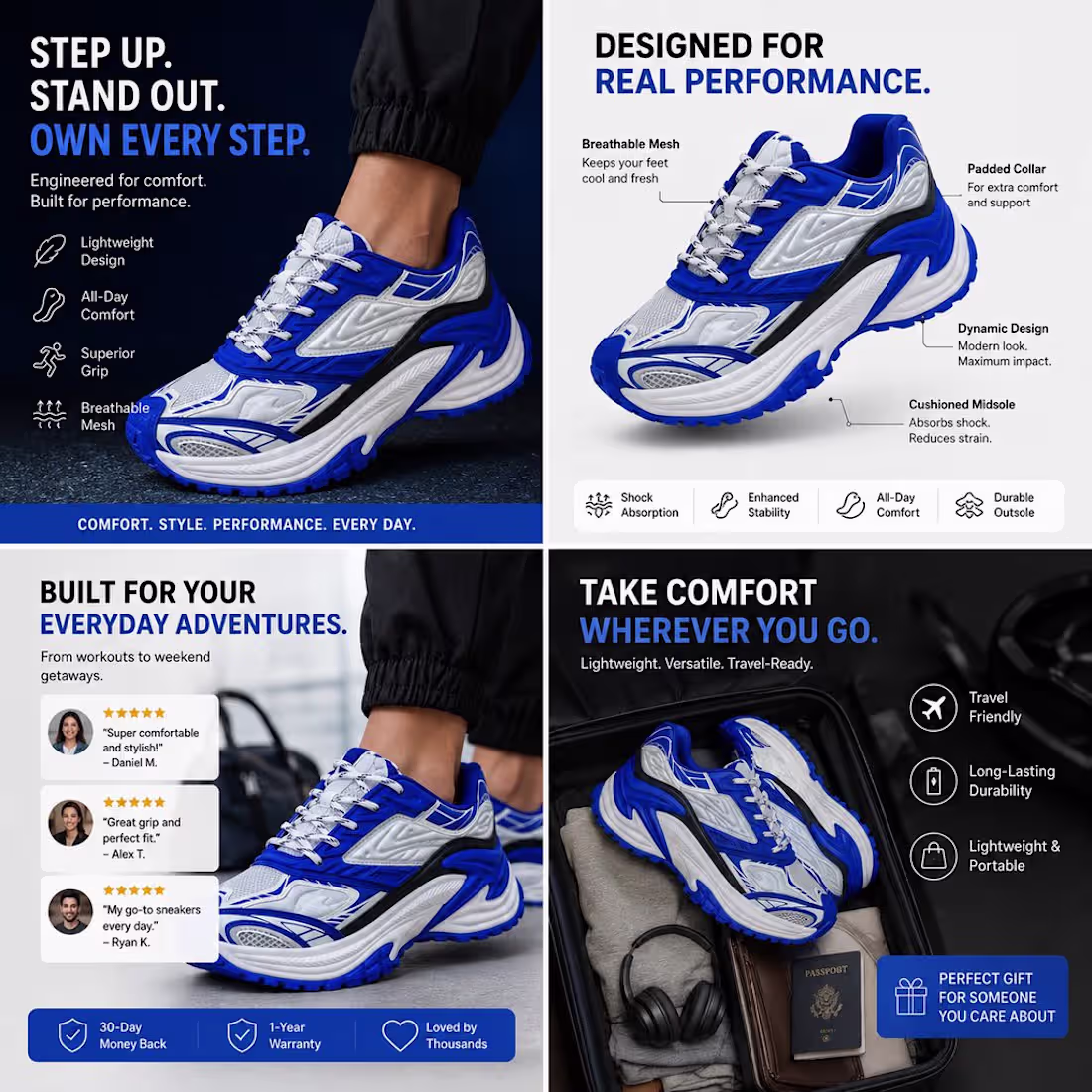
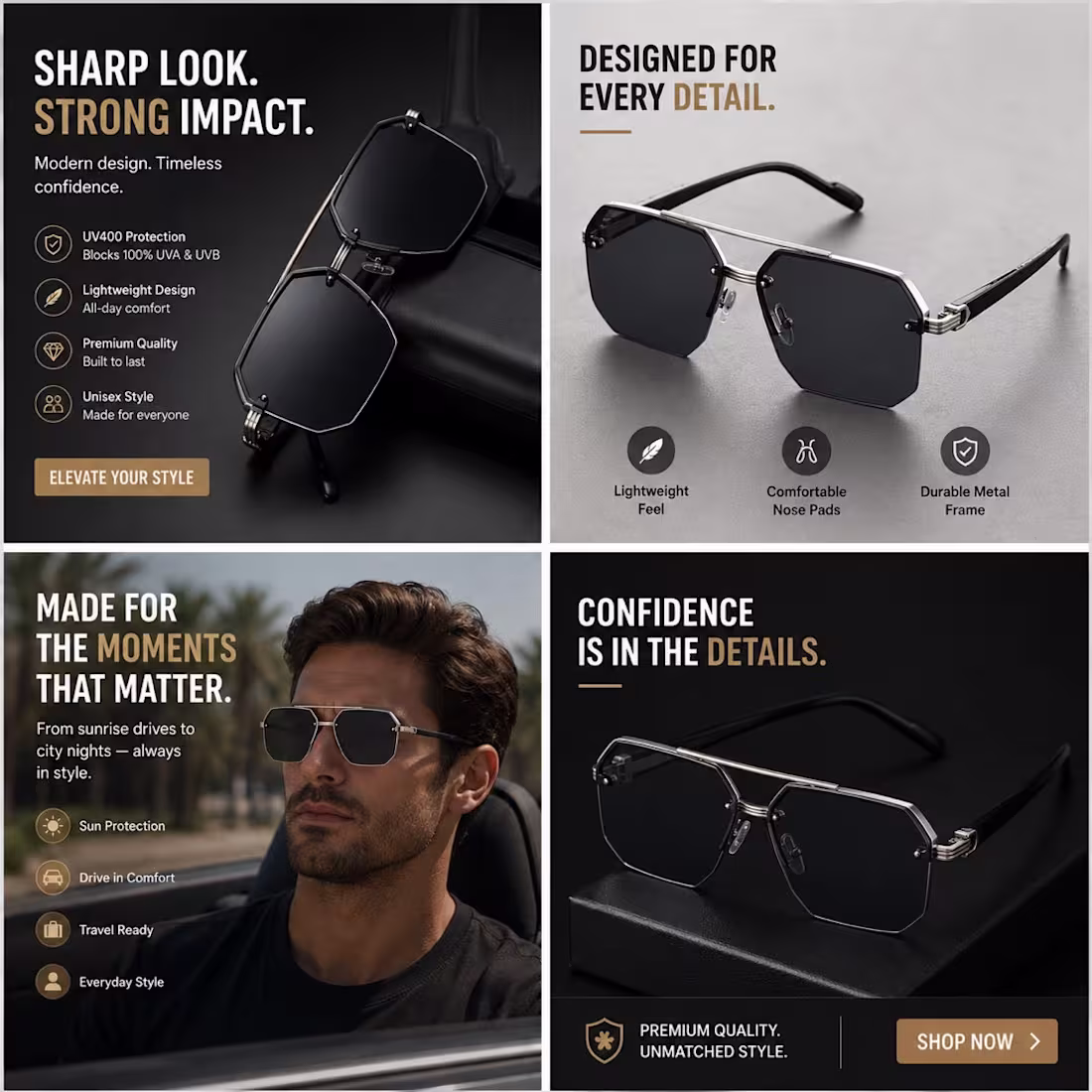
Nike-Style Static Ad Breakdown: Performance Sneakers
This is a strong example of how to position a shoe as more than footwear it becomes a performance identity product.
Here’s what makes this creative convert:
• Bold hero visuals = instant product attraction
• Strong headline hierarchy = “Move Different. Feel Every Step.” sticks immediately
• Benefit-led features = lightweight, breathable, cushioned, durable = easy decision-making
• Lifestyle positioning = training, running, daily wear = multiple use cases
• Clean premium layout = focuses attention on product, not noise
• Motion-focused messaging = connects product to action, not just looks
0
27
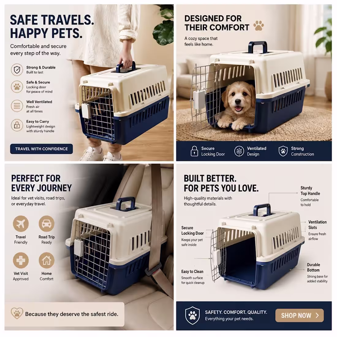
Static Ad Breakdown: Pet Travel Carrier
This is a great example of turning a simple product into a premium buying decision.
• Happy pet visuals = instant emotional connection
• Safety + comfort messaging = builds trust fast
• Clear features = removes doubt (ventilation, durability, secure lock)
• Travel context = makes it feel practical and necessary
• Clean premium design = increases perceived value
- Key insight:
They’re not selling a carrier they’re selling safety, comfort, and peace of mind for pets on every journey.
- Emotion sells. Clarity converts.
0
23
Good design reduces decision fatigue.
One of the biggest mistakes brands make is giving users too many things to process at once.
Too many messages.
Too many options.
Too many distractions.
When visitors have to work hard to understand a page, they’re more likely to leave without taking action.
That’s why the best-performing landing pages feel effortless to navigate.
Every section has a purpose.
Every element supports the buying decision.
Every CTA is clear and easy to find.
Good design isn't about adding more features or visual effects.
It's about creating a smooth experience that helps users move from interest to purchase with as little friction as possible.
The easier a page is to understand, the easier it becomes to convert.
#LandingPageDesign (https://x.com/hashtag/LandingPageDesign?src=hashtag_click) #ShopifyDesign (https://x.com/hashtag/ShopifyDesign?src=hashtag_click) #Ecommerce (https://x.com/hashtag/Ecommerce?src=hashtag_click) #DTCBrand (https://x.com/hashtag/DTCBrand?src=hashtag_click) #ConversionOptimization (https://x.com/hashtag/ConversionOptimization?src=hashtag_click)
0
23
Worked on improving a homepage layout today.
Focused on:
• clearer messaging
• better spacing
• stronger mobile experience
• cleaner CTA visibility
A lot of homepage problems come from clutter and weak hierarchy.
When users land on a page, they should instantly understand:
• what the brand offers
• why it matters
• and where to go next
Small UX improvements can completely change how visitors interact with a site.
Good homepage design isn’t just about aesthetics.
It’s about creating a smoother path to conversion.
#HomepageDesign (https://x.com/hashtag/HomepageDesign?src=hashtag_click) #ShopifyDesign (https://x.com/hashtag/ShopifyDesign?src=hashtag_click) #Ecommerce (https://x.com/hashtag/Ecommerce?src=hashtag_click) #DTCBrand (https://x.com/hashtag/DTCBrand?src=hashtag_click) #LandingPageDesign (https://x.com/hashtag/LandingPageDesign?src=hashtag_click) #ConversionOptimization (https://x.com/hashtag/ConversionOptimization?src=hashtag_click)
0
25
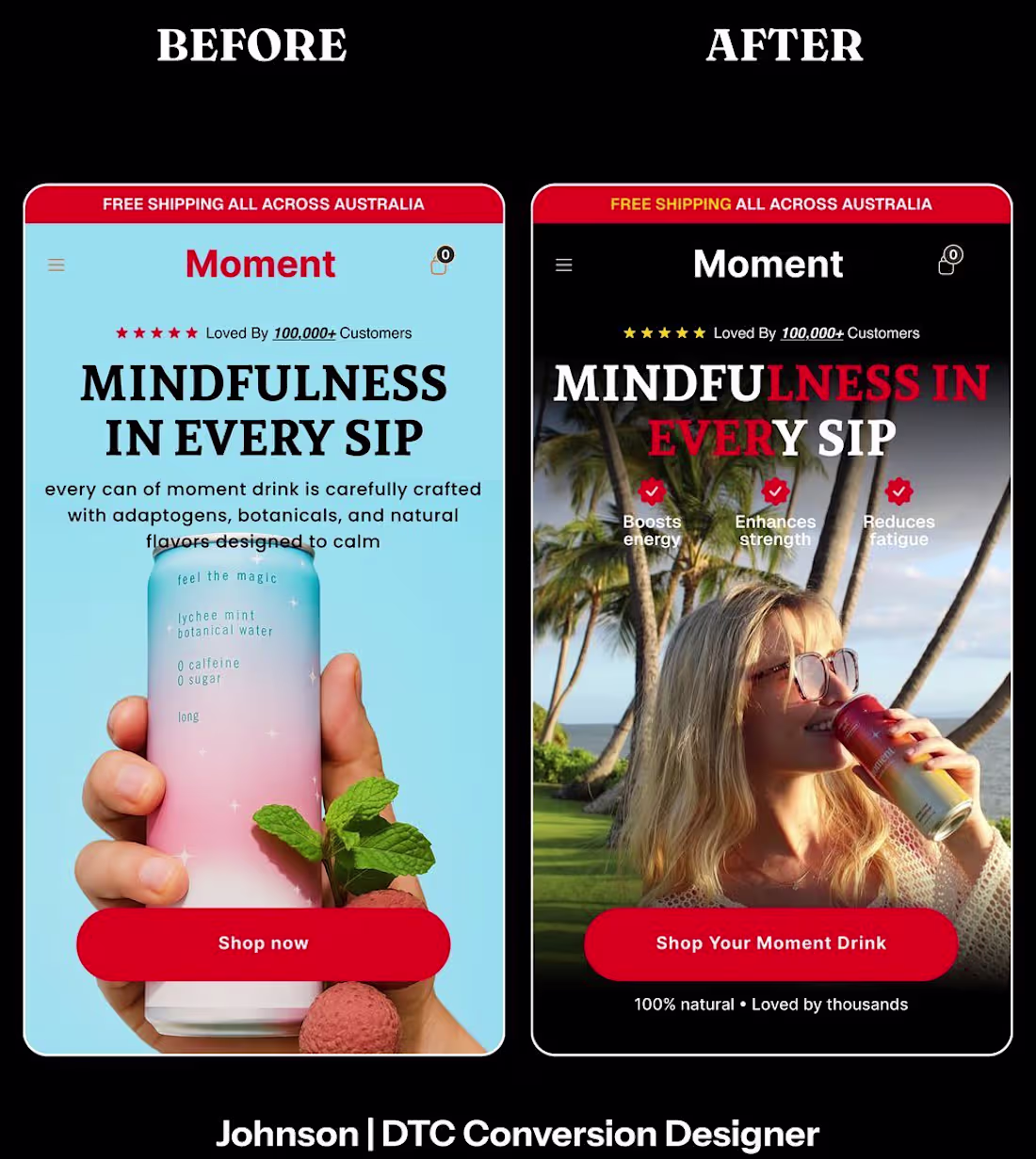
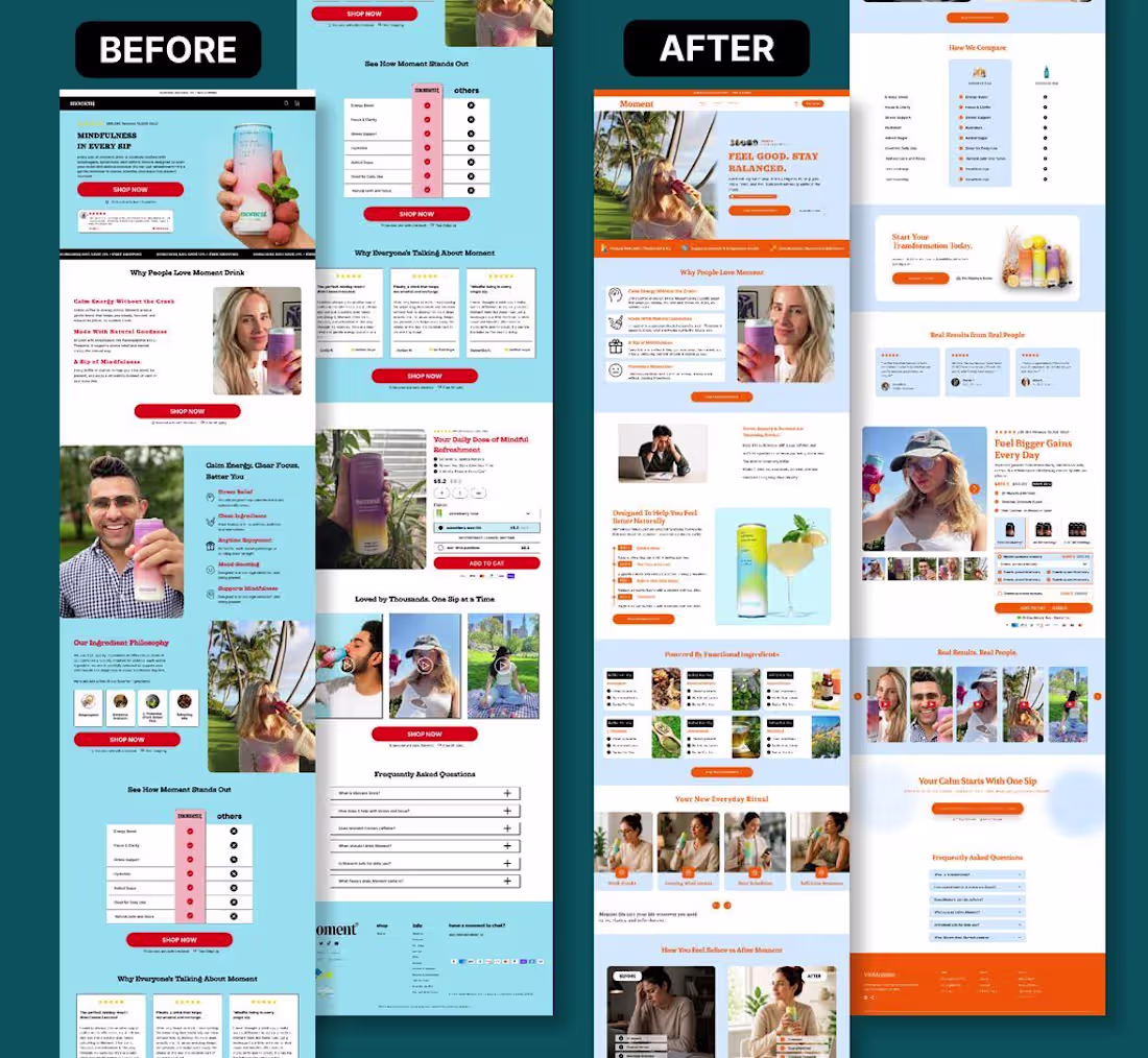
Before vs After.
Redesigned this hero section to:
• improve readability
• reduce clutter
• increase CTA visibility
• improve mobile experience
Small changes. Bigger impact.
#LandingPageDesign (https://x.com/hashtag/LandingPageDesign?src=hashtag_click) #ShopifyDesign (https://x.com/hashtag/ShopifyDesign?src=hashtag_click) #Ecommerce (https://x.com/hashtag/Ecommerce?src=hashtag_click) #DTCBrand (https://x.com/hashtag/DTCBrand?src=hashtag_click)
0
31
Design should support the buying decision, not distract from it.
Every element on the page should help users understand, trust, and take action.
Good design drives conversions.
#LandingPageDesign (https://x.com/hashtag/LandingPageDesign?src=hashtag_click) #ShopifyDesign (https://x.com/hashtag/ShopifyDesign?src=hashtag_click) #Ecommerce (https://x.com/hashtag/Ecommerce?src=hashtag_click) #DTCBrand (https://x.com/hashtag/DTCBrand?src=hashtag_click)
0
33
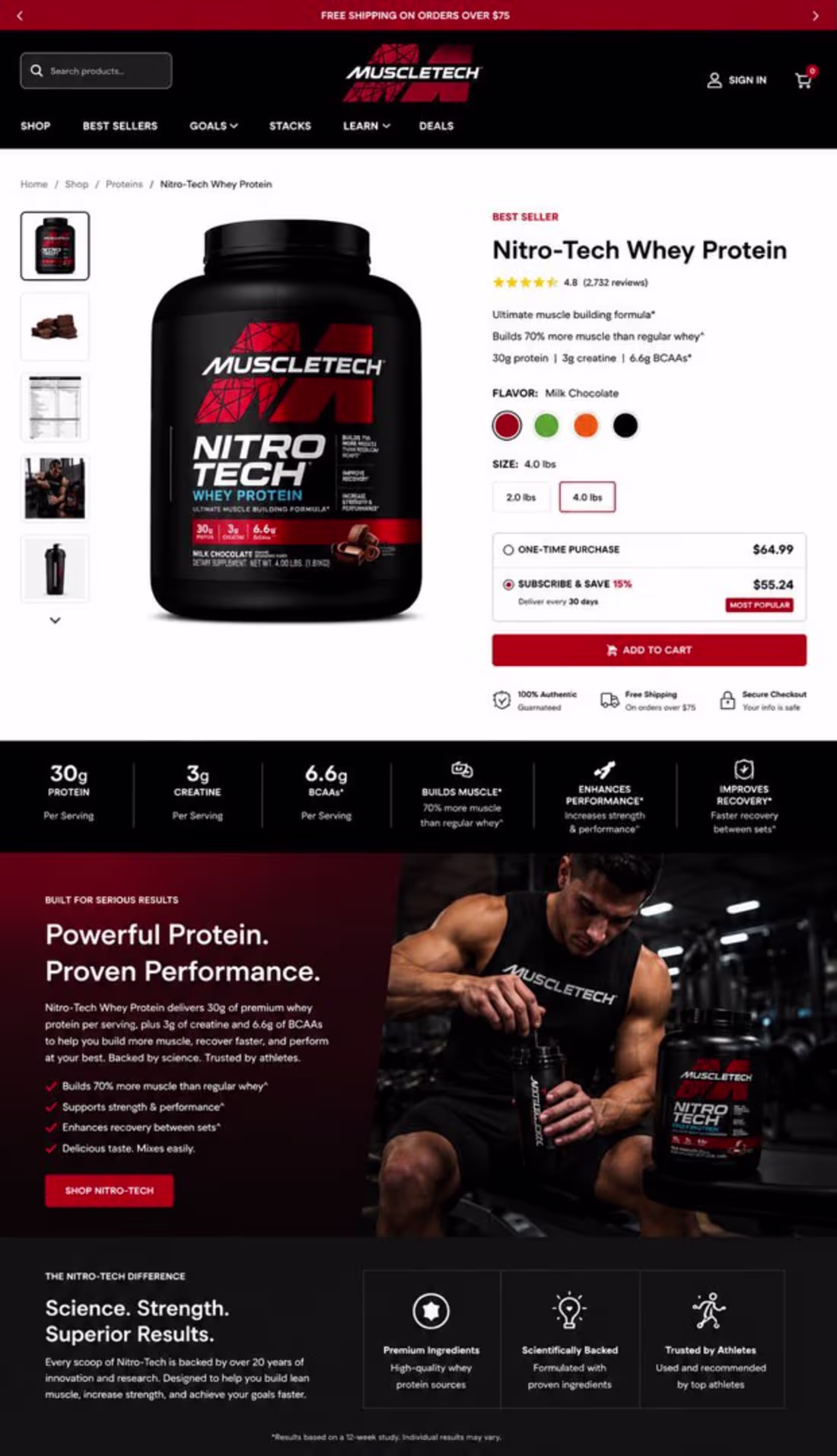
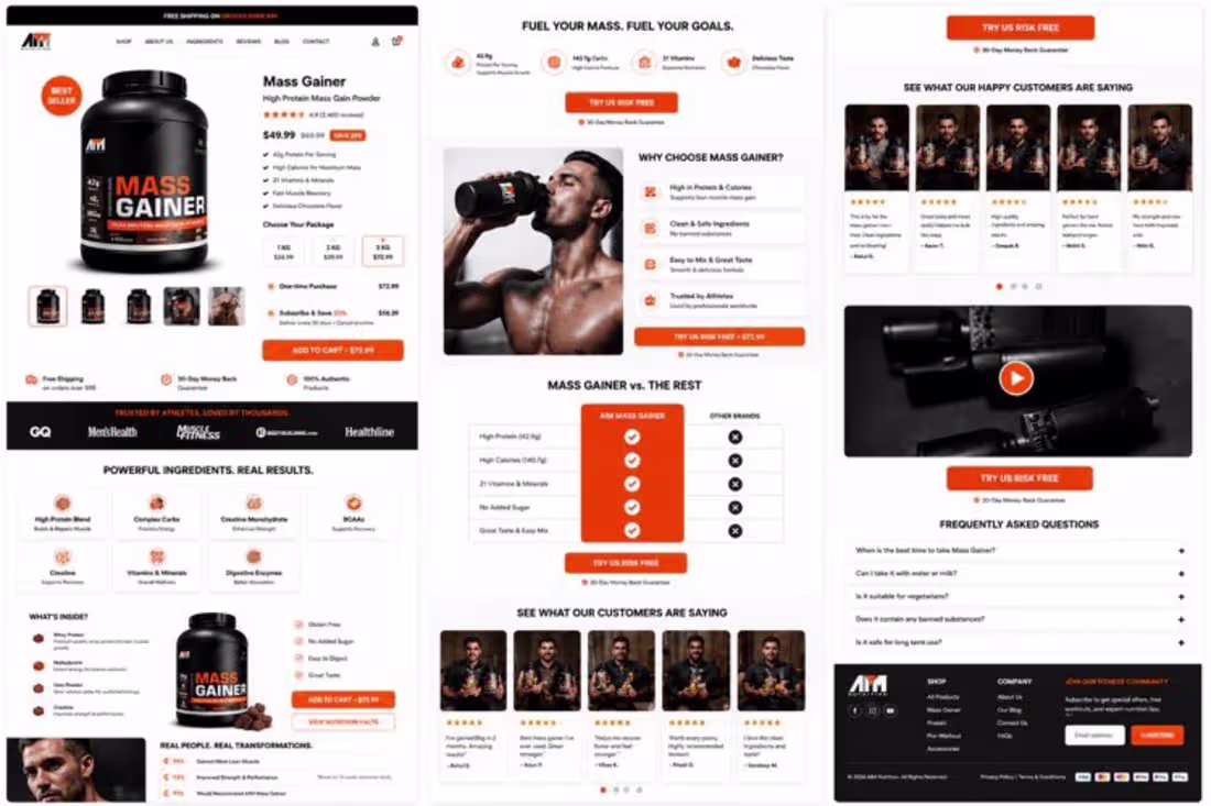
PDP Breakdown: MuscleTech Nitro-Tech
This is a high-converting product page built for clarity and performance.
• Strong hero section = instant product + value understanding
• Clear metrics (30g protein, 3g creatine, 6.6g BCAAs) = fast trust
• Ratings + reviews = strong social proof
• Clean pricing + subscription option = decision guidance
• Athletic visuals = aspiration + credibility
- Key insight:
It doesn’t just show the product it sells strength, performance, and results.
- Great PDPs don’t confuse. They guide, build trust, and convert fast. #ConversionOptimization (https://x.com/hashtag/ConversionOptimization?src=hashtag_click)
#Ecommerce (https://x.com/hashtag/Ecommerce?src=hashtag_click) #websitedesigner (https://x.com/hashtag/websitedesigner?src=hashtag_click)
#cro (https://x.com/hashtag/cro?src=hashtag_click) #marketing (https://x.com/hashtag/marketing?src=hashtag_click) #digitalmarketing (https://x.com/hashtag/digitalmarketing?src=hashtag_click) #starup (https://x.com/hashtag/starup?src=hashtag_click)
0
35
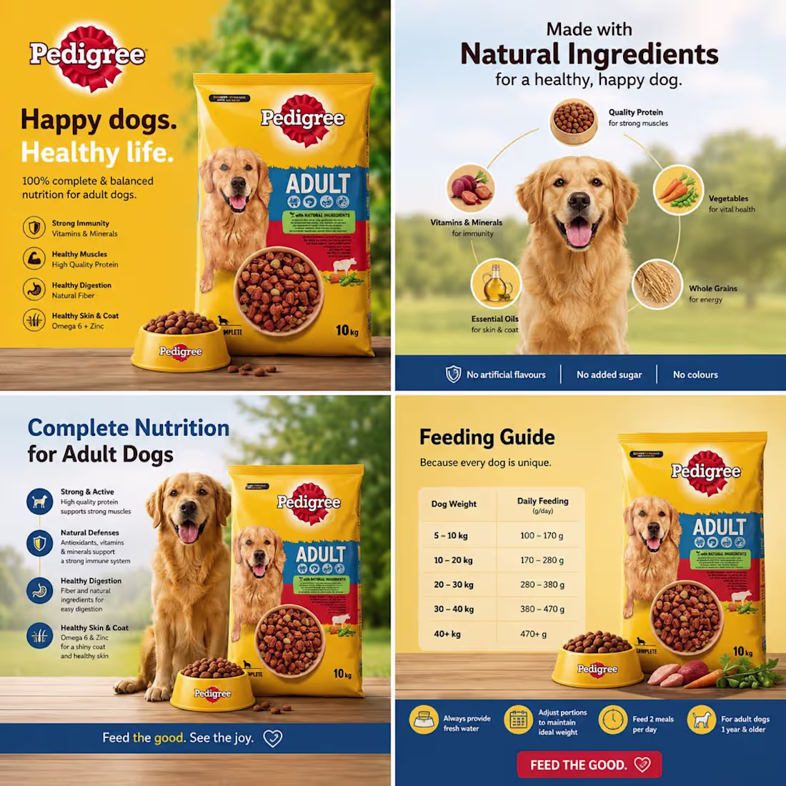
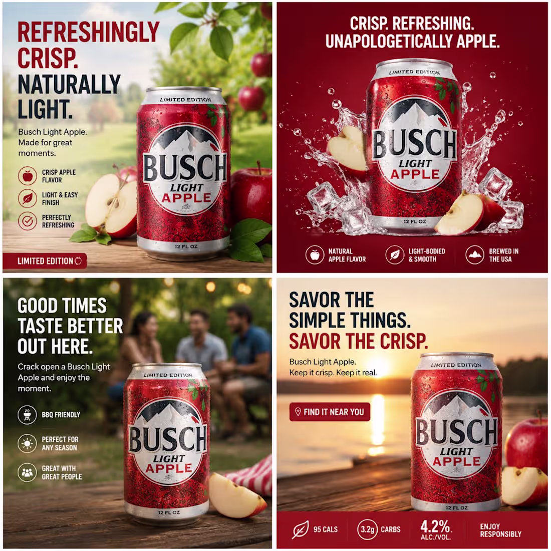
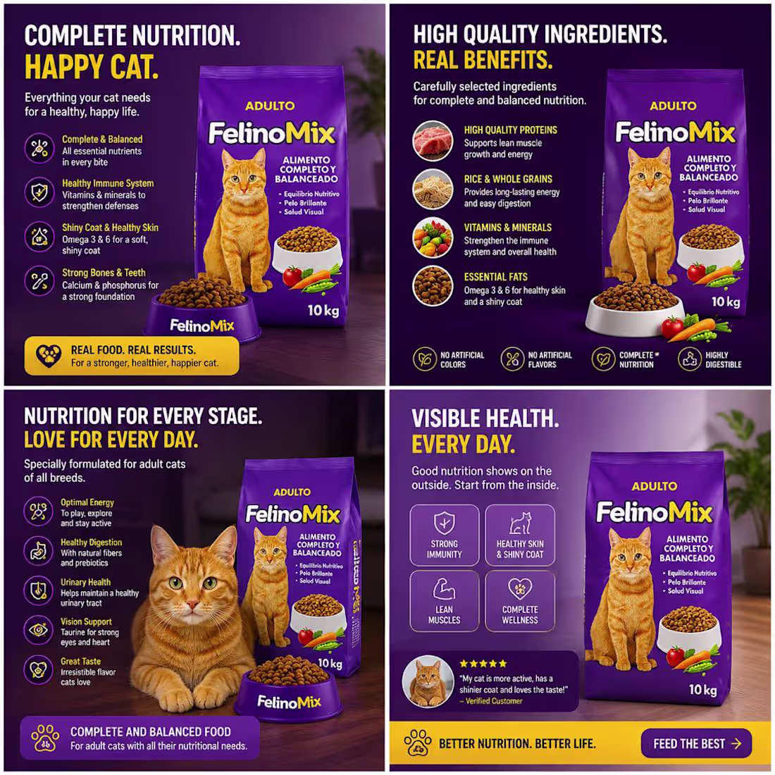
These ads work because they combine clarity + emotion + trust.
• Happy dog visuals = instant emotional hook
• Clear benefits = health, immunity, digestion, coat
• Ingredient transparency = builds trust fast
• Simple layout = easy to scan, easy to believe
• Feeding guide = removes buying doubt
They’re not selling dog food they’re selling a healthier, happier life for pets.
Key takeaway: Emotion gets attention, clarity closes the sale.
#StaticAds (https://x.com/hashtag/StaticAds?src=hashtag_click) #AdCreative (https://x.com/hashtag/AdCreative?src=hashtag_click) #MarketingStrategy (https://x.com/hashtag/MarketingStrategy?src=hashtag_click) #PerformanceMarketing (https://x.com/hashtag/PerformanceMarketing?src=hashtag_click) #Copywriting (https://x.com/hashtag/Copywriting?src=hashtag_click)
@ecommerce (https://x.com/ecommerce) #cro (https://x.com/hashtag/cro?src=hashtag_click)
@DTCGroup_
(https://x.com/DTCGroup_)
0
38
The best Shopify pages feel effortless to navigate.
Clear hierarchy.
Strong messaging.
Obvious next steps.
When users don't have to think, they convert more.
Good design removes friction.
build with
@ai
(https://x.com/ai)#ShopifyDesign (https://x.com/hashtag/ShopifyDesign?src=hashtag_click) #LandingPageDesign (https://x.com/hashtag/LandingPageDesign?src=hashtag_click) #Ecommerce (https://x.com/hashtag/Ecommerce?src=hashtag_click) #DTCBrand
(https://x.com/hashtag/DTCBrand?src=hashtag_click)
0
41
Focused on improving trust signals today:
• reviews
• testimonials
• guarantees
• product clarity
People rarely buy when they're uncertain.
The faster a page builds trust, the easier it becomes to convert visitors into customers.
#LandingPageDesign (https://x.com/hashtag/LandingPageDesign?src=hashtag_click) #ShopifyDesign (https://x.com/hashtag/ShopifyDesign?src=hashtag_click) #Ecommerce (https://x.com/hashtag/Ecommerce?src=hashtag_click) #DTCBrand (https://x.com/hashtag/DTCBrand?src=hashtag_click)
0
42
Clarity usually converts better than “fancy” design.
A landing page doesn’t need excessive animations or complicated layouts to perform well.
If users can’t instantly understand:
• what the product is
• why it matters
• and what to do next
…they’ll leave.
The best-performing pages focus on:
• clear messaging
• strong hierarchy
• clean spacing
• visible CTAs
• friction-free mobile experience
Good design should guide users, not distract them.
Simple and clear almost always wins.
#LandingPageDesign (https://x.com/hashtag/LandingPageDesign?src=hashtag_click) #ShopifyDesign (https://x.com/hashtag/ShopifyDesign?src=hashtag_click) #Ecommerce (https://x.com/hashtag/Ecommerce?src=hashtag_click) #DTCBrand (https://x.com/hashtag/DTCBrand?src=hashtag_click) #Replo (https://x.com/hashtag/Replo?src=hashtag_click) #ConversionOptimization (https://x.com/hashtag/ConversionOptimization?src=hashtag_click)
0
35
Most DTC brands don’t need more traffic.
They need better conversion pages.
A lot of brands spend thousands on ads just to send visitors to product pages that don’t build trust, guide attention, or make the buying decision easy.
More traffic won’t fix a weak landing page.
High-converting pages focus on:
• clear product messaging
• strong visual hierarchy
• mobile-first design
• trust-building sections
• visible CTAs
• friction-free user experience
Small design improvements can completely change conversion performance.
Because at the end of the day, traffic means nothing if the page doesn’t convert.
#Shopify (https://x.com/hashtag/Shopify?src=hashtag_click) #LandingPageDesign (https://x.com/hashtag/LandingPageDesign?src=hashtag_click) #Ecommerce (https://x.com/hashtag/Ecommerce?src=hashtag_click) #DTCBrand (https://x.com/hashtag/DTCBrand?src=hashtag_click) #Replo (https://x.com/hashtag/Replo?src=hashtag_click) #ConversionRateOptimization (https://x.com/hashtag/ConversionRateOptimization?src=hashtag_click)
0
32
Most supplement brands don’t have a traffic problem.
They have a conversion problem.
You can run ads, get clicks, and still struggle to make consistent sales if the landing page experience doesn’t build trust fast enough.
A lot of product pages fail because:
• the messaging is unclear
• the design feels outdated
• the product benefits aren’t obvious
• there’s no strong visual hierarchy
• mobile experience is weak
• the CTA gets lost
People don’t buy because of the product alone.
They buy because the page makes the decision feel easy and trustworthy.
A high-converting landing page should:
✓ instantly communicate the benefit
✓ make the product feel premium
✓ guide visitors toward action
✓ remove distractions
✓ increase trust within seconds
Small design changes can completely change conversion performance.
Good design isn’t decoration.
It’s a sales tool.
#Shopify (https://x.com/hashtag/Shopify?src=hashtag_click) #ShopifyDesign (https://x.com/hashtag/ShopifyDesign?src=hashtag_click) #LandingPage (https://x.com/hashtag/LandingPage?src=hashtag_click) #Ecommerce (https://x.com/hashtag/Ecommerce?src=hashtag_click) #DTCBrand (https://x.com/hashtag/DTCBrand?src=hashtag_click) #Replo (https://x.com/hashtag/Replo?src=hashtag_click) #ConversionRateOptimization (https://x.com/hashtag/ConversionRateOptimization?src=hashtag_click) #WebDesign (https://x.com/hashtag/WebDesign?src=hashtag_click)
0
31
A high-converting mobile layout usually has:
• clear headline
• visible CTA
• trust signals
• easy scrolling
• strong spacing
Simple wins.
@ecommerce (https://x.com/ecommerce)
@replohq (https://x.com/replohq)
@figma (https://x.com/figma)
@DTCGroup_ (https://x.com/DTCGroup_)
@cpandpromo (https://x.com/cpandpromo)
@onlinestore (https://x.com/onlinestore) #cro (https://x.com/hashtag/cro?src=hashtag_click)
@Shopify
(https://x.com/Shopify)
0
33
Your product page is your real salesperson.
Not your ads. Not your brand. The PDP.
If it fails, nothing else matters.
Fix this:
– Show the result in the first 3 seconds
– Make the offer impossible to miss
– Add proof where doubt happens
– Remove every distraction
– Make the next step obvious
Confusion kills sales. Clarity prints money.
Comment “PDP” or DM me if you want me to review yours
@replohq (https://x.com/replohq)
@ecommerce (https://x.com/ecommerce)
@delfinaagency (https://x.com/delfinaagency)
@LcvideoprodX (https://x.com/LcvideoprodX)
@Shopify (https://x.com/Shopify) #cro (https://x.com/hashtag/cro?src=hashtag_click)
@DTCGroup_
(https://x.com/DTCGroup_)
0
36
Built a custom Replo landing page today.
Focused on:
• speed
• clean sections
• mobile responsiveness
• conversion-focused structure
Figma → Replo → Shopify
@replohq (https://x.com/replohq)
@Shopify (https://x.com/Shopify)
@ecommerce (https://x.com/ecommerce)
@DTCBrand (https://x.com/DTCBrand)
@FoundersGroup (https://x.com/FoundersGroup)
@figma
(https://x.com/figma)
0
39
Most homepages look nice but don’t convert.
Why?
– No clear offer
– Weak hierarchy
– Too much clutter
– No trust positioning
– No direction
Winning homepages guide users step-by-step toward action.
Clarity beats creativity every time.
Comment “FIX” or DM me
0
36
A good homepage should answer 3 questions immediately:
• What is this?
• Why should I care?
• Why should I trust you?
Most brands fail the first screen.
@ecommerce (https://x.com/ecommerce)
@DTCGroup_ (https://x.com/DTCGroup_)
@Shopify (https://x.com/Shopify)
@figma (https://x.com/figma)
@StoreShopi31727 (https://x.com/StoreShopi31727)
@replohq
(https://x.com/replohq)
0
36
If your mobile experience feels hard to scroll, people leave.
Most DTC traffic is mobile.
Design for thumbs, not desktops.
@Shopify (https://x.com/Shopify)
@DTCGroup_ (https://x.com/DTCGroup_)
@replohq (https://x.com/replohq) #cro (https://x.com/hashtag/cro?src=hashtag_click)
@ecommerce
(https://x.com/ecommerce)
0
39
Most Shopify brands focus too much on making pages “look premium.”
Clarity converts better than fancy design.
@Shopify (https://x.com/Shopify)
@replohq (https://x.com/replohq)
@ecommerce (https://x.com/ecommerce)
@DTC_Quizbuilder (https://x.com/DTC_Quizbuilder)
@DTCBrand (https://x.com/DTCBrand) #cro (https://x.com/hashtag/cro?src=hashtag_click) #agency (https://x.com/hashtag/agency?src=hashtag_click) #founder (https://x.com/hashtag/founder?src=hashtag_click)
@DTCGroup_
(https://x.com/DTCGroup_)
0
42
Focused on:
• stronger hierarchy
• cleaner CTA section
• mobile optimization
• trust-building layout
Simple changes can completely change conversion flow.
@Shopify
@DTCGroup_
@ecommerce
@replohq
@SEO_Web_Designs
0
46
Your product page is the final decision point.
People scan fast and rarely read everything.
If it’s unclear, they leave without buying.
Make results, trust, and offer instantly visible.
A well-built page multiplies your conversions. Build on
@replohq
(https://x.com/replohq)
0
46
I just designed a static ad for an ecommerce product, and the approach was simple but intentional.
No clutter. No unnecessary elements. Just a clean layout, strong product focus, and a premium visual direction that makes the product the hero.
Most ads fail not because the product is bad, but because the creative doesn’t earn attention fast enough.
This is the kind of design that does.
Built to stop the scroll, hold attention, and make the message instantly clear.
#AdCreative (https://x.com/hashtag/AdCreative?src=hashtag_click) #MarketingStrategy (https://x.com/hashtag/MarketingStrategy?src=hashtag_click) #PerformanceMarketing (https://x.com/hashtag/PerformanceMarketing?src=hashtag_click) #StaticAds (https://x.com/hashtag/StaticAds?src=hashtag_click) #Copywriting (https://x.com/hashtag/Copywriting?src=hashtag_click)
0
46
Just worked on a static ad for an ecommerce product.
The focus was clarity over complexity.
A clean layout that guides the eye.
A strong product focus that removes distractions.
A clear message that communicates value instantly.
A premium look that builds trust without saying a word.
Because in today’s attention economy, you don’t get time to explain you only get time to be understood fast.
That’s what this creative is built for.
#StaticAds (https://x.com/hashtag/StaticAds?src=hashtag_click) #AdCreative (https://x.com/hashtag/AdCreative?src=hashtag_click) #PerformanceMarketing (https://x.com/hashtag/PerformanceMarketing?src=hashtag_click) #Copywriting (https://x.com/hashtag/Copywriting?src=hashtag_click)
0
42
Static ads made for the supplement brand.
The focus was simple: clean layout, strong product presence, clear messaging, and a premium visual feel that instantly communicates value.
Built to cut through the noise, stop the scroll, and make the product the center of attention without distractions.
#StaticAds (https://x.com/hashtag/StaticAds?src=hashtag_click) #AdCreative (https://x.com/hashtag/AdCreative?src=hashtag_click) #PerformanceMarketing (https://x.com/hashtag/PerformanceMarketing?src=hashtag_click) #Copywriting (https://x.com/hashtag/Copywriting?src=hashtag_click)
#Ecommerce (https://x.com/hashtag/Ecommerce?src=hashtag_click)
#cro (https://x.com/hashtag/cro?src=hashtag_click)
0
43
Most good-looking ads don’t sell.
They just look good.
The ads that actually win grab attention and communicate value within the first 2 seconds.
That’s what I design for.
#StaticAds (https://x.com/hashtag/StaticAds?src=hashtag_click) #AdCreative (https://x.com/hashtag/AdCreative?src=hashtag_click) #MarketingStrategy (https://x.com/hashtag/MarketingStrategy?src=hashtag_click) #PerformanceMarketing (https://x.com/hashtag/PerformanceMarketing?src=hashtag_click) #Copywriting (https://x.com/hashtag/Copywriting?src=hashtag_click)
0
44
If your PDP isn’t converting, this is why:
– No clear outcome
– No system thinking
– Weak value display
– No trust signals
– Too much friction
Fix it = more sales.
People don’t buy items, they buy outcomes.
Comment “PROGRAM” or DM me
0
45
Your homepage is where interest is either lost or turned into action.
When it’s messy, unclear, or hard to follow, visitors click away.
I build homepages that communicate fast, guide attention, and help people understand your offer so they’re more likely to take the next step.
@figma (https://x.com/figma)
@Shopify (https://x.com/Shopify)
@replohq (https://x.com/replohq)
@InstantHQ (https://x.com/InstantHQ)
@ecommerce (https://x.com/ecommerce)
@DTCGroup_
(https://x.com/DTCGroup_)
0
44
Most fitness landing pages look good but struggle to convert.
This redesign fixes that:
• Clear benefits
• Real trust signals
• Strong CTAs
• Mobile-ready
Design should drive sales, not just look nice.
0
43
Your product page decides if visitors buy or bounce.
People don’t read. They scan.
If your page is unclear, slow, or messy, you lose sales.
Show:
✔ The result
✔ Real proof
✔ A clear offer
👉 Better pages turn the same traffic into more orders.
Comment “AUDIT” or DM me
0
38
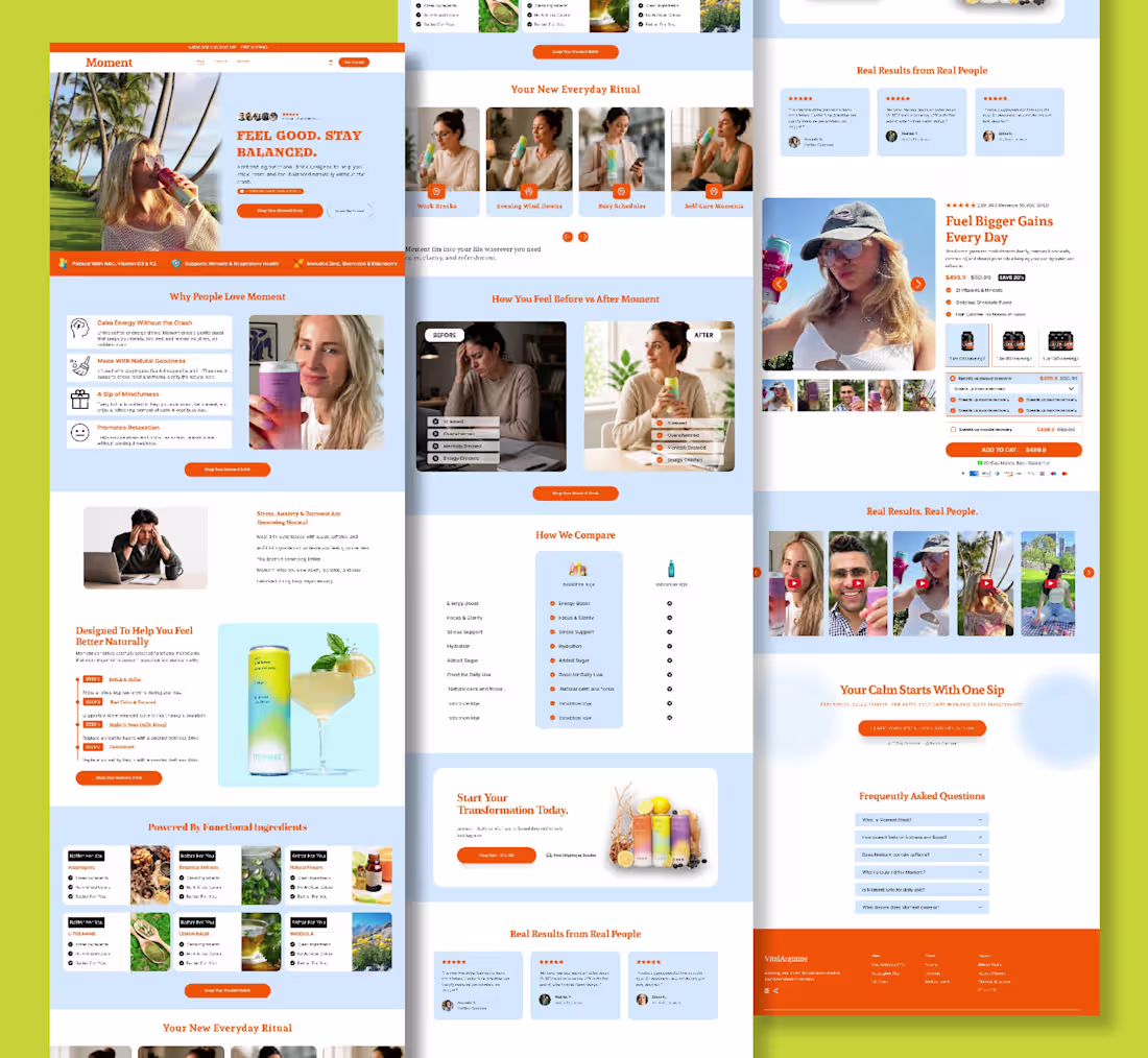
Statistics Don’t Lie. Results Speak for Themselves.
The strongest ads don’t just make claims they prove them.
When your product page includes real statistics, verified customer data, and measurable results, visitors stop guessing and start trusting.
The numbers build confidence:
10,000+ Happy Customers
4.9/5 Average Rating
Thousands of Orders Delivered
High Repeat Purchase Rate
Trusted by Customers Worldwide
People buy when they believe.
That’s why high-converting brands use real numbers to eliminate doubt, increase credibility, and make every purchase feel like the obvious choice.
Data creates trust. Trust drives conversions. Conversions grow brands.
- Real Statistics. Real Customers. Real Results.
#PDPDesign (https://x.com/hashtag/PDPDesign?src=hashtag_click) #ProductPageDesign (https://x.com/hashtag/ProductPageDesign?src=hashtag_click) #LandingPageDesign (https://x.com/hashtag/LandingPageDesign?src=hashtag_click) #EcommerceDesign (https://x.com/hashtag/EcommerceDesign?src=hashtag_click) #ShopifyDesign (https://x.com/hashtag/ShopifyDesign?src=hashtag_click) #ConversionDesign (https://x.com/hashtag/ConversionDesign?src=hashtag_click) #ConversionRateOptimization (https://x.com/hashtag/ConversionRateOptimization?src=hashtag_click) #CRo (https://x.com/hashtag/CRo?src=hashtag_click) #WebDesign (https://x.com/hashtag/WebDesign?src=hashtag_click) #UIDesign (https://x.com/hashtag/UIDesign?src=hashtag_click) #UXDesign (https://x.com/hashtag/UXDesign?src=hashtag_click) #DTCBrand (https://x.com/hashtag/DTCBrand?src=hashtag_click)
0
37
Visitors shouldn’t have to figure out your page.
Clear offer.
Strong trust.
Easy checkout.
If people leave without buying, your page needs work.
I design eCom pages that convert.
DM me to improve yours.
2
63
Most product pages don’t have a traffic problem.
They have a clarity problem.
People land on the page and quickly ask themselves:
“Is this for me?”
“Will this actually work?”
If the page doesn’t answer that in a few seconds, they leave.
Clear offer. Real benefits. Strong trust
0
41
Getting clicks but no conversions?
Your homepage isn’t guiding the decision.
Most e-commerce brands show products but don’t explain why they matter.
This homepage design fixes that with clear structure and flow. @replohq @InstantHQ @Shopify @StoreOwners
0
38
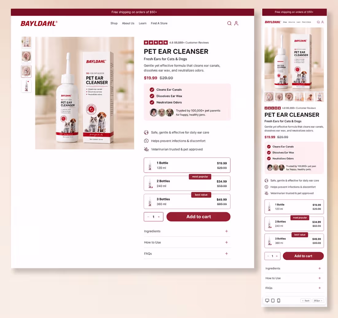
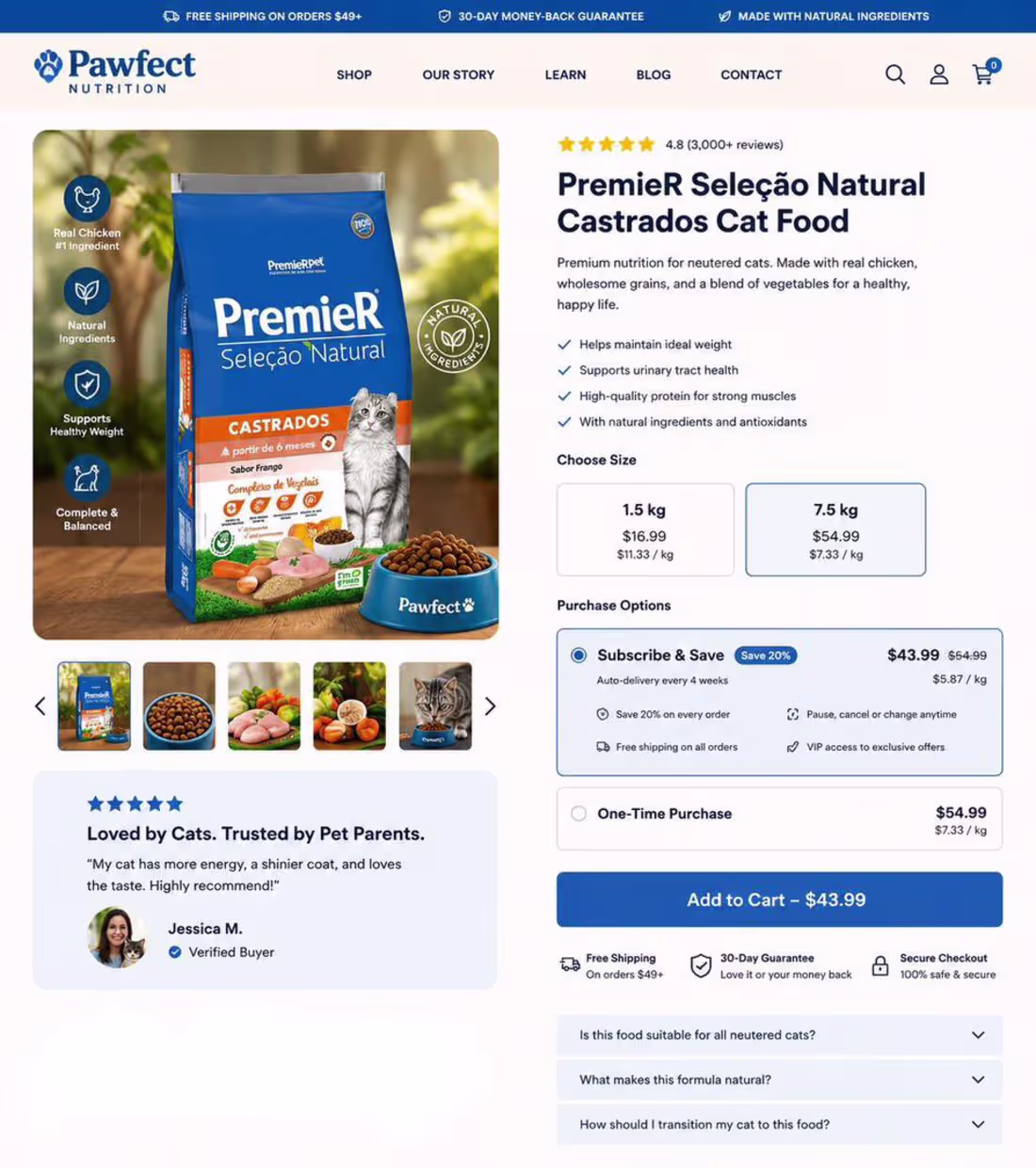
Another high-converting Shopify product page designed to turn visitors into customers.
Every element of this pet shampoo product page is strategically placed to build trust, reduce buying hesitation, and increase conversions.
Conversion-focused features: • Clean, premium visual hierarchy • Lifestyle imagery that connects with pet owners • Social proof and customer reviews for instant credibility • Subscription model to drive recurring revenue • Bundle offers to increase average order value (AOV) • Benefit-first messaging that communicates value at a glance • Risk-reversal with a 90-day money-back guarantee • Bold, high-converting “Add to Cart” CTA • Fully responsive across desktop and mobile devices
A successful ecommerce product page isn’t just about aesthetics it’s about creating a seamless buying experience that converts traffic into loyal customers.
Design with purpose. Build trust. Increase conversions.
What feature do you think has the biggest impact on conversion rates?
0
36
A product page should do more than showcase a product it should sell it.
Every section of this ecommerce product page is designed with one goal: maximize conversions.
From the moment customers land on the page, they’re guided through a seamless buying journey with:
⭐ Trust-building social proof and customer reviews
🎯 Clear, benefit-driven messaging
📦 Strategic bundle pricing to increase average order value
🔄 Subscription options for recurring revenue
🛡️ Money-back guarantee to reduce purchase hesitation
🛒 Strong call-to-action that stands out
📱 Fully responsive design optimized for desktop and mobile
Great ecommerce design isn’t just about looking good it’s about creating confidence, reducing friction, and turning visitors into paying customers.
Beautiful UI attracts attention. Smart UX drives conversions. That’s the difference.
If you’re looking to build Shopify product pages that don’t just impress but actually increase sales, let’s connect.
0
34
Your product page isn’t competing with another brand.
It’s competing with your customer’s doubts.
Every visitor lands on your page asking the same questions:
“Will this actually work?”
“Can I trust this brand?”
“Is it worth the price?”
“What if it doesn’t meet my expectations?”
The brands that generate millions don’t leave those questions unanswered.
They answer them before the customer even has to ask.
A high-converting product page isn’t built by adding more sections.
It’s built by removing friction.
✔️ A headline that sells the outcome, not the product.
✔️ Premium visuals that increase perceived value.
✔️ Benefits that are easy to scan.
✔️ Social proof that builds instant credibility.
✔️ Offers that make buying feel like the smartest choice.
✔️ Guarantees that eliminate risk.
✔️ A checkout experience with zero distractions.
Every pixel should have one purpose:
Move the customer closer to saying “Yes.”
Design alone doesn’t increase sales.
Psychology does.
Trust does.
Clarity does.
When your product page answers objections before they become reasons to leave, conversions stop being a guessing game.
That’s how great product pages become powerful sales machines.
0
36
Most landing pages don’t have a traffic problem.
They have a trust problem.
Visitors arrive.
They scroll.
They leave.
Not because the product is bad.
Because the page fails to answer the questions buyers have:
• Why should I care?
• Why should I trust you?
• Why should I buy now?
A high-converting landing page removes doubt section by section until buying feels like the obvious next step.
That’s what great design actually does.
0
36
Clarity usually converts better than “fancy” design.
Most landing pages don’t fail because of visuals they fail because users don’t immediately understand what to do next.
If a page is visually impressive but unclear, conversions drop.
High-performing pages prioritize:
• clear messaging above the fold
• strong visual hierarchy
• simple, readable spacing
• visible and repeated CTAs
• mobile-first structure
• friction-free navigation
The goal is simple:
make the decision effortless for the user.
When clarity increases, confusion drops.
When confusion drops, conversions go up.
#LandingPageDesign #ShopifyDesign #Ecommerce #DTCBrand #Replo #ConversionOptimization
0
35
Running ads but your store feels “dead”?
Your homepage might look good…
but if the message isn’t clear, people leave.
Designed this one in Figma to turn first-time visitors into buyers.
Clarity changes everything. Developed on @InstantHQ
#EcommerceGrowth #ShopifyTips #DTC
0
37
Another Shopify Product Page Built with Replo
I recently completed the development of this product page in Replo, focusing on creating a shopping experience that’s clean, engaging, and built to convert.
Rather than simply showcasing the product, I structured the page to guide customers through every stage of the buying journey—from capturing attention to building trust and encouraging confident purchases.
Some key features include:
✅ Clean, responsive design for desktop and mobile
✅ Conversion-focused layout and visual hierarchy
✅ Benefit-driven content sections
✅ Customer reviews and trust-building elements
✅ Product comparison to reduce buying hesitation
✅ FAQ section to address common objections
✅ Strategic CTA placement throughout the page
✅ Optimized for a smooth Shopify shopping experience
Every section was designed with a purpose: reduce friction, increase engagement, and make purchasing feel effortless.
I’m always excited to build product pages that combine thoughtful design with conversion-focused strategy.
If you’re looking for a Replo developer to create high-performing Shopify product pages or landing pages, feel free to reach out.
#Replo #ReploDeveloper #Shopify #ShopifyDeveloper #ProductPage #LandingPage #Ecommerce #ConversionRateOptimization #CRO #WebDesign #UXDesign #ResponsiveDesign #FrontendDevelopment #DTC #BuildInPublic
0
41
A great product page doesn’t just look premium it drives sales.
This Shopify product page for a dog salmon oil supplement was designed with conversion in mind.
Key conversion elements: • Strong hero section with lifestyle imagery • Instant trust through reviews and social proof • Subscription-first pricing strategy to increase recurring revenue • Clear product bundles that boost average order value (AOV) • Money-back guarantee to reduce purchase hesitation • Benefit-focused messaging that answers “Why buy?” • High-visibility CTA designed to maximize conversions • Fully responsive experience across desktop and mobile
Every section is intentionally crafted to reduce friction, build trust, and guide customers from product discovery to checkout.
Beautiful design gets attention. Strategic design generates revenue.
0
42
Built this product page to perform on both desktop and mobile because conversions happen on both.
A lot of brands focus on one and neglect the other.
But real growth comes when the experience feels seamless everywhere.
This page was structured to keep the buying journey simple, clear, and optimized across every device.
What makes this page convert:
✔ Strong above-the-fold trust stack (reviews, units sold, guarantees)
✔ Product-first imagery that instantly builds desire
✔ Benefit-driven copy that sells outcomes, not just features
✔ Subscription model placed first to boost retention and LTV
✔ Bundle options designed to increase AOV naturally
✔ Price-per-day breakdown to make the offer feel more affordable
✔ Money-back guarantee to remove buying hesitation
✔ Clean product hierarchy for faster decision-making
✔ Mobile layout simplified for faster scrolling and quicker checkouts
✔ Desktop layout optimized for clarity without overwhelming the buyer
Desktop builds confidence.
Mobile closes fast.
If both experiences aren’t optimized, you’re leaving money on the table.
High-converting product pages aren’t just about good design.
They’re built around psychology, clarity, and conversion strategy.
0
42
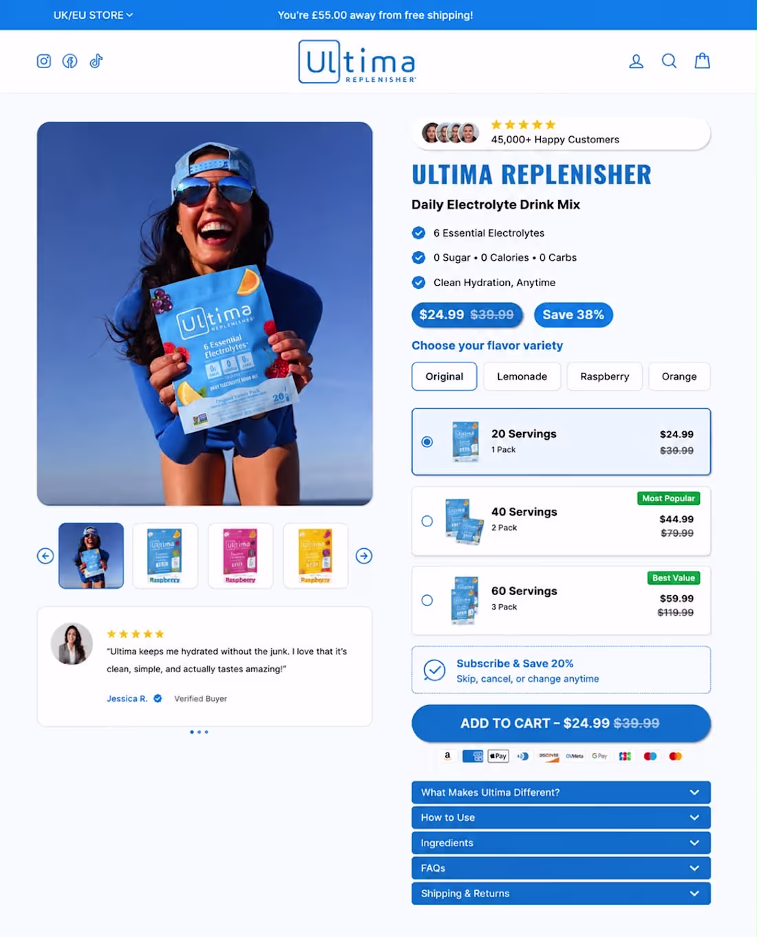
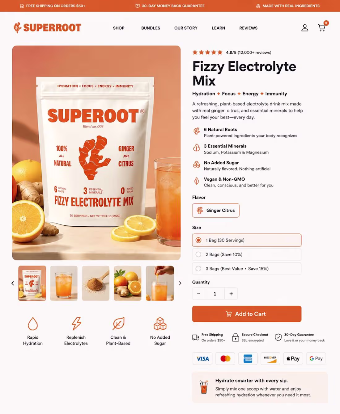
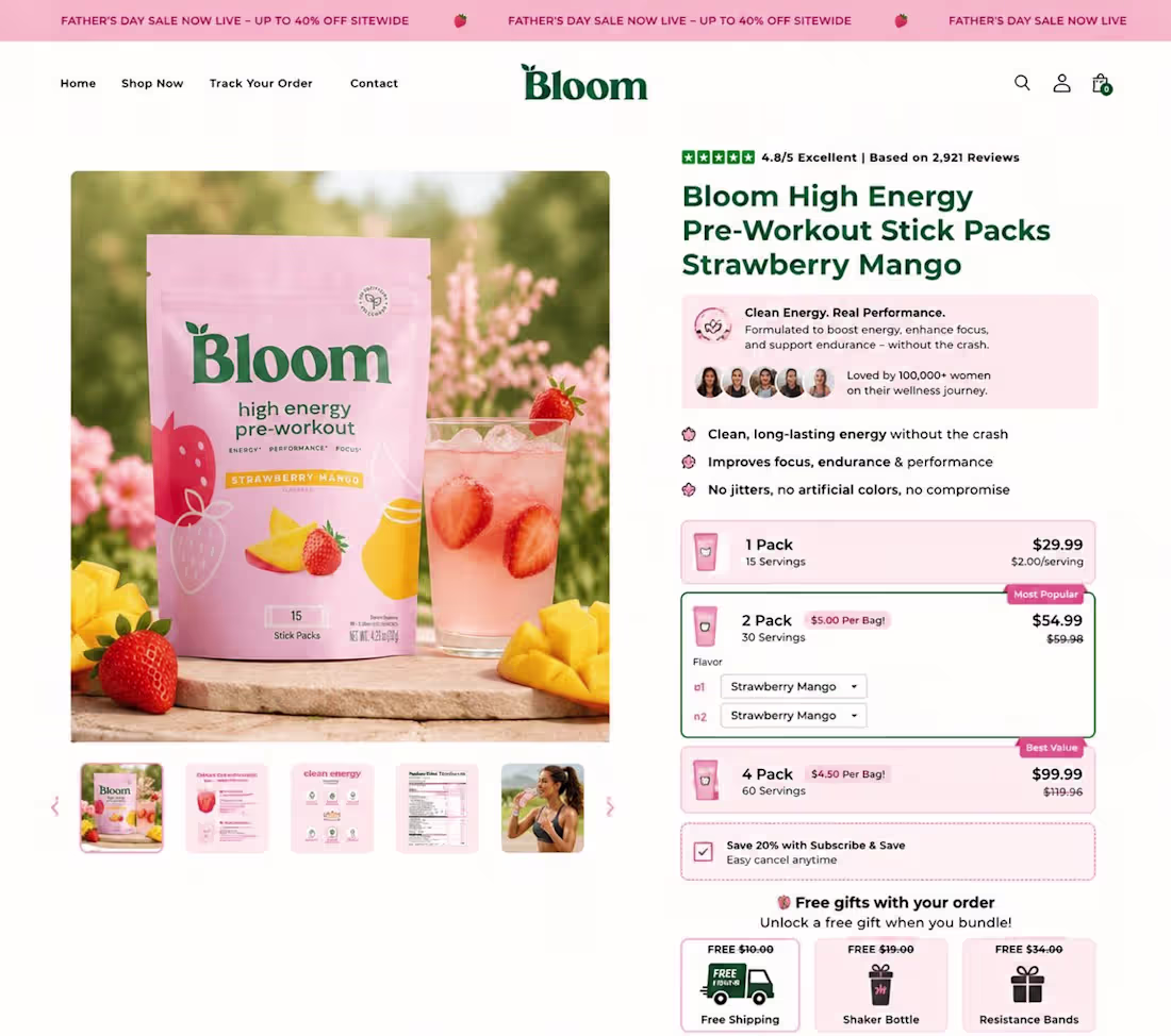
A product page engineered for high conversions.
This page does what every winning product page should do - it makes the customer understand the value in seconds.
From the clean layout to the bold pricing offer, every element is built to reduce hesitation and increase action.
The product promise is clear:
Fast, clean hydration
Zero sugar, zero calories
Essential electrolytes for daily performance
What makes this page powerful?
Strong social proof with 45,000+ happy customers
Clear bundle pricing to boost order value
Subscription offer for retention
Verified reviews that build trust
Easy flavor selection for better user experience
High-visibility CTA that drives instant checkout
This is more than a product page it’s a sales machine built with clarity, trust, and simplicity.
Good product pages inform. Great product pages convert.
0
41
Most Shopify product pages lose sales because they don’t answer key customer questions.
I built a high-converting PDP supplemental in Replo designed to handle objections, build trust, and improve conversions.
If your product page isn’t converting as it should, I can optimize it
0
37
A homepage isn’t just a page, it’s the front door to your brand and It's the first impression visitors get.
It sets the tone, tells your story, and guides people to take action.
Just finished designing a new Homepage!
Would you stop and explore this one?
0
39
New Build: High-Converting Product Page (Desktop + Mobile)
Just finished designing and developing this product page in Replo, with a strong emphasis on conversion optimization, user experience, and mobile-first performance.
💻 Desktop Experience
✔️ Premium hero section with clear product positioning
✔️ Benefit-driven layout highlighting key selling points
✔️ Strategic placement of reviews and trust signals
✔️ Optimized bundle offers to increase AOV
✔️ Subscription incentives and upsell opportunities
✔️ Clean product gallery with engaging visual storytelling
📱 Mobile Experience
✔️ Fully responsive and optimized for smaller screens
✔️ Streamlined product selection and purchase flow
✔️ Easy-to-scan content hierarchy
✔️ Fast and intuitive shopping experience
✔️ Mobile-friendly CTA placement for higher conversions
🎯 Key Focus Areas
• Conversion-focused design
• CRO best practices
• Bundle and subscription optimization
• Trust-building elements and guarantees
• Consistent branding across devices
• Seamless Shopify + Replo implementation
The goal was to create a shopping experience that not only looks premium but also guides customers effortlessly from product discovery to checkout.
Building product pages like this is a reminder that great eCommerce design is about more than aesthetics it’s about creating experiences that drive results.
💬 What do you think is the most important element of a high-converting product page?
0
39
Just wrapped up another high-converting mobile product page in Replo for Shopify.
When most shoppers are buying from their phones, every scroll, tap, and CTA matters. That’s why I focused on creating a seamless mobile experience that keeps visitors engaged from the hero section to checkout.
Here’s what I built:
Mobile-first responsive design
Smooth scrolling and clean section flow
Conversion-focused product layout
Trust-building reviews and social proof
Benefit-driven storytelling instead of feature overload
Optimized CTA placement to reduce drop-offs
Pixel-perfect implementation in Replo
A beautiful product page is nice.
A product page that keeps visitors scrolling, builds trust, and turns clicks into customers is even better.
That’s the standard I aim for with every Replo project.
If you’re looking for a Replo developer who builds Shopify product pages that don’t just look premium but are designed to convert let’s connect.
0
40
A beautiful product page gets attention. A strategic one gets sales.” 🚀
Here’s a recent Shopify product page I designed and developed in Replo, built with one goal in mind: turning visitors into customers.
Instead of relying on flashy visuals alone, I focused on the buying journey.
✅ A compelling hero section that grabs attention instantly
✅ Benefit-driven storytelling that answers customer pain points
✅ Social proof and testimonials to build trust
✅ Comparison tables that eliminate buying hesitation
✅ Ingredient highlights that educate and reassure buyers
✅ FAQs to overcome objections before checkout
✅ Mobile-responsive design for a seamless shopping experience
✅ Strategic CTAs placed throughout the page to maximize conversions
Every section has a purpose. Every scroll moves the customer one step closer to clicking “Add to Cart.”
Design isn’t just about how it looks—it’s about how it performs.
If you’re looking for a Replo developer who builds Shopify landing pages and product pages that combine clean design with conversion strategy, let’s connect.
0
42
Most product pages talk about features.
The best ones remove objections.
This page does exactly that:
✅ 100,000+ units sold
✅ 90-day money-back guarantee
✅ Strong social proof
✅ Clear benefits above the fold
✅ Subscription savings
✅ Multiple bundle options
✅ Low-risk purchase decision
Every section answers a customer’s question before they ask it.
That’s how product pages convert.
0
43
I recently developed this fully responsive ecommerce product page, ensuring a smooth and consistent shopping experience across desktop, tablet, and mobile devices.
Every element was carefully designed and optimized to improve usability, build customer trust, and increase conversions.
What makes this product page effective?
✅ Fully responsive across all screen sizes
✅ Clean, intuitive UI with a mobile-first approach
✅ Optimized product gallery and content layout
✅ Trust-building reviews and social proof
✅ Clear pricing, bundle offers, and purchase options
✅ Conversion-focused “Add to Cart” section
✅ Fast, seamless user experience from product discovery to checkout
Responsive design isn’t just about making a page fit different screens it’s about delivering the best possible experience for every customer, no matter what device they’re using.
Building high-performing ecommerce experiences requires the perfect balance of design, development, UX, and conversion strategy. That’s exactly what I aim to deliver with every project.
What device do you use most for online shopping desktop, tablet, or mobile?
0
46
A great product page makes buying feel effortless.
Strong visuals. Clear benefits. Social proof. Smart bundle offers. A frictionless path to checkout.
Every element should answer a question, build trust, and move the customer one step closer to clicking Add to Cart.
That’s what conversion-focused design looks like.
0
41
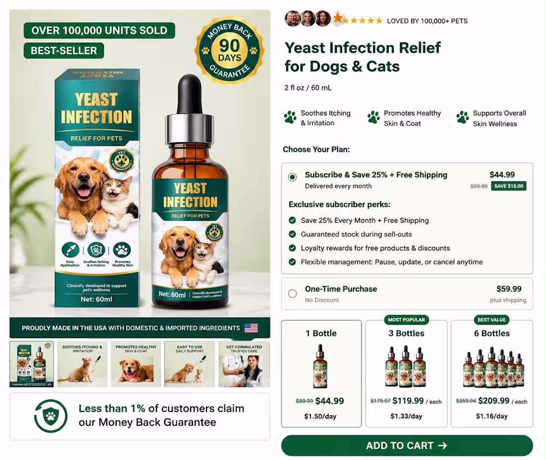
Most product pages talk about features. High-converting product pages solve problems.
Pet owners aren’t looking for “ear drops.”
They’re looking for a way to stop their dog from constantly scratching, shaking its head, or dealing with painful ear irritation.
That’s the mindset I designed this product page around.
Instead of overwhelming visitors with technical details, I focused on answering the questions customers already have:
🐶 Is this safe for my pet?
⭐ Can I trust this brand?
💰 Is this worth the price?
🎁 Why should I buy today?
📦 Which bundle gives me the best value?
To support those decisions, I built the page in Replo with:
✔️ A pain-point-focused hero section
✔️ Strong social proof and verified reviews
✔️ Urgency and scarcity elements that feel natural
✔️ Clear bundle pricing and value comparison
✔️ Free gift incentives to increase average order value
✔️ A clean, distraction-free checkout experience
✔️ Fully responsive design optimized for desktop and mobile
A great product page doesn’t just look premium it addresses customer concerns, builds trust, and makes purchasing feel like the obvious next step.
That’s the kind of experience I aim to create with every Replo project.
0
40
A High-Converting PDP Doesn’t Just Describe the Product. It Removes Every Reason Not to Buy.
Every section should answer your customer’s biggest questions before they ask them.
Why this product?
Why this brand?
Why now?
The highest-converting product pages are built with intention:
Scroll-stopping product visuals
Benefit-driven copy that sells outcomes, not features
Trust signals that reduce hesitation
Social proof that builds confidence
A frictionless buying experience from top to bottom
A beautiful design gets attention.
A strategic PDP gets conversions.
Don’t just design a product page. Design the moment someone decides to buy.
0
52
People buy faster when pages feel trustworthy.
Clear messaging, social proof, and a strong user experience reduce hesitation and increase confidence.
Trust is one of the biggest conversion drivers.
0
56
Just shipped a high-converting product page built in Replo and every section was designed with one goal in mind: turn attention into action.
This wasn’t about making it look “nice.”
It was about building a page that sells clearly and effortlessly.
Here’s what went into it:
• Strong hero section = instant understanding of product + value
• Benefit-led structure = clarity over confusion
• Clean, modular layout (Replo build) = smooth user flow
• Social proof placed at decision points = trust at the right moment
• UGC integration = real credibility, not just claims
• Clear CTA hierarchy = no friction in the buying journey
- The approach was simple:
Remove everything that doesn’t help the user decide.
Because in ecommerce:
Confusing pages don’t lose slowly they lose instantly.
- Result-focused design:
Built to guide the user from:
- curiosity → trust → decision → purchase
Not just a product page.
A conversion system built in #Replo.
0
60
If your PDP doesn’t feel trustworthy, it won’t convert.
Fix it:
– Premium clinical aesthetic
– Clear offer structure
– Real proof near CTA
– Less clutter
– More breathing space
Trust lowers friction. Friction kills sales.
Comment “TRUST” or DM me. Build on replo
2
111
🔥 Your PDP isn’t broken… it’s unclear.
– No structure
– Weak offer
– Too much clutter
– No trust
Fix it:
✔ Simple layout
✔ Clear benefits
✔ Strong offer
✔ Proof first
👉 Clear pages sell faster.
Comment “HELP” or DM me 🚀
1
81
Your product page controls your sales.
Visitors don’t read everything, they scan and exit in seconds.
Clutter or confusion kills conversions.
Make your offer, proof, and outcome clear immediately.
Better pages = more sales from the same traffic.
1
2
111
Your product page is the final decision point.
People scan fast and rarely read everything.
If it’s unclear, they leave without buying.
Make results, trust, and offer instantly visible.
A well-built page multiplies your conversions.
1
93
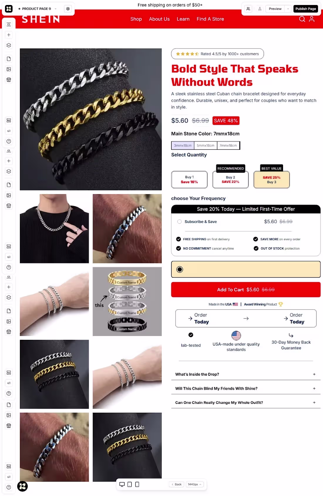
I developed a high-converting product section on @replohq for a client.
Clear message. Strong visuals. Smart CTA placement.
Result? More clicks, more carts, more sales.
If your section isn’t doing this, it needs fixing.
1
104
I developed a product page on @replohq for a client with one goal: conversions.
Clear messaging. Clean layout. Strong CTA.
No fluff just a smooth path from visit to purchase.
Result? More clicks. More sales.
If your page isn’t doing this, it’s time to fix it.
@ShopifyI developed a product page on @replohq for a client with one goal: conversions.
Clear messaging. Clean layout. Strong CTA.
No fluff just a smooth path from visit to purchase.
Result? More clicks. More sales.
If your page isn’t doing this, it’s time to fix it.
@Shopify
2
123
Most people are using AI to build product pages…
And wondering why they’re not getting sales.
Because AI gives you content
Not strategy
Not structure
Not conversion
That’s where Replo comes in.
Clean layouts
High-converting sections
Mobile-optimized designs
Built to turn visitors into buyers
Stop guessing. Start building pages that work.
3
5
176
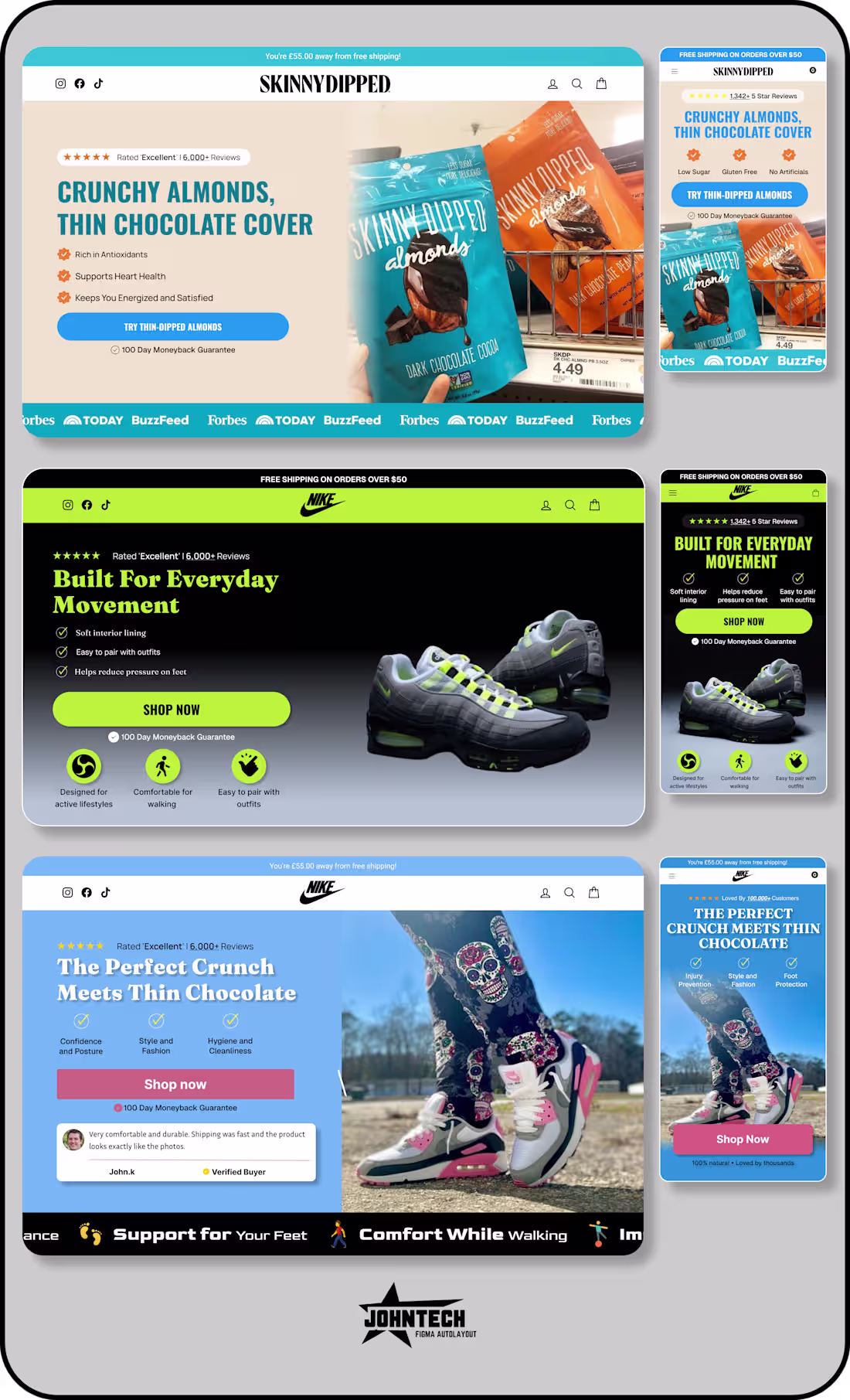
Most stores lose sales in the first 5 seconds.
Not because of the product.
Because of a weak hero section.
Vague headline. Random image. No clear value.
If visitors don’t instantly understand the product, they leave.
4
6
216
Getting clicks but no conversions?
Your listicle isn’t guiding the decision.
Most e-commerce brands show products but don’t explain why they matter.
This listicle design fixes that with clear structure and flow.
Built on @Replo
2
122
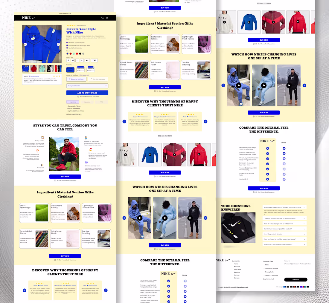
Most product pages don’t have a traffic problem.
They have a clarity problem.
People land on the page and quickly ask themselves:
“Is this for me?”
“Will this actually work?”
If the page doesn’t answer that in a few seconds, they leave.
Clear offer. Real benefits. Strong trust
1
2
119

Getting clicks but no conversions?
Your homepage isn’t guiding the decision.
Most e-commerce brands show products but don’t explain why they matter.
This homepage design fixes that with clear structure and flow.
2
3
120
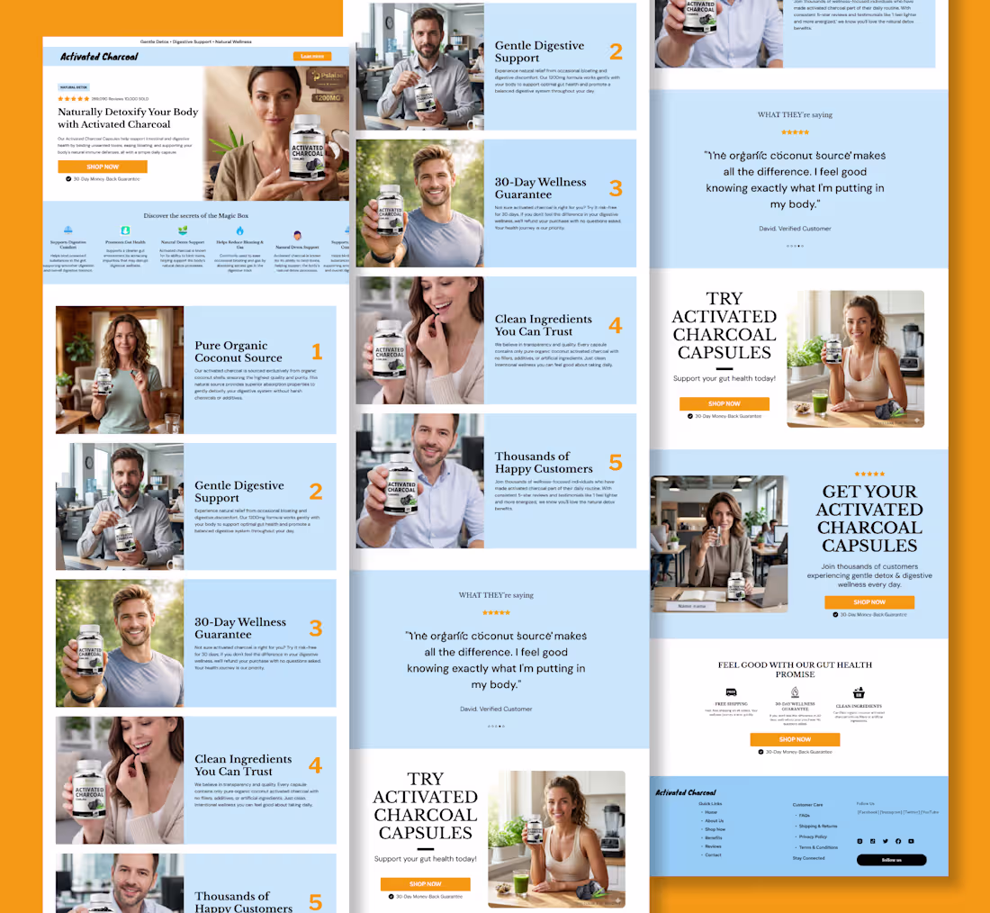
Listicles don’t just entertain… they sell.
Easy to skim
Focus on benefits
Build trust fast
Lead to action
Cold traffic in → buye
1
3
165
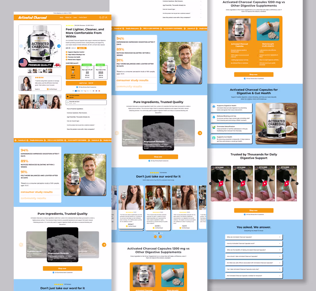
product page designer
1
2
121