
Sam Anthony
Framer Expert, Brand, and Website Designer
- $1k+
- Earned
- 3x
- Hired
- 5.0
- Rating
- 43
- Followers


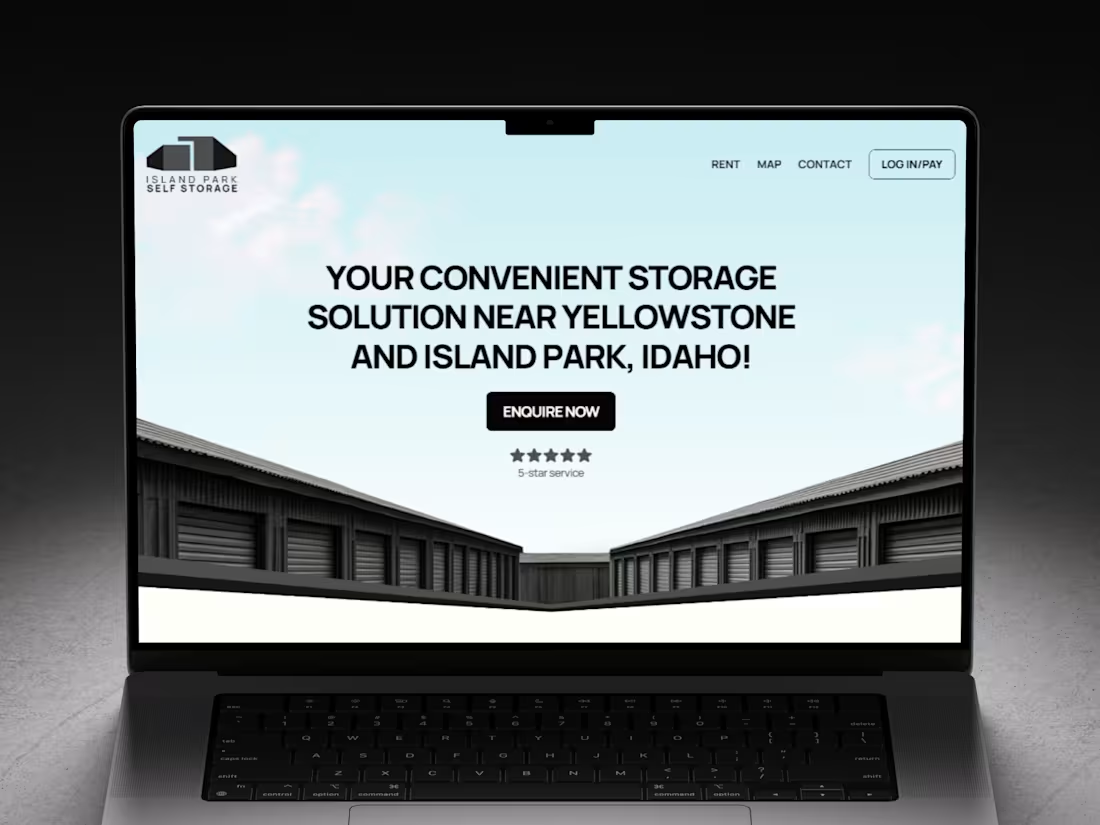
Island Park Self Storage is a brand new facility sitting on Highway 20 in Island Park, Idaho, just minutes from the entrance to Yellowstone National Park. The owners hired me to design and build their website in Framer, and because the facility itself was new, the site had to do a lot of the heavy lifting: introduce the business, explain what it stores, and get people reserving units before the first phase sold out.
The audience is a specific one. Boats, campers, snowmobiles, UTVs, fly fishing boats, dirt bikes and the occasional tractor. People heading into the mountains who need somewhere safe to leave their gear, and locals who have simply run out of garage. The design needed to feel secure and dependable without tipping into corporate, so I kept it light, clean and a little bit outdoorsy.
The site is a single, focused page. A big, confident hero over a pale sky and a row of storage units, a secure storage section with location and access cards, a clear breakdown of the current unit size and the expansion planned for 2026, the full list of vehicles and equipment they cater for, a trust section, and the address, phone number and office hours at the bottom. Every call to action links straight into their online rental software so a visitor can rent, view the map, get in touch or log in to pay without ever losing their place.
It is a tidy, hard-working little site for a business that needed to start filling units straight away, and I am really pleased with how calm and clear it turned out.
0
14
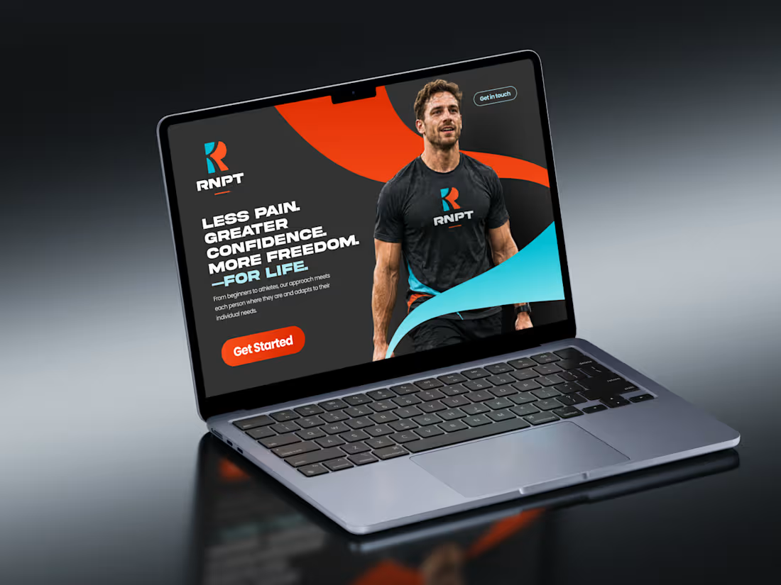
Robbie Noonan is my own personal trainer and a wonderful friend, so when he needed a brand of his own I jumped at it. I designed the RNPT logo and a full brand guidelines document, built around an energetic colour palette we refined together over several rounds until it felt right.
The brief was a brand that felt professional but not exclusive of any person. Not too strong-man, not too dancy. Something that could work with anyone who wanted to train with him.
We worked insanely closely on it, with several bouts and rounds of revisions and changes. The colours took the most work by far. We continually revisited them until we finally landed on the energetic teal and orange palette that now defines the brand.
I delivered the RNPT logo and a full brand guidelines document covering colour, typography, iconography, photography and web design - a clear identity and the tools to keep it consistent.
0
30
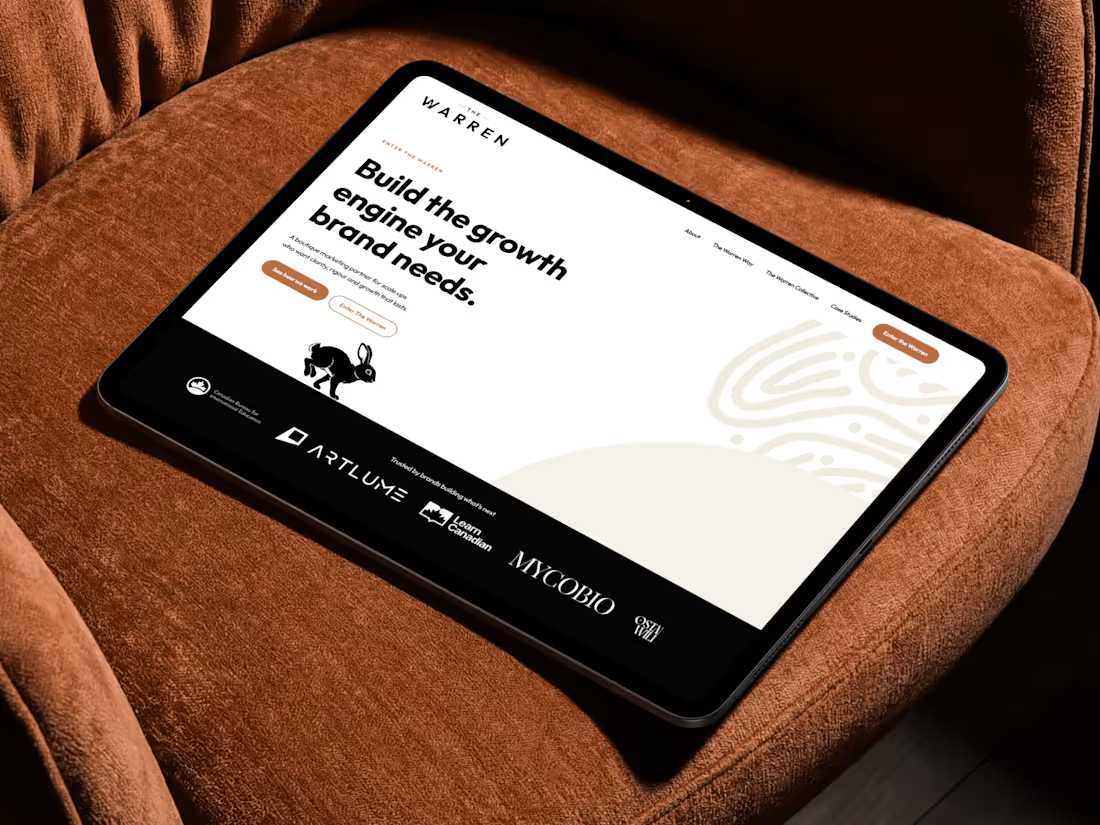
The Warren Brand & Website
Guy Crozier-Vernon hired me to transform Crozier Consulting into The Warren - a name that connects his first role in media, his first son, and his belief in growth as one connected system. I delivered the logo, brand guidelines, and a published Framer website.
Client
The Warren
Services
Logo Design, Brand Guidelines, Website Design (Framer)
Industry
Marketing & Growth Consultancy
Deliverables
Logo design, brand guidelines (colour schemes, typography), published Framer website
Having worked with Guy before for BLD BRO, we had a fantastic pre-existing relationship, so I was so excited to get to build his rebrand and new website for him. Guy is someone I genuinely care to see thrive and one of the kindest souls I have had the pleasure of working with - so building The Warren was not just great fun, but a true pleasure.
I was hired to help Guy move Crozier Consulting to become The Warren - a name with deep personal meaning, sitting at the intersection of his professional and personal life. His consultancy helps growing brands get better results by bringing their strategy, advertising, customer data and overall brand experience together.
I delivered a logo design built around the rabbit and the warren motif, a full brand guidelines document covering colour schemes and typography, and took the identity all the way through to a published Framer website - a warm, confident presence for a consultancy that helps ambitious brands scale through one connected growth system.
One of the truest pleasures was Guy’s reaction - seeing him genuinely thrilled with what was built for him, and then watching him apply the brand across his LinkedIn banner with real excitement. The outcome is a presence Guy never pictured his new brand looking like, but now can’t imagine anything different - one he is proud to share with the world as his business and new professional identity.
0
48
Dennan Frew Scholarship: Building a Brand with Purpose
3
71