Samadara Ginige's Work | Contra
Work by Samadara Ginige
Sign Up
Post a job
Sign Up
Log In
Samadara Ginige
Independent Logo & Brand Identity Designer
Message
Follow
5.00
Rating
26
Followers
Sri Lanka
Work
Posts
Reviews
Services
About
Sri Lanka
2
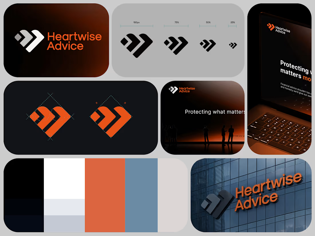
Approved logo & brand idntity design for Heartwise Advice, a financial advisory company in Belgium.
2
2
57
2
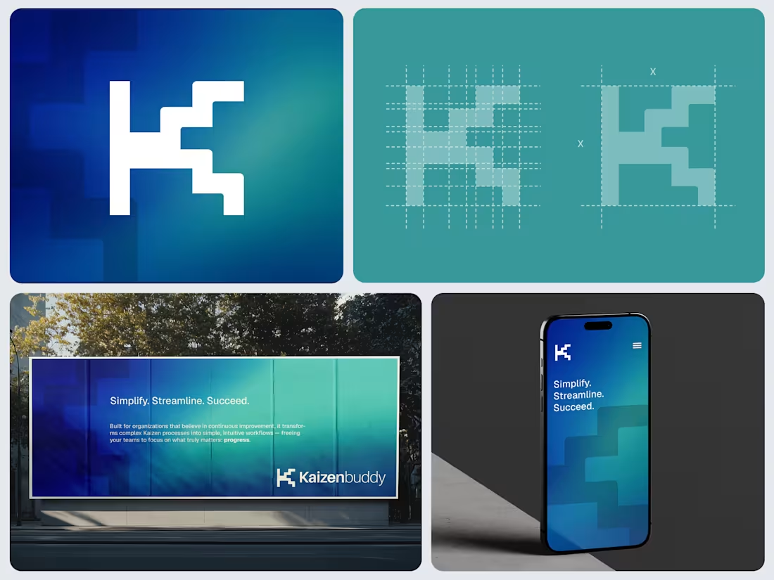
Proposed logo design for a Saas product which designed for organizations implementing lean management practices using Kaizen method. “Kaizen” is a Japanese word that can be translated to mean “improvement” or “change for the better.” This is one of the proposed concepts. Instead of a purely technical or rigid design, the client wanted it to reflect a balance of digital innovation and human-centered sustainability. Can you guess the depiction here?
2
2
70
2
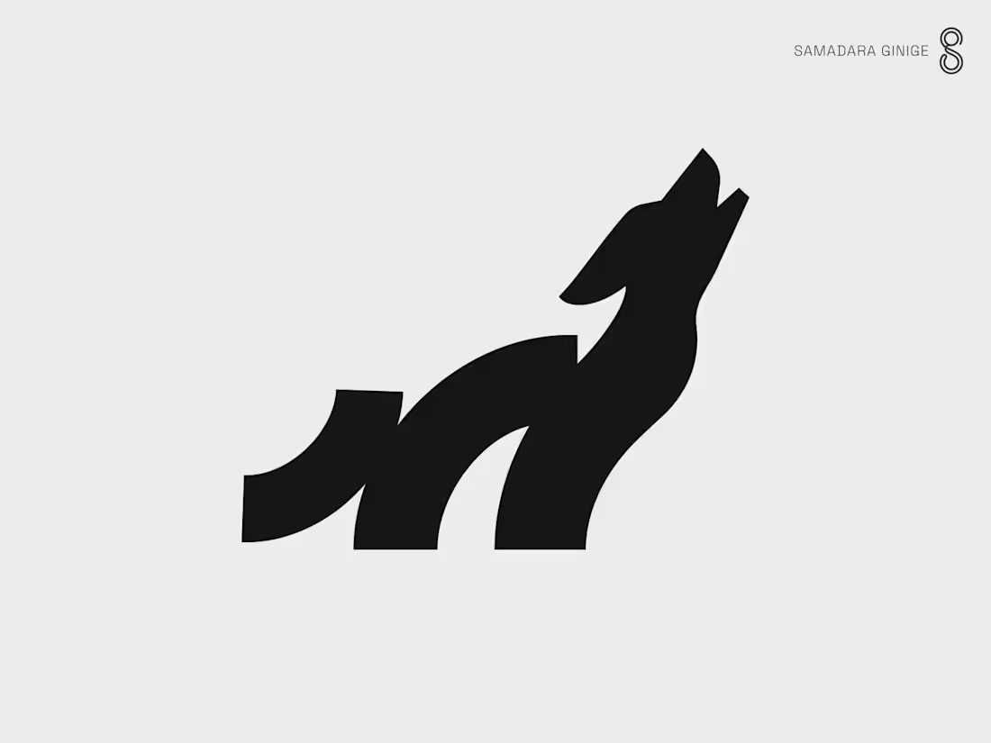
This personal project started with the Ape/Gorilla concept (in collection #1), which I proposed to a client. Due to the use of very few geometric shapes, I decided to explore more on this direction and created a few more concepts with the same shapes and formation but tweaking them a bit to bring out each animal's distinct shape. The first collection of 6 animals were completed a couple of years ago and I kept adding to the second collection over past 2 years whenever I got a chance. My latest addition is the Wolf. One more spot left for the second collection to complete. Any suggestions? The bear and the Horse logos from the collection #1 are already sold. :) © Samadara Ginige
2
51
1
Logo design for GOGOPONI, an active wear brand in China. © Samadara Ginige #logo #logodesign #fashion #activewear #brand
1
55
1
One of the proposed logo designs for a Saas product which designed for organisations implementing lean management practices using Kaizen method. “Kaizen” is a Japanese word that can be translated to mean “improvement” or “change for the better.” Inspired by the natural behaviour of a leaf turning toward the sun, constantly adjusting their angle to capture more light. A metaphor for Kaizenʼs continuous improvement and adaptability. The overlap of the two shapes forms a diagonal upward arrow, which depicts growth, and forward momentum. Interested in working together? Get in touch. © Samadara Ginige
2
1
44
2
This personal project which started with the Ape/Gorilla concept, which I proposed to a client a year ago. Due to the use of very few geometric shapes, I decided to explore more on this direction and created a few more concepts with the same shapes and formation but tweaking them a bit to bring out each animal's distinct shape. This was the first collection of this series. Currently working on the second collection as and when I get chance. ;)
2
2
151
7
Sincerely Coco Yogurt
7
16
3
Explorer Elite Logo & Brand Identity
3
26
3
Zillium Brand Identity
3
39
2
Humanimate Consulting
2
34
2
Easy Freight Logo and Brand Identity
2
25
2
Tritium Supercar Brand Identity
2
36
2
Insytful Logo & Brand Identity Design
2
23
2
Logo-folio Mid-Year 2024
2
26