


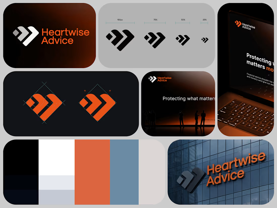
Approved logo & brand idntity design for Heartwise Advice, a financial advisory company in Belgium.
2
2
111
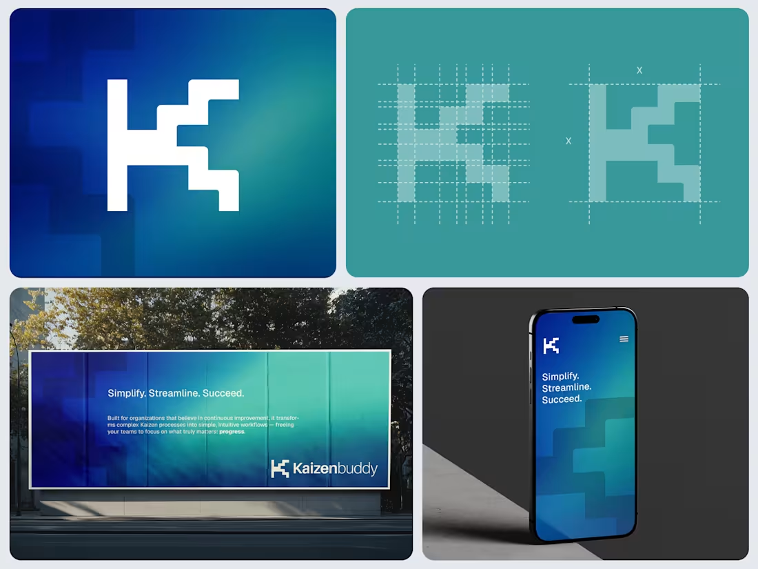
Proposed logo design for a Saas product which designed for organizations implementing lean management practices using Kaizen method. “Kaizen” is a Japanese word that can be translated to mean “improvement” or “change for the better.”
This is one of the proposed concepts. Instead of a purely technical or rigid design, the client wanted it to reflect a balance of digital innovation and human-centered sustainability.
Can you guess the depiction here?
2
2
119
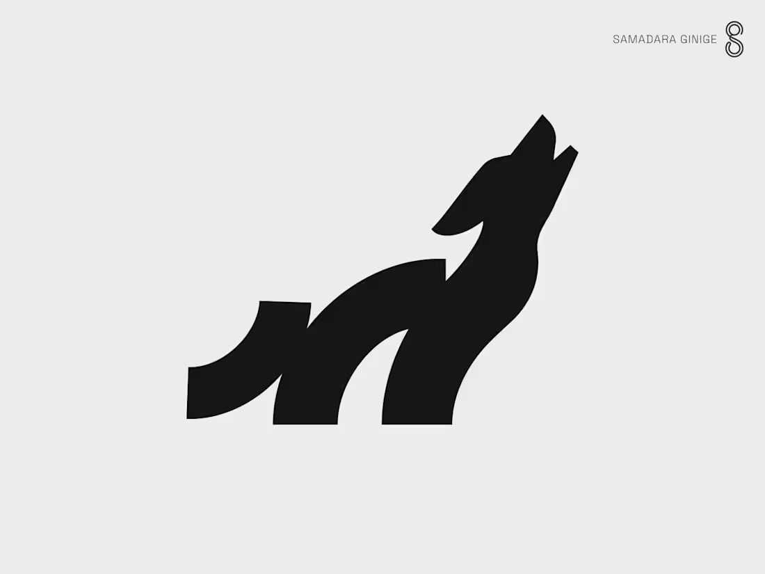
This personal project started with the Ape/Gorilla concept (in collection #1), which I proposed to a client. Due to the use of very few geometric shapes, I decided to explore more on this direction and created a few more concepts with the same shapes and formation but tweaking them a bit to bring out each animal's distinct shape.
The first collection of 6 animals were completed a couple of years ago and I kept adding to the second collection over past 2 years whenever I got a chance. My latest addition is the Wolf. One more spot left for the second collection to complete. Any suggestions?
The bear and the Horse logos from the collection #1 are already sold.
:)
© Samadara Ginige
2
121
Logo design for GOGOPONI, an active wear brand in China.
© Samadara Ginige
#logo #logodesign #fashion #activewear #brand
1
100