
Saliu Abdulqudus
Product Designer building conversion-focused experiences.
Ready for work
Saliu is ready for their next project!
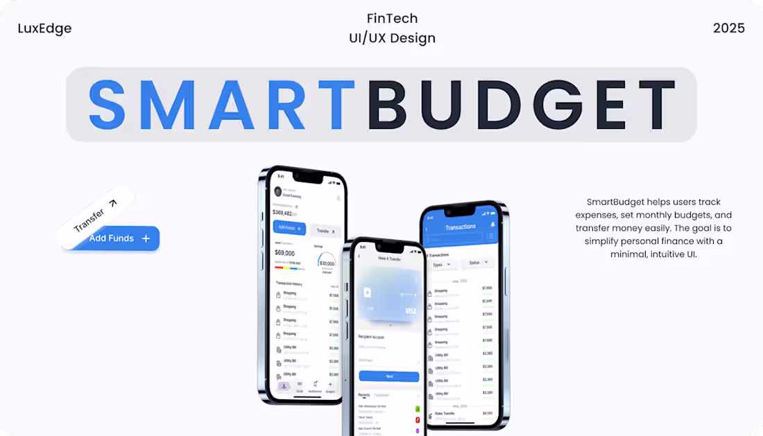
SmartBudget: Budgeting & Expense Tracking App Design
2
67
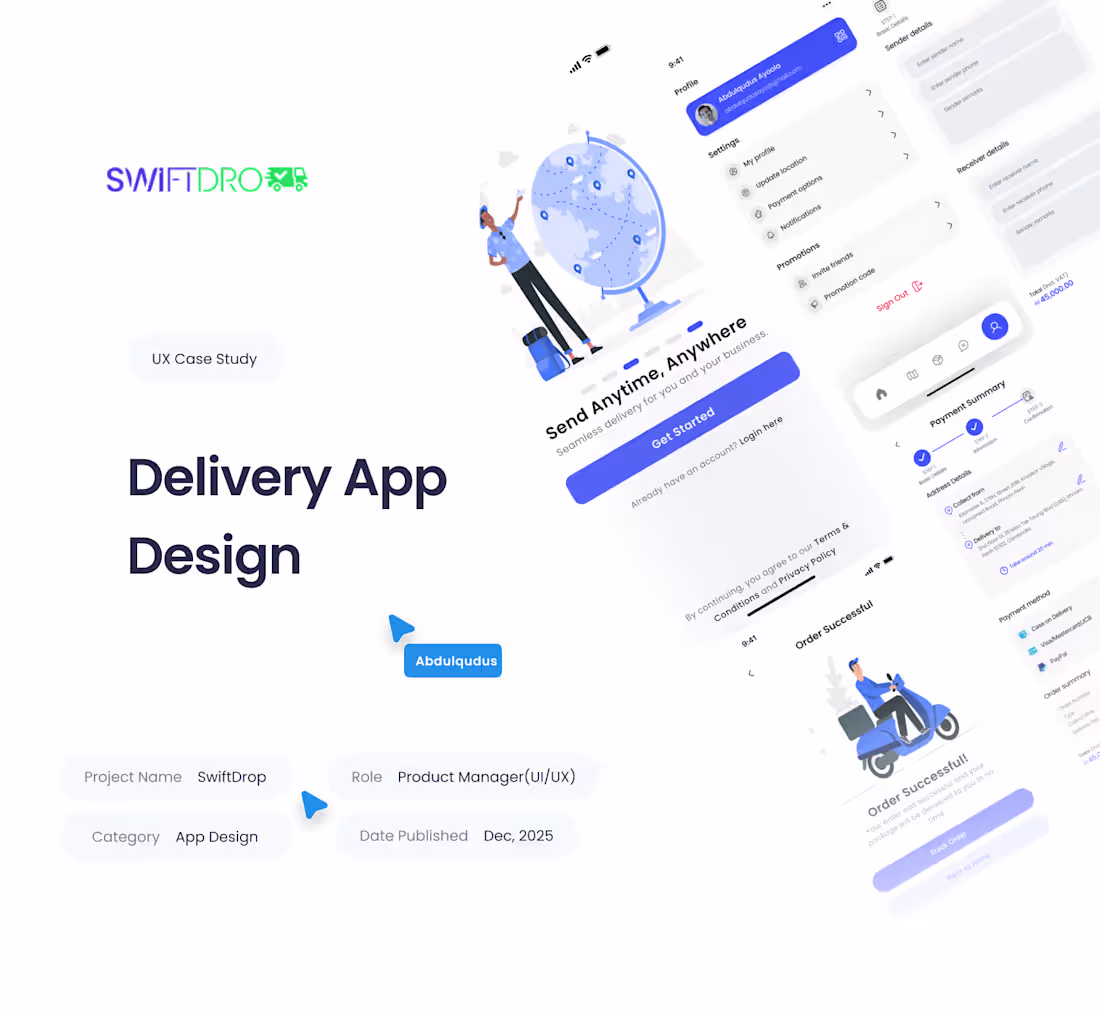
SwiftDrop – Delivery App UX/UI Case Study
2
72
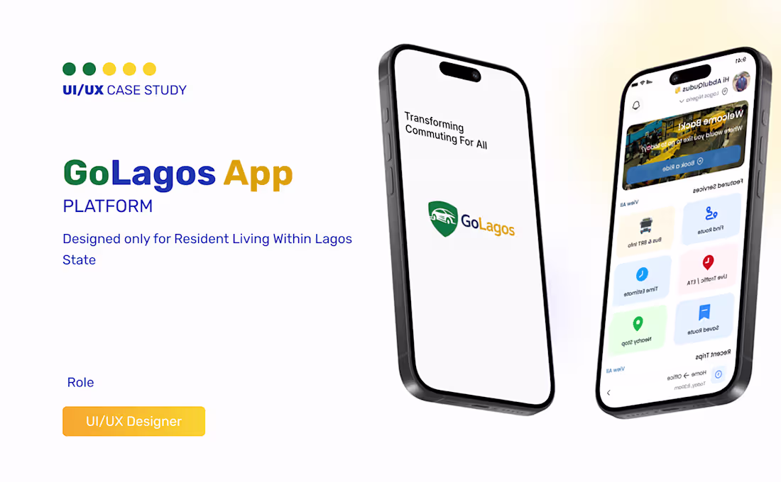
GoLagos — Mobile Transport UX Case Study
1
1
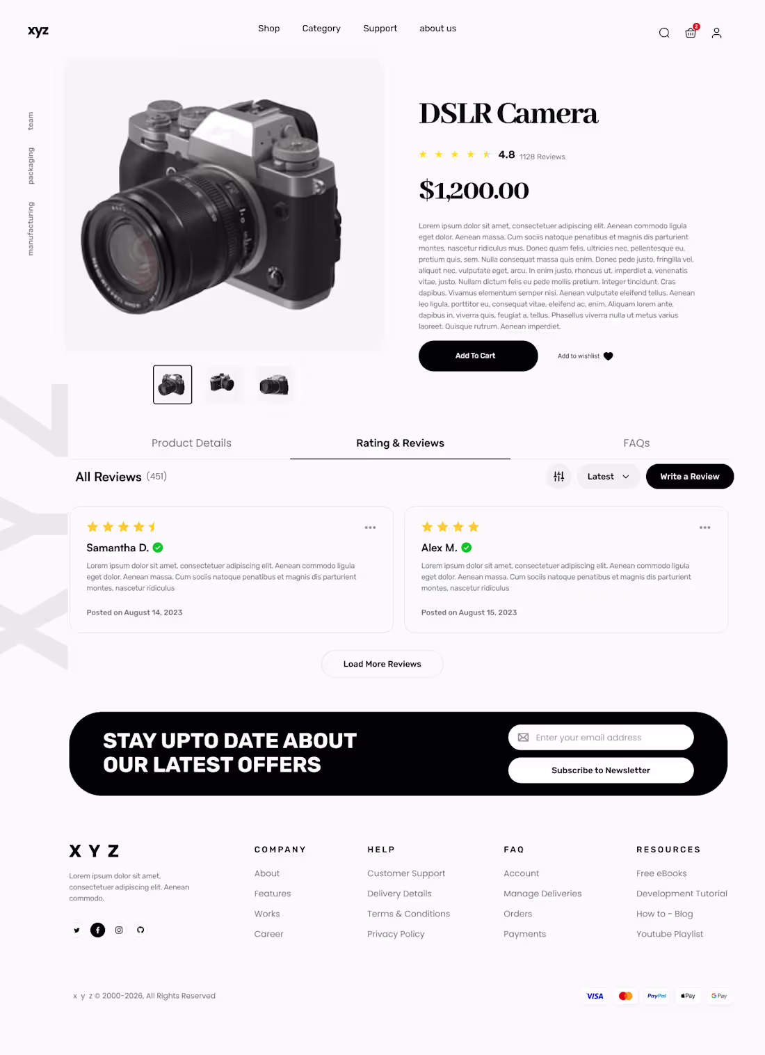
Designed a clean and conversion-focused product page for a camera e-commerce store.
The goal was to create a layout that keeps the product as the focal point while making key actions like purchasing and navigation feel simple and intuitive. I focused on hierarchy, spacing, and reusable components to ensure the design is both user-friendly and easy to implement.
This project helped me improve how I approach product visibility and structure in e-commerce design.
Open to feedback and available for similar UI/UX projects.
2
37
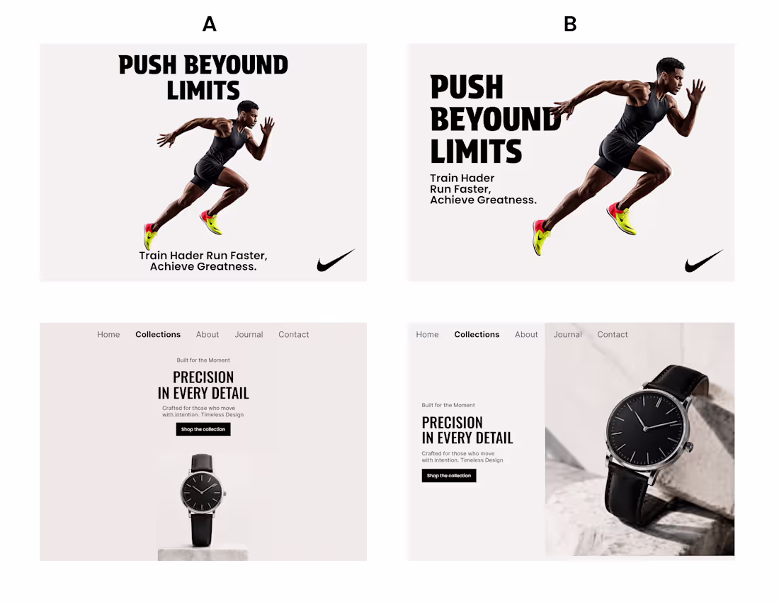
Studying how composition influences attention and visual hierarchy.
Same content. Different composition. Different impact.
Top: Centered Composition
Bottom: Rule of Thirds
Which approach communicates more effectively—and why?
#UIDesign #UXDesign #DesignStudy
2
30
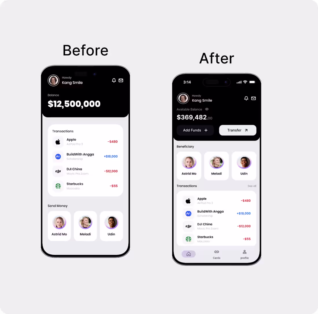
FinTech Dashboard UX Redesign
Goal: Enable users to understand their balance and take the next action within 5 seconds.
Approach:
Prioritized clarity over density by elevating the balance, surfacing key actions early, and reducing visual competition across sections.
Key decisions:
High-contrast balance for instant glanceability
Primary actions (Add Funds, Transfer) placed directly under the balance
Simplified beneficiaries to speed up repeat actions
Transaction history visually de-emphasized to keep focus on action
Result:
A dashboard that reduces friction, improves decision speed, and clearly guides users toward their next step.
2
28
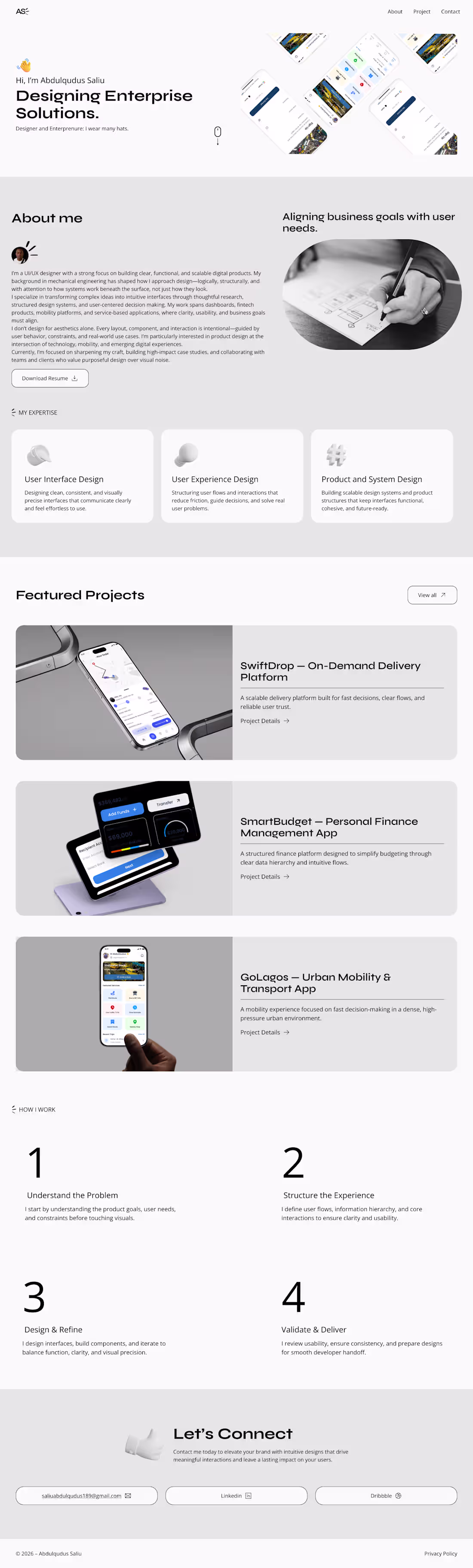
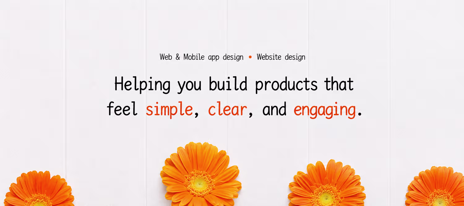
The portfolio presents my work clearly, communicates my design approach, and demonstrates UI/UX skills across multiple product types.
1
45