
MD SAJIBUZZAMAN
UI/UX Designer building for humans, not just for screens.
Ready for work
MD is ready for their next project!
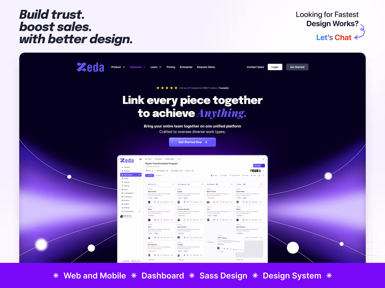
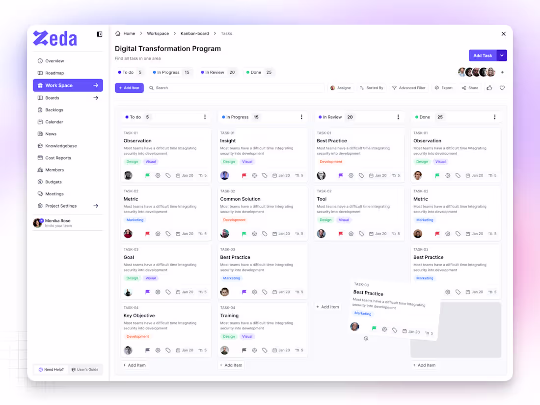
✦ Zeda — Kanban Board Screen
Zeda is a SaaS productivity platform built to help teams plan, track, and manage their work with clarity.
The Kanban Board screen was designed to make collaboration feel simple, organized, and intuitive — where every task flows naturally from idea to completion.
Each card, color, and interaction was crafted to reduce friction and boost focus, giving users a workspace that feels light yet powerful.
The design goal was simple —
create a system that makes teams move faster, think clearer, and work smarter.
Because great design isn’t just about how it looks — it’s about how it keeps people in flow.
2
126
✦ Nax — SaaS Website Homepage (Light Theme)
Nax is a modern SaaS homepage built with a light and minimal aesthetic — designed to feel clean, calm, and conversion-focused.
The goal was to create a digital space where clarity meets purpose, helping users understand the product instantly without distractions.
Each section flows naturally — from the hero headline to the feature highlights — giving the brand a professional yet approachable tone.
Soft shadows, balanced typography, and structured spacing keep the interface fresh, elegant, and easy to scan.
This design is all about confidence through simplicity.
Because sometimes, light design says more.
2
1
140
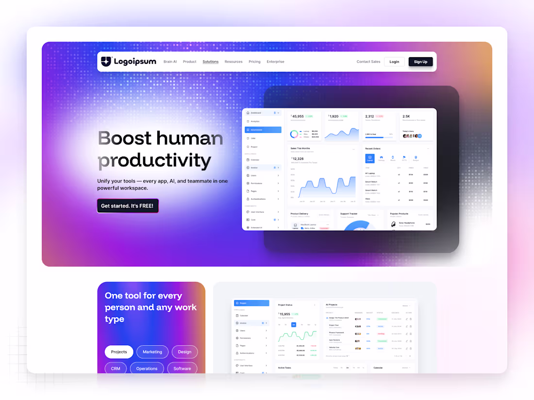
✦ Nax — SaaS Web App Homepage
Nax is a sleek and modern SaaS website homepage designed to help digital products stand out through clarity, simplicity, and trust.
The concept focuses on structured storytelling — from a bold hero section to clear feature highlights and strong call-to-actions that drive conversions.
Every section was built with purposeful spacing, modern typography, and minimal visuals, creating a balance between aesthetics and usability.
Soft tones and subtle animations make the interface feel alive yet calm, giving users a sense of confidence while exploring the product.
For me, Nax represents what great SaaS design should be —
simple, scalable, and human-centered.
Because when design tells a story clearly,
conversion happens naturally.
0
134
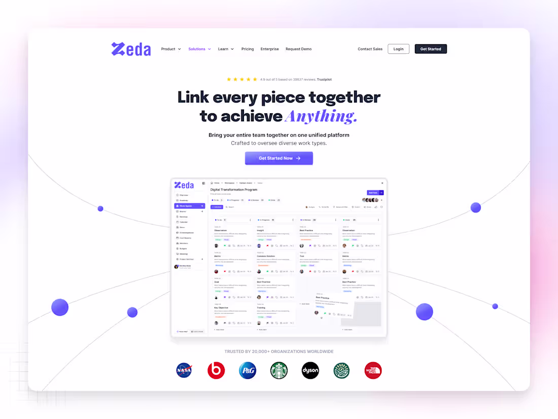
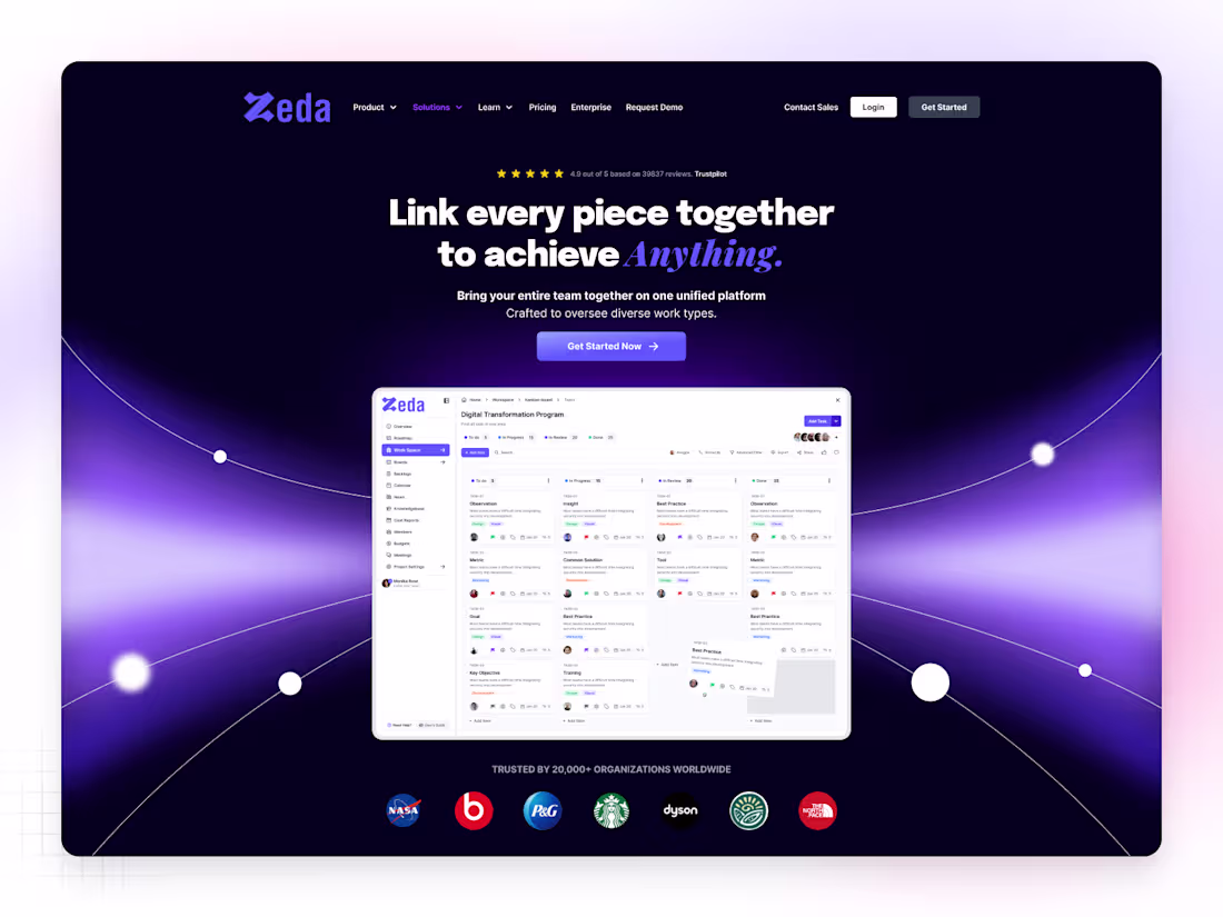
✦ Zeda — SaaS Web App Homepage
Zeda is a clean and modern SaaS web app homepage designed to help digital products communicate their value with clarity and confidence.
The layout focuses on visual hierarchy, simplicity, and storytelling, guiding users from the hero section to the product features in a natural flow.
Every element — from typography to spacing — was crafted to feel balanced, calm, and purposeful, giving the brand a trustworthy and modern presence.
Soft gradients, structured grids, and friendly iconography create a sense of innovation and accessibility, making Zeda’s interface both engaging and professional.
The goal was simple — to design a homepage that converts visitors into believers.
Because great SaaS design doesn’t just inform — it inspires action.
0
142
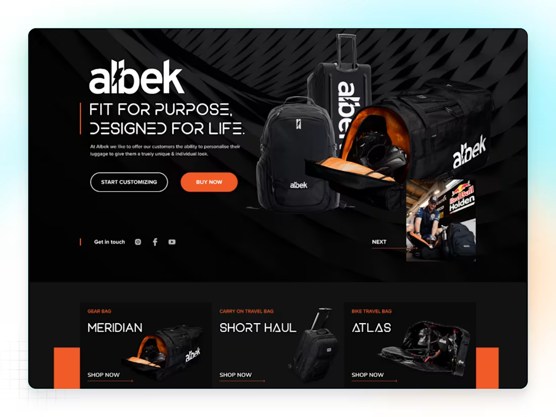
✦ Albek — Luggage & Bag Brand Website
Albek is a premium luggage and travel gear website designed for people who value both style and performance.
The design blends modern aesthetics with rugged energy, reflecting the brand’s adventurous spirit.
From the bold hero visuals to the smooth product grid, every section was crafted to create a luxury retail experience that feels human and aspirational.
The layout focuses on clarity, storytelling, and brand emotion — giving users a reason not just to browse, but to connect.
I designed Albek with one goal in mind —
to make travel gear look as premium as it performs.
2
1
142
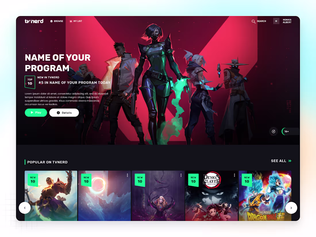
✦ TVnerd — OTT Platform Website Design
TVnerd is a modern OTT platform website built to deliver seamless entertainment through design that feels bold, cinematic, and effortless.
The goal was to create an interface that celebrates content discovery — where every show, movie, and genre feels easy to find and exciting to explore.
With dark tones, vivid highlights, and dynamic layouts, TVnerd brings a theater-like vibe right to the screen.
From hero sections to content sliders, every detail was shaped to enhance visual storytelling and user flow, making the browsing experience immersive and intuitive.
This design is for those who love simplicity —
and stories that stay with you.
0
137
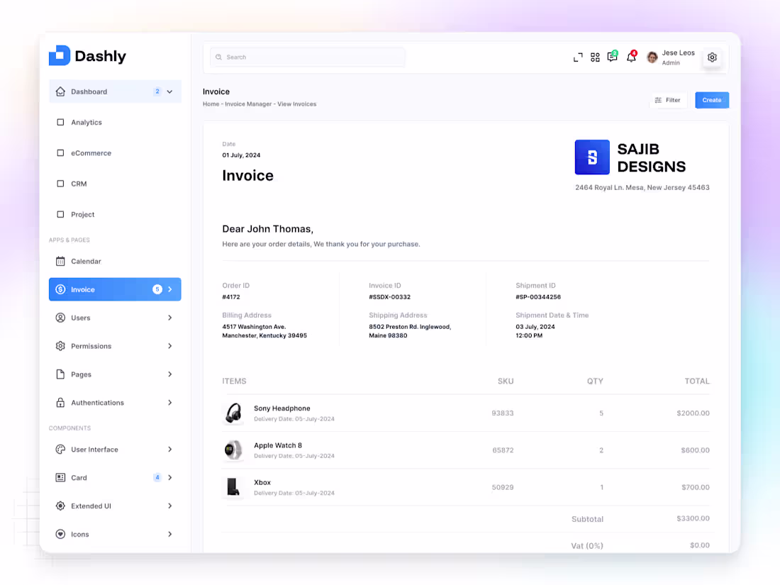
✦ Dashly — Invoice Profile App
Dashly Invoice Profile is a modern dashboard app designed to help users manage, track, and view invoices effortlessly — all in one clean and connected experience.
From the Home overview to Invoice Manager and View Invoices screens, every detail was built with clarity, consistency, and usability in mind.
The interface combines minimal layouts, structured grids, and balanced spacing to simplify financial management while keeping it elegant and professional.
Colors and typography were carefully chosen to enhance readability and trust, giving users confidence as they manage their workflow.
The goal was simple —
to turn a complex process into a calm, focused experience that just works.
Because great design isn’t about more features —
it’s about making every interaction feel effortless.
1
107
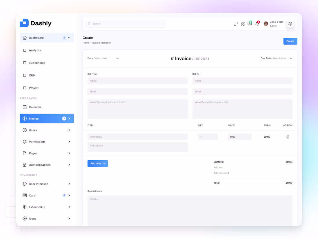
✦ Dashly — Create Invoice Dashboard
Dashly Create Invoice is a simple and intuitive dashboard screen built to help users generate, manage, and track invoices with ease and confidence.
The goal was to design an interface that feels efficient yet elegant — reducing friction in every step of the process, from input to confirmation.
Each element is placed with clarity and purpose, using clean typography, structured grids, and calm tones to make the experience effortless and focused.
The layout highlights usability over complexity —
because even financial tools should feel friendly and intuitive.
For me, this design reflects how simplicity builds trust —
especially when it comes to business operations.
1
101
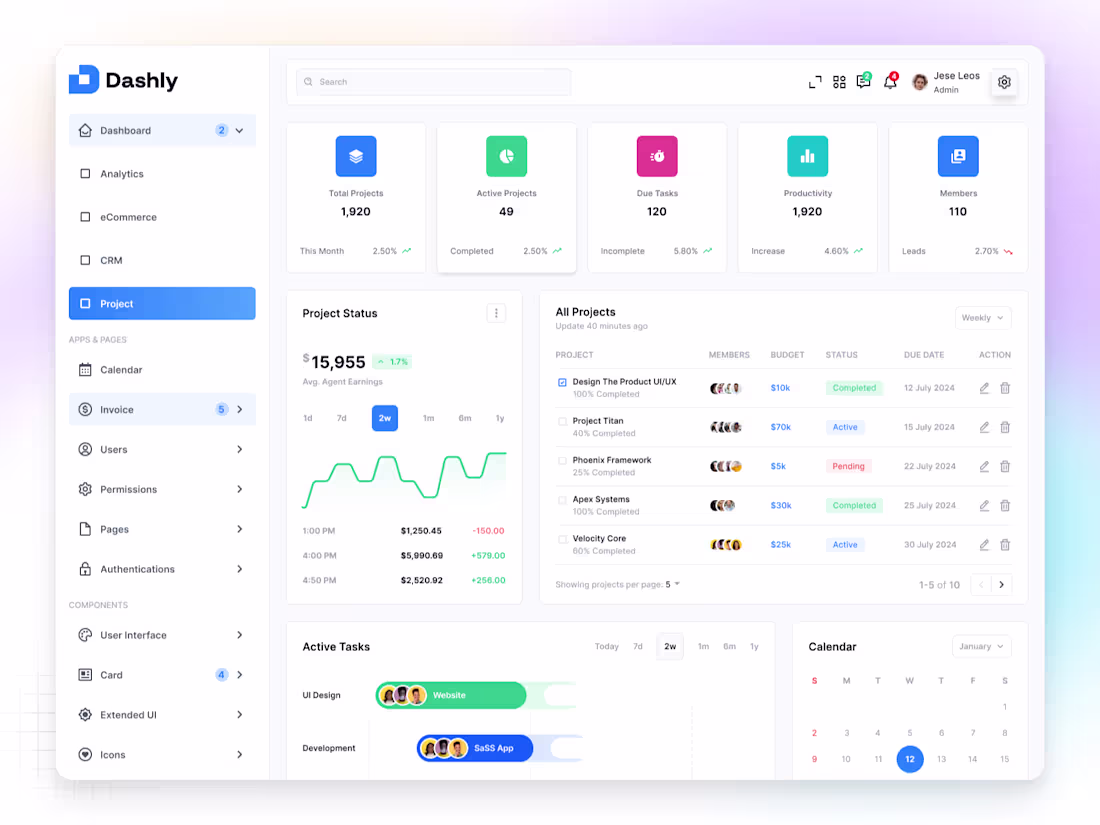
✦ Dashly — Project Dashboard
Dashly Project is a clean and structured dashboard built to help teams manage tasks, track timelines, and monitor progress — all from one organized space.
The design focuses on clarity, hierarchy, and usability, making it easy to switch between projects, view team activity, and stay aligned on goals.
Every section — from project cards to progress charts — was designed with intentional spacing, contrast, and simplicity, ensuring a calm and focused user experience.
The interface blends functionality with aesthetics,
proving that productivity tools can look as good as they work.
Because great dashboards don’t just track progress —
they inspire it.
2
87
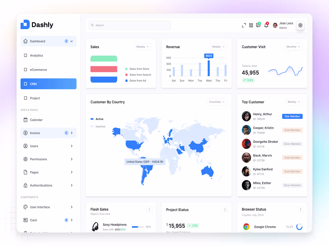
✦ Dashly — CRM Dashboard
Dashly CRM is a modern and intuitive dashboard designed to help teams manage leads, track interactions, and build stronger customer relationships in one simple interface.
The layout focuses on clarity, accessibility, and flow, giving users a complete overview of their customer pipeline — from first contact to closed deals.
Each element, from data cards to activity sections, was designed with purposeful hierarchy and breathing space, ensuring users can focus on what truly matters.
Soft tones, consistent grids, and clear typography make the experience feel balanced, reliable, and human-centered.
Because great CRM design isn’t just about managing data —
it’s about understanding people.
1
81
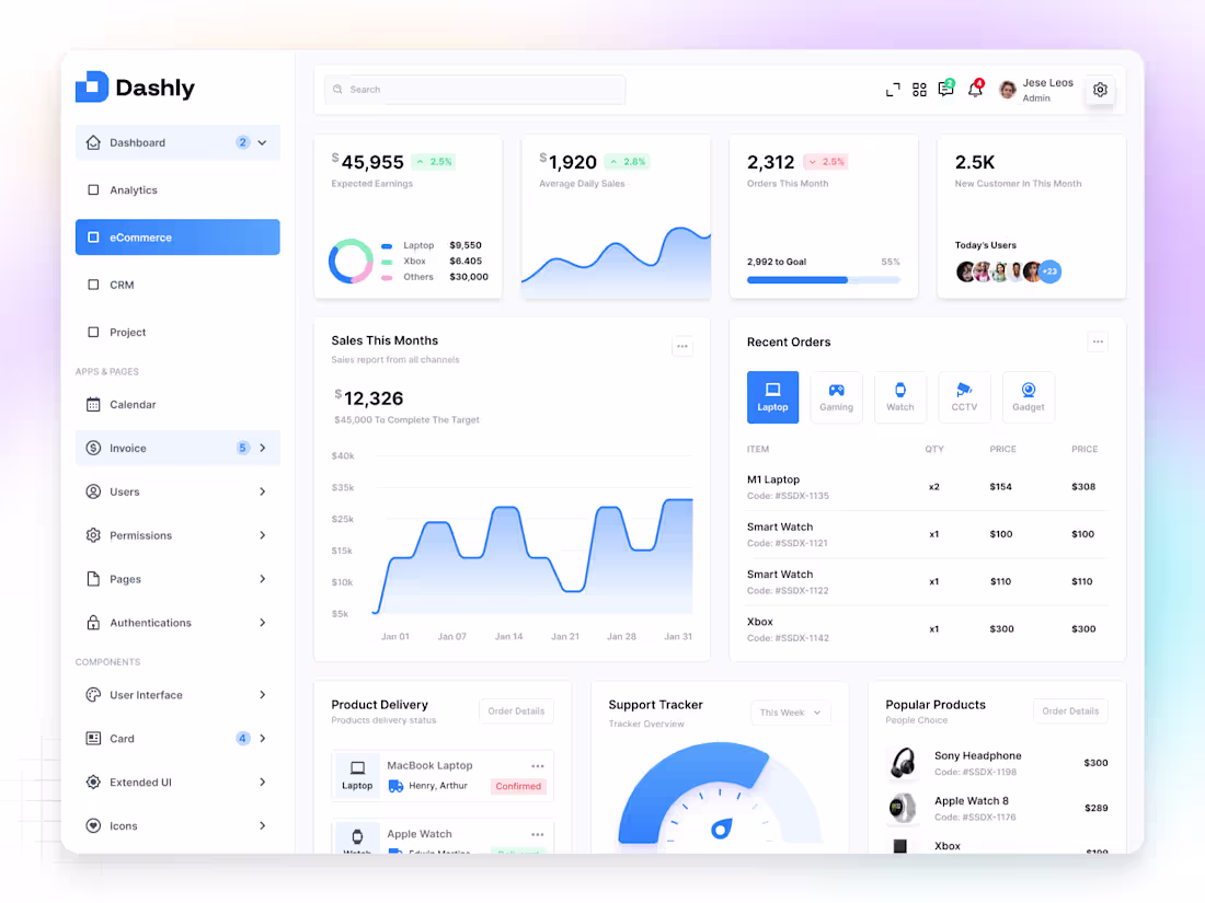
✦ Dashly — eCommerce Dashboard
Dashly eCommerce is a modern dashboard screen built to help online businesses track sales, manage products, and monitor performance in one intuitive view.
The design focuses on clarity, hierarchy, and usability, allowing users to see key insights — like revenue, orders, and customer activity — at a glance.
Each section is structured with visual rhythm and balance, ensuring that data feels simple, not overwhelming.
Neutral colors and soft accents create a calm interface that enhances focus and readability.
The goal was to make analytics feel human and actionable,
so every decision feels confident and informed.
1
81
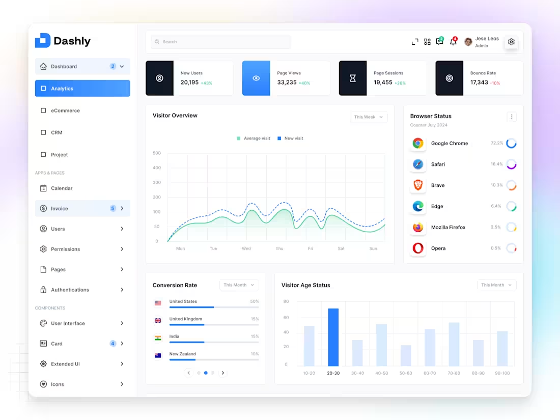
✦ Dashly — Analytics Dashboard
Dashly Analytics is a modern dashboard screen designed to help teams track performance, monitor progress, and analyze key metrics with ease.
The layout focuses on clarity and balance, combining data cards, graphs, and project stats into a seamless visual flow.
Every detail — from color contrast to typography — was crafted to guide the user’s eye naturally and make complex information feel simple.
The goal was to create a system that not only looks clean but also communicates insights instantly — without the noise.
Because when data feels clear,
decisions come naturally.
1
55
✦ PYNEX — Logo Animation
Tried Jitter.video (https://jitter.video/file/?id=KQJLlpfbSPkVXRf6hsyOeVVU) (AI) for the first time — and decided to bring my PYNEX logo to life through motion.
It was a fun experiment in blending AI and creativity, exploring how motion can add emotion and depth to a simple mark.
The animation focuses on smooth transitions, timing, and balance, keeping the PYNEX identity clean and futuristic — just like the brand itself.
I’m always curious about new tools that help designers move faster without losing the human touch, and Jitter felt like a great step in that direction.
Sometimes, a little motion can say a lot.
1
2
51
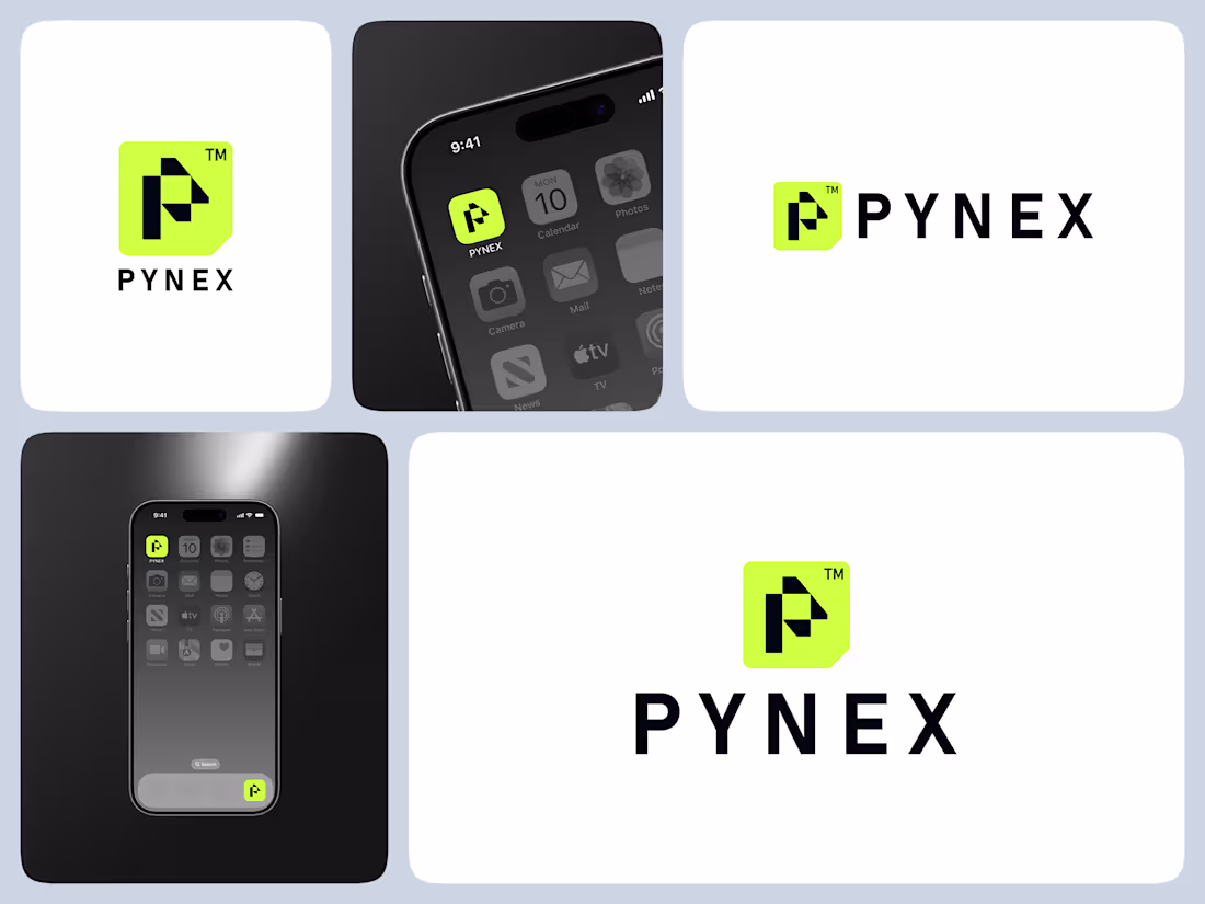
✦ PYNEX — Where Precision Meets Connection
PYNEX is a tech-forward logo I designed for a brand that blends power, performance, and precision.
The name “PYNEX” represents the fusion of modern technology and human-centered design — where every connection feels seamless, and every interaction feels intentional.
The visual mark is clean, geometric, and future-focused. Sharp edges convey strength and innovation, while subtle curves keep the design approachable and balanced.
My goal was simple — to create a brand identity that feels bold, trustworthy, and scalable across any digital platform.
Because in today’s world, brands don’t just need to look good — they need to connect.
7
117
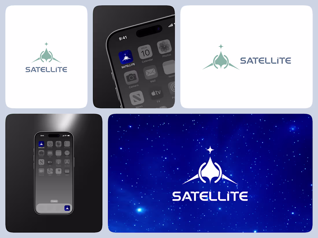
✦ SATELLITE — Connecting the World Through Design
SATELLITE is a logo concept I designed for a satellite company that represents connection, communication, and innovation beyond boundaries.
The idea behind the mark was to visualize movement and orbit — how technology brings people closer, no matter the distance. Each curve and shape in the design symbolizes precision and global reach, while the clean typography builds a sense of trust and modernity.
The goal was to create a logo that feels dynamic yet balanced, technical yet human — just like the satellites that inspire it.
For me, this project is a reminder that design, like communication, isn’t just about signals — it’s about connection.
5
111