
Sadia Afrin Ratri
Product designer · Interaction & UI for SaaS and mobile
- 5
- Followers


Vault One Buy Crypto Interaction! 🔥
Following up on my previous Vault One dashboard overview, here's a closer look at the Buy Crypto flow in motion.
This interaction covers the complete purchase process, from entering an amount and selecting a payment method to reviewing the order and confirming the transaction with 2FA verification.
I focused on keeping each step clear and easy to follow, with smooth transitions, visible progress indicators, and simple feedback throughout the flow.
The idea was to make a multi-step crypto purchase feel straightforward without overwhelming users with too much information at once.
I've already shared the full dashboard overview in an earlier post on my profile if you'd like to see more of the Vault One design.
Would love to hear your thoughts on the interaction and motion details!
0
5
A modern crypto dashboard concept focused on clarity, usability, and data visualization.
NoxFi is a web-based trading and portfolio interface designed to help users monitor crypto markets, manage digital assets, and track financial activity from one dashboard.
My Design Focus:
I worked on building a clean, structured interface where complex market information feels easier to understand.
The design uses dark surfaces, lime-green highlights, organized data cards, and clear typography to create a consistent experience across trading and portfolio sections.
Key Design Elements:
Crypto price charts and market statistics
Wallet balance and asset holdings
Portfolio performance indicators
Staking rewards and market sentiment
Transaction history and quick wallet actions
Responsive-friendly layout structure
2
3
85
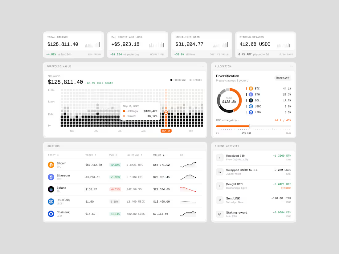
Exploring how complex financial data can feel simple, structured, and easy to navigate.
Vault One is a crypto portfolio dashboard concept that brings together asset performance, portfolio allocation, transaction history, and key financial metrics in one workspace.
I focused on visual hierarchy, information density, and data visualization, using a neutral color palette, subtle UI details, and selective accent colors to keep the interface clean without compromising functionality.
The goal was to make the data easier to understand, not just nicer to look at.
Would love to hear your thoughts on the visual direction and layout!
#ProductDesign #UIDesign #Fintech #DashboardDesign #UXDesign
3
6
161
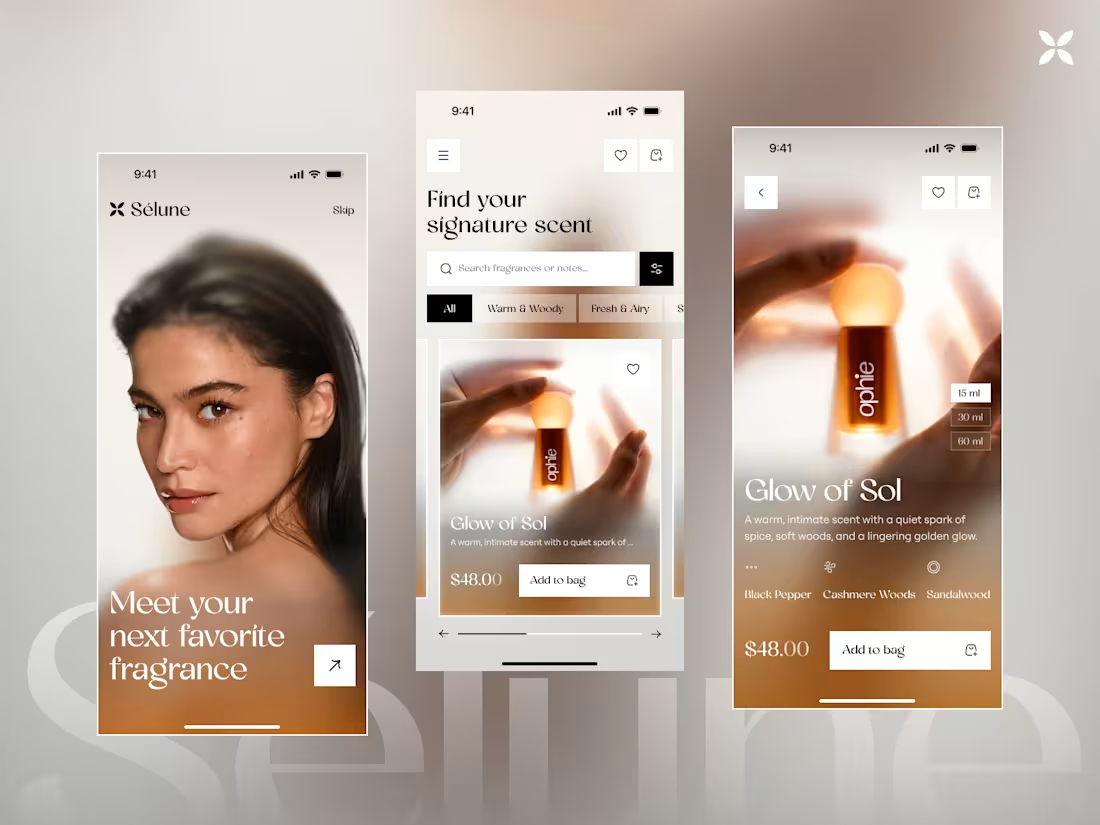
🌙 What if discovering a fragrance felt as beautiful as wearing one?
Introducing Sélune - a premium fragrance shopping app concept designed around discovery, emotion, and effortless shopping. ✨
For this exploration, I have created:
📱 A premium onboarding experience
🔎 Fragrance discovery & browsing
🌿 Scent-note focused product details
🛍️ A clean, conversion-friendly shopping flow
Warm visuals, editorial typography, immersive product imagery, and a minimal interface come together to create a more sensory fragrance-buying experience.
Which screen catches your eye first? 👀
#UIUX #MobileDesign #UIDesign #ProductDesign #Ecommerce #DesignInspiration
3
153