
Sable Balmes
Creative strategist & storyteller for modern brands
New to Contra
Sable is ready for their next project!
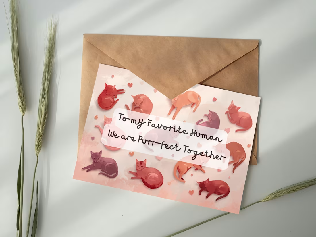
This design was created as part of a seasonal card concept focused on approachable, character-driven illustration. The visual direction emphasizes warmth and softness through color and composition, allowing the humor of the message to feel natural rather than forced. The project reflects my interest in combining illustration, typography, and emotional storytelling within small-scale product design.
0
23
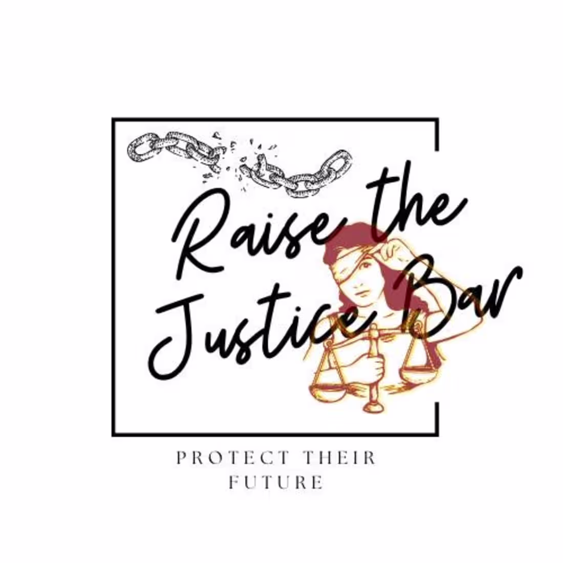
I designed this piece to visually communicate the idea of raising standards within systems meant to protect people. The broken chain represents disruption of harmful cycles, while the justice imagery reinforces responsibility and fairness. The overall composition combines structured elements with expressive typography to reflect the balance between advocacy, education, and human-centered storytelling that inspired the project.
0
23
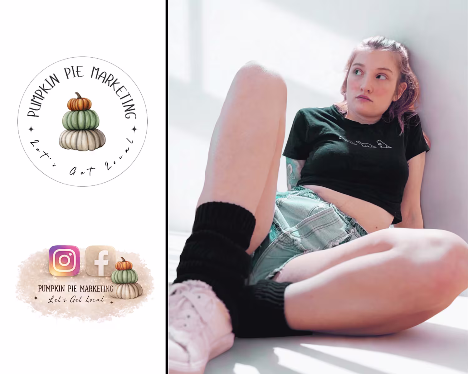
This logo was created to reflect the heart of Pumpkin Pie Marketing as a brand rooted in warmth, personality, and intentional growth. Inspired by a nickname for my daughter, the concept blends personal meaning with professional purpose. The stacked pumpkins symbolize building strong foundations and layering creative elements together, while the soft illustration style keeps the brand approachable and memorable.
0
31

I created this piece to demonstrate how visual design can communicate strategy at a glance. The concept was inspired by the way brands move between platforms today, where content, messaging, and audience experience should feel connected rather than fragmented. The soft watercolor movement contrasts with clean icon placement to represent the balance between creativity and structure that guides my work.
0
37