
Mobile Design • UX/UI Mark Hrechukha
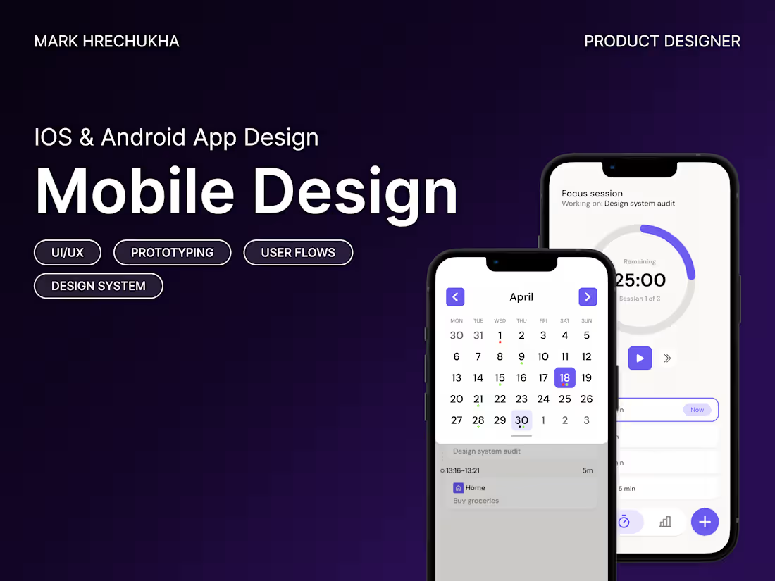
I design mobile apps where complex flows feel obvious. Not by stripping everything out, but by figuring out what actually belongs there.
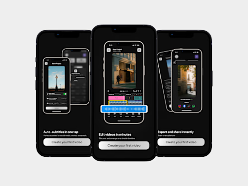
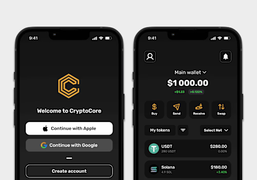
Most of my work is consumer-facing: video editors, crypto wallets, onboarding sequences that don't lose people on step 3. I design for iOS, Android, or both, end to end in Figma, from research and product strategy through to the final UI your developers will build from.
What's included
Competitive & Market Analysis
I study what exists in your space: direct competitors, adjacent products, and interaction patterns that work. You get a clear picture of where the opportunities are and what to avoid.
User Research & Personas
Interviews, surveys, or desk research depending on what's available. I define who we're designing for, what they need, and where current solutions fail them.
Product Strategy & Feature Prioritization
Not every feature belongs in v1. I help decide what ships first based on user needs, business goals, and technical constraints.
Information Architecture & User Flows
The full map of how your product works: screens, states, transitions, edge cases. Every path a user can take gets documented, including the ones most designers skip. Structural problems get solved here, before a single pixel is placed.
Wireframes & UX Validation
Low-fidelity layouts that lock in navigation, screen hierarchy, and interaction patterns. We test and iterate at this stage so we're not redesigning in high-fidelity. How many steps in onboarding, what lives on the home screen, how edge flows connect back to the core experience, all decided before moving to visuals.
High-Fidelity UI Design
Polished, production-ready screens with platform-native patterns where they make sense and custom solutions where they don't. Typography, color, iconography, spacing, all built on a system. Every state is covered: empty states that guide instead of confuse, loading states that feel intentional, error states that actually help the user recover. If your app runs on both platforms, I handle iOS and Android adaptations so each version feels native, not ported.
Component Library & Design System
Reusable components with variants, states, and responsive behavior. Grids, spacing tokens, color tokens, type scales, all structured so your dev team can build consistently from day one. The system grows with your product: new features plug into existing patterns instead of creating one-off screens. This is what keeps your app coherent at 50 screens the same way it was at 10.
Interactive Prototypes
Clickable Figma prototypes that show real user flow, not just static screens. Useful for stakeholder alignment, usability checks, and dev reference.
Developer Handoff
Organized Figma files with named layers, auto layout, and consistent component structure so your dev team can inspect any screen without guessing. Spacing, sizing, colors, and interaction behavior are all readable directly from the file. If questions come up during build, I'm available to clarify.
After we ship
Most projects turn into ongoing work: new features, iteration based on user feedback, design system expansion as the product scales.
Contact for pricing
Duration1 week
Tags
Figma

Mobile Designer
Product Designer
UI Designer
UX Designer
Service provided by
Mark Hrechukha proCherkasy, 18000
- 5.00
- Rating
- 7
- Followers
Mobile Design • UX/UI Mark Hrechukha
Contact for pricing
Duration1 week
Tags
Figma
Mobile Designer
Product Designer
UI Designer
UX Designer
I design mobile apps where complex flows feel obvious. Not by stripping everything out, but by figuring out what actually belongs there.
Most of my work is consumer-facing: video editors, crypto wallets, onboarding sequences that don't lose people on step 3. I design for iOS, Android, or both, end to end in Figma, from research and product strategy through to the final UI your developers will build from.
What's included
Competitive & Market Analysis
I study what exists in your space: direct competitors, adjacent products, and interaction patterns that work. You get a clear picture of where the opportunities are and what to avoid.
User Research & Personas
Interviews, surveys, or desk research depending on what's available. I define who we're designing for, what they need, and where current solutions fail them.
Product Strategy & Feature Prioritization
Not every feature belongs in v1. I help decide what ships first based on user needs, business goals, and technical constraints.
Information Architecture & User Flows
The full map of how your product works: screens, states, transitions, edge cases. Every path a user can take gets documented, including the ones most designers skip. Structural problems get solved here, before a single pixel is placed.
Wireframes & UX Validation
Low-fidelity layouts that lock in navigation, screen hierarchy, and interaction patterns. We test and iterate at this stage so we're not redesigning in high-fidelity. How many steps in onboarding, what lives on the home screen, how edge flows connect back to the core experience, all decided before moving to visuals.
High-Fidelity UI Design
Polished, production-ready screens with platform-native patterns where they make sense and custom solutions where they don't. Typography, color, iconography, spacing, all built on a system. Every state is covered: empty states that guide instead of confuse, loading states that feel intentional, error states that actually help the user recover. If your app runs on both platforms, I handle iOS and Android adaptations so each version feels native, not ported.
Component Library & Design System
Reusable components with variants, states, and responsive behavior. Grids, spacing tokens, color tokens, type scales, all structured so your dev team can build consistently from day one. The system grows with your product: new features plug into existing patterns instead of creating one-off screens. This is what keeps your app coherent at 50 screens the same way it was at 10.
Interactive Prototypes
Clickable Figma prototypes that show real user flow, not just static screens. Useful for stakeholder alignment, usability checks, and dev reference.
Developer Handoff
Organized Figma files with named layers, auto layout, and consistent component structure so your dev team can inspect any screen without guessing. Spacing, sizing, colors, and interaction behavior are all readable directly from the file. If questions come up during build, I'm available to clarify.
After we ship
Most projects turn into ongoing work: new features, iteration based on user feedback, design system expansion as the product scales.
Contact for pricing