
Single Screen UI ConceptElla Sh.
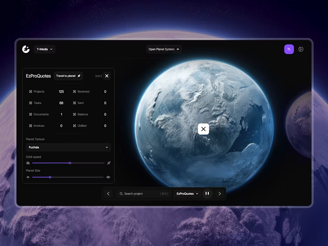
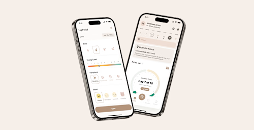
One screen, designed properly. A dashboard, a settings page, a data view, whatever is currently the worst one.
Who this is for. Two cases. Either one screen in your product is visibly worse than the rest and you need it fixed without a full redesign. Or you want to see how I work on your actual product before committing to a larger engagement, which is a reasonable thing to want.
Why a single screen is a real deliverable. The hardest screens in a product are usually dense ones: a dashboard, a table view, an analytics page. Those are where hierarchy either works or the user gives up. Solving one properly gives you a pattern the rest of the product can follow.
Where this comes from. For T-Media the dashboard was the whole problem: no hierarchy, too many competing elements, users leaving because the interface added work. For UniBot the fix was restructuring dashboards around priority, key metrics first and role-specific actions where each user reaches for them.
What you get. The screen in light and dark if your product needs both, with states covered, empty, loading, error, because those are the states that get skipped and then improvised badly in code.
FAQs
Example work
Starting at$300
Duration3 days
Tags
Dashboard Design
SaaS Design
Design Systems Specialist
Product Designer
UI Designer
Service provided by
Ella Sh. Kyiv, 02000
- 5.00
- Rating
- 10
- Followers
Single Screen UI ConceptElla Sh.
Starting at$300
Duration3 days
Tags
Dashboard Design
SaaS Design
Design Systems Specialist
Product Designer
UI Designer
One screen, designed properly. A dashboard, a settings page, a data view, whatever is currently the worst one.
Who this is for. Two cases. Either one screen in your product is visibly worse than the rest and you need it fixed without a full redesign. Or you want to see how I work on your actual product before committing to a larger engagement, which is a reasonable thing to want.
Why a single screen is a real deliverable. The hardest screens in a product are usually dense ones: a dashboard, a table view, an analytics page. Those are where hierarchy either works or the user gives up. Solving one properly gives you a pattern the rest of the product can follow.
Where this comes from. For T-Media the dashboard was the whole problem: no hierarchy, too many competing elements, users leaving because the interface added work. For UniBot the fix was restructuring dashboards around priority, key metrics first and role-specific actions where each user reaches for them.
What you get. The screen in light and dark if your product needs both, with states covered, empty, loading, error, because those are the states that get skipped and then improvised badly in code.
FAQs
Example work
$300