
SaaS & Web App UI/UX Design for Complex, Data-Heavy ProductsAyan E.
Your team ships features fast. But the dashboard has become five different design patterns stitched together, new users bounce off onboarding before they see the product's actual value, and every support ticket is some version of "I couldn't find where to-"
That's not a content problem. It's an interface problem.
I design UI/UX for SaaS platforms and web applications that handle real complexity - dense data, multi-step workflows, enterprise-scale catalogs - and make them feel simple to the person using them, without stripping out the depth power users actually need.
What's usually behind it:
Dashboards that show every data point at once instead of the one that matters right now
Navigation built around how the backend is structured, not how users actually think about their work
Admin tools that were designed once, then patched feature by feature until nothing feels consistent
Onboarding that explains every feature instead of getting a user to their first real result
No shared design system, so every new screen looks like it came from a different product
My process:
Product audit - I go through your product as a real user would, mapping every point of confusion, dead end, or unnecessary click
Information architecture - Restructure navigation and data hierarchy around how your users actually think, not how your database is organized
Wireframes & flow validation - Rough structure gets tested and approved before a single pixel of visual design happens
High-fidelity UI design - Every screen, every state - empty, loading, error, success - designed to a standard your engineers can build from directly
Design system - A modular, reusable component library so new features stay visually consistent without you needing me for every screen going forward
Dev handoff - Clean, organized Figma file with proper naming, spacing, and specs, plus a walkthrough so your engineering team isn't guessing
Proof this works:
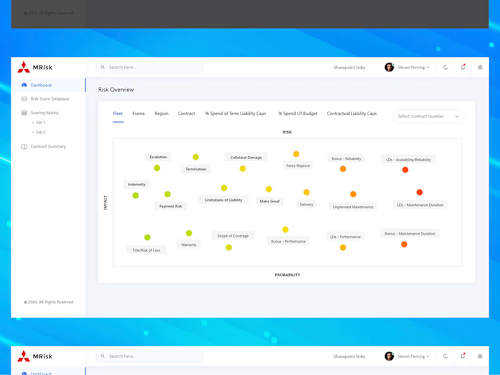
Designed the risk-scoring dashboard for an enterprise contract liability platform (MRisk) - turning dozens of interdependent financial and risk variables into a single scannable view
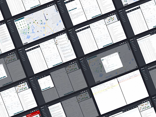
Designed the operational interface for a live emergency dispatch system (NexCAD) - where every screen had to hold up under real, split-second decision-making
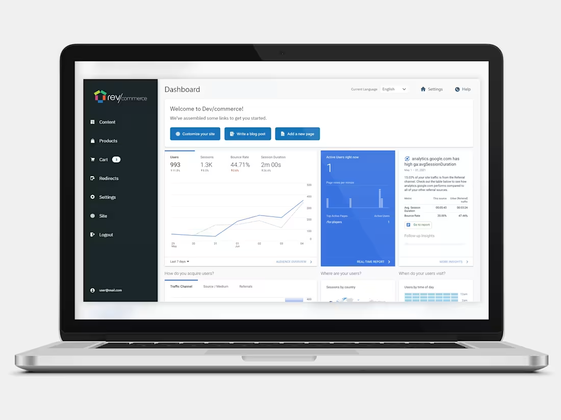
Designed the admin and storefront experience for a full e-commerce builder (RevCommerce) - including a product catalog interface built to stay usable at 28,000+ SKUs, not just a 10-item demo
7 years designing product interfaces across SaaS, fintech, legal tech, and enterprise dashboards
What you get:
UX audit with a prioritized list of what to fix first
Redesigned core flows - onboarding, dashboard, key actions
High-fidelity screens covering every state, not just the happy path
A modular design system your team can build on after I'm gone
Responsive guidelines for desktop, tablet, and mobile
Dev-ready Figma file, organized and labeled properly
This is for you if:
Your product works, but users describe it as "confusing" or "clunky"
You're planning a v2 or a major redesign and don't want to just reskin the same problems
Your team ships fast but the UI has drifted into five different visual styles
You need a design system so new features stop looking bolted-on
You want an admin or dashboard interface that stays usable as your data scales, not just at demo size
Let's talk about what you're building.
FAQs
Example work
Ayan's other services
Contact for pricing
Duration1 week
Tags
Dashboard Design
Figma

Design Systems Specialist
Interaction Designer
Product Designer
UI Designer
UX Designer
Web Designer
SaaS
Service provided by
Ayan E. proDubai - United Arab Emirates
SaaS & Web App UI/UX Design for Complex, Data-Heavy ProductsAyan E.
Contact for pricing
Duration1 week
Tags
Dashboard Design
Figma
Design Systems Specialist
Interaction Designer
Product Designer
UI Designer
UX Designer
Web Designer
SaaS
Your team ships features fast. But the dashboard has become five different design patterns stitched together, new users bounce off onboarding before they see the product's actual value, and every support ticket is some version of "I couldn't find where to-"
That's not a content problem. It's an interface problem.
I design UI/UX for SaaS platforms and web applications that handle real complexity - dense data, multi-step workflows, enterprise-scale catalogs - and make them feel simple to the person using them, without stripping out the depth power users actually need.
What's usually behind it:
Dashboards that show every data point at once instead of the one that matters right now
Navigation built around how the backend is structured, not how users actually think about their work
Admin tools that were designed once, then patched feature by feature until nothing feels consistent
Onboarding that explains every feature instead of getting a user to their first real result
No shared design system, so every new screen looks like it came from a different product
My process:
Product audit - I go through your product as a real user would, mapping every point of confusion, dead end, or unnecessary click
Information architecture - Restructure navigation and data hierarchy around how your users actually think, not how your database is organized
Wireframes & flow validation - Rough structure gets tested and approved before a single pixel of visual design happens
High-fidelity UI design - Every screen, every state - empty, loading, error, success - designed to a standard your engineers can build from directly
Design system - A modular, reusable component library so new features stay visually consistent without you needing me for every screen going forward
Dev handoff - Clean, organized Figma file with proper naming, spacing, and specs, plus a walkthrough so your engineering team isn't guessing
Proof this works:
Designed the risk-scoring dashboard for an enterprise contract liability platform (MRisk) - turning dozens of interdependent financial and risk variables into a single scannable view
Designed the operational interface for a live emergency dispatch system (NexCAD) - where every screen had to hold up under real, split-second decision-making
Designed the admin and storefront experience for a full e-commerce builder (RevCommerce) - including a product catalog interface built to stay usable at 28,000+ SKUs, not just a 10-item demo
7 years designing product interfaces across SaaS, fintech, legal tech, and enterprise dashboards
What you get:
UX audit with a prioritized list of what to fix first
Redesigned core flows - onboarding, dashboard, key actions
High-fidelity screens covering every state, not just the happy path
A modular design system your team can build on after I'm gone
Responsive guidelines for desktop, tablet, and mobile
Dev-ready Figma file, organized and labeled properly
This is for you if:
Your product works, but users describe it as "confusing" or "clunky"
You're planning a v2 or a major redesign and don't want to just reskin the same problems
Your team ships fast but the UI has drifted into five different visual styles
You need a design system so new features stop looking bolted-on
You want an admin or dashboard interface that stays usable as your data scales, not just at demo size
Let's talk about what you're building.
FAQs
Example work
Ayan's other services
Contact for pricing