
Ronnie Abs
Product Designer 🥷 SaaS, Web Apps, Dashboards & Websites
New to Contra
Ronnie is ready for their next project!


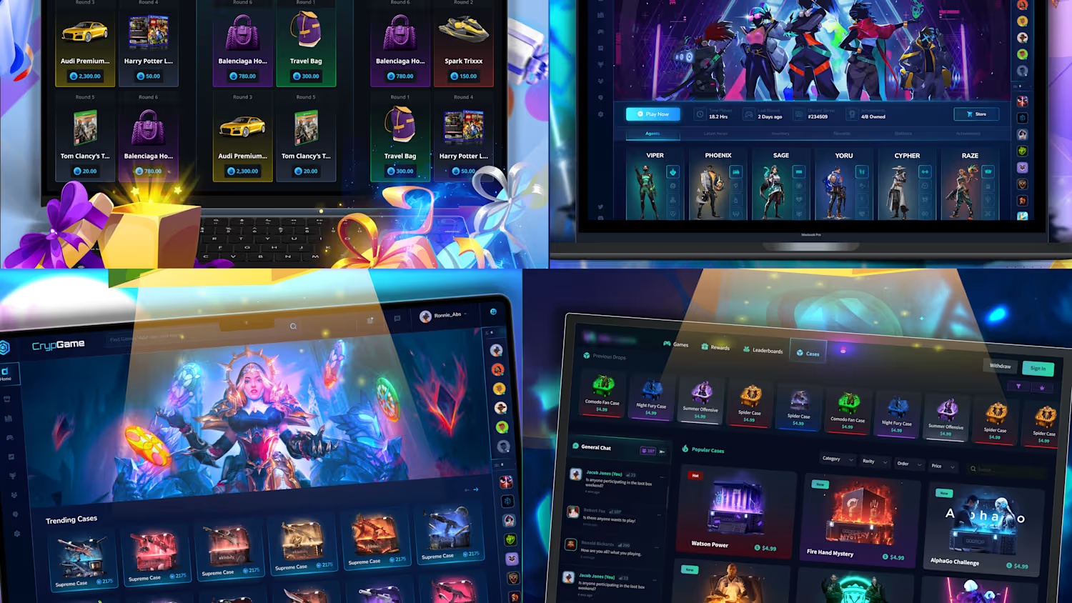
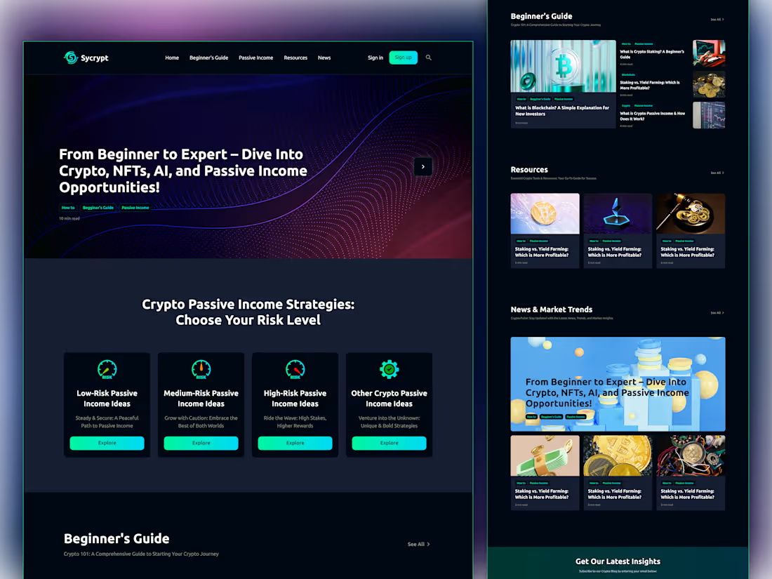
Crypto Blog & Education Platform UI/UX Design
A modern crypto content platform designed to help users learn about cryptocurrency, NFTs, AI, and passive income. The layout combines educational content, curated resources, and market insights into a clean editorial experience that feels approachable for both beginners and experienced users.
My Approach: I focused on creating a dark, premium visual style with vibrant gradients and neon accents to match the crypto-focused brand. The content structure is organized into clear sections, making it easy to discover beginner guides, passive income strategies, resources, and the latest market trends. Strong typography and image-led cards help improve readability while keeping the experience engaging.
1
58
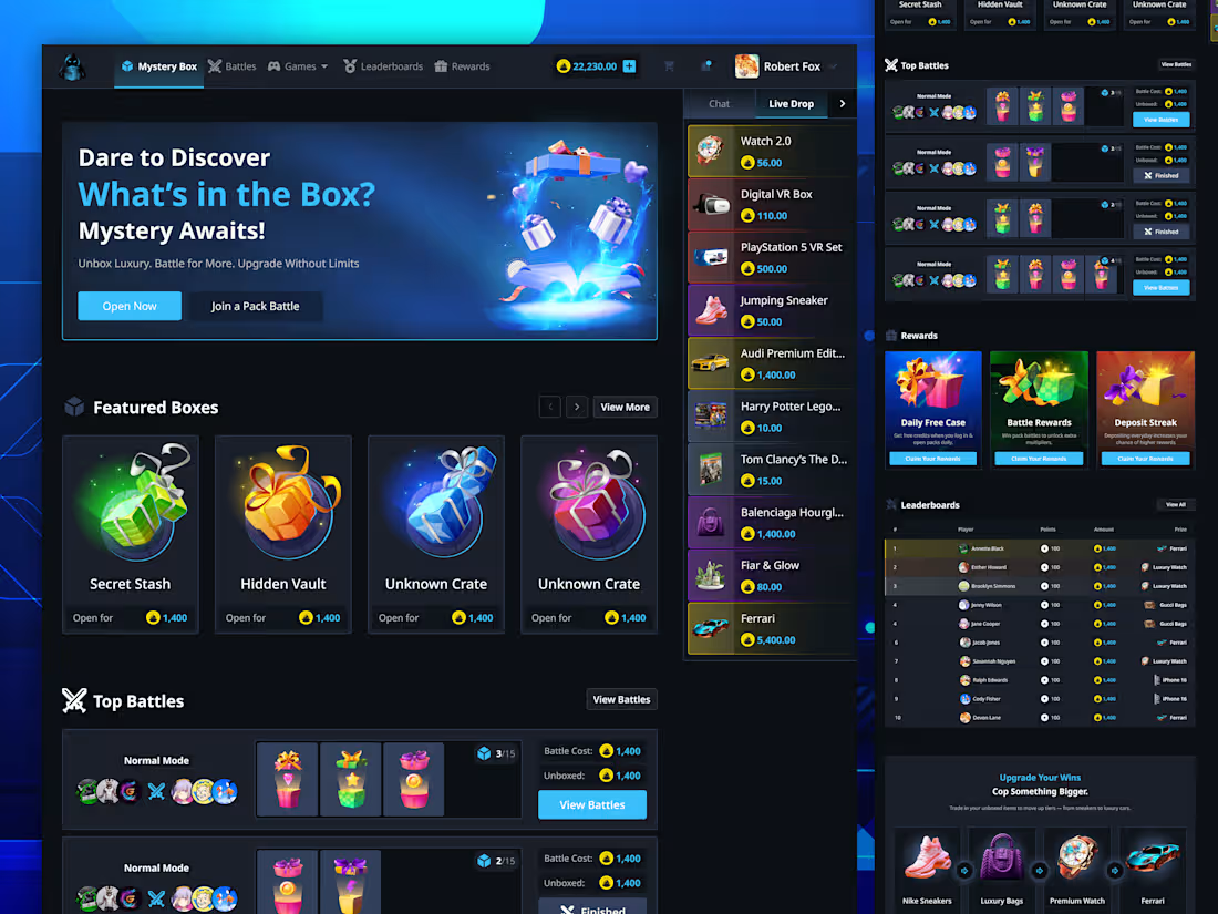
Mystery Box Unboxing Gaming Platform UI/UX Design!
A dark and immersive dashboard designed for a mystery box and gaming platform. The interface brings together featured boxes, live drops, active battles, rewards, and leaderboards in one engaging experience. The goal was to make the platform feel exciting while keeping key actions and game information easy to discover.
My Approach:
I focused on creating a strong gaming atmosphere with a dark UI, vibrant blue accents, glowing product visuals, and clear content hierarchy. The homepage prioritizes the main mystery box experience, while secondary sections help users quickly explore battles, rewards, live drops, and rankings without overwhelming the interface.
0
69
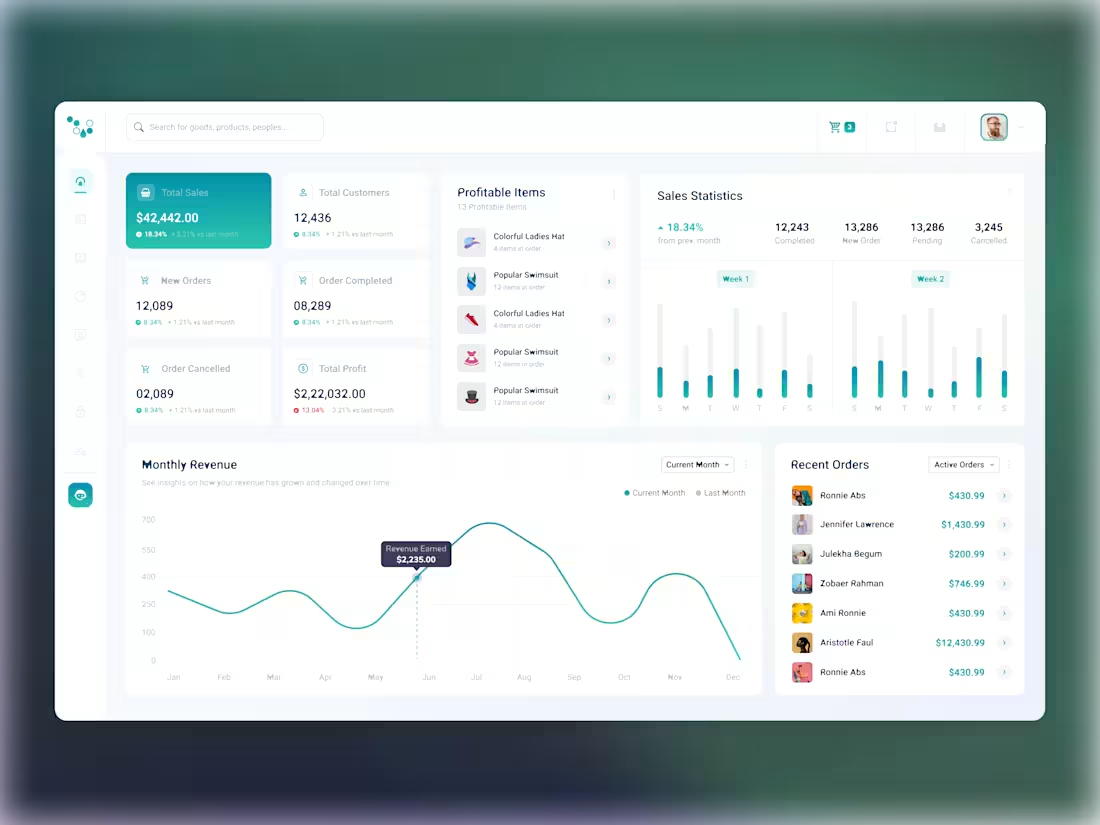
E-Commerce Sales & Product Analytics Dashboard
A modern e-commerce dashboard designed to give businesses a clear view of their sales, customers, orders, products, and revenue performance. The interface brings key metrics and analytics together in one place, making it easier to monitor business performance and spot important trends.
The Challenge
The challenge was to organize a large amount of sales data without making the dashboard feel overwhelming. Users need to quickly understand revenue, orders, customers, profitable products, and sales trends while still having access to detailed information when needed.
My Approach
I focused on creating a clean, structured dashboard with a strong visual hierarchy. Important KPIs are placed at the top for quick scanning, while product lists, sales statistics, revenue charts, and recent orders provide deeper insights. The use of cards, simple charts, and subtle colors helps separate different types of information while keeping the overall experience consistent and easy to navigate.
1
1
85
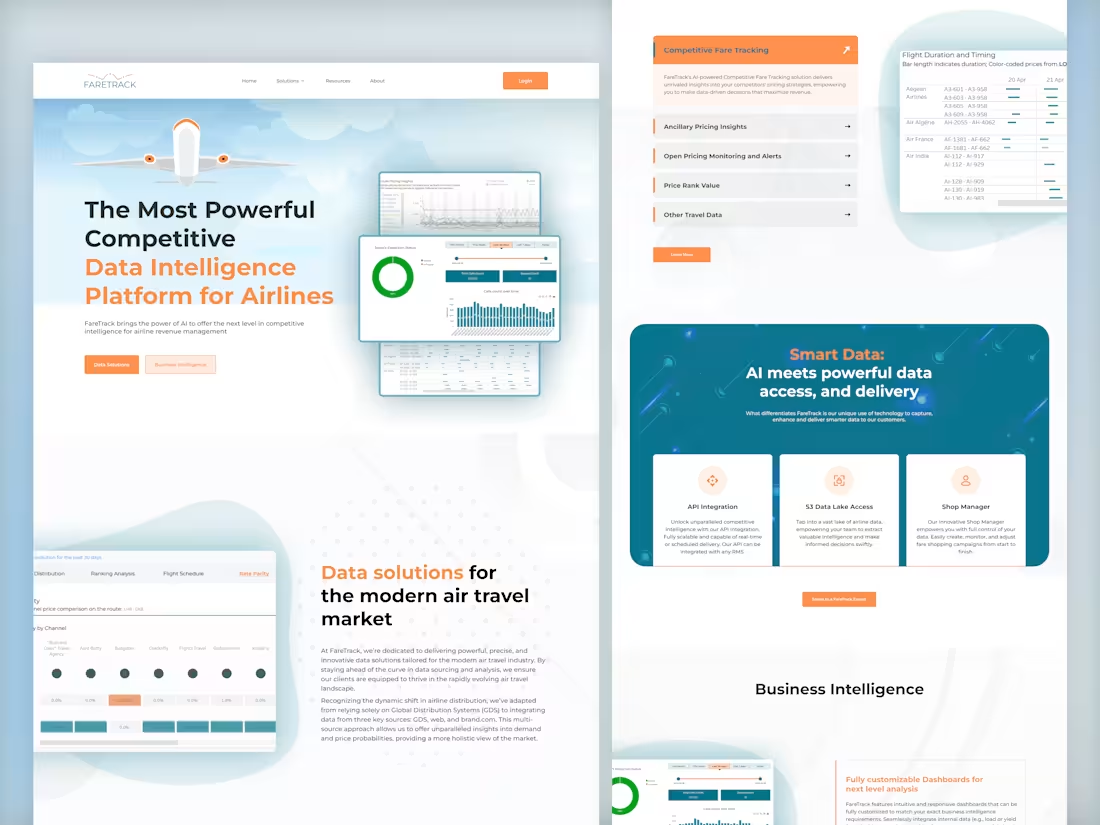
FareTrack — Airline Data Intelligence Platform
Designed a modern B2B website for an airline data intelligence platform focused on competitive pricing and revenue insights. I used a clean, professional layout with soft visuals and orange/teal accents to make complex data feel approachable. The page combines product screenshots, feature highlights, and clear content sections to build trust and communicate the platform’s value quickly.
2
1
99