
Rizqi M Akbar
Brand designer & creative partner for your business
New to Contra
Rizqi M is ready for their next project!

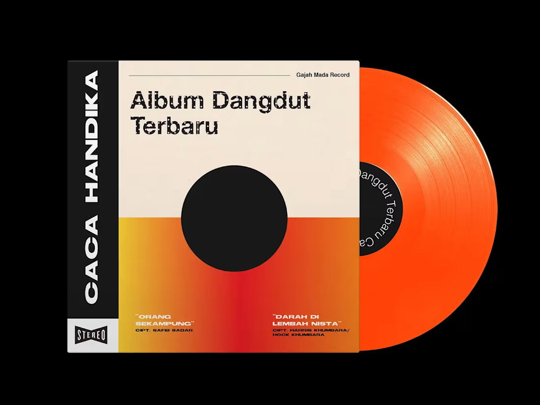
This project explores a modern reinterpretation of a classic dangdut icon, reimagining the album cover of Caca Handika. Known for his distinctive style and hits like Undangan Palsu, Mandi Kembang, and Bakar Kemenyan, Caca Handika represents a unique blend of traditional dangdut culture and theatrical expression.
The redesign aims to bridge nostalgia and contemporary visual language—capturing the expressive, mystical, and dramatic essence often found in his music, while translating it into a more refined and relevant aesthetic for today’s audience. Inspired by elements of Indonesian culture, including his connection to batik motifs, this exploration seeks to elevate dangdut’s visual identity into something bold, iconic, and culturally resonant.
0
26

Ciganjur Mono is a typeface inspired by Betawi architecture, translating the bold and angular character of traditional ornaments into a modern typographic form. Its sharp, structured shapes draw directly from elements like Gigi Balang, reflecting a strong visual identity rooted in local culture.
0
49
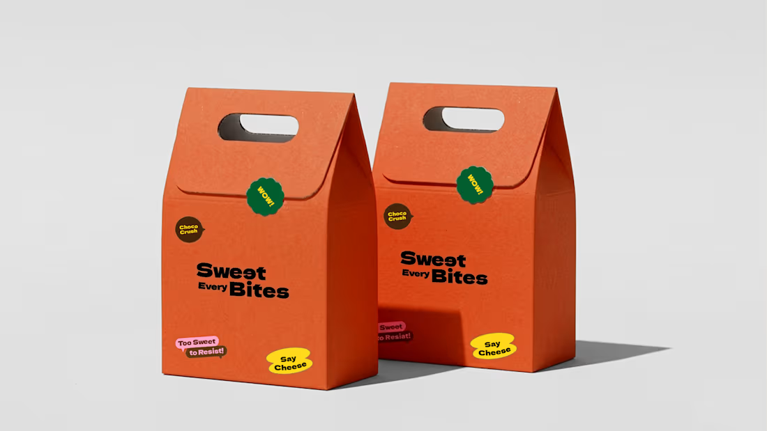
Branding for Sweet Every Bite, a brownie brand targeting Gen Z. The challenge was to move beyond "just a cake" creating a visual identity that feels alive, expressive, and emotionally resonant with a generation that buys feeling, not just food.
0
66
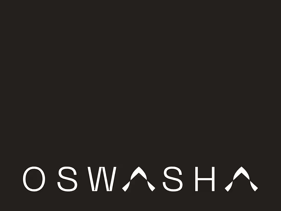
Oswasha is a concept project exploring brand identity for a green-futuristic residential development — where sustainability meets forward-thinking technology to redefine modern living.
The brief challenged me to balance two opposing tensions: the warmth of home and the precision of innovation. The result is a visual identity that feels both grounded and visionary — rooted in natural principles, expressed through a clean, tech-forward aesthetic.
This is a self-initiated concept project, created to explore branding for the architecture and property development space.
0
80