
Ritu Vaghela
Turning scrolls into sales with strategy, creativity!
Ready for work
Ritu is ready for their next project!

Week 2 of #ContraQuest
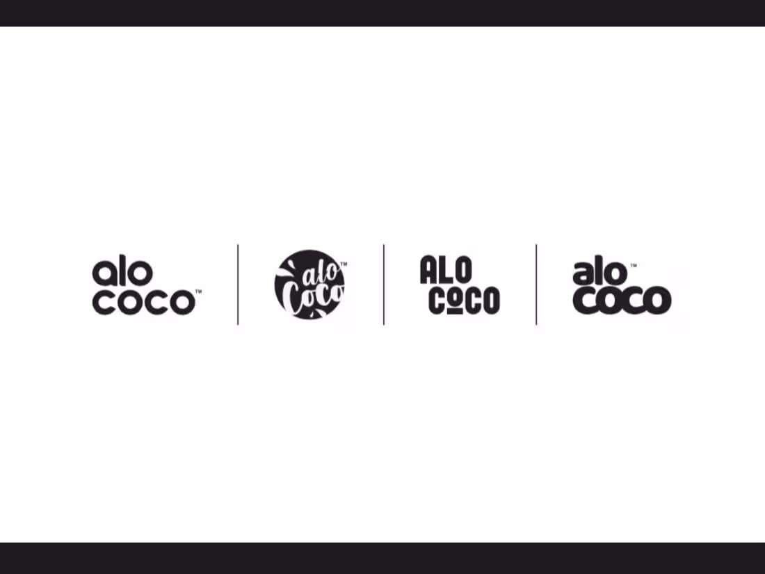
This is Alo Coco — a vibrant coconut beverage brand.
The visual direction blends playful energy with clean structure. Rounded typography, bold colorways, and simple layouts create a system that feels fresh, approachable, and shelf-ready.
I explored the identity across logo variations, packaging, and product mockups, making sure each flavor stands out while staying part of one cohesive brand world.
Tools used: Adobe Illustrator & Adobe Photoshop.
Hi, I’m Ritu 👋
New to Contra and loving the creative energy here. Always happy to connect with fellow designers 😊
0
18
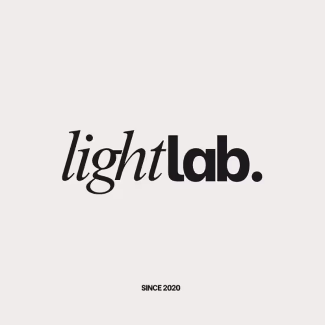
LightLab is a photography brand built on the balance of creativity and technical precision.
The Visual Strategy
The logo blends two expressive forms:
“light” — A graceful serif wordmark capturing softness, emotion, and the natural beauty of light.
“lab.” — A bold, modern typographic block symbolizing experimentation, structure, and craft.
Together, they create a minimal yet striking identity that reflects LightLab’s essence — where artistry meets technique.
2
4
104
From kitchen chaos to scroll- stopping reels🍳✨Every chop, stir, and sizzle captured perfectly!
1
39
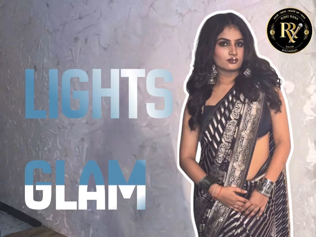
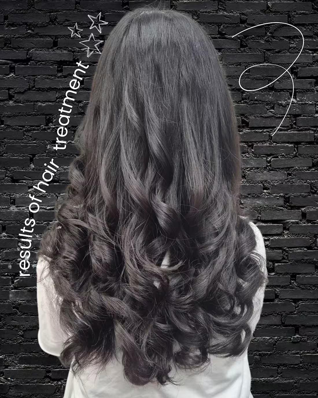
Turning everyday salon moments into scroll-stopping magic ✨ From snips to clips, every cut counts! 💇♀️💖
0
28
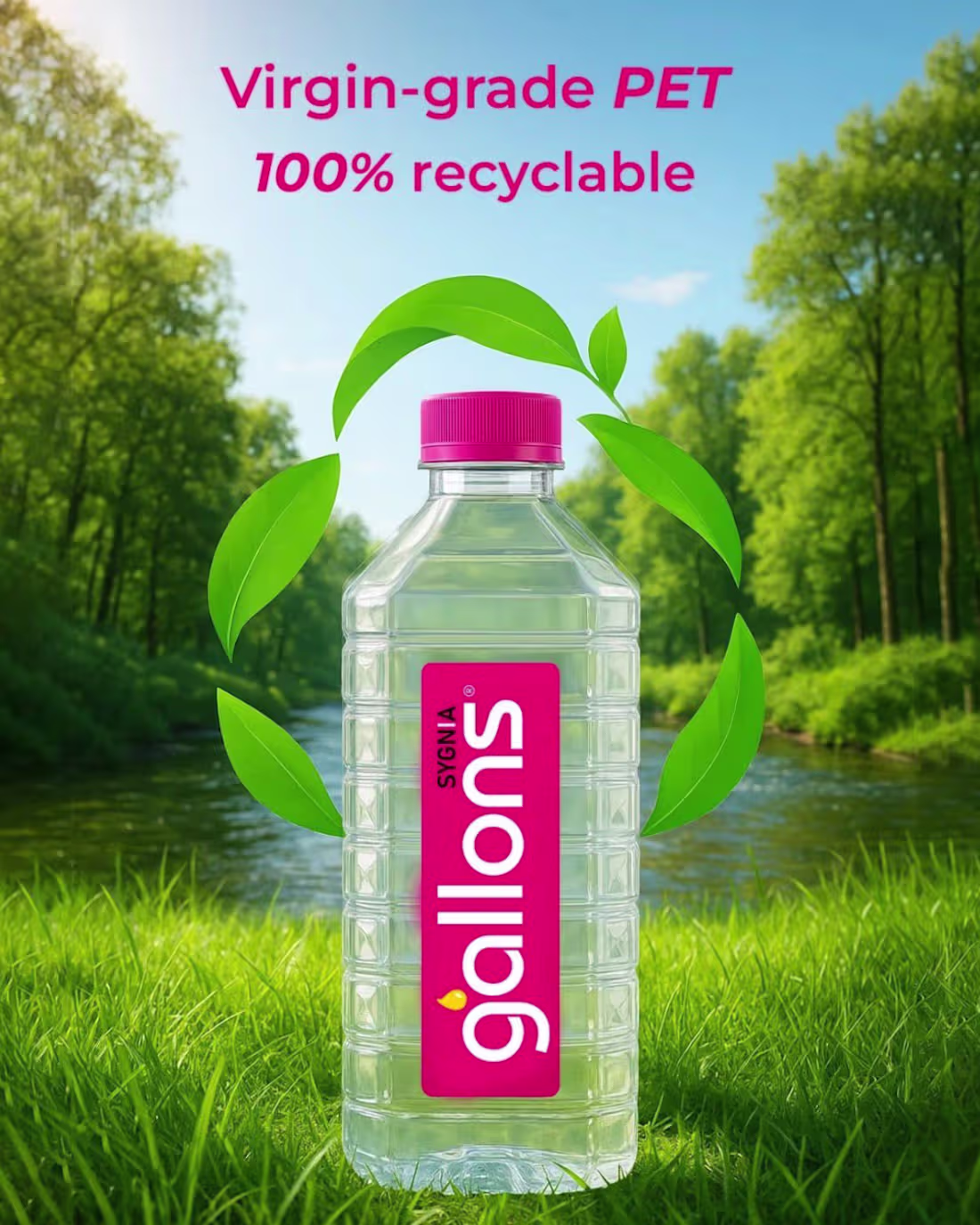
Pure hydration. Clean design.
A water brand built for everyday freshness. ✨
0
29

Currently working on social media strategy + short-form video content for lifestyle and beauty brands.
Helping clients grow with clean visuals, engaging reels, and consistent branding.
0
28
New season, new hair energy. From soft blends to bold transformations — these trending looks are all about shine, shape, and confidence. Which style are you choosing next? 💇♀️✨
0
50

Designs that turn heads ✨ Crafted for R R Salon — now crafting yours. DM to book your visual makeover!
0
49