
Rishitha Galicherla
Web designer & developer. Figma to shipped product.
New to Contra
Rishitha is building their profile!
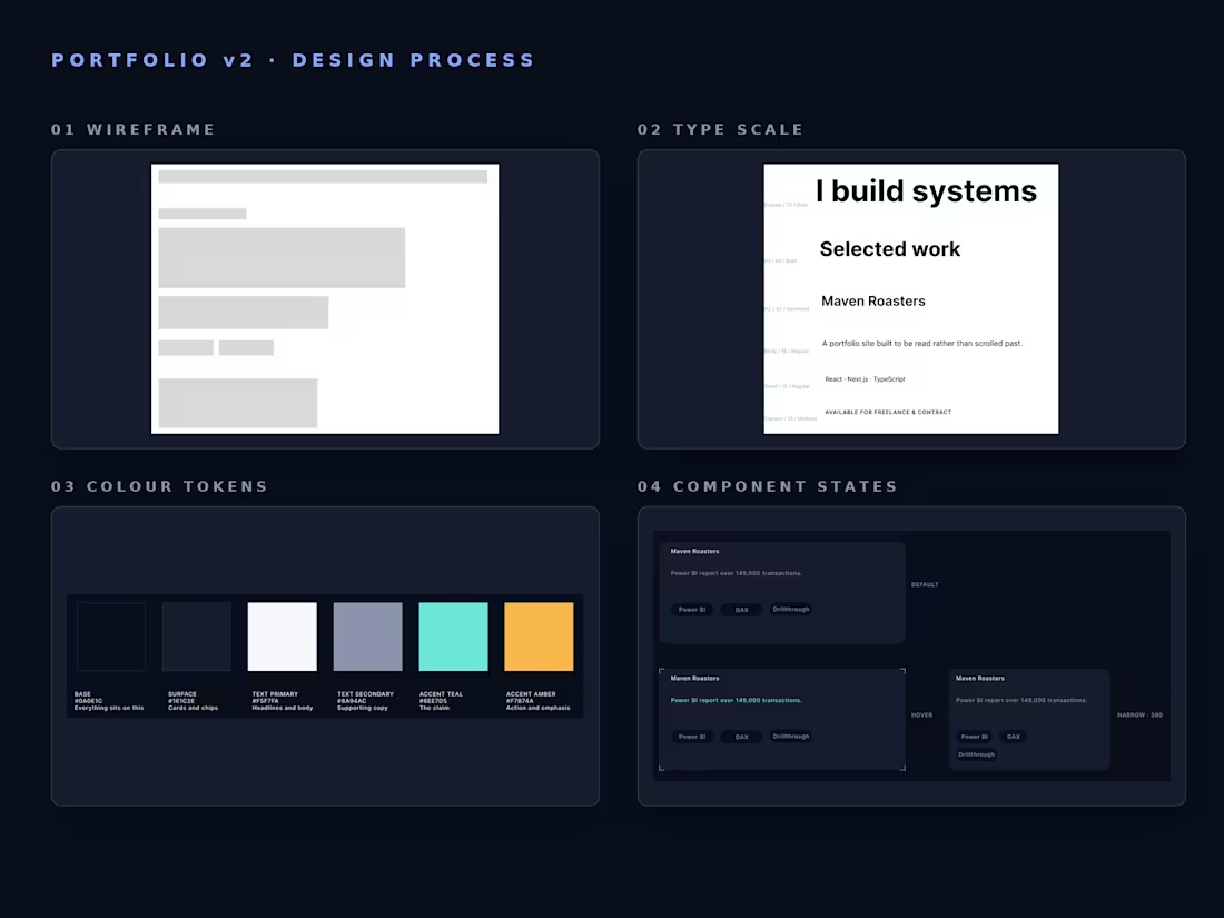
Design process for a portfolio redesign — wireframe, type scale, colour tokens with defined roles, a project card component in three states, and the composed hero.
The point of the file is the reasoning, not the screens. Every element is linked to a named style rather than a one-off value, so a change to the type scale propagates rather than needing to be chased. Colours are defined by role — base, surface, primary text, secondary text, and two accents with one job each — which is what stops a palette drifting as a project grows.
The final frame carries a written rationale for what changed between wireframe and hero: why the availability pill moved, why the headline holds a fixed measure, why chips wrap rather than shrink at narrow widths, and why only one button is filled.
0
5
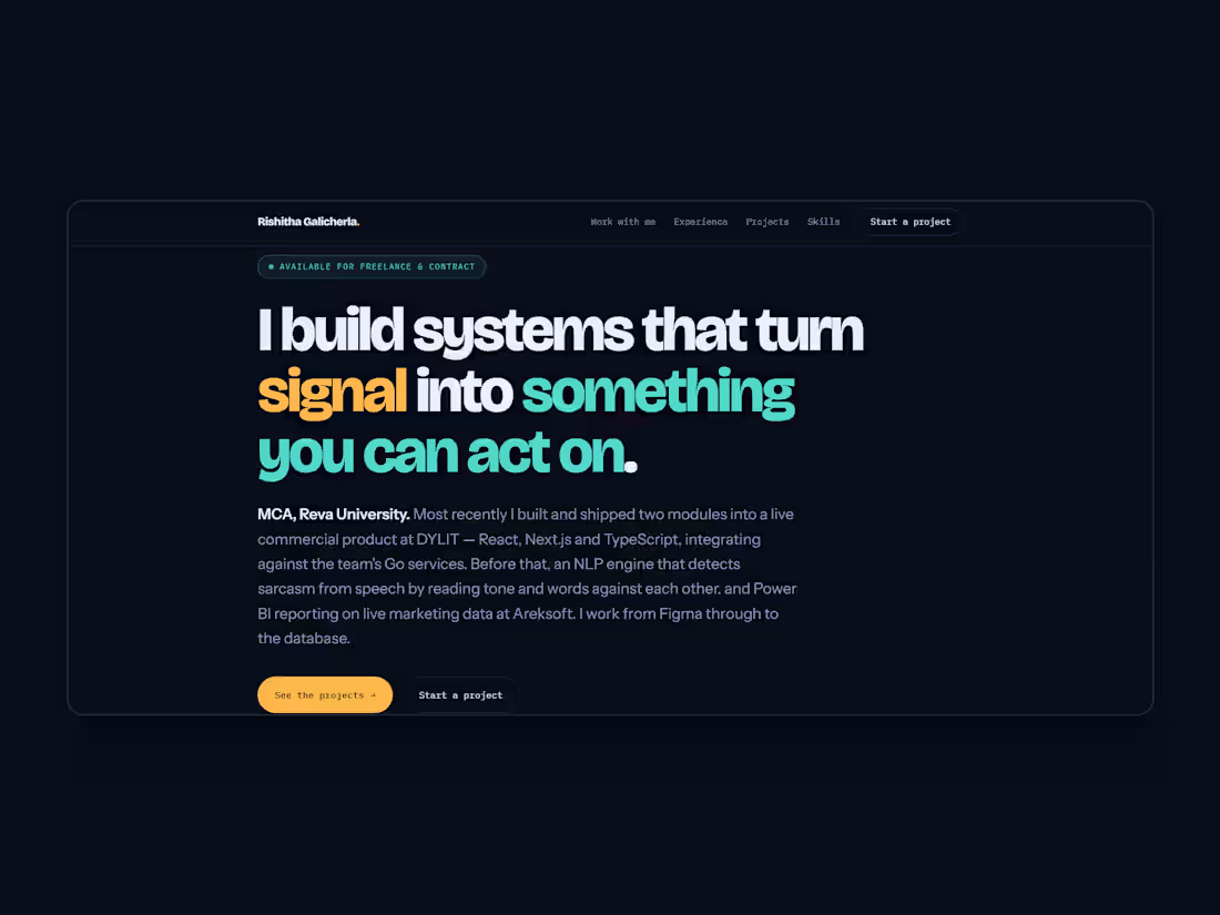
A portfolio site built to be read rather than scrolled past.
The brief I set myself: most developer portfolios list technologies and hope the reader assembles a picture. I wanted one that makes a claim and then proves it.
Type. A single oversized editorial headline carries the whole hero — "I build systems that turn signal into something you can act on." Set tight, three lines, with two words picked out in colour so the eye lands on the claim rather than reading it as a paragraph. Body copy drops to a quiet grey at a comfortable measure, so the contrast between claim and evidence is structural rather than decorative.
Colour. Near-black base at #0A0E1C so the two accents do all the work — teal for the claim, amber for emphasis and the primary action. Two accents, one job each. Nothing else competes.
Structure. Work with me, then Experience, then Projects, then Skills. Ordered as a conversation: what I can do for you, proof I've done it, the artefacts, then the detail. Project cards separate overview from stack from contribution, so a non-technical reader and a technical one can each find their layer.
Honesty as a design constraint. Projects are labelled by what you can actually inspect versus what is only listed. Three you can open, two stated plainly. That constraint shaped the card design.
Designed and built end to end: type scale, colour system, layout and copy, then hand-written HTML and CSS with no framework overhead. Deployed on GitHub Pages.
0
15
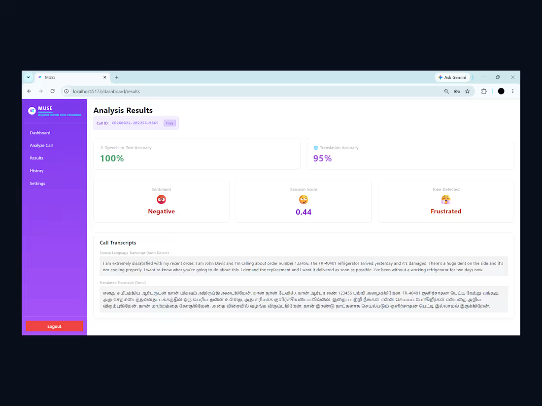
MUSE — Multilingual Sentiment & Sarcasm Engine
Sarcasm is the hard case for sentiment analysis: the words and the tone disagree, so reading the transcript alone gets it wrong.
MUSE reads both signals against each other — language through mBERT embeddings and a trained classifier, tone through pitch and energy features from Librosa — then fuses them. Around that sits a full pipeline: Whisper transcribes and detects the language, a router translates across seven languages via NLLB-200 or Marian, and RoBERTa handles sentiment.
Built with JWT authentication, bcrypt-hashed passwords, per-user analysis history in MongoDB, an admin panel, and PDF export with embedded Noto fonts so Indic scripts render properly rather than as boxes.
My part: the feature extraction and late-fusion pipeline, the sarcasm classifier and its evaluation, the translation router, and the React/Flask application end to end.
0
40
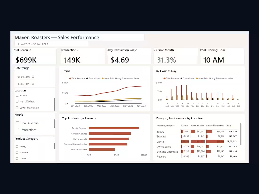
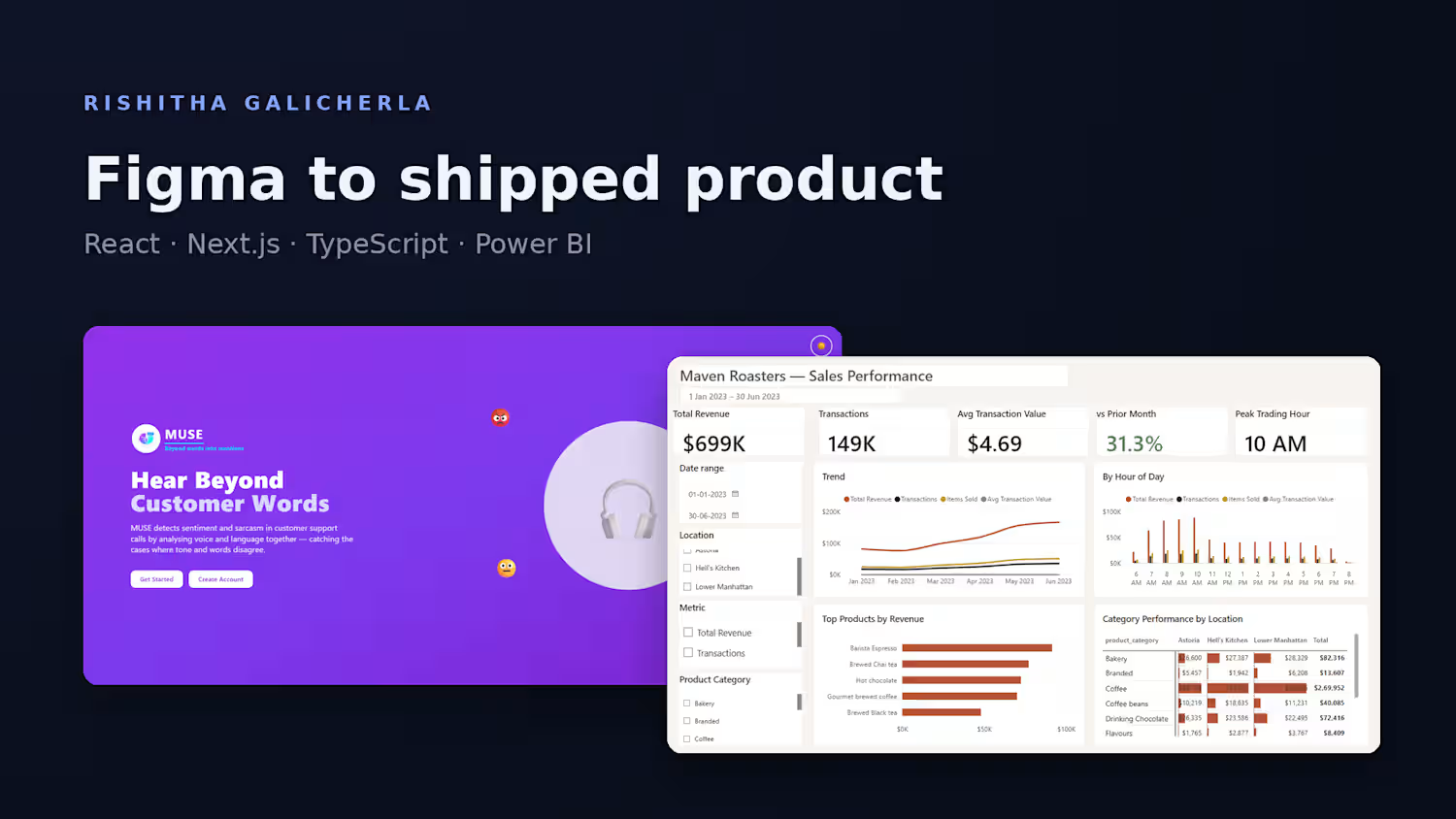
Maven Roasters — Sales Performance Dashboard
A Power BI report over 149,000 transaction-level records across three retail locations, built to answer what a shop owner actually asks: where revenue is trending, which hours carry the day, which products do the work.
The interesting part isn't the charts, it's the interaction. Most dashboards answer one question and then need an analyst for the follow-up. This one lets the viewer ask their own — a single slicer switches the trend and hourly charts between four metrics, right-clicking a product opens a detail page that renames itself to whatever was clicked, and hovering shows a miniature report rather than one number.
Underneath is a star schema with a marked date table, so month-over-month and year-to-date resolve correctly rather than approximately. Fifteen measures in a dedicated table, and the whole report styled through a custom theme JSON — nothing in it is a Power BI default.
0
48