
Riaz Uddin
Figma Mobile App UI UX Designer | App Designer iOS, Android
New to Contra
Riaz is ready for their next project!
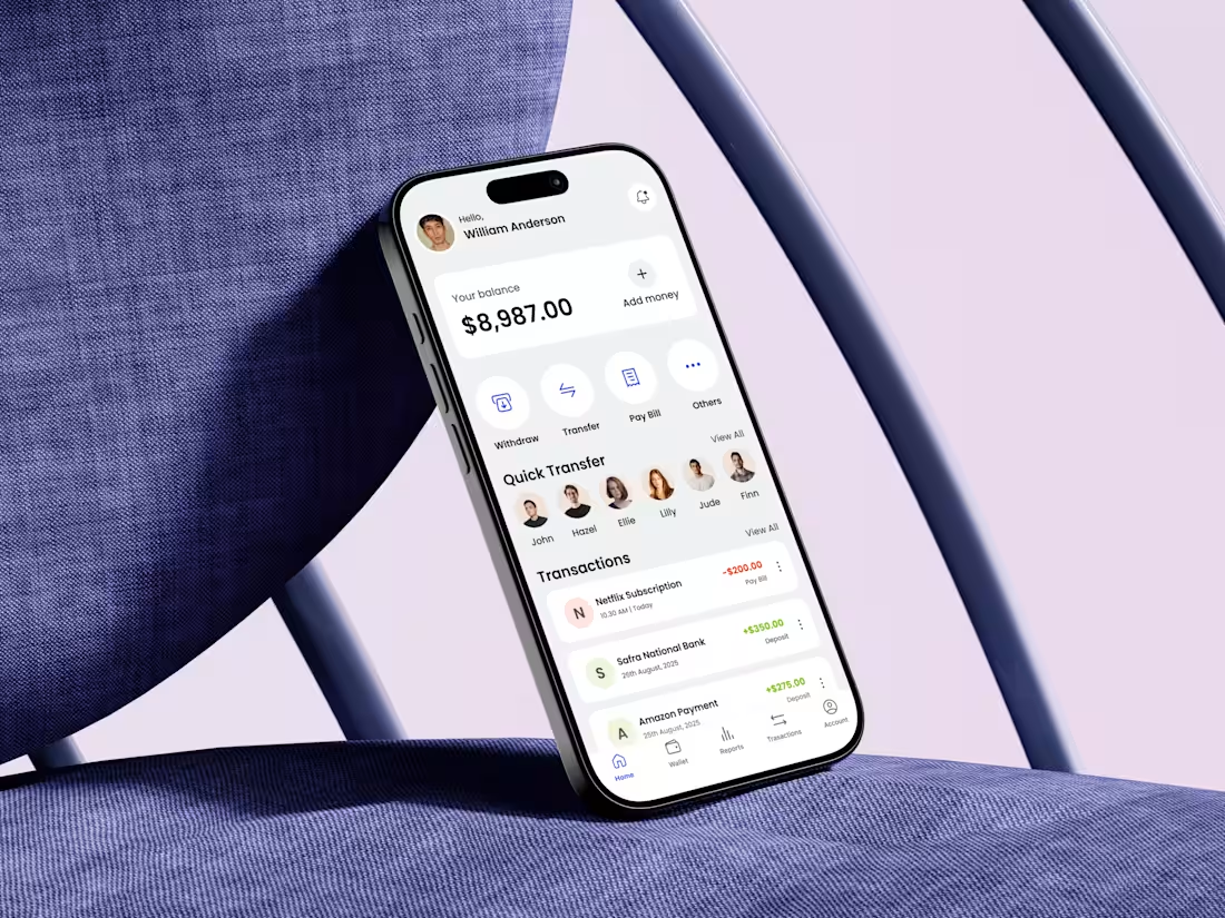
Designing a fintech eWallet home screen is not about showing features—it’s about reducing anxiety.
When I started this design, my first question was simple: What does a user need to feel confident within the first 3 seconds?
That insight shaped every decision. The balance is placed front and center, not buried, because financial clarity builds trust. Primary actions like Withdraw, Transfer, and Pay Bill are surfaced immediately to reduce cognitive load and eliminate hesitation. No scrolling, no guessing.
Quick Transfer is intentionally visual. Faces over names reduce decision time and make money movement feel human rather than transactional. Transactions follow a clear hierarchy with color-coded feedback, helping users instantly understand money in vs money out without reading details.
1
135

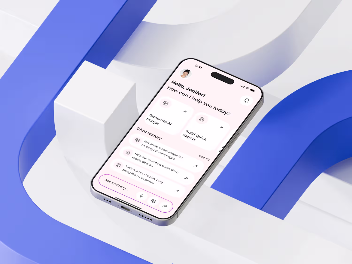
Just wrapped up a new AI Chatbot Mobile App Home Screen Design — and this one was all about clarity, intention, and reducing friction for first-time users.
My goal was to build a space that feels instantly helpful. To achieve that, I structured the top section with a warm greeting and a clear hierarchy, ensuring users immediately understand “What can this AI help me do right now?” The action shortcuts are purposefully minimal: fewer choices, higher clarity.
The biggest challenge was balancing intelligence with simplicity. AI tools can feel overwhelming, so I leaned into soft spacing, neutral tones, and recognizable iconography to calm the experience. The chat history section is intentionally lightweight to maintain focus without cognitive overload.
Design UX principle: Guide the user before they even think about what to ask.
1
121
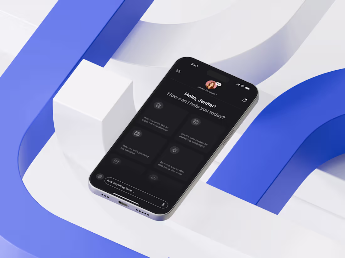
Today I’m excited to share the home screen of an AI Tool Mobile App I recently designed — a space where clarity meets intelligent user flow. My core focus was to simplify decision-making by placing the most frequently used actions upfront, reducing cognitive load and ensuring the user never feels overwhelmed by the depth of AI capabilities.
I approached the layout by first mapping real user intentions: quick prompts, saved actions, and high-impact shortcuts. Then I crafted a modular card structure that adapts visually without breaking hierarchy. The dark theme wasn’t just aesthetic — it enhances visual comfort, especially since AI interactions often involve prolonged reading. I prioritized accessibility through high contrast, consistent spacing, and thumb-friendly tap zones to support seamless single-hand use.
1
118
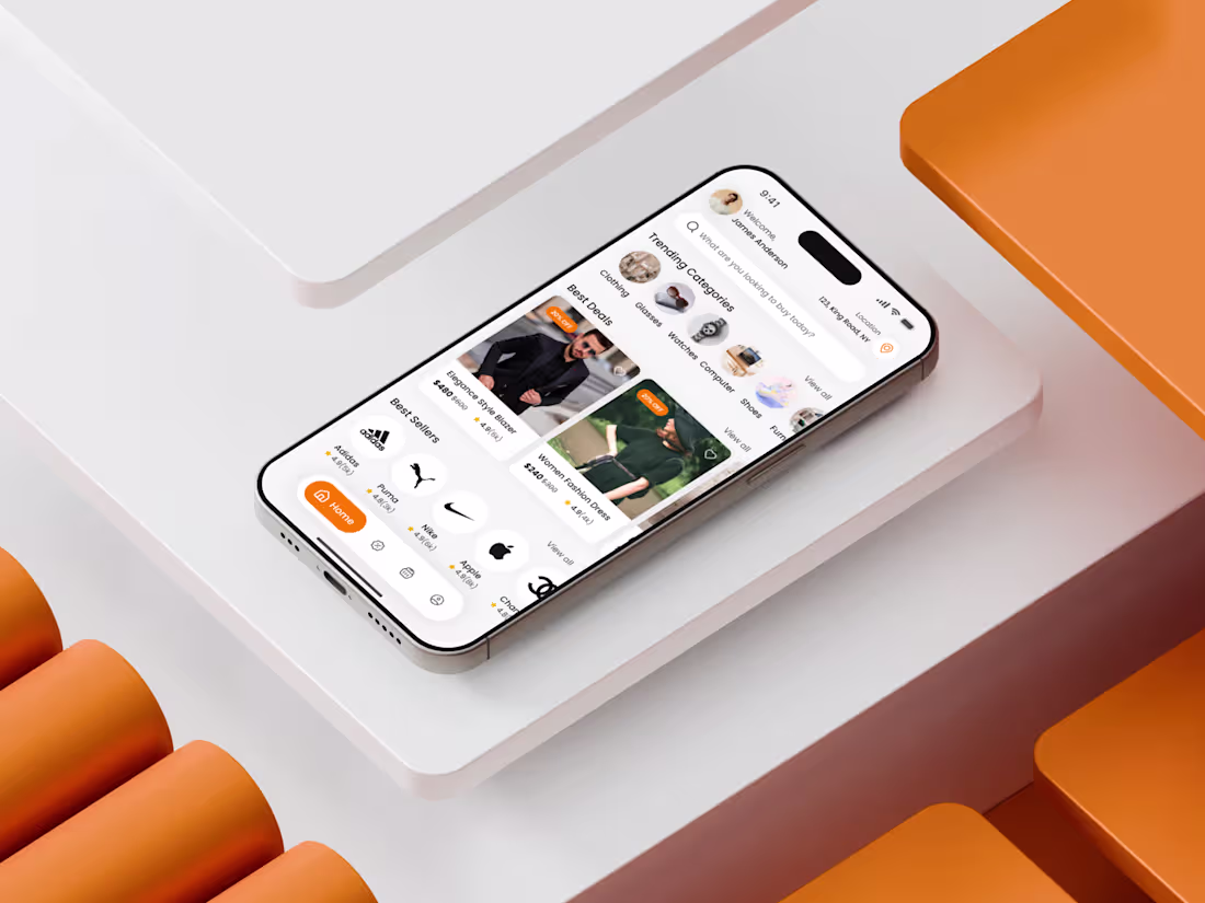
Just wrapped up an eCommerce Marketplace Mobile App Home Screen Design for a client — and this one was all about turning complex buying journeys into a clean, intuitive flow. My goal was simple: remove friction, increase clarity, and make the user feel in control from the first tap.
I started by mapping out the user’s mental model: people want quick entry points, recognizable patterns, and a sense of visual calm. That’s why the top section focuses on search + profile + location, giving immediate accessibility to high-intent actions.
The next challenge was balancing brand discovery with task completion. I solved that by using horizontal scrolls for categories, visually weighted product cards, and a carefully crafted hierarchy that guides the eye naturally from “Trending Categories” → “Best Deals” → “Best Sellers”.
1
119

Designing this Telemedicine App home screen began with identifying the primary friction: users struggle to choose the right doctor quickly while under stress.
From a UX perspective, the home screen acts as a decision hub. The layout prioritizes clarity over density, guiding users through a predictable flow—search, browse categories, evaluate doctors.
The search bar is intentionally placed at the top to support both goal-driven and exploratory behaviors. Category icons provide quick entry points while maintaining visual simplicity. Instead of listing every option, the interface promotes progressive disclosure to avoid overwhelming first-time users.
Doctor cards are designed as trust containers. Profile image, specialty, rating, reviews & pricing are grouped to reduce scanning effort and support informed decision-making in seconds
1
67
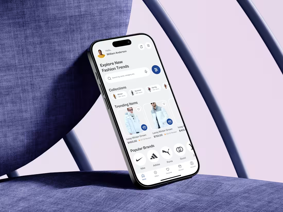
This home screen was designed with one clear goal: help users move from inspiration to action with zero friction.
In fashion eCommerce, the biggest challenge isn’t lack of products—it’s cognitive overload. My process started by mapping the first 5 seconds of user intent: users arrive to browse, not search. That’s why the layout prioritizes visual discovery before filters or deep navigation.
The greeting personalizes the experience instantly, while the search bar is positioned for quick access without stealing attention from curated collections. Seasonal collections act as mental shortcuts, reducing decision fatigue and guiding users based on context rather than categories.
Trending items are displayed with strong visual hierarchy and subtle social proof, helping users feel confident in their choices.
1
70
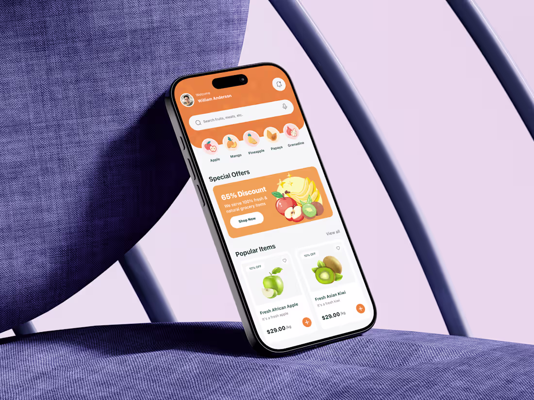
This grocery delivery mobile app home screen was designed by starting with a simple question: how do users decide what to buy in under 10 seconds?
The core challenge was cognitive overload. Grocery apps often fail because they throw too many products, banners, and categories at users at once. To solve this, I designed the layout to follow a clear visual hierarchy. The personalized greeting builds trust immediately, while the search bar and category icons reduce decision friction by letting users jump straight to intent-driven actions.
Special offers are placed above the fold with bold contrast to capture attention without overwhelming the screen. Product cards focus on scannability first: image, name, price, discount, and a clear add action. No unnecessary details interrupt the buying flow.
1
64
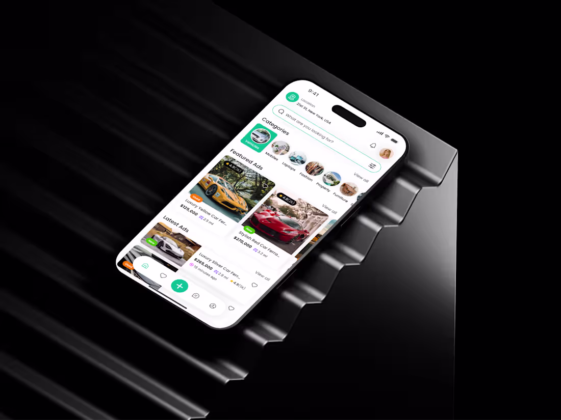
Recently, I designed the Home Screen of a Classified Marketplace Mobile App — a project that challenged me to rethink how users browse, search, and discover items within seconds. My core goal was simple: reduce cognitive load while increasing discoverability.
I started by prioritizing visual hierarchy. The top section highlights location and search, because early user interviews showed most users first check “What’s nearby?” before exploring categories. Next, I introduced a clean horizontal category carousel, helping users jump into their intent instantly. The card-based layout for Featured and Latest Ads was refined for scannability: larger visuals for emotional appeal, micro-tags like new, used, featured, and quick price indicators to support faster decision-making.
1
72
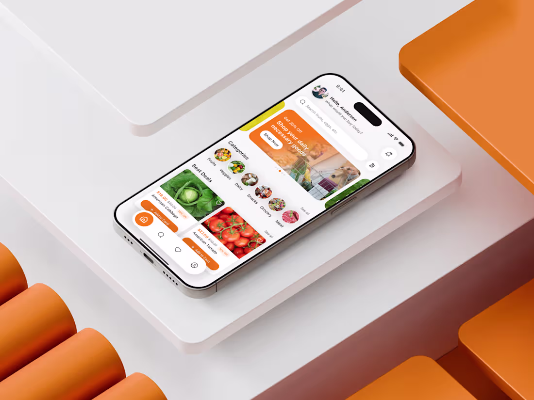
Recently, I designed a Grocery Shopping Mobile App Home Screen that focuses on reducing friction in the first 10 seconds of user interaction. My goal was simple: help users find essentials fast, feel in control, and trust the interface instantly. I started by mapping real user behaviors—quick scanning, category jumping, and deal hunting. That inspired the clean top search bar, the bold “Best Deals” visual section, and simplified categories that guide users without cognitive overload.
I chose warm, energetic tones to spark visual attention while keeping spacing breathable for a calm browsing experience. The card layout wasn’t just aesthetic—it solved a real usability challenge: giving users product clarity while maintaining fast scrollability. Micro-interactions were built around reducing decision time and building confidence.
1
53
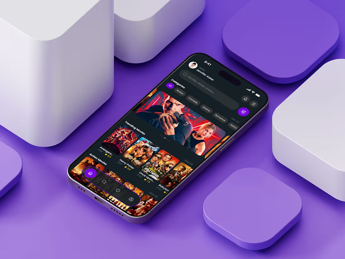
Just wrapped up a brand-new OTT Streaming Mobile App Home Screen, and this one was a joy to create. I wanted the experience to feel cinematic from the very first tap — bold visuals, immersive thumbnails, and a clean navigation flow that effortlessly guides users toward what they want to watch.
The home screen focuses on personalization and discovery. From trending titles to genre filters, every section adapts to the viewer’s mood. The dark theme enhances poster visibility, while the rounded cards bring a modern, inviting feel to the interface. Subtle highlights, intuitive categorization, and smooth hierarchy ensure that users never feel overwhelmed, even when browsing hundreds of shows.
My goal? Craft an experience that feels premium yet familiar — a space where storytelling meets seamless usability.
1
50