Rheznandya Alisya's Work | ContraWork by Rheznandya Alisya
Rheznandya  Alisya

Rheznandya Alisya

Transforming messy Excel data into data-driven decisions.

New to Contra

Rheznandya is ready for their next project!

Cover image for Travel Package Analytics Dashboard 📊✈️
An
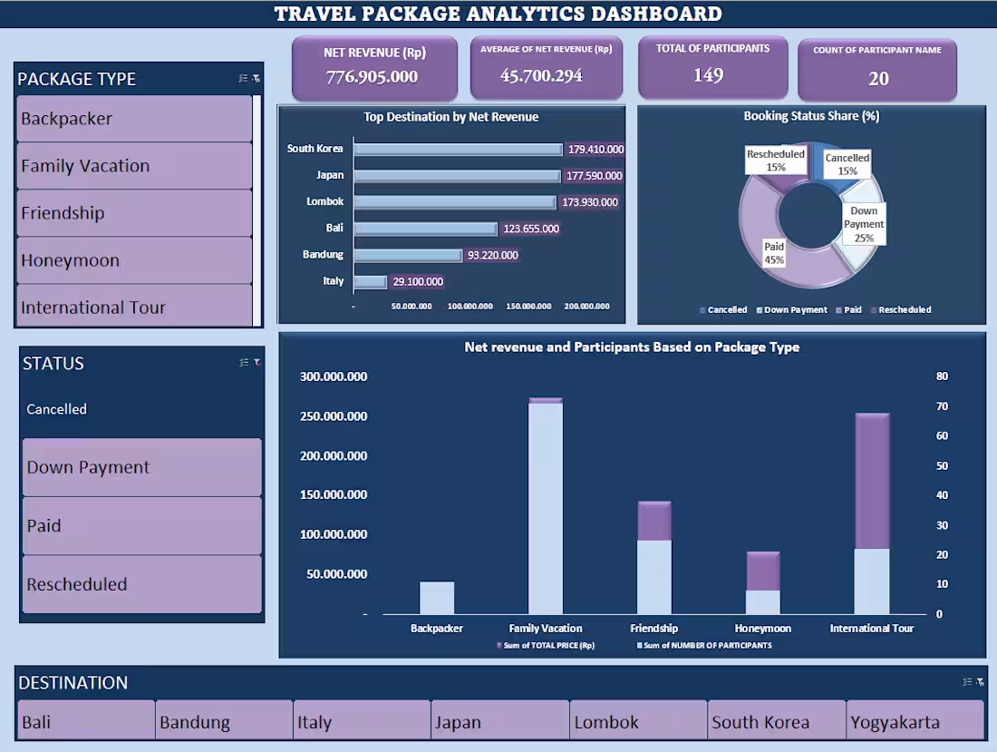
Travel Package Analytics Dashboard 📊✈️ An interactive Excel dashboard designed for travel agencies to track sales performance, booking conversions, and key business metrics in one place. Key Highlights: - KPI Tracking: Displays total Net Revenue (Rp 776.9M - excluding cancellations), Average Revenue per Booking (Rp 45.7M), Total Travelers (149 pax), and Total Bookings (20). - Top Destinations: Ranks top revenue drivers (South Korea, Japan, and Lombok) using a sorted bar chart. - Booking Conversion: Tracks status breakdown (45% Paid, 25% DP, 15% Rescheduled, 15% Cancelled) to monitor conversion health. - Package Performance: Compares revenue vs. traveler volume per package type (Family Vacation leads overall volume; International Tour yields high margin per pax). - Business Insight: Uncovered a 100% cancellation rate for Yogyakarta, identifying potential lost revenue for operational review. ---Features & Tools: Pivot table, chart, and slicers using Microsoft Excel
0
59
Cover image for Turning complex spreadsheet noise into
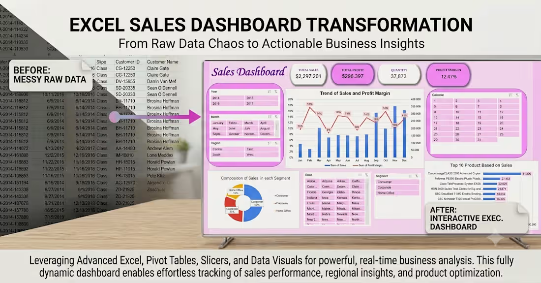
Turning complex spreadsheet noise into clear business insights! 📊 This project shows how raw sales order records can be converted into a user-friendly, interactive dashboard. Designed to help business owners and managers track revenue trends, monitor segment performance, and spot top-selling products in just a few clicks.🙌
1
114
Cover image for HR & Salary Analytics Dashboard🙌
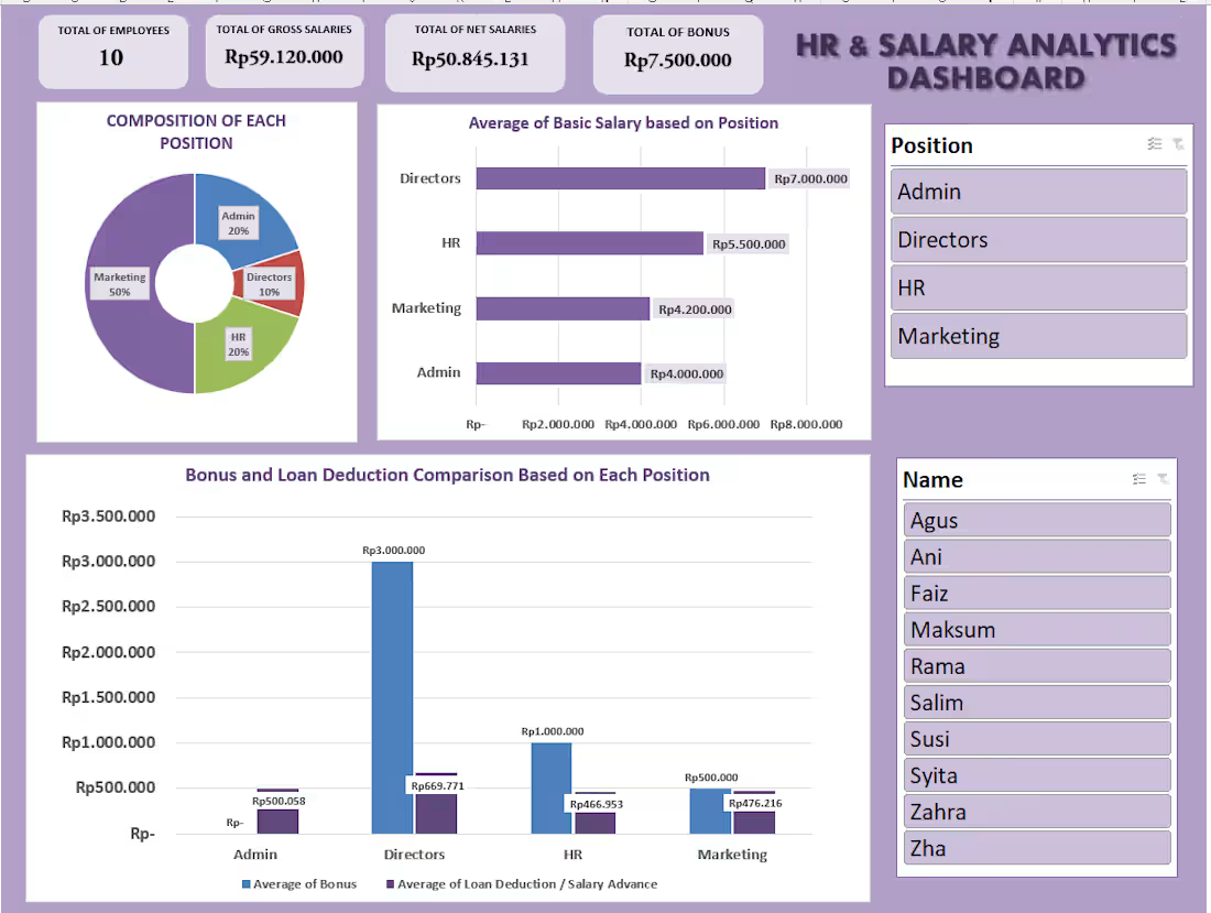
HR & Salary Analytics Dashboard🙌 Excited to share my interactive HR & Salary Analytics Dashboard built in Microsoft Excel! Designed to help HR managers efficiently track compensation and employee metrics. Key Highlights: -KPI Cards: Instant view of Headcount, Gross & Net Salary, and Total Bonus. - Composition: Donut chart showing employee breakdown by department. - Salary Ranking: Horizontal bar chart sorting average basic salaries. -Bonus vs. Loan: Clustered chart comparing extra income against loan deductions. -Interactive Slicers: Dynamic filtering by Position and Name. Built with MS Excel (Pivot Tables, Charts & Slicers).
0
117
Cover image for The reference codes needed for
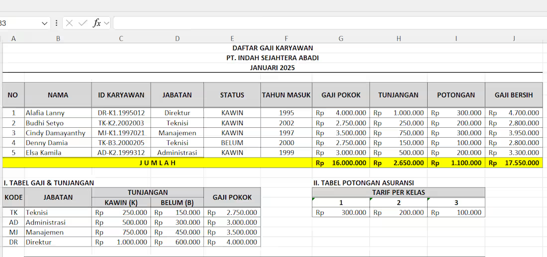
The reference codes needed for the tables were mixed inside the Employee ID (like DR-K1.1995012), not written in separate columns. So, standard lookup formulas couldn't work normally. Instead of manual inputs, I built advanced nested formulas to automate the entire process: -LEFT & MID: To extract hidden codes and status keys from the Employee ID. -VLOOKUP & HLOOKUP: To instantly pull data from reference tables using the extracted codes. -IF & SUM: To handle dynamic allowance logic and calculate final net pay.
0
138
Cover image for I'm officially open for Excel
I'm officially open for Excel data entry and formatting projects! If you need help cleaning up your spreadsheets, check out my service below🙌 Glad to discuss and contribute on your projects together!😍 https://contra.com/s/ZFkN6Ome-professional-excel-data-entry-and-formatting
2
403
Cover image for Searching data manually in a
Searching data manually in a matrix table with multiple criteria is inefficient. A two-way INDEX & MATCH function is the perfect solution for dynamic retrieval: Row Match: Automatically locates the specific food item (e.g., "Mie Goreng") vertically. Column Match: Identifies the correct portion size (e.g., "Besar") horizontally. Dynamic Result: The INDEX function intersects both criteria to instantly retrieve the exact price.
1
269
Cover image for Using logical formulas is essential
Using logical formulas is essential for automated data categorization and reporting. This project demonstrates how to apply IF, IFS, COUNTIF, and SUM functions in Excel to process sales data effectively: -IF Function (Binary Logic): Automatically flags whether a transaction is "Untung" (Profit) or "Rugi" (Loss) based on a single condition. -IFS Function (Multi-tier Logic): Handles multiple conditions to classify sales performance into tiered categories ("Low", "Medium", "High") based on revenue thresholds. -COUNTIF Function (Data Aggregation): Calculates the exact number of transactions that fall into each specific performance category. -SUM Function (Totaling Data): Computes the grand total of all transactions to ensure complete data reconciliation in the summary table.
1
282
Cover image for Choosing the right chart in
Choosing the right chart in Excel depends entirely on the dataset. This project demonstrates effective data visualization for livestock and meat production insights: Line Chart: Shows the upward growth trend of total meat production (2020-2022). Column Chart: Compares the total production volume across different meat categories. Donut Chart: Illustrates the percentage share and regional distribution of chicken production. Combo Chart: Displays two metrics at once—feed volume (columns) vs. total expenditure (line).
0
188
Cover image for To visualize the top 10
To visualize the top 10 export values ​​of Indonesian commodities in the manufacturing sector, using a bar chart is the right solution because it can display the export values ​​of commodities in order from highest to lowest. Before creating the chart, you need to sort and filter the table you want to visualize.
0
209