
Rhea Udutha
Logo and Brand Kit Designer
New to Contra
Rhea is ready for their next project!

Skyvdo
An ongoing project.
0
3
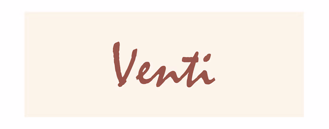
Venti
The Venti identity is built to stand out on a crowded shelf or a busy street. Unlike static, boring coffee logos, the motion in the splash creates an immediate psychological trigger of 'freshness.'
The earthy green and cream tones position your brand as a 'premium third-space', somewhere between a high-end cafe and a cozy home kitchen. It’s a logo that looks just as good on a burlap sack as it does on a high-end digital app.
0
7
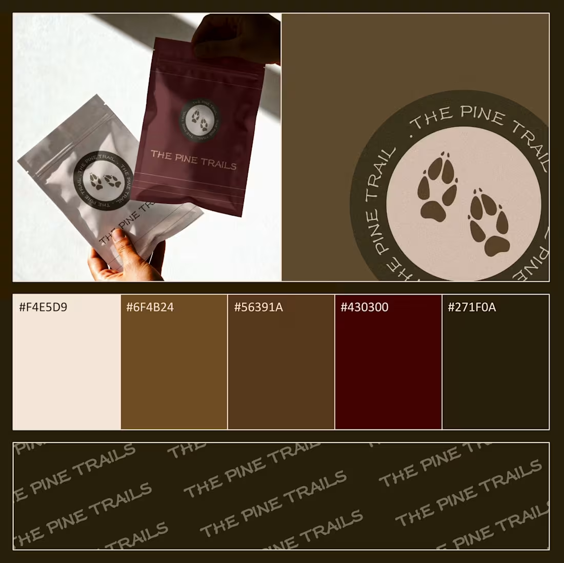
The Pine Trails Identity Design
Nature-forward branding for the modern outdoorsman.
Concept: Tracking the path less traveled.
Palette: Earthy ochres, deep mahogany, and forest shadows.
Deliverables: Logo design, brand pattern, packaging system, and retail mockups.
The Result: A brand that feels grounded, authentic, and ready for the wild.
0
16
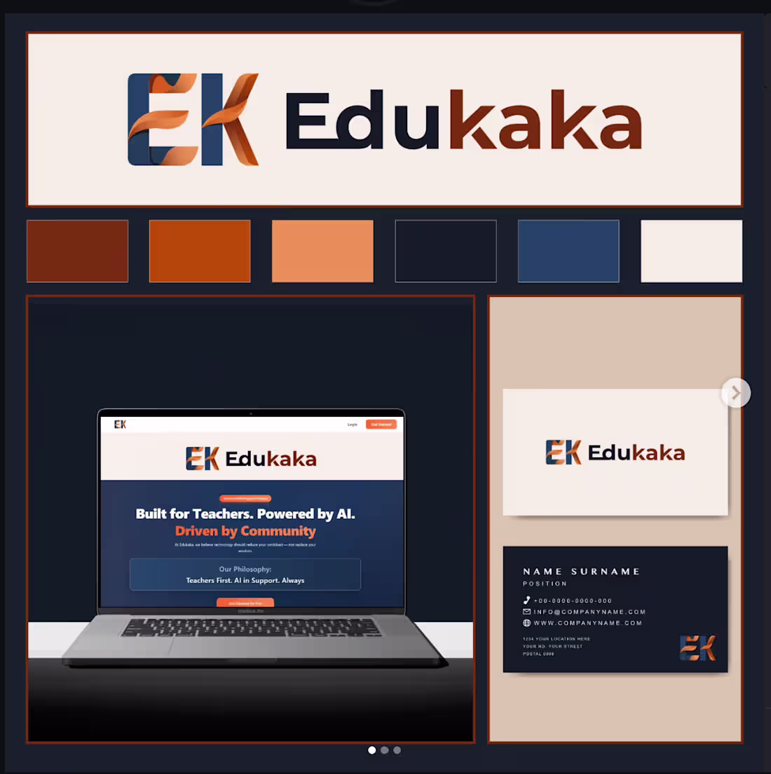
Edukaka
– Developed a complete brand identity from scratch for an AI-powered edtech platform — including logo design, colour palette, and typographic system.
– Designed a distinctive ribbon-integrated wordmark logo combining fluid motion and bold letterforms to reflect innovation and approachability.
– Delivered brand collateral including business card designs and a website UI mockup, ensuring visual consistency across digital and print touchpoints.
– Presented final brand guidelines and assets to the client for seamless handover.
0
20