pro
Rasid Wiyono
Pitch Deck Designer & Jitter Expert
- $25k+
- Earned
- 14x
- Hired
- 5.0
- Rating
- 85
- Followers


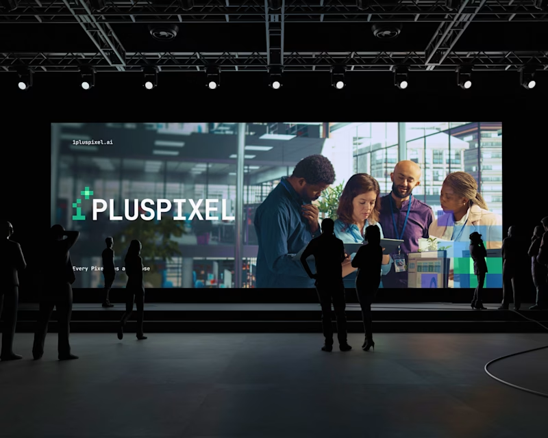
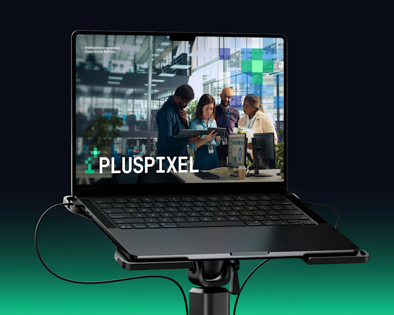
Same content, two different settings.
One designed to be seen on a big conference screen, the other experienced through a compact device. It's interesting how the same visuals can feel different depending on where they show up.
Which setting do you think brings the content to life better?
4 voted
57%
3 voted
43%
7 votes
Closed
Had a little idea for presenting content differently. Something about the contrast between crumpled paper textures and polished metallic elements felt worth exploring. Ended up really liking how this came together.
What do you think of this direction?

More than just presenting an idea, it's about creating a visual world around it.
Here's a look at Omnis AI, where bold visuals, abstract forms, and thoughtful layouts come together to shape a cohesive presentation.
I'd love to hear your thoughts on this visual direction. What stands out to you?
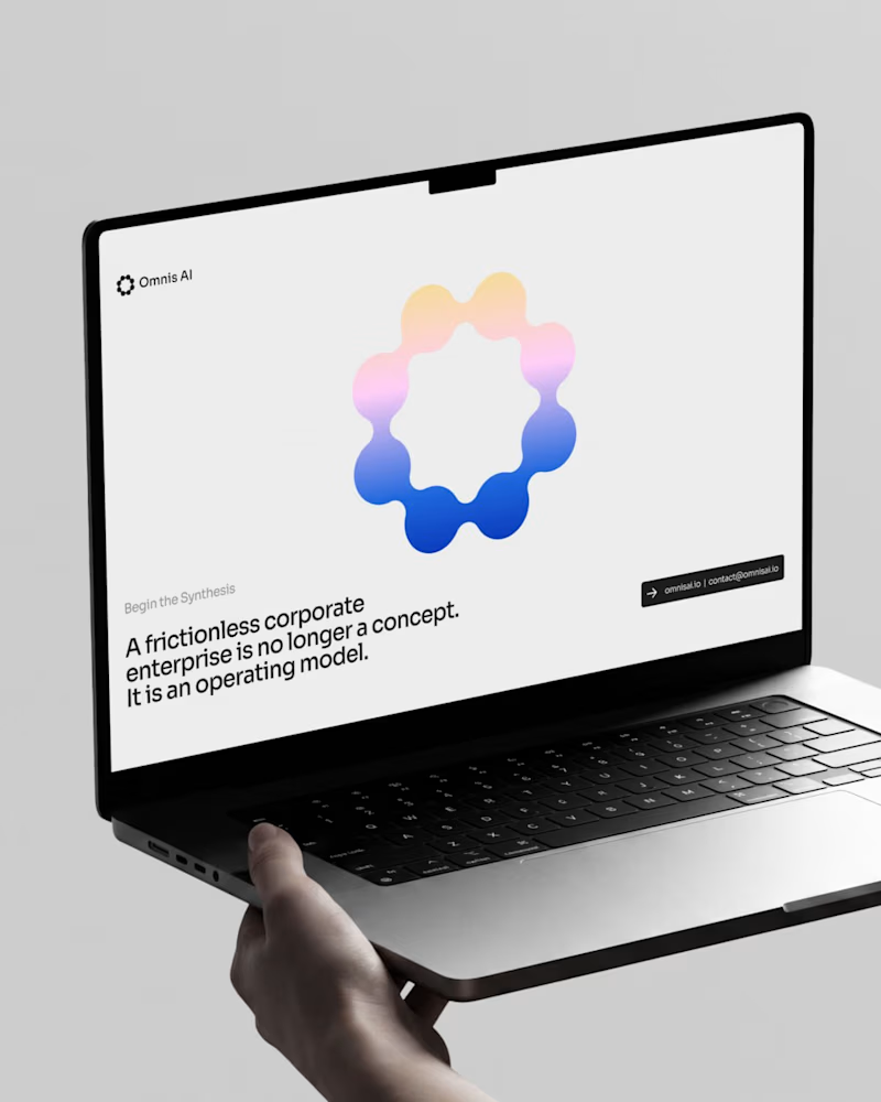
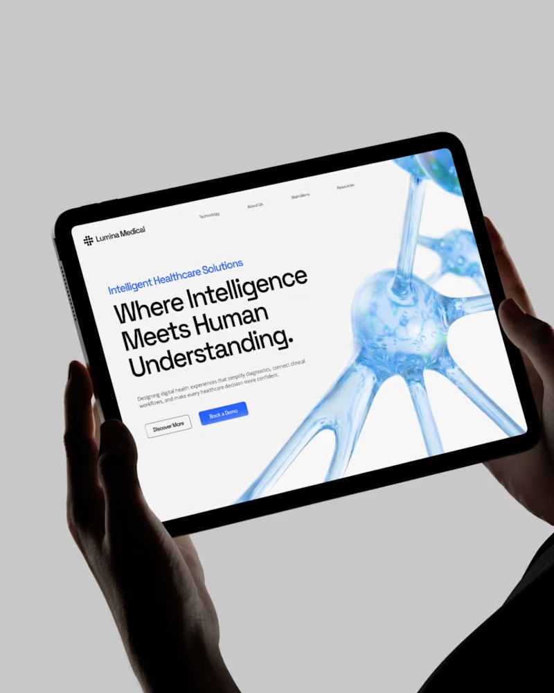
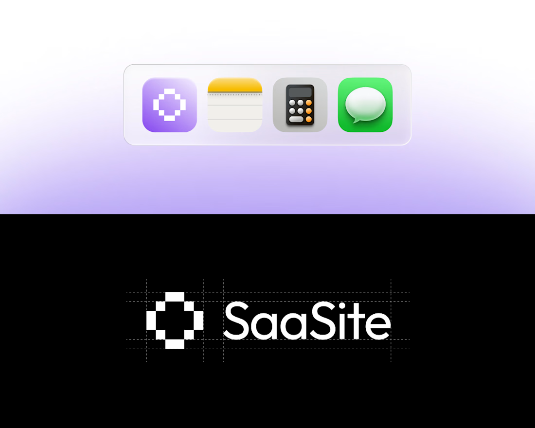
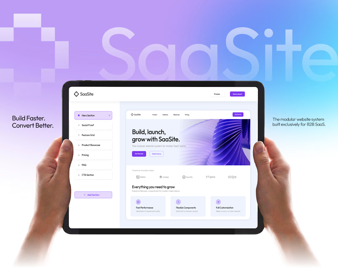
A SaaS brand, brought to life through slides. From the visual identity to product mockups, every slide is designed to tell a consistent story and make the whole presentation feel like one cohesive experience.