Ramcharantej Paka
I design & build sites that breathe conversions
Ready for work
Ramcharantej is ready for their next project!
This is what i meant !
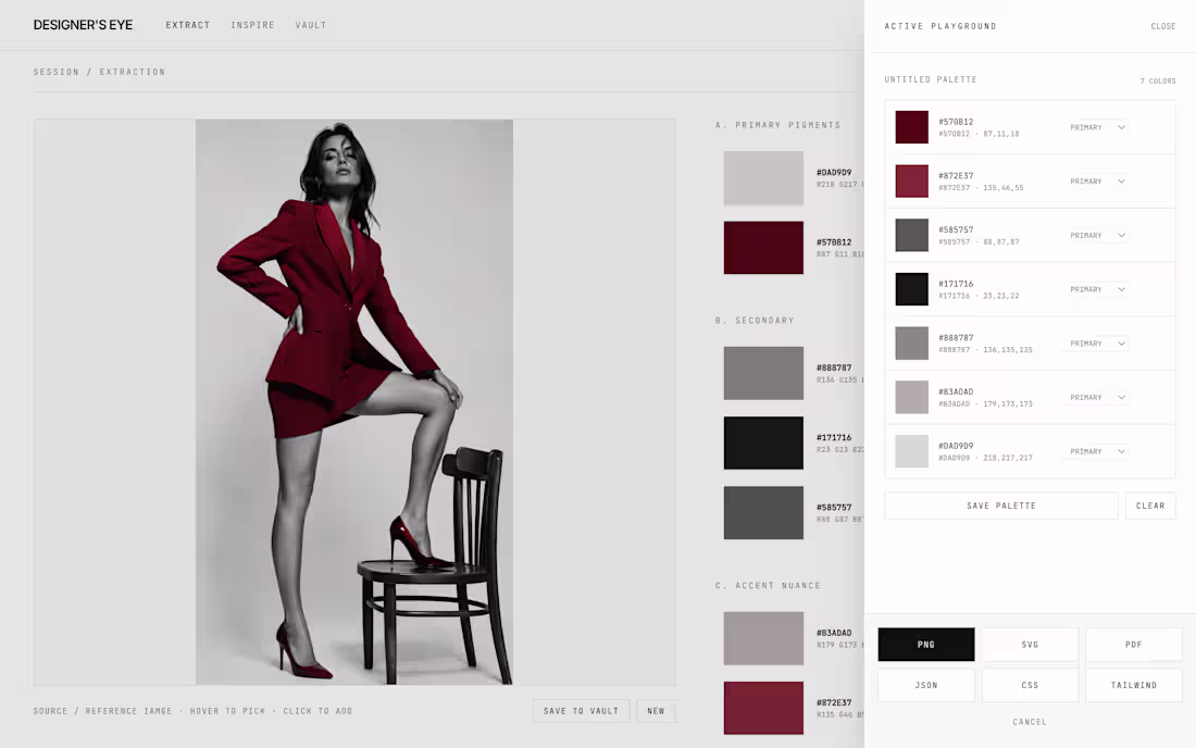
Pixel-precise colour palette selection tool with real-time exploration for designers. Creates matching colour schemes for digital products and art.
Export like you want them.
https://designerseyes.lovable.app
2
62
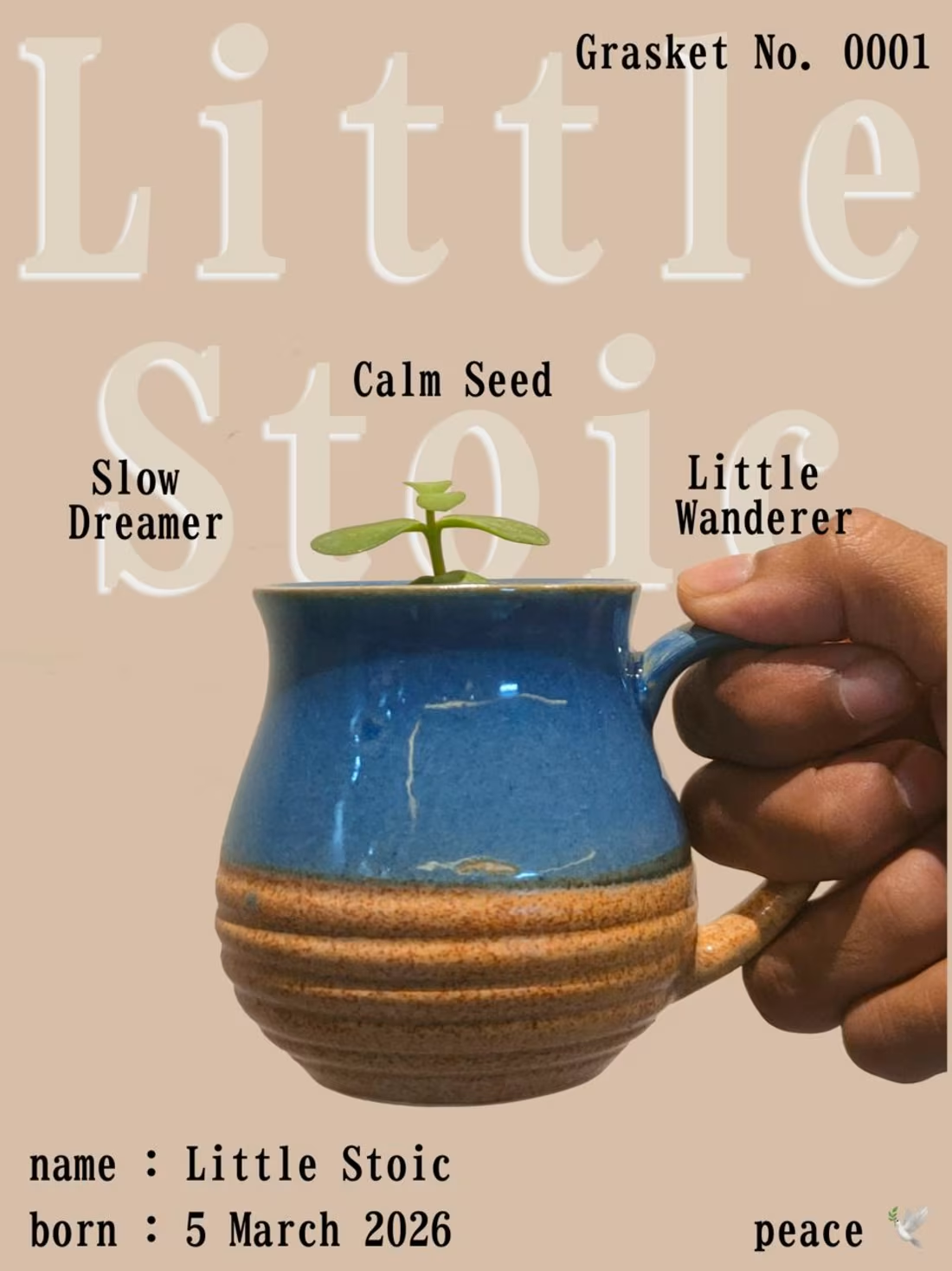
Designed this Simple Calm Card on Figma !
4
3
124
Forget the Static Logo's.
How about this Animated Logo Reveal ??
0
71
Stayzea | The 24-Hour Build. 🥂
Built this entire landing page on squarespace in under 24 hours!
Full brand case study + custom typography + high-end UI all done under 24 hours.
5
2
152
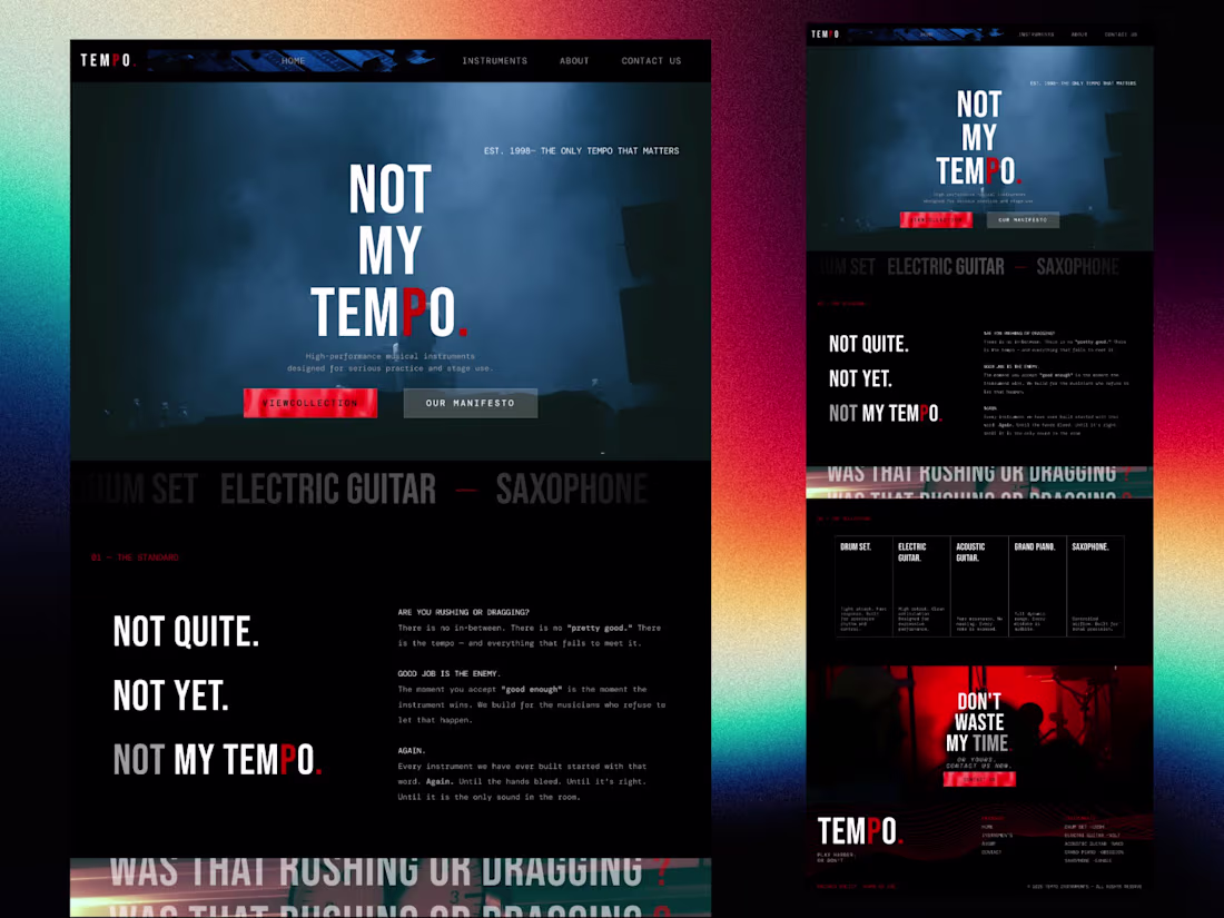
TEMPO.
The Landing page that doesn't explain but speaks itself.
2
1
90
Why are "About" pages always so boring?
I wanted to build one that reads like a manifesto.
Finished the TEMPO About page today.Heavy contrast, brutalist typography, and pure tension.
Does the layout flow, or is it too heavy?
1
96
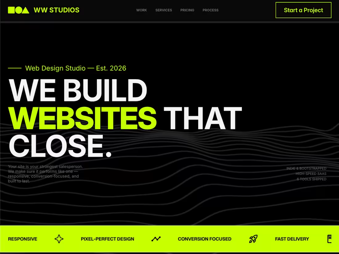
Built this web design studio site in 24 hours.
The goal was simple:
make the message instantly clear.
Designed for:
• Startup founders
• Indie hackers
• Early-stage SaaS teams
No unnecessary sections.
No visual noise.
Just:
• Strong headline
• Clean structure
• Focused communication
"We build websites that close." — not as a buzzword, but as clarity in what the site is meant to do.
Live preview:
https://wwstudio-1.framer.website
0
71
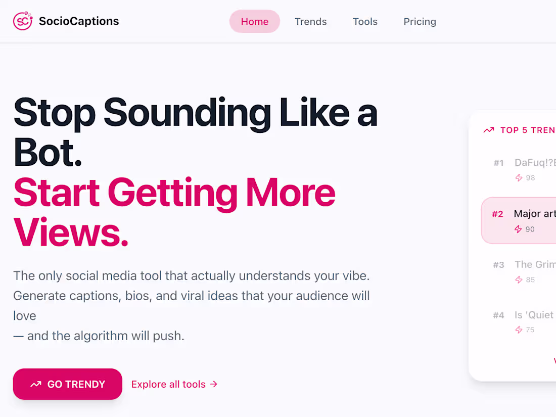
This ain't just pixels, folks. We're talking digital soul. Your website hero, feeling the vibe. What's your site's heartbeat saying?
1
0
176
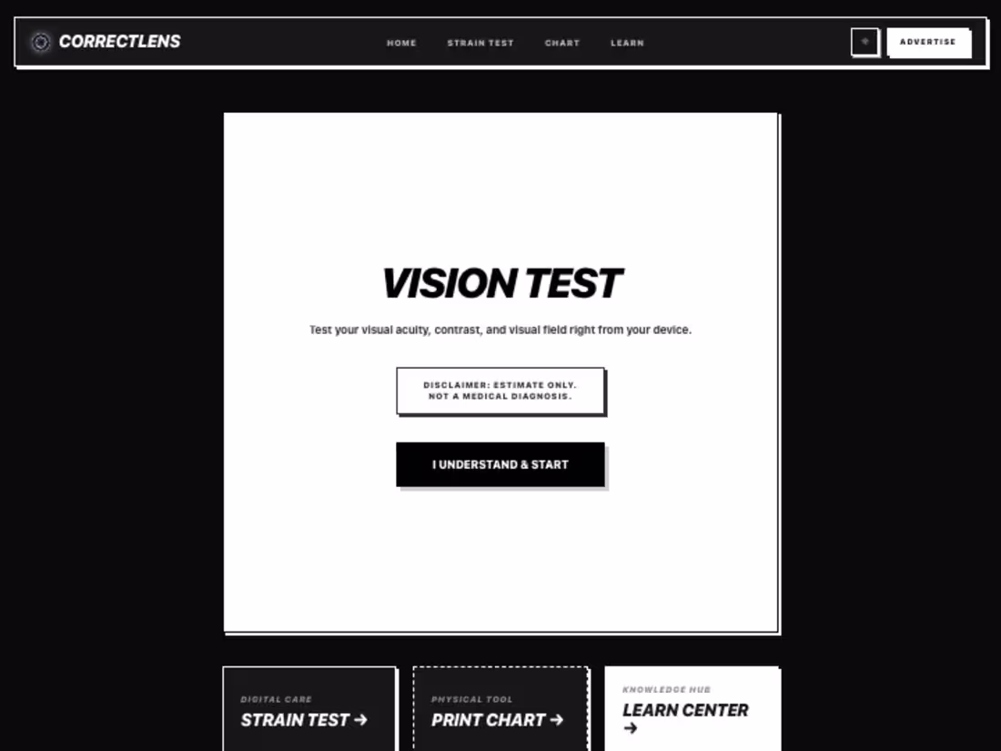
Our design's live at correctlens.com (https://correctlens.com) ;)
1
120
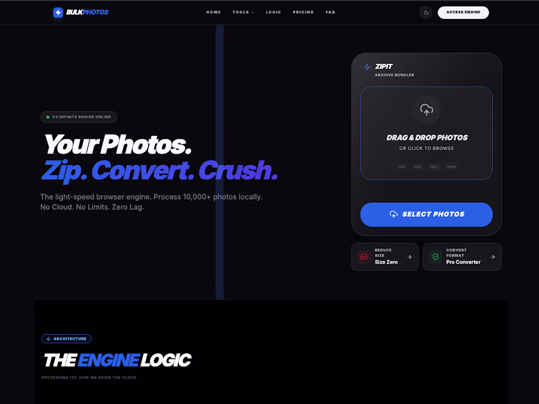
Trying to explain a whole vibe in one hero section. Take a look at the landing page and tell us, too much info or just right?
6
2
196